
バイオレットレッドスクリーン印刷プラスチゾルインク
価格帯: $15.99 – $33.99
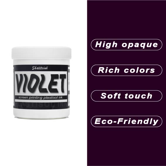
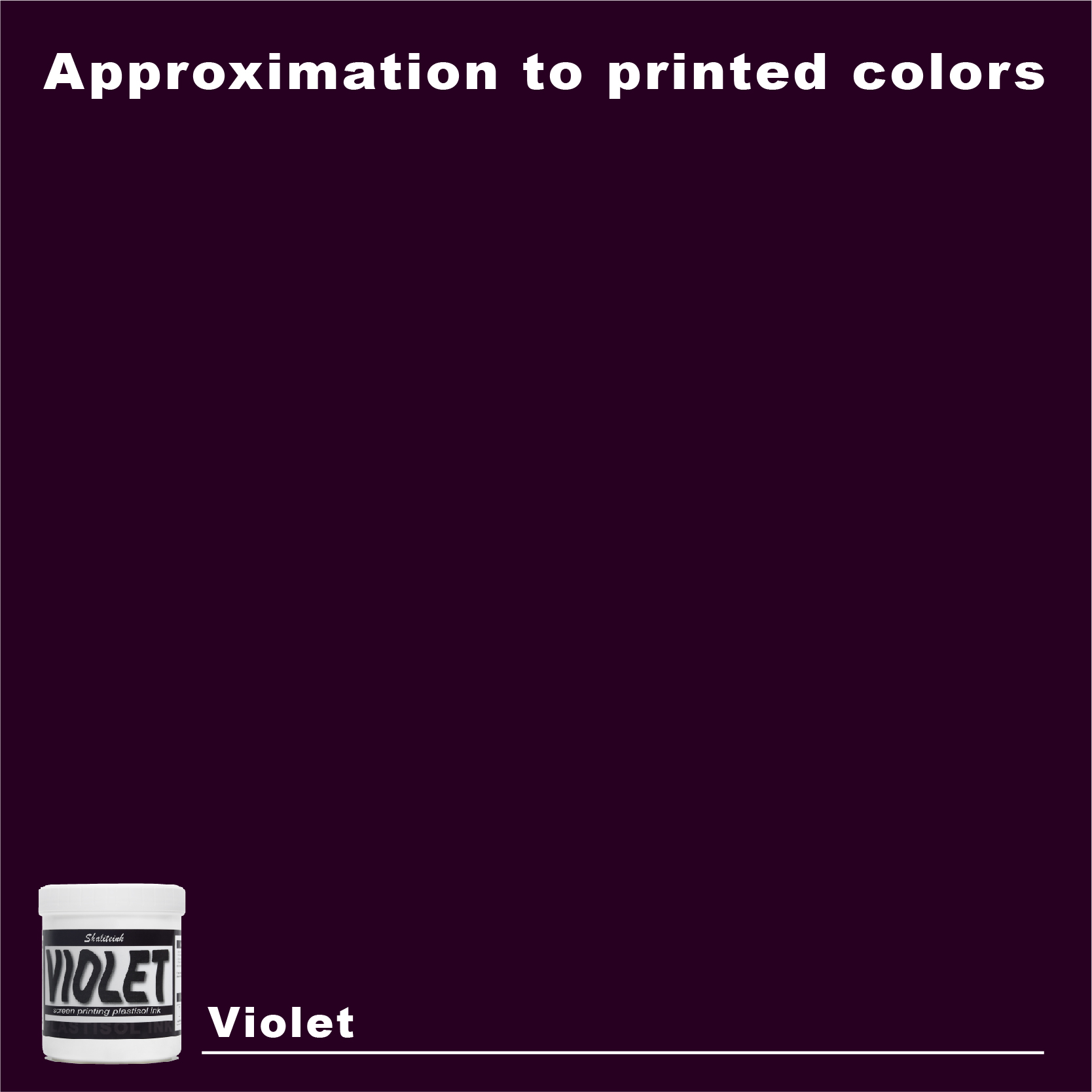
正直言って、ほとんどの赤インクはファストフードのロゴに似合いそうな、派手で明るすぎる、ちょっと安っぽい印象です。でも、このバイオレットレッドは全く別物。深みのある、落ち着いたワインのような色合いで、ごく普通の$5の無地のシャツが、まるで高級ブティックの$40のシャツのように見えます。真っ黒なパーカーにこのインクを使ってみたところ、高い不透明度のおかげで、色がくすんで濁ったような色にならず、本来の色合いを保ってくれました。クライアントが、ありきたりなジムシャツではなく、洗練されたデザインのシャツを求めている時に、まさに「圧倒的なアドバンテージ」となるでしょう。.
冷たいピーナッツバターのようなインクと格闘するのはもうやめましょう。このインクはバケツから出した瞬間からバターのように滑らかで、かき混ぜたり薄めたりする必要は一切ありません。コーヒーを買いに行ったり、配達の対応をしたりしても、インクが剥がれたり、スクリーンを傷めたりすることはありません。正直に言って、着用した瞬間にひび割れてしまうプリントほど、ブランドイメージを損なうものはありません。このインクは生地の動きに合わせて伸縮し、手触りも柔らかく、高温洗浄テストにも耐え、剥がれることなく仕上がります。まさに万能なので、スクリーンをこする時間を減らし、印刷作業に集中できます。.
巨匠のパレット:バイオレットレッドのプラスチゾルインクが、あなたが今まで見過ごしてきた高収益の秘密である理由
正直に言いましょう。ほとんどのスクリーン印刷業者は、原色以外の色を使うことを恐れています。私たちは、ファイアーレッド、ロイヤルブルー、レモンイエローといった定番色に安心感を覚えます。それらは安全で、予測可能です。しかし、安全では高額な費用は賄えませんし、予測可能では混雑した小売店の棚でブランドを際立たせることはできません。.
私は印刷ミスのある綿布を、小さな国を養えるほど大量にぼろ布箱に捨ててきた。しかし、そうした失敗から重要なことを学んだ。高額な料金を支払う顧客は「安全色」を求めているのではなく、競合他社が恐れて調合できないような色を求めているのだ。. 私は早い段階で一つの秘密に気づいた。洗練された、雰囲気のある色合いを常に完璧に再現できる印刷業者は、高級顧客との取引を独占できるのだ。.
今日は、私のショップにとって状況を一変させたある特定の色についてお話ししたいと思います。 バイオレットレッドスクリーン印刷プラスチゾルインク. ベルベットのような、ワインのような深みのある色合いで、気負いすぎていない。派手で不快な消防車のような赤でもなく、濁ったブドウ色でもない。高級セダンで見かけて、「, “「あの男はセンスがいい。」”
大きな転換点:私が流行を追いかけるのをやめた理由
分かりますよ。趣味で印刷機を使っている「インフルエンサー」はみんな、水性インクが地球を救う唯一の方法であるかのように叫んでいます。でも、もしあなたが時間が最も貴重な資産である本格的なビジネスを経営しているなら、 プラスチゾルインク 彼が紛れもない王者であるのには理由がある。.
プラスチゾルはスクリーン上では乾燥しない。. 1時間ほど席を外してください。怒鳴り散らす客や、荷積み場を塞いでいる配達員に対応してください。席に戻ったときには、インクはまだ滑らかで、すぐに印刷できる状態です。メッシュの中でかさぶたのように乾いてしまうことはありません。. さらに重要なのは、バイオレットレッドのような微妙な色合いの場合、紫の色調が衣服に埋もれてしまわないように、高品質のプラスチゾルだけが提供できる高い不透明度が必要になるということです。.
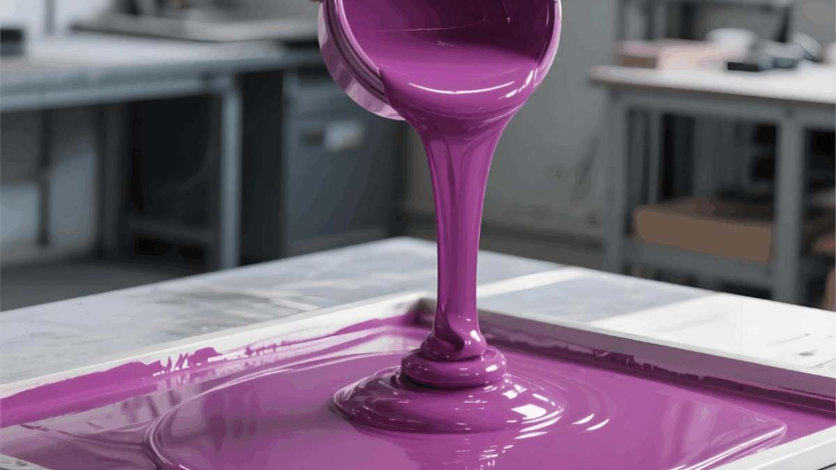
「ポップ」の化学“
次のような製品を使用すると シャライトインク プラスチゾルインク, つまり、単にバケツに入った顔料を買うわけではありません。PVC(またはPVCフリー樹脂)と可塑剤の懸濁液を購入するのです。 一番上に 生地の繊維に染み込むのではなく、表面にとどまることが重要です。バイオレットレッドの場合、これは非常に重要なポイントです。この色が染み込んでしまうと、泥のようなあざになってしまいます。表面にとどまれば、まるで百万ドルのような美しさになります。.
技術仕様:詳細
いいかい、この技術の「創造的な」側面について話す前に、まずは難しい計算を片付ける必要がある。ただ画面にベタベタしたものを投げつけて奇跡を祈るだけではダメなんだ。. 印刷の成功は、一連の制御された変数によって成り立つ。.
1. メッシュ数:ディテールの門番
のために バイオレットレッドスクリーン印刷プラスチゾルインク, 私は通常、2つの世界を行き来しています。
-
110メッシュ: 濃い色の衣類に印刷する場合で、厚みのある不透明なインク層が必要な場合は、これを使用してください。まさに「強力な」インクです。“
-
160メッシュ: これが私の「理想的な設定」です。細い線も十分に表現できるのに、バイオレットレッドの色味も十分に透過するので、深みのある鮮やかな発色を維持できます。.
2. スクイージーの選択
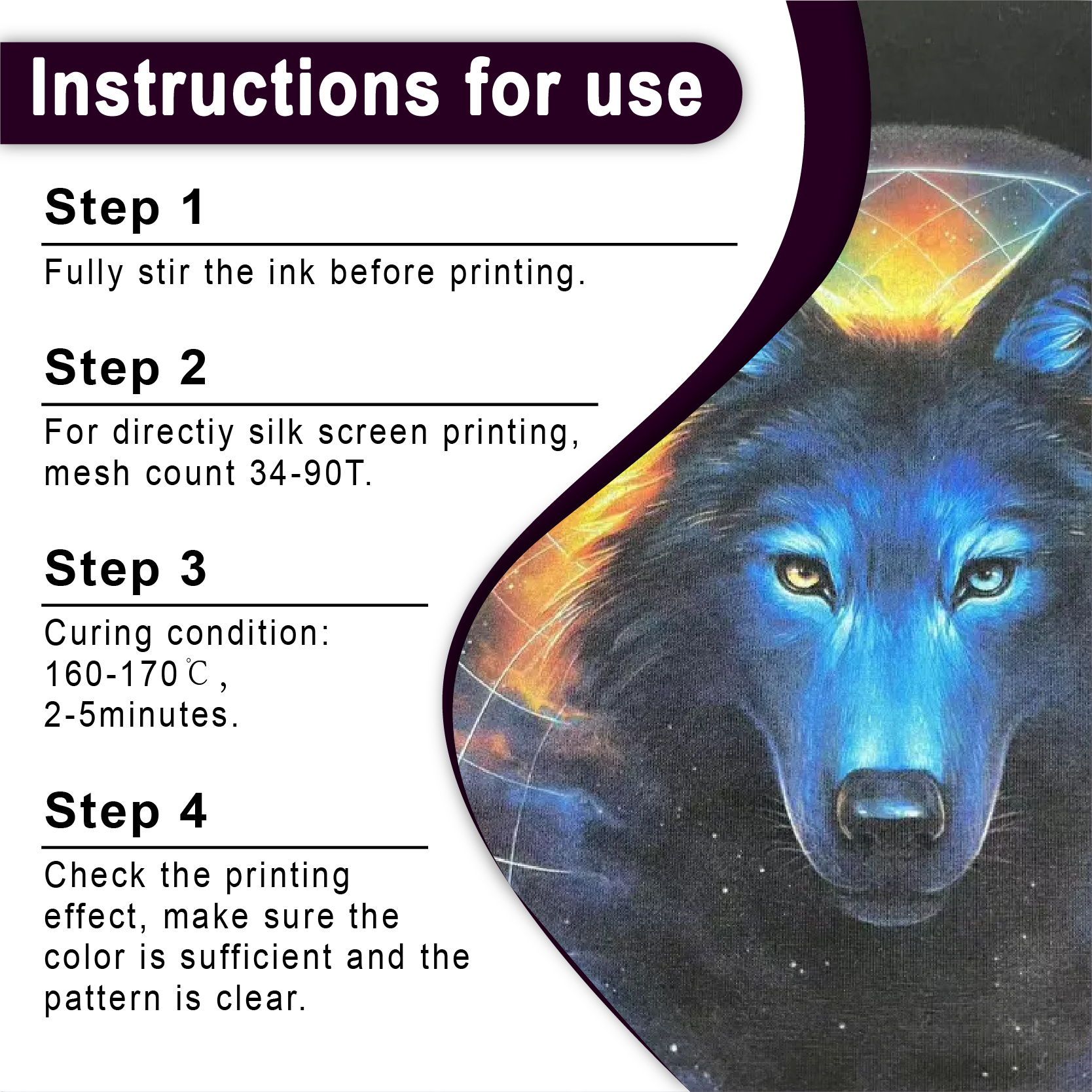
柔らかいスキージは使わないでください。インクがシャツに押し込まれてしまいます。 硬度70 または 70/90/70トリプル デュロメーター 刃。切れ味の良い、きれいな切り口が欲しい。一回か二回で終わり。.
3. 硬化曲線
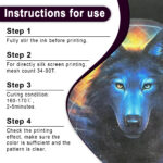
適切な温度に達しないと、顧客の最初の洗濯日が、あなたにとってその顧客のために働く最後の日になるでしょう。 スクリーン印刷用インク店 320°F(160°C)が最適な温度だと言う人もいるでしょう。しかし、バイオレットレッドの顔料の鮮やかさを考えると、乾燥機でゆっくりと一定の温度で焼くのが良いということが分かりました。.
| パラメータ | 推奨設定 | なぜそれが重要なのか |
| フラッシュ温度 | 220°F (105°C) | 重ね刷りができるように表面を整えます。. |
| 完全硬化温度 | 320°F (160°C) | インクが生地に永久的に定着することを保証します。. |
| 滞留時間 | 45~60秒 | 熱がインク膜全体に浸透することを可能にする。. |
「深紅」のジレンマ:アンダーベースと不透明度
業界で最も頭を悩ませる問題の一つは、濃い色のシャツに薄い色をプリントすることです。バイオレットレッドは「中間色」の厄介な色です。黒いパーカーに直接プリントすると、色が消えてしまいます。.
真に鮮やかなバイオレットレッドを得るには、しっかりとした 白色PVCフリーNBスクリーン印刷インク 下地として。.
私個人のプロからのアドバイス: バイオレットレッドをただ「塗って、軽く乾かして、また塗る」というやり方は避けてください。まず白地に塗り、触ってもベタつかない程度に乾かしてから、その上にバイオレットレッドを軽く重ねてください。こうすることで「サンドイッチ」効果が得られ、色が鮮やかに保たれます。.
shein@v1@151
ビジネスロジック:高品質インクが実際には安価な理由
私は、1ガロンあたり$5を節約するために「謎のインク」を仕入れようとする店主を何人も見てきました。 スクリーン印刷用インクの卸売 まるで1994年にデザインされたかのようなサイト。問題は、安価なインクは顔料含有量が少ないことだ。.
同じ鮮やかさを得るために安価なインクを3層印刷しなければならない場合、 シャリテインク, 、 あなたは:
-
時間の浪費(人件費は最大の経費です)。.
-
フラッシュドライヤーに電気を無駄に使う。.
-
まるで段ボールのような手触りのシャツを作る。.
プレミアムを使用すると プラスチゾルインクサプライヤー, プラスチゾルでも「ソフトハンド」な感触が得られます。お客様は実際に 欲しい シャツを着てくれるということは、次の注文でもまたあなたに依頼してくれるということだ。.
環境に優しい選択肢を探る:PVCフリーの選択肢
業界は変化しています。ブティックファッションブランドとの契約に入札する場合、環境負荷について質問されるでしょう。 PVCフリープラスチゾルインク が作用する。.
最初は懐疑的でした。「PVCフリー」は「印刷しにくい」という意味だと思っていました。それは間違いでした。現代の配合では、 環境に優しいスクリーン印刷インク Shaliteink社の製品は、従来のプラスチゾルとほぼ同じように機能しますが、フタル酸エステル類や有害物質を含んでいません。.
クライアントに「プレミアム」ティアを提供したい場合は、 バイオレット PVCフリー NB スクリーン印刷インク あるいは、PVCフリーのベースを使って自分だけのオリジナルバイオレットレッドを調合することもできます。これは大きなセールスポイントです。.
バイオレットレッドプリントのトラブルシューティング
最高の メタリックインクショップ または標準的なインク供給業者であっても、問題が発生することがあります。よくある問題の解決方法は次のとおりです。
-
心房細動(「ぼやけた」外観): 美しいバイオレットレッドのインクの中に小さな白い繊維が突き出ている場合は、インクの濃度が薄すぎるか、圧力が強すぎる可能性があります。より濃いインクを使用してください。 感光乳剤 インクのためのより深い「窪み」を作るため。.
-
インクのにじみ: バイオレットレッドの縁がぼやけ始めた場合は、インクが薄すぎる(希釈剤が多すぎる)か、作業場の温度が高すぎる可能性があります。インクは一定の室温に保ってください。.
-
「ゴースティング」効果: 必ず アンチマイグレーションスクリーン印刷インク(プラスチゾル) ポリエステル混紡素材に印刷する場合。.
比較分析:シャリインク対「他の連中」“
| 特徴 | シャリテインク バイオレットレッド | 一般的な低価格インク |
| 色素密度 | 高得点(1~2回パス) | 低(3回以上のパスが必要) |
| 安全性 | フタル酸エステル不使用 | 不明/PVCを含むことが多い |
| ストレッチ | 200% 伸長 | 簡単にひび割れる |
| クリーミーさ | 印刷準備完了 | 頻繁に激しくかき混ぜる必要がある |
よくある質問5選(FAQ)
1. バイオレットレッドには特定の種類の乳剤が必要ですか?
ほとんどのデュアルキュアエマルジョンを使用できますが、 高精細感光乳剤. 特にハーフトーン作業を行う場合、バイオレットレッドのエッジをよりしっかりと保持できます。.
2. バイオレットレッドをCMYKインクと混ぜて使うことはできますか?
もちろんです。 4色プロセスプラスチゾルインク 特定の領域の赤色を「強調」したい場合は、スポットカラーとしてバイオレットレッドを使用することで、CMYKでは表現できない深みを加えることができます。.
3. インクの手触りを「柔らかく」するにはどうすればよいですか?
クライアントが「触感のない」プリントを希望する場合は、ソフトハンドベース(通常は25%まで)を混ぜてください。ただし、これにより不透明度が若干低下することを覚えておいてください。.
4. このインクはスポーツウェアに適していますか?
バイオレットレッドのプラスチゾルは綿とは相性が良いですが、ポリエステルは別物です。100%のポリエステルジャージにプリントする場合は、ケチらないでください。 弾性スクリーン印刷インクプラスチゾル もしくは専用のブロッカーを使用してください。そうしないと、誰かがそれを装着しようとした瞬間に、プリントは乾いた小枝のようにパキッと折れてしまいます。.
5. 開封したバケツの賞味期限はどれくらいですか?
そのバケツはどれくらい持つかって?ほぼ永久に使えるよ。プラスチゾルは印刷業界の不滅の存在だからね。店の奥で2年間放置されていた、固くこびりついたバケツを見つけたことがあるんだけど、ドリルミキサーでさっとかき混ぜたら、まるで昨日トラックから降ろしたばかりみたいに印刷できたんだ。.
最終的な感想:暗闇を恐れるな(レッド)
ダイレクトレスポンスマーケティングの世界では、「大きな約束」という言葉がよく使われます。私があなたに約束するのはこれです。価格競争をやめて、 色と品質, あなたのビジネスは変革を遂げるでしょう。.
色を使うと バイオレットレッド それは、あなたがデザインセンスに優れていることを顧客に示すことになります。あなたは単なる「Tシャツ屋」ではなく、インテリアデザイナーであることを示すのです。そして、真の利益を生み出すのはインテリアデザイナーなのです。.
だから、次にあなたが スクリーン印刷インクキット, 標準的な色を選ぶだけではなく、 バイオレットレッドスクリーン印刷プラスチゾルインク. 乾燥機は問題なく対応できますし、スクリーンも喜ぶでしょう。そして、お客様は財布で感謝の気持ちを表してくれるでしょう。.
| サイズ |
8オンス ,16オンス ,32オンス |
|---|
Violet Red Screen Printing Plastisol Ink に対するレビュー9件
フィルターをクリア以前にこの商品を購入したことのあるログイン済みのユーザーのみレビューを残すことができます。
関連商品
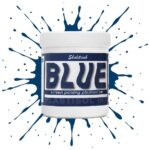
明るい青色のスクリーン印刷プラスチゾルインク
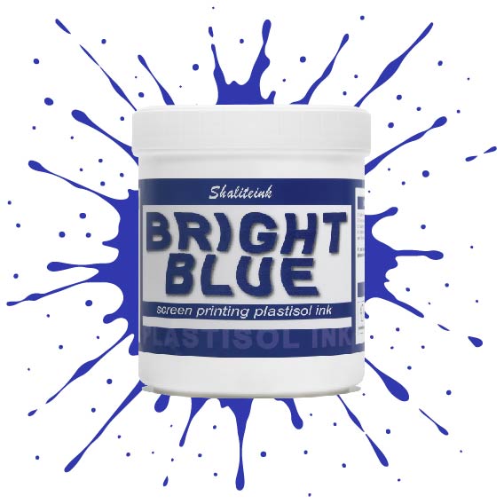
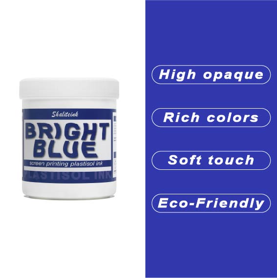
オフィスカーペットのようなくすんだ青色で妥協するのはもうやめましょう。Shaliteinkのブライトブルー・プラスチゾルインクを使えば、シャツに地中海の夏の空のような鮮やかな色合いを与えることができます。まるで上質なベシャメルソースのように滑らかに伸び、プリントが終われば使い込んだ革ブーツのように丈夫です。このインクは作業中にスクリーン上で乾くことがないので、焦らずにじっくりと作品作りに集中できます。.
ご自宅のスタジオや小規模な店舗でプリントされる方が多いことを考慮し、この製品は高い不透明度と環境への配慮を両立させました。「NB」シリーズはフタル酸エステル不使用で、OEKO-TEXなどの世界で最も厳しい安全基準を満たしています。160℃(320°F)で適切に硬化させれば、最初の洗濯後も色落ちしない鮮やかなシャツが完成します。.
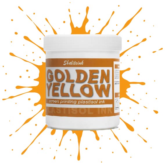
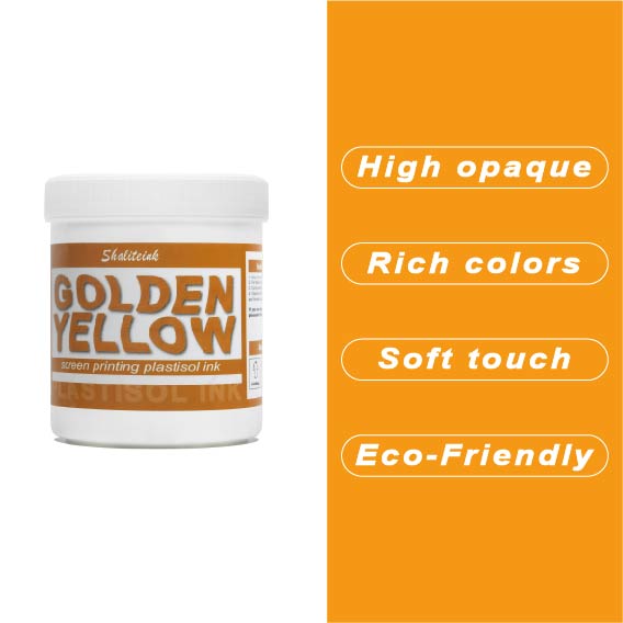
深みのあるゴールデンイエローのスクリーン印刷用プラスチゾルインク
安っぽく見えて色落ちする「安全ベスト」のような黄色で妥協するのはやめましょう。 濃い黄金色のプラスチゾルインク 太陽の光を浴びたような、豊かで温かみのある色合いをデザインにもたらし、最初の洗濯後も鮮やかな色合いが長持ちする、高級感あふれるバーシティスタイルを実現します。高い不透明度と、まるでバターのように滑らかで、手首に負担をかけずにメッシュの上を滑らせるほどの滑らかさを持ちながら、濃い色の生地にもしっかりと密着する適度な厚みを兼ね備えた、まさに理想的なインクです。.
丈夫なパーカーから繊細なストリートウェアまで、どんな素材にも使えるこのインクは、スクリーン上では濡れた状態を保ち、作業性も抜群ですが、320°F(約160℃)に達すると、耐久性に優れたプロ仕様の仕上がりへと変化します。見た目だけでなく着心地も優れたプレミアムアパレルを生産するために必要な、安定した品質のフタル酸エステル不使用の頼れるインクです。「ピーナッツバター」のような質感や、くすんだプリントとはもうおさらば。印刷機に、純粋な液体の黄金をお届けします。.
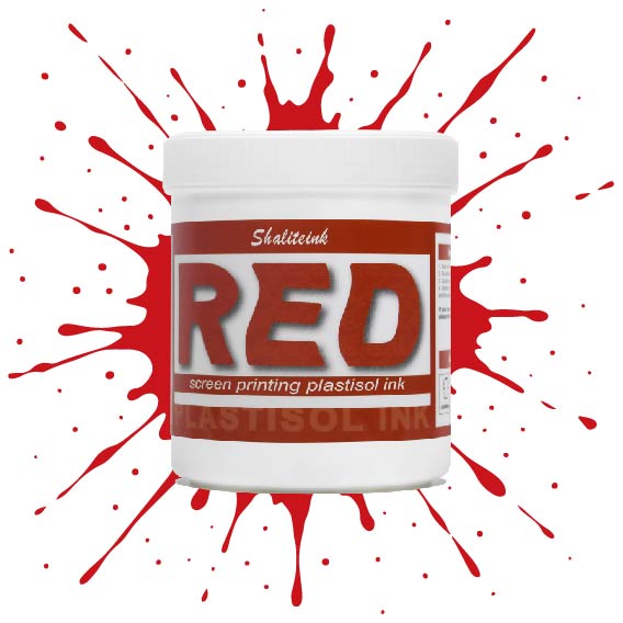
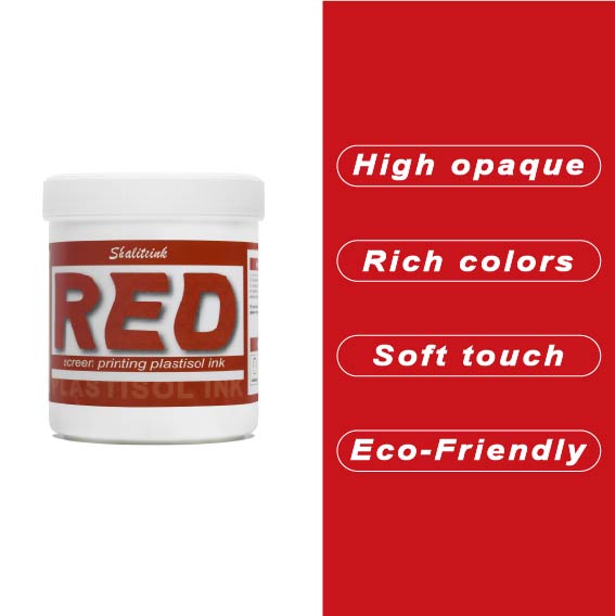
深紅のスクリーン印刷プラスチゾルインク
濃い色の衣類に「赤がピンクに変色」してしまうような失敗はもうやめましょう。当社のインクは、繊維化学の専門家が、技術的な問題に悩まされることなく、店頭に並べられるような深みのある鮮やかな赤色を求める印刷業者向けに開発しました。DIY愛好家の方にも、成長中のブティックブランドの方にも、このインクはバターのように滑らかな質感で、メッシュから簡単に洗い流せ、洗濯を繰り返しても鮮やかな色を保ちます。.
当社は安全性と高性能の両方を最優先事項とし、OEKO-TEXなどの厳格な国際基準を満たすため、フタル酸エステルを含まない配合を採用しています。標準硬化環境と低温硬化環境(270°F~280°Fまで設定可能)の両方に最適化されており、扱いにくいポリエステル混紡素材における染料のにじみを効果的に最小限に抑えながら、高級アパレルを特徴づける柔らかくプロフェッショナルな肌触りを維持します。.
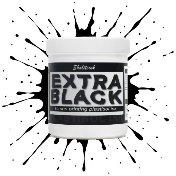
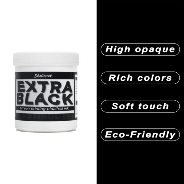
エクストラブラックスクリーン印刷プラスチゾルインク
お客様が真夜中のような濃さを求めているのに、「チャコールグレー」で妥協するのはもうやめましょう。Shaliteinkのエクストラブラックは、単なる濃いインクではありません。透明感を一筆で完全に消し去るために設計された、高顔料配合の強力なインクです。安価な黒インクは、濃い色の綿に色あせたエスプレッソのように見えることが多いですが、当社のフォーミュラは、見た目と同じくらい手触りの良い、プロフェッショナルなマットな質感で、濃密な「ブラックホール」のような仕上がりを実現します。.
日々の酷使に耐えるように設計されており、細かいメッシュも難なく切断できるほど滑らかでありながら、100回の洗濯後も深みのある色合いを保ちます。しっかりとしたベタ塗りを得るために何度も印刷を繰り返すことにうんざりしているなら、このインクはあなたの印刷機にふさわしいアップグレードです。増量剤もグレーの色調も一切なし。業界で最も深く、最も信頼性の高い黒を実現します。.
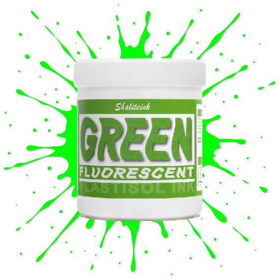
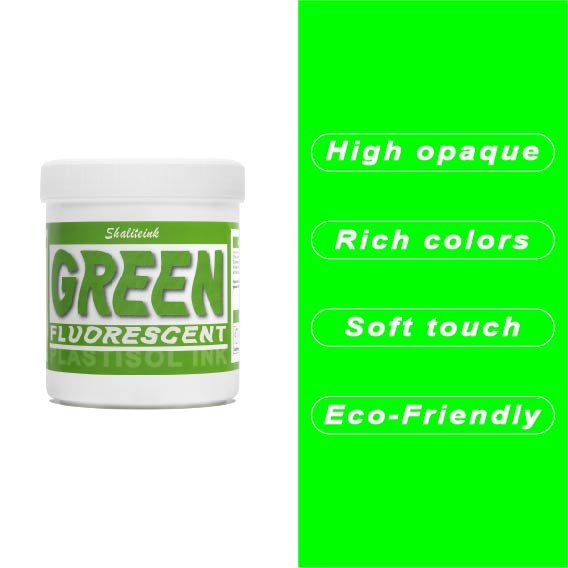
蛍光グリーンスクリーン印刷プラスチゾルインク
シャリテインク蛍光グリーン:ウェアラブル電気
「安全グリーン」なんて忘れてください。これはまさに物理学の結晶です。当社の蛍光グリーンは、紫外線を捉えて反射するように配合されているため、プリントがまるでコンセントに差し込まれているかのような鮮やかさを実現します。ストリートウェアやイベントグッズに最適な「秘密兵器」です。シャツの上にただ乗っているだけではなく、強烈なインパクトを与えます。顔料の配合量を調整することで、110~156メッシュの紙をきれいにせん断し、ネオンカラー特有の「目詰まり」の悩みを解消し、鮮やかな発色を実現します。.
ネオンカラーの成功は土台作りにかかっています。これをしっかりとした白い下地の上に重ねて、 320°F (160℃洗濯にも強く、ブラックライトの下でも鮮やかな印刷を実現するソリューションです。手動印刷機でも高速自動印刷機でも、Shaliteinkはクリーミーで安定した品質を維持するため、「特殊インク」のプレミアム価格を自信を持って設定できます。ありきたりな印刷はやめて、お客様の目を引く印刷を実現しましょう。.
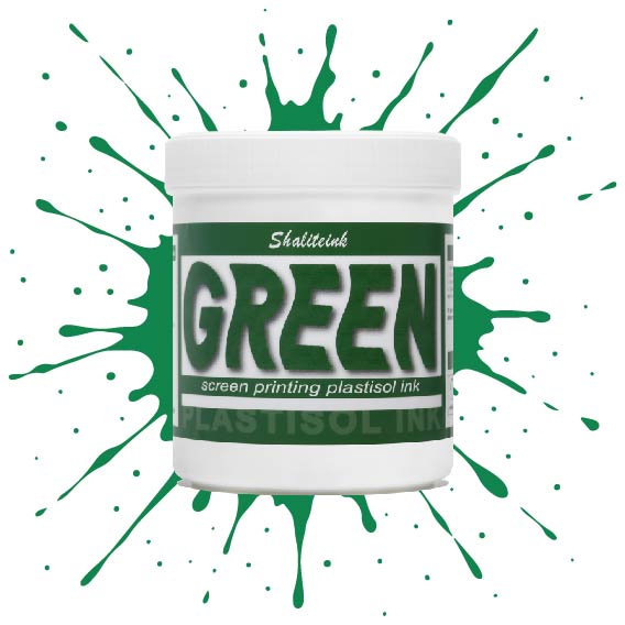
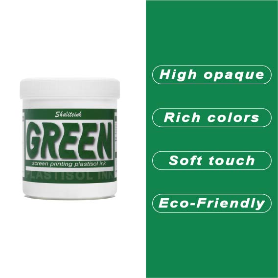
グリーンスクリーン印刷プラスチゾルインク
ガレージで夜遅くまで刺激臭を吸い込んで過ごしていましたが、ついにShaliteinkのグリーンインクで解決しました。昔ながらの有害なインクとは違い、自宅の作業場でも安全に使用でき、有害なPVCも一切含まれていません。鮮やかな発色で、まるで工業作業ではなく、焼きたてのケーキにたっぷりとアイシングを塗っているような感覚です。.
このインクは260°F(約127℃)という低温で硬化するので、電気代の節約になり、シャツが縮んで人形の服のようになってしまうこともありません。濃い色の綿生地にソフトな肌触りでプリントでき、50回以上の洗濯後も鮮やかな色を保ちます。有害なガスに悩まされることなく、自宅のキッチンでプロ仕様のプリント用品を作り始めましょう。.
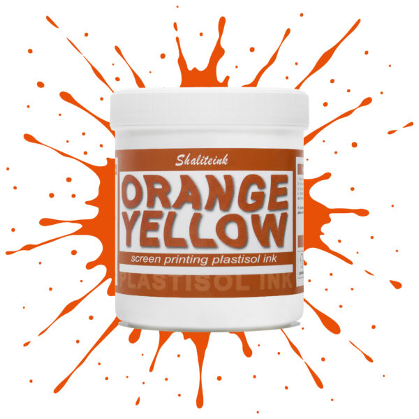
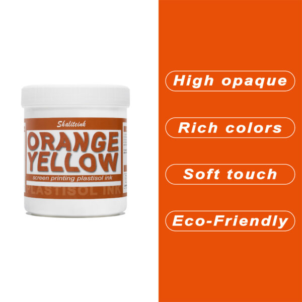
オレンジイエロースクリーン印刷プラスチゾルインク
暗い生地に溶け込んでしまうような「くすんだ」黄色で妥協するのはもうやめましょう。人目を引く鮮やかな発色の秘訣は、妥協を嫌う印刷業者向けに設計された、高不透明度の強力なオレンジイエロースクリーン印刷用プラスチゾルインクです。スポーツウェアでも小売店のTシャツでも、このインクは豊富な顔料含有量のおかげで鮮やかな発色を保ちます。ゴールドとオレンジの中間のような、大胆で太陽の光を浴びたような色合いでありながら、厚塗り感のないしっかりとした存在感を放ちます。.
安全対策は面倒な作業であってはなりません。そこで、この製品はPVCとフタル酸エステルを一切使用せず、お客様の店舗が法令を遵守し、環境にも配慮できるよう開発しました。独自のノンブリード(NB)技術により、扱いにくいポリエステル混紡素材でも染料のにじみを防ぎ、鮮やかな色合いを洗濯後も保ちます。滑らかで切りやすく、上質なソフトな手触りで、お客様にまるで魔法の手を持っているかのような印象を与えます。ぜひ一度お試しいただき、プロがShaliteinkを信頼する理由をご実感ください。.
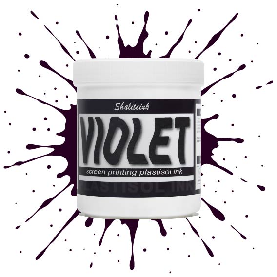
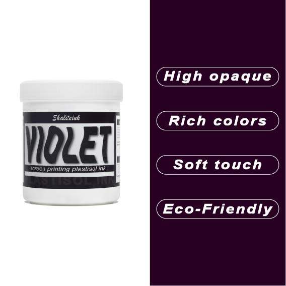
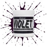
バイオレットスクリーン印刷プラスチゾルインク
暗い生地に触れるとすぐに消えてしまう、くすんだ紫色で妥協するのはもうやめましょう。 バイオレットスクリーン印刷プラスチゾルインク 顔料を豊富に配合しているため、デザインが鮮やかで生き生きとした仕上がりで際立ちます。安価なインクのように、冷たいピーナッツバターをスクリーンに塗りつけるような感触とは異なり、このインクはメッシュをスムーズに通過し、厚手のコットンや濃い色の混紡素材でも、くっきりとしたエッジと均一な不透明度を実現します。.
すべては化学反応にかかっています。このインクは繊維の表面にしっかりと定着し、最大限の鮮やかさを実現すると同時に、12回洗濯してもひび割れしない柔軟性を保ちます。乾燥機で色落ちして「あざ」のようなプリントに悩んでいるなら、この高固形分インクは、一度の洗濯で理想的な色合いを実現するために必要なソリューションです。この鮮やかで信頼性の高いバイオレットカラーは、普通のTシャツを際立たせるアイテムへと変身させます。.
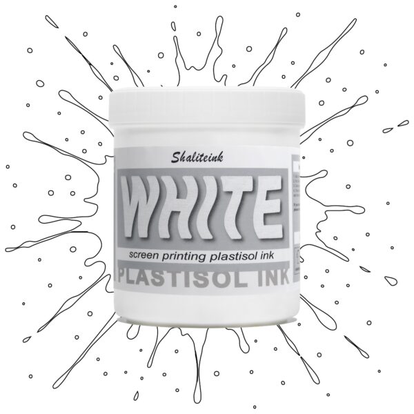
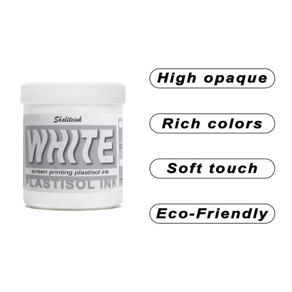
ホワイトスクリーン印刷プラスチゾルインク
生地に溶け込んでしまうような「幽霊のような」白いプリントで妥協するのはもうやめましょう。Shaliteinkのホワイトプラスチゾルインクは、濃色の衣類にしっかりとした不透明度を与えるために開発されました。クリーミーで滑らかな質感でスクリーンに塗布でき、硬いプラスチックというよりはホイップバターのような感触です。そのため、手作業でのプリント作業がスムーズになり、生産性が向上します。たった一度のフラッシュで、鮮やかで明るい白の「ポップ」な仕上がりを実現し、最初の洗濯でインクがひび割れたり色褪せたりする心配もありません。.
週末に趣味でプリントを楽しむ方にも、忙しいショップを経営されている方にも、これはまさにあなたが探し求めていた頼れる相棒です。高発色で、驚くほど簡単に混ぜることができ、数秒で硬化するので、機材の扱いに時間を費やすことなく、実際にプリント作業に集中できます。プロ仕様の性能をバケツに詰め込んだこのインクは、最初のプリントから1000回目のプリントまで、白を鮮やかに保ち、デザインをシャープに仕上げるように設計されています。.
 EN
EN  DE
DE  ES
ES  PT
PT  JA
JA
アナ・コスタ –
最高の利益。最高の利益。最高の利益。ユーザーと結果の一貫性を維持します。安全な情報を提供します。最高の利益。 Superou minhas 期待しています。 Superou minhas 期待しています。機能はありません。機能はありません。楽しい
アンナ・シュミット –
Hochwertige Qualität und Schnelle Lieferung。ホッホ
エミリー・デイビス –
品質は高級感があり、配送も早かったです。
アンナ・シュミット –
Leicht zu Nutzen und konstante Ergebnisse。ライヒト
ペドロ・ソウザ –
安全な情報を提供します。ファンシオナm
ピオトル・ジエリンスキ –
Łatwa aplikacja i niezawodne działanie.ウィソカ・ジャック
ペドロ・ソウザ –
最高の利益。優れた評価と迅速な取り組み。機能はありません。オティモ
エミリー・デイビス –
日々の作業に非常に役立っています。使いやすく、仕上がりも安定しています。品質も高級感があります。
サラ・ミラー –
使いやすく、結果も安定しています。日々の作業に非常に役立っています。品質は高級感があります。