
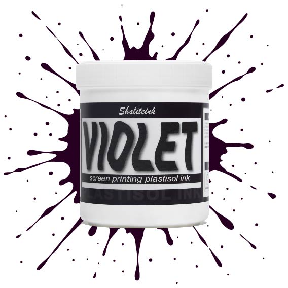
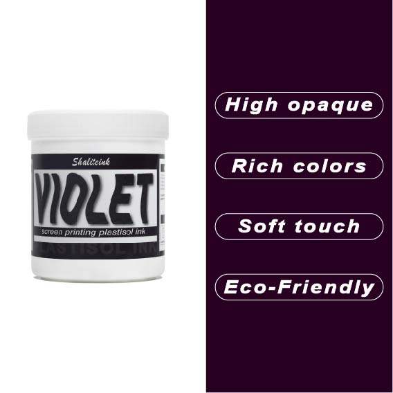
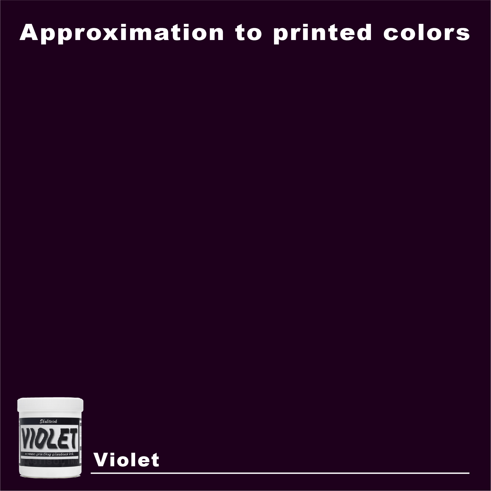
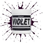
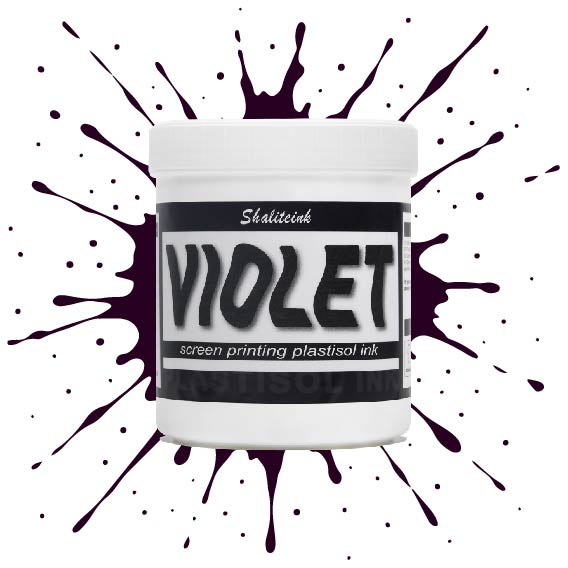
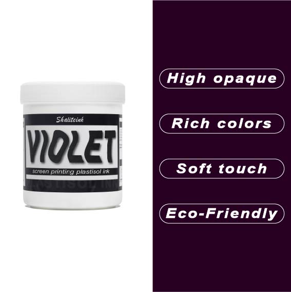
バイオレットスクリーン印刷プラスチゾルインク
価格帯: $15.99 – $32.99
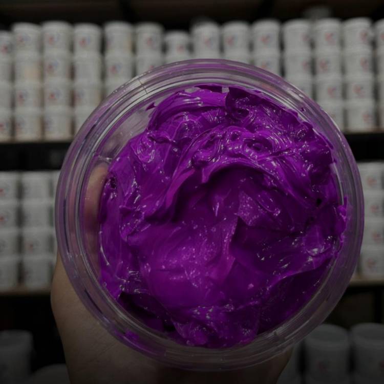
暗い生地に触れるとすぐに消えてしまう、くすんだ紫色で妥協するのはもうやめましょう。 バイオレットスクリーン印刷プラスチゾルインク 顔料を豊富に配合しているため、デザインが鮮やかで生き生きとした仕上がりで際立ちます。安価なインクのように、冷たいピーナッツバターをスクリーンに塗りつけるような感触とは異なり、このインクはメッシュをスムーズに通過し、厚手のコットンや濃い色の混紡素材でも、くっきりとしたエッジと均一な不透明度を実現します。.
すべては化学反応にかかっています。このインクは繊維の表面にしっかりと定着し、最大限の鮮やかさを実現すると同時に、12回洗濯してもひび割れしない柔軟性を保ちます。乾燥機で色落ちして「あざ」のようなプリントに悩んでいるなら、この高固形分インクは、一度の洗濯で理想的な色合いを実現するために必要なソリューションです。この鮮やかで信頼性の高いバイオレットカラーは、普通のTシャツを際立たせるアイテムへと変身させます。.
紫色の支配をマスターする:バイオレットプラスチゾルインクがあなたのショップの秘密兵器である理由
いいかい、私は印刷機で十分な時間を費やしてきたから、どの色が厄介な色か分かるんだ。紫はまさに究極の偏頭痛だよ。耳障りなネオングリーンや炭の煤みたいな黒も見てきたけど、印刷工の腕を試すのに、深い紫ほど難しい色はない。ほとんどの印刷所のオーナーは、この色は扱いにくいとか、調色が難しいとか考えて避けるんだ。でも秘密を教えよう。うまくやれば、結果はまさに王者の域に達する。今日はその秘密を解き明かすんだ。 プラスチゾルインク そしてその背後にある化学を見てみると バイオレットスクリーン印刷プラスチゾルインク.
なぜバイオレットなのか?(そしてプロが完璧に仕上げる方法)
誰もが経験したことがあるでしょう。1時間かけて色合わせをしたのに、出来上がったプリントはまるで魂を失ったブドウゼリーのよう。あるいはもっとひどいことに、パレット上では素晴らしく見えたのに、最初の洗浄で乾燥した砂漠の地面のようにひび割れてしまう。問題は色ではなく、化学反応なのです。.
バイオレットは、私が言うところの「重たい」顔料です。発色を保つには、最高級のキャリアが必要です。私は、 スクリーン印刷用インクショップ 顔料の配合バランスが完璧なため、美しい発色が得られます。インクは冷たいピーナッツバターのようにスクリーン上に留まるのではなく、メッシュの中をスムーズに流れます。.
「ポップ」の科学“
私たちが話すとき シャライトインク プラスチゾルインク ここで重要なのは、高い不透明度です。濃い紺色や黒のシャツに安価な紫色のインクでプリントしようとすると、インクが消えてしまいます。デザインというより、濃い油染みのように見えてしまうのです。鮮やかな発色を得るには、繊維の上にしっかりと定着する高固形分インクが必要です。.
私は、 バイオレットスクリーン印刷プラスチゾルインク お客様が求めるシャープな仕上がりを実現します。重要なのは見た目だけではなく、フラッシュドライヤーの熱に顔料がどれだけ耐えられるかです。.
「グリーン革命」:PVCを超えて
正直に言いましょう。業界は方向転換しています。大手ブランドや目の肥えた顧客は環境に優しい製品を求めており、肌に刺激の強い化学物質が触れることは決して望んでいません。テストをしていないなら PVCフリープラスチゾルインク あなたは基本的に、AI時代に折りたたみ式携帯電話を売ろうとしているようなものだ。.
最近私は バイオレット PVCフリー NB スクリーン印刷インク 早速試してみました。これはまさに画期的な商品です。手触りが驚くほど柔らかく、高級Tシャツの胸元によくある「プラスチックの鎧」のような感触がありません。.
性能比較:標準仕様 vs. エコフレンドリー仕様
| パフォーマンス指標 | 標準バイオレットプラスチゾル | PVCフリーNBバイオレット |
| 色の濃度 | エリート | 高い |
| 触感 | 固体 | 超ソフト |
| 化学組成 | 業界標準 | フタル酸エステル不使用/安全 |
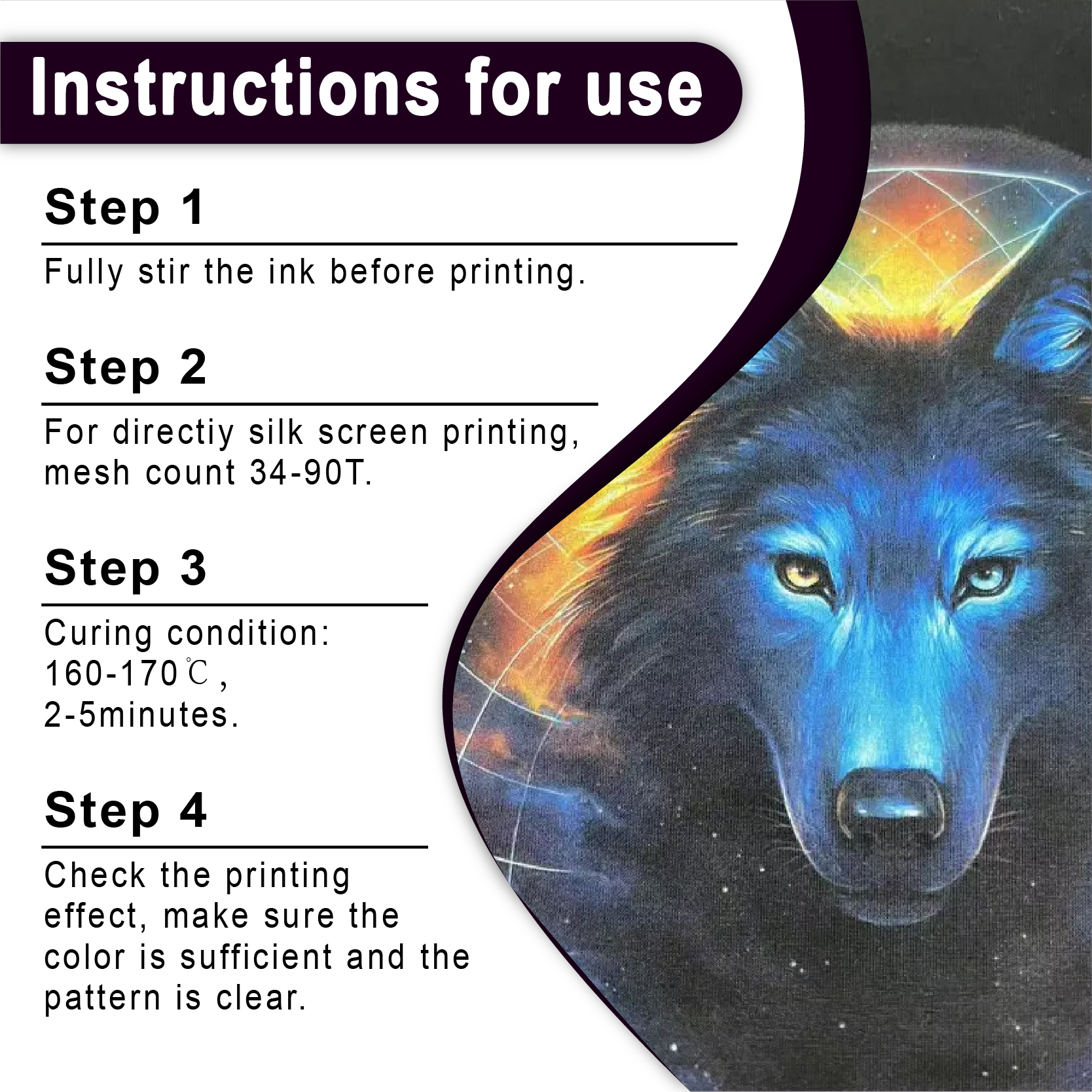
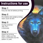
| 硬化温度 | 160℃(320°F) | 160℃(320°F) |
| 応用 | 作業服/厚手コットン | ハイエンドファッション/アスレチック |
プロのコツ:バイオレットをマスターのように印刷する方法
ただ画面にインクを垂らして祈るだけではダメです。しっかりとした作戦が必要です。ここでは、私が実際に試して効果を実感したワークフローを紹介します。 スクリーン印刷用インクの卸売 用品。.
1. 下地を省略しないでください
白いシャツに印刷する場合を除き、必ず白い下地が必要です。安売りの白インクは使わないでください。高品質の白インクを使用してください。 ホワイトスクリーン印刷プラスチゾルインク. 明るい白色のベースは鏡のように働き、紫色の色素を目に反射させます。それがなければ、暗い色の生地が光を吸収してしまい、ぼやけた印象になってしまいます。.
2. メッシュを賢く選びましょう
太い紫色の糸を305メッシュに無理やり通そうとする人たちを見たことがあるけど、あれは悪夢だよ。絶対にそんなことはしないで。.
-
110~160メッシュ: これは、高不透明度の紫色にとって最適なポイントです。.
-
230メッシュ: ハーフトーンや「ビンテージ」ルックなど、インクの付着を薄くしたい場合に使用します。 PVCフリープラスチゾルインク.
3. スクイージーの仕組み
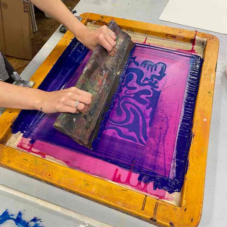
スキージの角度は75度程度に保ってください。インクを表面に均一に伸ばすのがポイントです。生地に押し付けすぎると、インクの光沢が失われてしまいます。しっかりとしたストロークでインクを繊維に馴染ませてください。.
トラブルシューティング:「紫色の問題」の解決“
どのプリンターもいずれは壁にぶつかります。ここでは、プリンター使用時によくある問題を解決するための簡単なガイドをご紹介します。 プラスチゾルインクサプライヤー 製品。.
| 症状 | 推定原因 | 解決策 |
| インクが剥がれる | 硬化不足 | 乾燥機が全時間を通して160℃に達していることを確認してください。. |
| くすんだ最終色 | インクのにじみ | 使用 アンチマイグレーションスクリーン印刷インク(プラスチゾル). |
| ぼやけたエッジ | 張力不良/メッシュ | スクリーン張力を確認し、156メッシュに切り替えてください。. |
| 画面の裏側に貼り付く | 高粘度 | インクをかき混ぜるか、少量の希釈剤を加えてください。. |
特殊効果:バイオレットを次のレベルへ
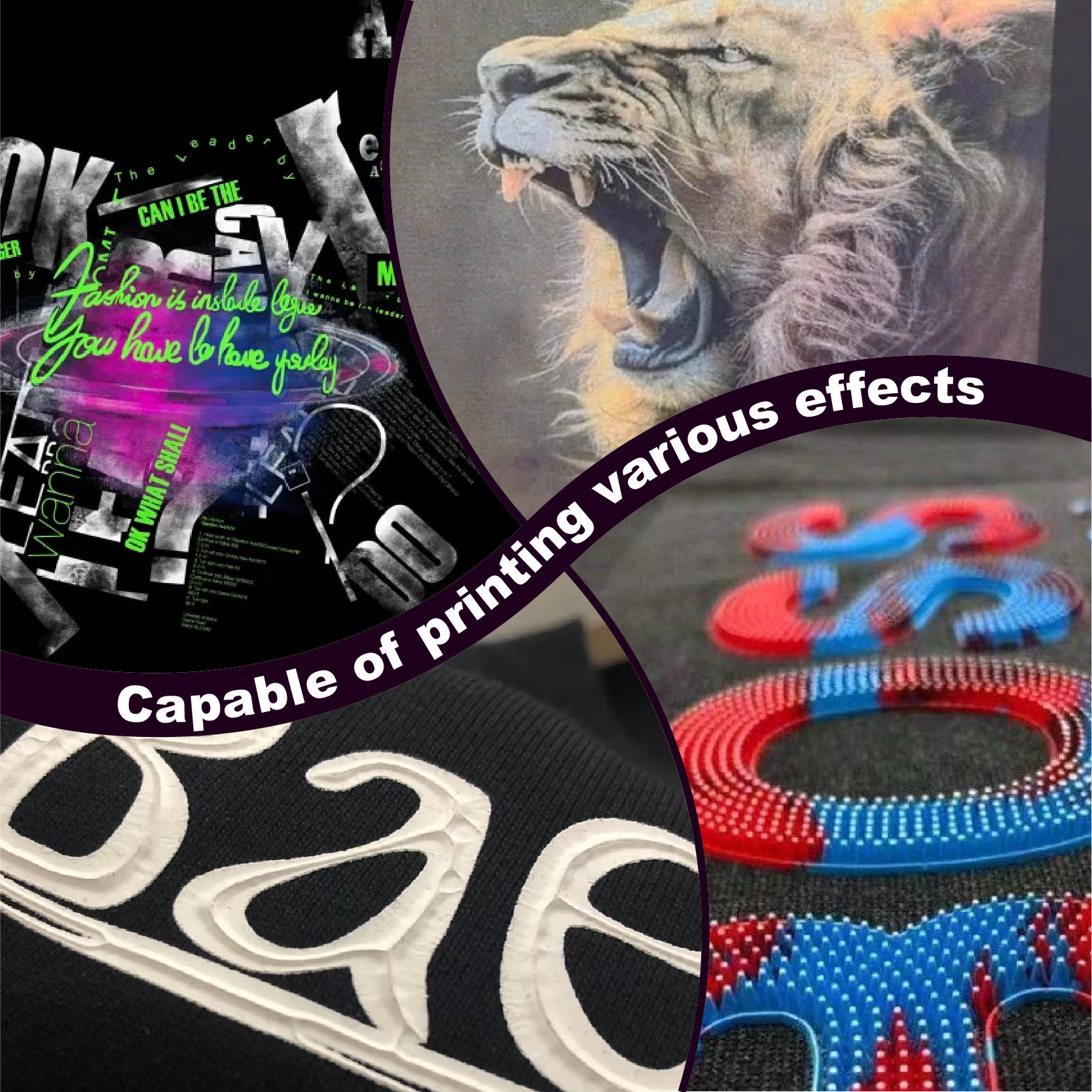
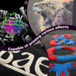
単調な紫色は退屈な場合もあります。顧客が文字通り目立つデザインを求めている場合は、 スクリーン印刷インク特殊効果.
私はとても幸運でした 高密度スクリーン印刷インク プラスチゾル. 紫色に立体感のある建築的な外観を与え、人々は触れたくなる。レトロな雰囲気にしたい場合は、 パフスクリーン印刷インクプラスチゾル. 乾燥機で膨らみ、シンプルなロゴにクールな質感を与えます。.
高品質インクの経済学
市場で一番安いバケツを買いたくなる気持ちはよく分かります。でも、それに惑わされないでください。正規の業者から購入すれば、 プラスチゾルインクショップ あなたは信頼性を買っているのです。安価なインクはバケツの中で分離し、時間を無駄にします。100枚のシャツの注文が一度拒否されると、最高品質のインク1ガロンよりもはるかに大きな損失になります。 プラスチゾルインク.
初心者の方は、 スクリーン印刷インクキット Tシャツ用. 必要なものがすべて揃っているので、迷うことなく始められます。.
私の個人的な経験:「ジャズフェスト」での勝利
去年の夏、地元のジャズフェスティバルで仕事をした。デザインは濃い紫色のサックスをチャコールグレーのシャツに描いたものだった。普通のインクだと平坦に見えると思ったので、 バイオレットレッドスクリーン印刷プラスチゾルインク さらなる暖かさのために。.
私は 高解像度感光乳剤 楽器の鍵盤の細部まで正確に再現するために、この技術を用いました。完成品を見たお客様は大変驚かれました。「こんなに完璧に色を再現できた店は初めてだ」とおっしゃっていました。まさに、仕事に適した道具を選ぶことの威力です。.
よくあるご質問:プリンターに関する実際の回答
1. 紫を他の色と混ぜることはできますか?
はい、できます。私はよく混ぜます。 バイオレットスクリーン印刷プラスチゾルインク と プロセスブルー オリジナルの「ミッドナイトパープル」を作るには、インクの線がずれないように注意してください。.
2. この顔料をどうやって落とせばいいですか?
紫は落ちにくい色です。長時間放置するとスクリーンにシミが残ります。強力なプレス洗浄剤と専用の布を使用してください。 PVCフリープラスチゾルインク 小さなお店なら、匂いははるかに抑えられるでしょう。.
3. 紫色のインクは期限切れになりますか?
プラスチゾルの一番良いところは、丁寧に扱えば基本的に永久に使えることです。蓋をしっかり閉めて、涼しい場所に保管すれば、何年も使えます。時間が経って少し粘度が高くなった場合は、水を加えないでください。適切な希釈剤を使えば、元の状態に戻すことができます。.
4. 100%ポリエステルに紫色の印刷はできますか?
できますが、染料の移行に注意する必要があります。乾燥機の熱でポリエステル染料が紫色のインクに引き込まれ、濁ってしまうことがあります。ブロッキング剤を使用するか、 アンチマイグレーションスクリーン印刷インク(プラスチゾル) 色の鮮やかさを保つため。.
5. 印刷面がでこぼこしているのはなぜですか?
これは「オレンジの皮」と呼ばれる現象です。インクが濃すぎるか、メッシュが粗すぎることを意味します。作業を始める前に、インクをよくかき混ぜる必要があります。これは「せん断」と呼ばれ、化学結合を切断してインクをクリーミーで滑らかな状態にします。.
結論
スクリーン印刷は、多くの重機を必要とする芸術形式です。あなたが選ぶ色はあなたの個性です。紫は単なる色合いではなく、大胆な主張です。 標準プラスチゾルスクリーン印刷インク または飛び込む 環境に優しいスクリーン印刷インク インクの質は、あなたの評判の質を左右する。.
「まあまあ」なプリントで満足するのはやめましょう。最高の仕上がりを目指しましょう。 シャリテインク 本物の顔料を使うことでどれほどの違いが出るか、ぜひ実感してください。印刷機も、そしてお客様も、きっと感謝してくれるでしょう。.
| サイズ |
8オンス ,16オンス ,32オンス |
|---|
Violet Screen Printing Plastisol Ink に対するレビュー12件
フィルターをクリア以前にこの商品を購入したことのあるログイン済みのユーザーのみレビューを残すことができます。
関連商品
酸性ブルースクリーン印刷プラスチゾルインク
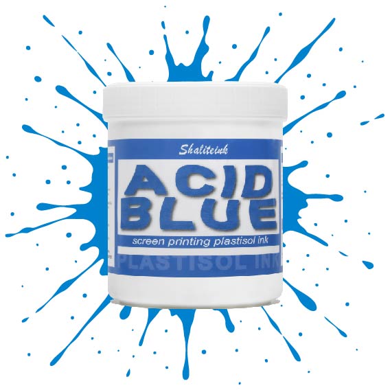
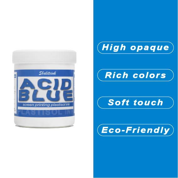
生地に触れた瞬間に消えてしまうような、平坦で濁った青色で妥協するのはもうやめましょう。 酸性ブルースクリーン印刷プラスチゾルインク この製品は、人目を引くような、インパクトのある仕上がりを求める印刷業者向けに開発されました。クリーミーで高濃度の顔料配合により、メッシュをスムーズに通過し、スクリーン内部ではなくスクリーン上で湿った状態を保つため、ステンシルが詰まる心配なく、休憩を取ることができます。.
細かいディテールを狙って230メッシュの細密な紙に通す場合でも、パーカーに大胆な110メッシュのブロックプリントを施す場合でも、このインクはプロ仕様の不透明度とバターのように滑らかな手触りを実現します。乾燥機や洗濯機にも耐え、ひび割れや剥がれのない、まさに「秘密兵器」のようなインクです。洗濯を繰り返しても鮮やかなブルーが色褪せない、ストリートウェアのスタイルをワンランクアップさせたいなら、まさにこれです。.
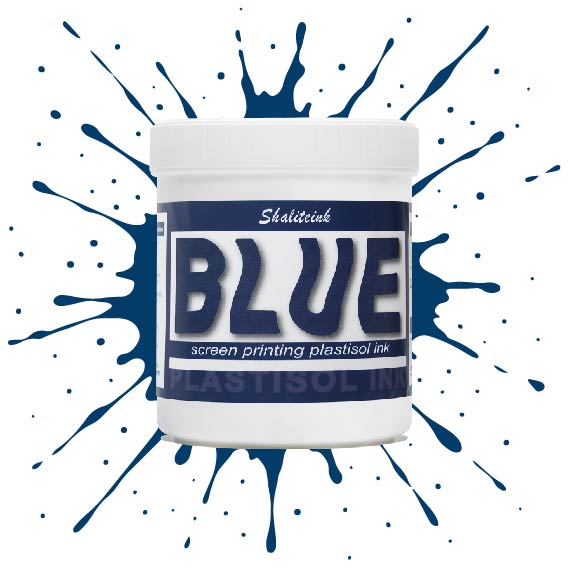
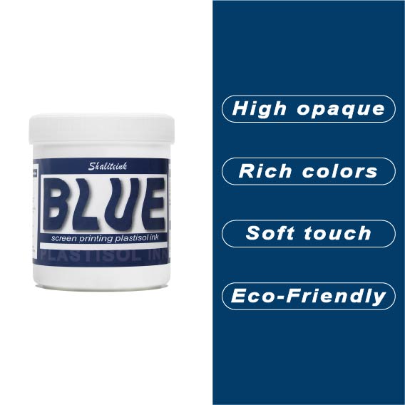
ブルースクリーン印刷プラスチゾルインク
薄くて透明感のあるブルーインクは、生地に触れた瞬間に消えてしまうため、もう悩む必要はありません。当社のブルースクリーン印刷用プラスチゾルインクは、バケツから出した瞬間からクリーミーな質感で、腕を疲れさせることなく、メッシュを通して完璧な透け感を実現します。濃いネイビーブルーでも鮮やかなブルーでも、 鮮やかな青, このインクは発色が鮮やかでしっかりと定着しますが、休憩中に画面上で乾いてしまうこともありません。.
長期間の使用に耐えるよう設計されており、適切な温度で洗濯すれば、何度洗ってもひび割れたり剥がれたりしません。有害なフタル酸エステル類を排除し、丈夫な作業服から柔らかいベビー服まで、あらゆる用途に安全にご使用いただけます。「まあまあ」では満足できない、あらゆる店舗にとって必要な、信頼性が高く不透明なブルーです。.
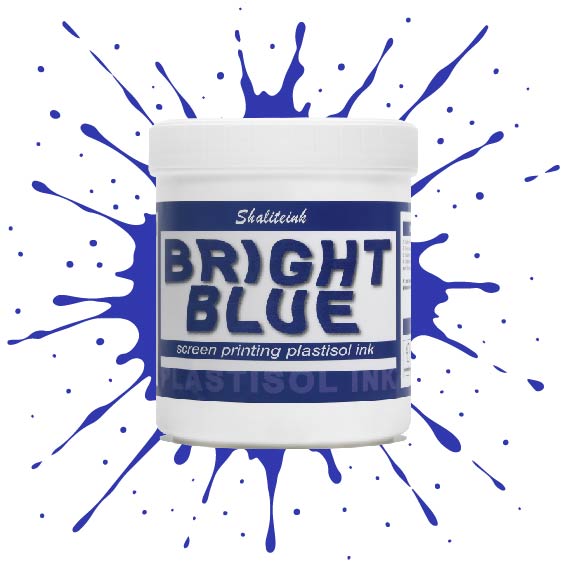
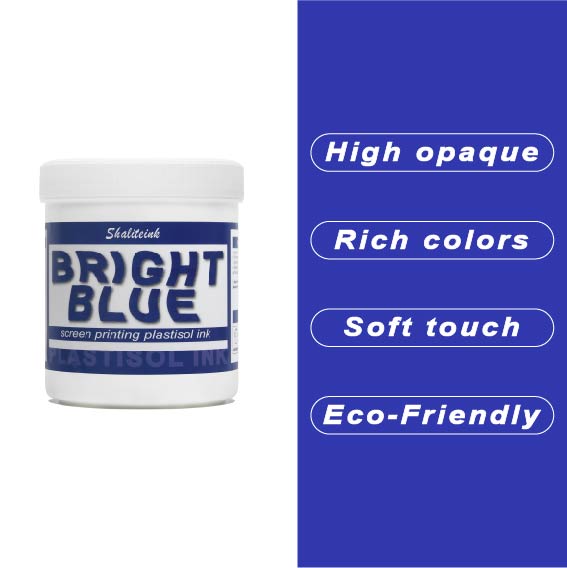
明るい青色のスクリーン印刷プラスチゾルインク
オフィスカーペットのようなくすんだ青色で妥協するのはもうやめましょう。Shaliteinkのブライトブルー・プラスチゾルインクを使えば、シャツに地中海の夏の空のような鮮やかな色合いを与えることができます。まるで上質なベシャメルソースのように滑らかに伸び、プリントが終われば使い込んだ革ブーツのように丈夫です。このインクは作業中にスクリーン上で乾くことがないので、焦らずにじっくりと作品作りに集中できます。.
ご自宅のスタジオや小規模な店舗でプリントされる方が多いことを考慮し、この製品は高い不透明度と環境への配慮を両立させました。「NB」シリーズはフタル酸エステル不使用で、OEKO-TEXなどの世界で最も厳しい安全基準を満たしています。160℃(320°F)で適切に硬化させれば、最初の洗濯後も色落ちしない鮮やかなシャツが完成します。.
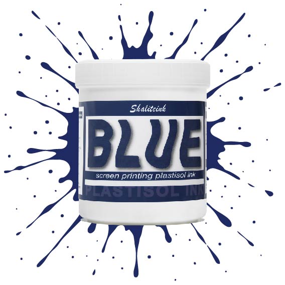
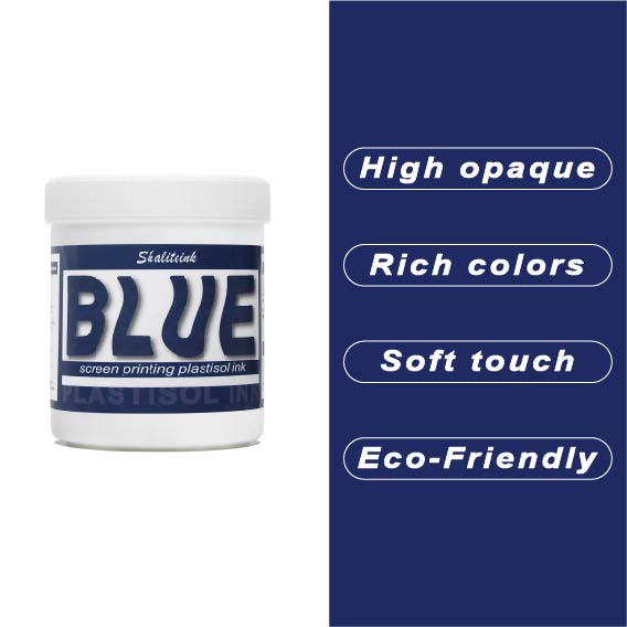
ディープブルースクリーン印刷プラスチゾルインク
ネオンサインのように派手な青色や、生地の繊維に溶け込んでしまうような青色で妥協するのはもうやめましょう。Shaliteinkのディープブルーは、まさにあの「真夜中の海」のような、洗練された深みのある色合いです。濃いチャコールグレーや黒の衣類にも映える、力強く鮮やかな発色を実現。高い不透明度で、塗った場所にしっかりと定着し、シャープでプロフェッショナルな仕上がりを提供します。まるで高級小売店に並ぶような、洗練された印象を与えるプリントが、趣味のガレージでプリントしたような安っぽさを感じさせません。.
バケツの中のこのインクは、驚くほどクリーミーで、すぐに印刷に使用できます。粘度を調整したので、手動スキージでも自動印刷機でも、メッシュを簡単に通過します。乾燥機で最適な温度である160℃(320°F)に達すると、剥がれたり、ひび割れたり、洗い流されたりしない、非常に強固で柔軟な接着層が形成されます。「まあまあ」な仕上がりに飽き飽きしていて、本当に頼りになるブルーインクをお探しなら、毎日使いたくなるこのインクがきっと見つかるでしょう。.
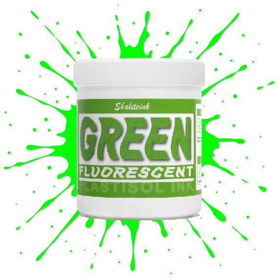
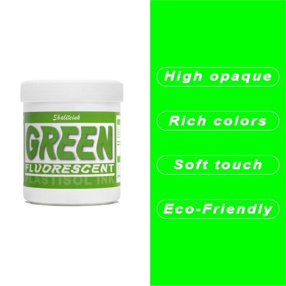
蛍光グリーンスクリーン印刷プラスチゾルインク
シャリテインク蛍光グリーン:ウェアラブル電気
「安全グリーン」なんて忘れてください。これはまさに物理学の結晶です。当社の蛍光グリーンは、紫外線を捉えて反射するように配合されているため、プリントがまるでコンセントに差し込まれているかのような鮮やかさを実現します。ストリートウェアやイベントグッズに最適な「秘密兵器」です。シャツの上にただ乗っているだけではなく、強烈なインパクトを与えます。顔料の配合量を調整することで、110~156メッシュの紙をきれいにせん断し、ネオンカラー特有の「目詰まり」の悩みを解消し、鮮やかな発色を実現します。.
ネオンカラーの成功は土台作りにかかっています。これをしっかりとした白い下地の上に重ねて、 320°F (160℃洗濯にも強く、ブラックライトの下でも鮮やかな印刷を実現するソリューションです。手動印刷機でも高速自動印刷機でも、Shaliteinkはクリーミーで安定した品質を維持するため、「特殊インク」のプレミアム価格を自信を持って設定できます。ありきたりな印刷はやめて、お客様の目を引く印刷を実現しましょう。.
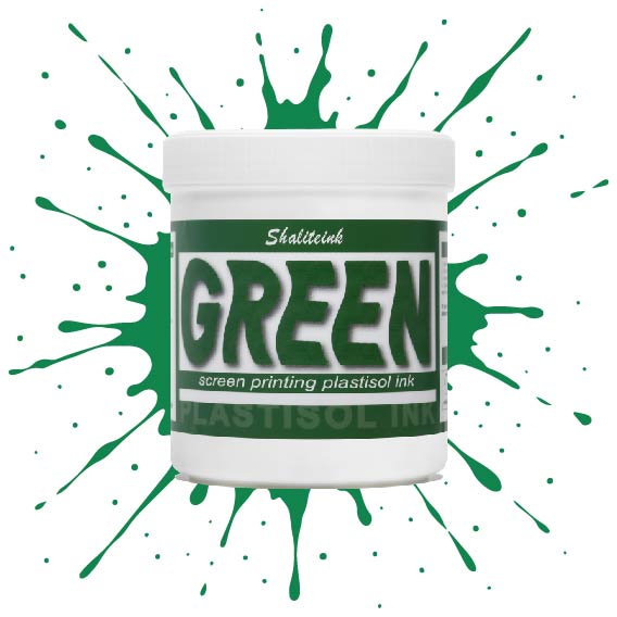
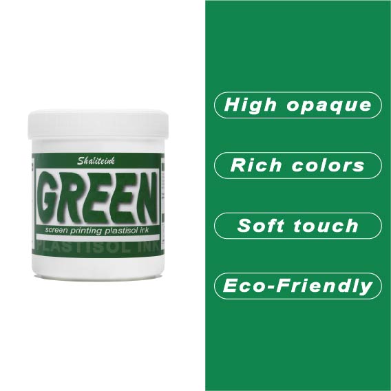
グリーンスクリーン印刷プラスチゾルインク
ガレージで夜遅くまで刺激臭を吸い込んで過ごしていましたが、ついにShaliteinkのグリーンインクで解決しました。昔ながらの有害なインクとは違い、自宅の作業場でも安全に使用でき、有害なPVCも一切含まれていません。鮮やかな発色で、まるで工業作業ではなく、焼きたてのケーキにたっぷりとアイシングを塗っているような感覚です。.
このインクは260°F(約127℃)という低温で硬化するので、電気代の節約になり、シャツが縮んで人形の服のようになってしまうこともありません。濃い色の綿生地にソフトな肌触りでプリントでき、50回以上の洗濯後も鮮やかな色を保ちます。有害なガスに悩まされることなく、自宅のキッチンでプロ仕様のプリント用品を作り始めましょう。.
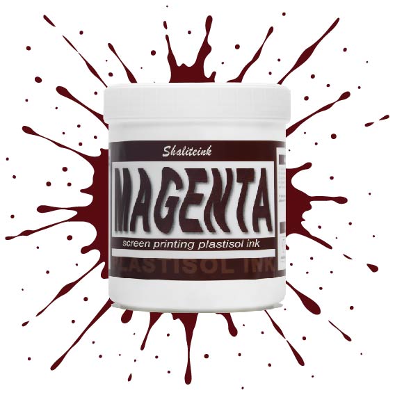
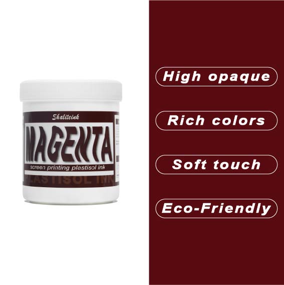
マゼンタスクリーン印刷プラスチゾルインク
正直に言いましょう。薄めたイチゴミルクのようなマゼンタなんて誰も欲しくありません。必要なのは、本当に発色の良いマゼンタスクリーン印刷用プラスチゾルインクです。このShaliteinkのインクはまさに本物。メッシュにしっかり定着するほどの粘度を持ちながら、スキージがスクリーンに触れた瞬間にシルクのように滑らかに伸びます。濃い色の印刷なら、妥協は禁物。鮮やかなホワイトスクリーン印刷用プラスチゾルインクをベースに重ねて使用すれば、色が本当に鮮やかに映えます。すぐに印刷に使用でき、メンテナンスも簡単。コーヒーを買いに行っている間にスクリーン上でインクが固まってしまう心配もありません。.
実際に印刷機を操作しているプラスチゾルインク専門店として、私たちは安価で粉っぽい顔料の悪夢をよく知っています。当社のマゼンタインクは100%で、フタル酸エステル不使用、耐久性に優れています。ひび割れや剥がれがなく、洗濯にも強く、通常は衣類自体よりも長持ちします。スクリーン印刷のスターターキットで始めたばかりの方でも、自動印刷機で何千枚も印刷している方でも、このインクを使えば、一般的なプラスチゾルインクにつきものの悩みを解消し、高級感のある仕上がりを実現できます。.
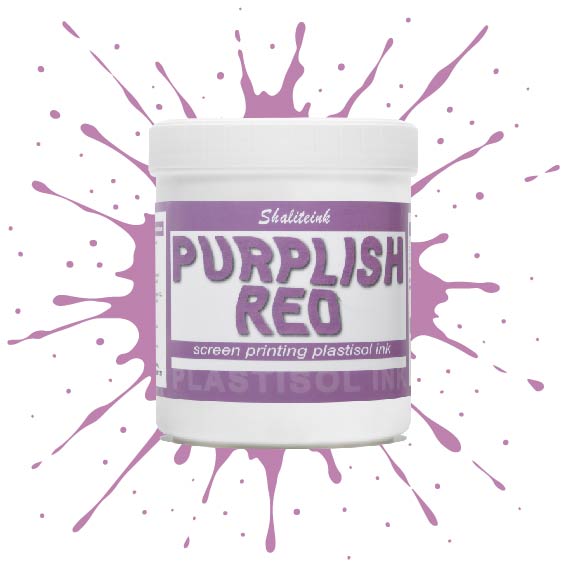
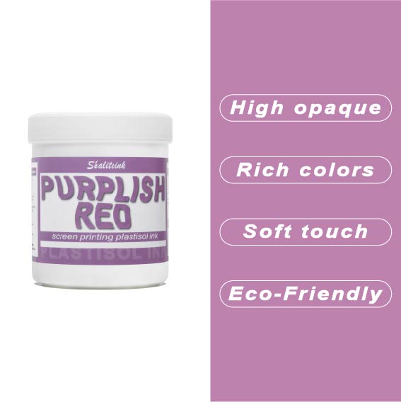
紫がかった赤のスクリーン印刷プラスチゾルインク
暗い色の衣類にプリントするとすぐに色が消えてしまう、つまらない赤色で妥協するのはもうやめましょう。当社のパープルレッド・スクリーン印刷用プラスチゾルインクは、高貴なバイオレットとエネルギッシュなクリムゾンの中間に位置する、深みのある魅力的な色合いです。それでいて、Tシャツをプラスチックの盾のように硬くすることなく、柔らかな手触りを保ちます。言葉にせずとも「高級感」をデザインに表現したい印刷業者にとって、まさに秘密兵器となるでしょう。.
このプロ仕様のインクは、画面上で何時間も乾きにくく、時間を気にすることなく作品制作に集中できます。高不透明で無毒性のブレンドで、厚手のコットンパーカーから軽量の合成繊維Tシャツまで、あらゆる素材に鮮やかな発色を実現します。Shaliteinkは洗濯や着用にも耐えるように設計されていますが、何よりも、ありきたりな原色ばかりの世界で、あなたの個性を際立たせるために開発されました。.
バイオレットレッドスクリーン印刷プラスチゾルインク
正直言って、ほとんどの赤インクはファストフードのロゴに似合いそうな、派手で明るすぎる、ちょっと安っぽい印象です。でも、このバイオレットレッドは全く別物。深みのある、落ち着いたワインのような色合いで、ごく普通の$5の無地のシャツが、まるで高級ブティックの$40のシャツのように見えます。真っ黒なパーカーにこのインクを使ってみたところ、高い不透明度のおかげで、色がくすんで濁ったような色にならず、本来の色合いを保ってくれました。クライアントが、ありきたりなジムシャツではなく、洗練されたデザインのシャツを求めている時に、まさに「圧倒的なアドバンテージ」となるでしょう。.
冷たいピーナッツバターのようなインクと格闘するのはもうやめましょう。このインクはバケツから出した瞬間からバターのように滑らかで、かき混ぜたり薄めたりする必要は一切ありません。コーヒーを買いに行ったり、配達の対応をしたりしても、インクが固まったり、スクリーンを傷めたりすることはありません。それに、正直に言って、誰かが実際に着用した瞬間にひび割れてしまうプリントほど、ブランドをあっという間にダメにするものはありません。このインクは生地の動きに合わせて伸縮し、手触りも柔らかく、高温洗浄テストにも耐え、剥がれることもありません。とにかく使いやすいので、スクリーンをこする時間を減らし、印刷作業に集中できます。.
 EN
EN  DE
DE  ES
ES  PT
PT  JA
JA
ケビン・ターナー –
スムーズな操作性と信頼性の高いパフォーマンス。日々の作業に非常に役立っています。以前のバージョンを上回りました。
エマ・フィリップス –
ほとんどの場合、期待を上回りました。価格に見合う価値が非常に高いです。ほとんどの場合、期待を上回りました。使いやすく、安定した結果が得られます。日々の作業に非常に役立ちます。スムーズな塗布と信頼性の高いパフォーマンス。価格に見合う価値が非常に高いです。日々の作業に非常に役立ちます。
ケビン・ターナー –
使いやすく、結果も安定しています。ほとんどの場合、期待を上回りました。ほとんどの場合、期待を上回りました。ほとんどの場合、期待を上回りました。スムーズな塗布と信頼性の高いパフォーマンス。使いやすく、結果も安定しています。日々の作業に非常に役立ちます。価格に見合った価値があります。
ルイス・トーレス –
期待以上です。期待以上です。素晴らしい安全性と迅速な対応を実現します。すする
ペドロ・ソウザ –
期待通りの通信を行います。クオリダード時代は、非常に困難な状況でした。.
ピオトル・ジエリンスキ –
トロシェ・ロズチャロワニ。 Wyniki nie były tak dobre、jak się spodziewałem.
カタジナ・レヴァンドフスカ –
プゼクロチウォ・モジェ・オチェキワニア。.
フェリックス・ウェーバー –
Sehr グーテス Preis‑Leistungs‑Verhältnis。 Einfache Anwendung und zuverlässige Leistung。 Hochwertige Qualität und Schnelle Lieferung。 Hat meine Erwartungen übertroffen。すべてのタグに関連する機能を確認してください。永
ピーター・フィッシャー –
Hochwertige Qualität und Schnelle Lieferung。ホッホ
ジョン・スミス –
品質は高級感があり、配送も迅速でした。価格に見合った価値が非常に高いです。ほとんどの場合、期待以上でした。品質は高級感があり、配送も迅速でした。日々の作業に非常に役立っています。
ケビン・ターナー –
品質は高級感があり、配送も早かったです。
ローラ・ワグナー –
ハット マイネ エルヴァルトゥンゲン ユーバートロフ