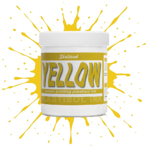
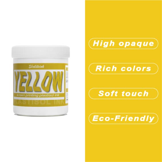
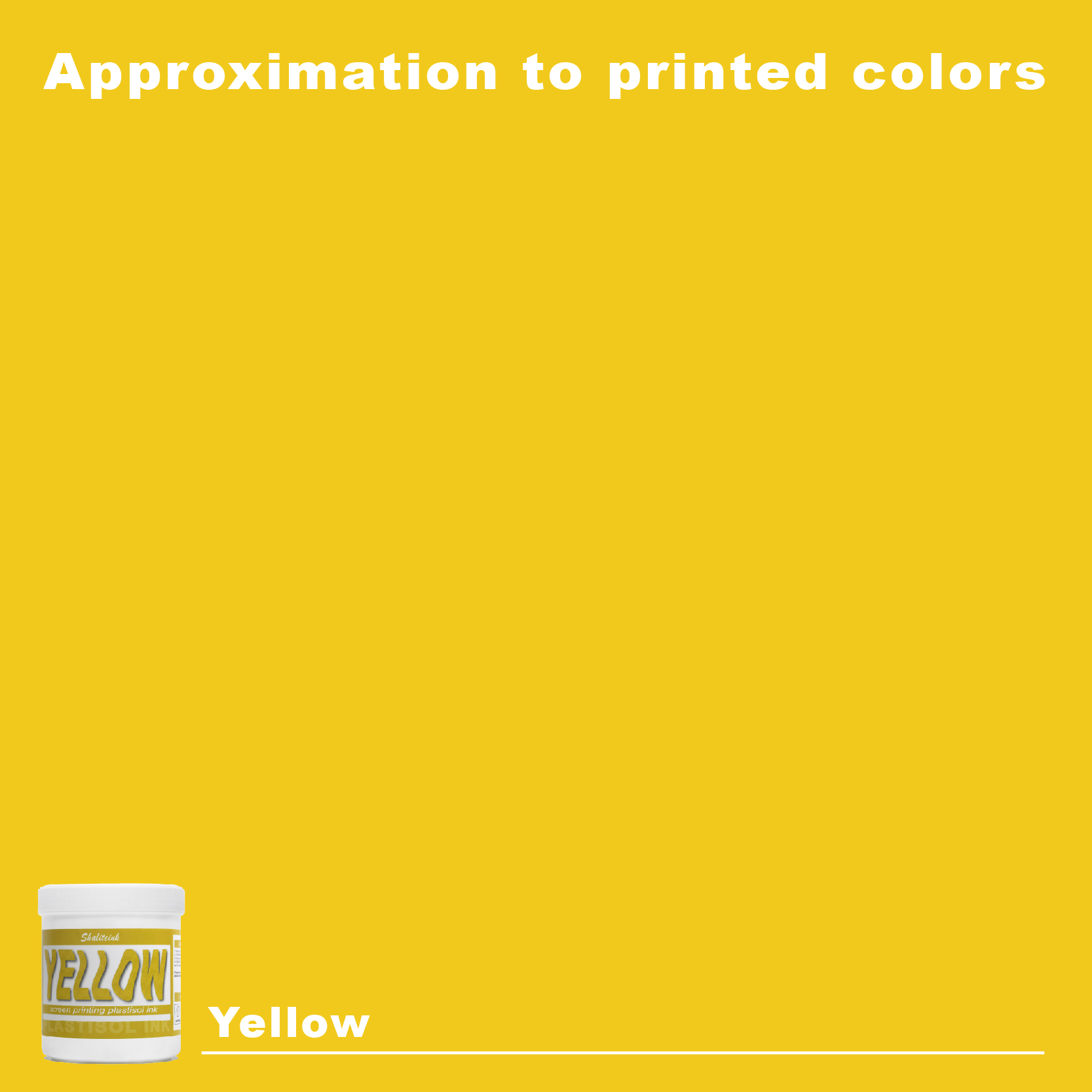
黄色のスクリーン印刷プラスチゾルインク
価格帯: $16.99 – $29.99
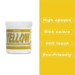
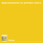
太陽の光のような鮮やかなプリントを目指しているのに、「沼のような緑」のプリントで妥協するのはもうやめましょう。黄色はインク棚の女王様です。本来半透明で、濃い色の生地にプリントすると濁ったり弱々しく見えたりすることが非常に難しいことで知られています。だからこそ、シャライトインクは顔料を豊富に含んだイエロープラスチゾルを開発しました。白い下地の上に完璧に定着するように特別に設計されており、遠くからでもはっきりと見えるほど鮮やかで、乾燥機にかけた後も明るさが持続します。.
鮮やかでエネルギッシュなレモンイエロー、あるいは温かみのあるバーシティジャケットのようなゴールデンイエロー、どちらの色をお探しでも、このインクはバターのように滑らかで、プリント中にメッシュが乾くこともありません。薄くムラのある仕上がりになるよう配合を調整し、クリーミーな質感を実現。プリントするたびに満足感を得られます。数回の洗濯後もひび割れたり色褪せたりしない、すぐに店頭に並べられるシャツをお求めなら、このイエローこそ、あなたのスクイージーが待ち望んでいた色です。.
スクイージーに映る太陽:黄色いスクリーン印刷が沼の水のように見える理由
いいかい、私は20年間、隙間風の吹き込むガレージや、焦げたエスプレッソ、溶けたポリマー、そして午前2時に締め切りに間に合わせようとする切迫した美しい匂いが漂う高級生産現場で過ごしてきたんだ。この業界に普遍的な真実があるとすれば、それはこれだ。黄色インクは絶対的な プリマドンナ インク棚の彼女。声が大きくて要求も厳しい。もしあなたが正しい方法で彼女に媚びへつらわなければ、金曜日の午後にヒーターが故障するよりも早く、あなたの生産スケジュールを台無しにしてしまうでしょう。.
誰もが一度は「夢想家」が店にやってきた経験があるだろう。そういう人、いるよね。紺色のパーカーにネオンカラーの太陽の光線を直接プリントしてほしいって言うんだ。仕事を引き受けて、自信満々にスキージを引いて、そして――voilà泥だらけの沼のような緑色の惨状を目の当たりにしている。まるでラジエーターから這い出てきたようなもので、プロの作品とは思えない。 プラスチゾルインク.
このガイドでは、その裏側を明かします。汚れや汗、そしてついにあの鮮やかな黄色が浮かび上がった時の、純粋で偽りのない喜びまで、すべてをお見せします。長年の試行錯誤(正直に言うと、ほとんどが失敗でしたが)から得た秘訣を皆さんと共有しますので、もうお金を無駄に捨てるのではなく、銀行に預けることができるようになります。.
1. 黄色があなたを嫌う理由の物理学
ちょっと「マッドサイエンティスト」になってみましょう。害はありませんからご安心ください。黄色の顔料は本来半透明です。欠陥ではなく、分子構造上の事実です。 黒スクリーン印刷プラスチゾルインク 光をブラックホールのように飲み込む黄色とは対照的に、黄色は社交的な蝶のような存在だ。光をそのまま透過させる。.
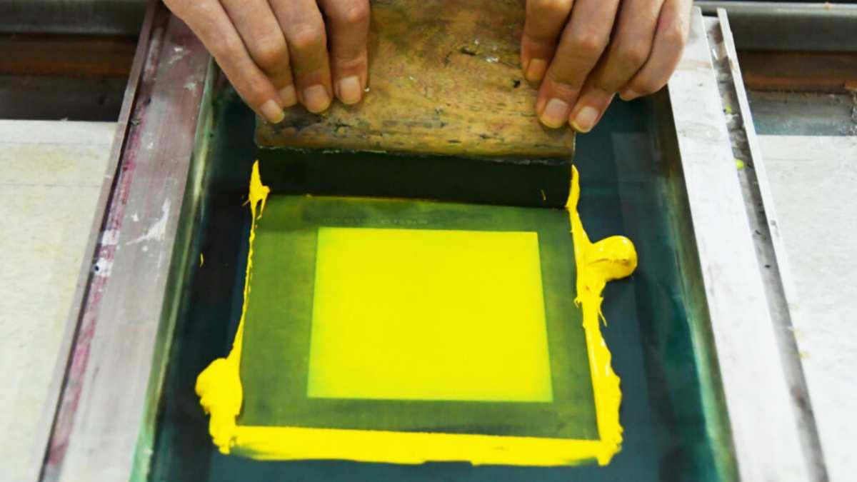
濃い色のシャツに黄色を塗ると、濃い色の生地がインクの膜を通して反射してしまいます。青い生地に黄色のインクを塗ると、不気味な緑色のプリントになってしまいます。まるで小学校の美術の授業のように利益率を下げ、印刷業者にとって悩みの種となっています。.
これを克服するには、高品質の プラスチゾルインクサプライヤー 不透明度が絶対条件であることを理解している人はいますか?もしあなたが安売りの安物塗料を買っているなら、それは基本的に色付きの水で家を塗ろうとしているようなものです。フェラーリさえもくすんで見えるほどの顔料濃度が必要なのです。.
2. 好みの色を選ぼう:色の階層構造
私の店では、色だけを見るのではなく、「雰囲気」を重視します。黄色も、それぞれに異なる意味合いを持つからです。.
レモンイエロー:爽やかで冷たい
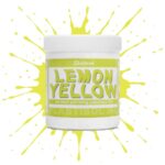
レモンイエロースクリーン印刷プラスチゾルインク 「ハイボルテージ」なルックを目指すなら、これが最適。クールトーンで、白やライトグレーのTシャツにプリントすると、まるで外科手術のようにシャープな印象になります。夏のサーフブランドをプリントするなら、これはまさにMVPと言えるでしょう。.
黄金の黄色:ヘビー級
ゴールデンイエロースクリーン印刷プラスチゾルインク は、バーシティジャケットや優勝トロフィーに見られるような、温かみのある深みのある色です。オレンジがかった顔料を使用しているため、通常は最も「隠蔽力」に優れています。.
ネオンのワイルドカード:蛍光
月面から見えるようになりたいなら、, 蛍光イエロースクリーン印刷プラスチゾルインク 答えはこれです。ただし、注意点があります。これらの顔料は幽霊のようなものです。白い下地がないと、生地の中に溶け込んで見えなくなってしまいます。.
イエローパフォーマンスマトリックス
| インクの種類 | 不透明度レベル | トーン | 最適な基材 | 典型的なメッシュ |
| レモン | 適度 | クール/ネオンっぽい | ホワイトコットン | 110-160 |
| ゴールデン | 高い | 温かい/深い | 陸上競技/海軍 | 86-110 |
| 蛍光 | 非常に低い | 電気 | 安全装備 | 110-230 |
| PVCフリー イエロー | 素晴らしい | 中性 | 高級小売店 | 120-160 |
3. 告白タイム:PVCフリーへの移行
正直に言うと、5年前は「環境に優しい」インクには全く懐疑的でした。まるで冷たいピーナッツバターで印刷しようとしているようなもので、画面上でインクが動く様子が嫌だったんです。.
しかし時代は変わり、化学は実際に賢くなりました。高級小売ブランドにアプローチしたり、ベビー服市場向けに印刷したりするなら、 PVCフリープラスチゾルインク 電車に乗る。なぜかって?「フタル酸エステル不使用」はもはやヒッピーの流行語ではなく、大型契約への門番だからだ。.
私は イエロー PVCフリー NB スクリーン印刷インク 最近は、この「NB」はノンブリーディング(またはノンPVC、人によってはそう呼ぶ)の略で、手触りがとにかく最高なんです。柔らかくて通気性も抜群。しかも、8時間勤務後に頭痛を引き起こすような、あの刺激的な「化学工場」臭さも全くありません。.
4. 完璧な引き抜きのための「黄金律」
店主を夜も眠れなくさせる「再印刷」の悪夢を避けたいなら、これらを覚えておきましょう。私は高額な失敗から学んだので、皆さんは無料で学ぶことができます。.
ルール1:土台はあなたの基盤である
漂白した白い布に印刷するのでなければ、白い下地は絶対条件です。ここで手を抜くと、印刷全体が台無しになります。私は 高密度感光乳剤 ステンシルがカミソリのように鋭利であることを確認するために、 ホワイトスクリーン印刷プラスチゾルインク, それを点滅させてから、その上に黄色を重ねる。.
ルール2:フラッシュを過剰に調理するな
多くの人がここでつまずきます。白い下地が熱くなりすぎたり、黄色が付着する前に完全に硬化してしまうと、黄色がうまく定着しません。まるでステッカーのように表面に張り付いてしまい、最初の洗濯で剥がれてしまいます。べたつきがなく、かといって完全に乾いていてはいけません。“
ルール3:メッシュトラップ
黄色の場合、160メッシュを超えることはめったにありません。白い下地を覆い隠すには、十分なインク量が必要です。細かすぎると、印刷が「弱々しく」見え、半透明になってしまいます。.
ルール4:治療は科学であり、魔法ではない
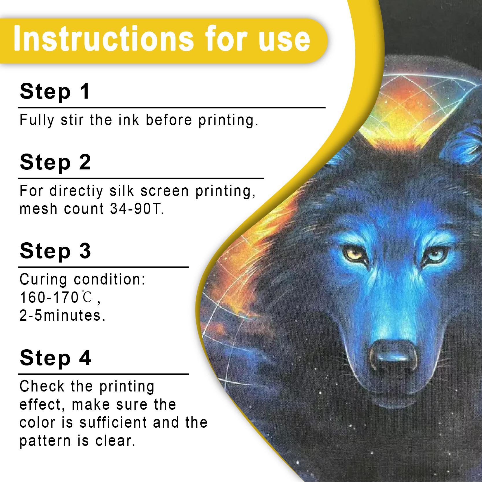
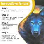
データによると 特殊グラフィックイメージング協会, ほとんどのプラスチゾルは 320°F (160°C) 全体を通して。落とし穴はここにある。黄色は明るい色で熱を反射する。表面は砂漠のように見えても、下はまだスープのような状態になっていることがある。必ずドーナツ型温度計か、本格的な赤外線温度計を使用する。勘で温度を測るのは宝くじに限った話で、プロの衣服には通用しない。.
5. トラブルシューティング:問題が発生した場合
プロでさえ、報道陣がまるで悪魔に取り憑かれているかのように感じる日がある。そんな時のための簡単な攻略法をご紹介しよう。.
-
“「私のイエローは、まるでエンドウ豆のスープみたい!」” →下地が十分に厚くないか、あるいは全く塗っていないかのどちらかです。.
-
“「インクが剥がれ落ちている。」” → 乾燥不足。乾燥機の温度が低すぎるか、ベルトコンベアの速度が速すぎる。.
-
“「印刷が板のように硬い。」” → インクを塗りすぎです。メッシュの細かいものに切り替えるか、[ソフトハンドベース]を使用してください。.
-
“「黄色がオレンジ色/赤色に変わりつつある。」” → 染料移行。シャツのポリエステルがインクに「にじみ出ている」。 アンチマイグレーションスクリーン印刷インク(プラスチゾル).
6. 輝きのビジネス:プレミアムを売る
専門的な作業には、より高い料金を請求することを恐れないでください。 シャリテインク ゴールデンイエロー, つまり、あなたは単に「シャツにインクをプリントしたもの」を売っているのではない。あなたはブランドのアイデンティティを売っているのだ。.
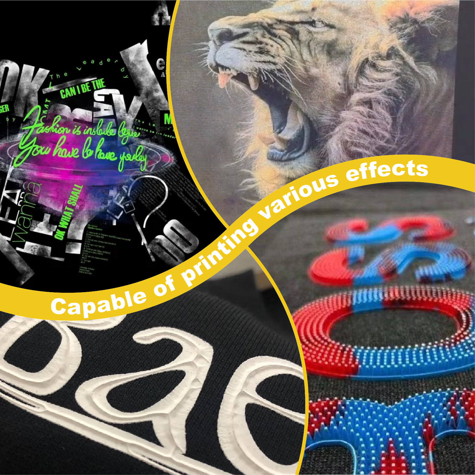
顧客は品質にお金を払います。その理由を説明できれば。耐久性を説明してください。環境安全性について説明してください。 PVCフリープラスチゾルインク. そして、アップセルをためらわないでください。 メタリックスクリーン印刷インク または パフスクリーン印刷インクプラスチゾル 3D効果をさらに高めるため。.
よくある質問:疲れていてググる気力もないようなことすべて
Q1:黄色のプラスチゾル絵具を水性絵具と混ぜてもいいですか?
絶対に違います。. それは油と水を混ぜるようなものです。それらの硬化化学は全く正反対です。 プラスチゾルインク 正気を保ちたいなら、家族が必要だ。.
Q2:黄色をより柔らかな印象にするにはどうすればよいですか?
「硬化性希釈剤」を加えてください。化学結合を切断せずに粘度を下げます。または、 PVCフリープラスチゾルインク ブルー ソフトハンド ソフトハンド技術がどれほど進歩したかを見るため。.
Q3:硬化時に焦げたタイヤのような臭いがするのはなぜですか?
それは昔ながらのインクに含まれるフタル酸エステルがガス化している音です。その匂いが嫌なら、 PVCフリープラスチゾルインク. 肺への負担がずっと少ないです。.
Q4:自然乾燥させても大丈夫ですか?
いいえ。プラスチゾルは家庭用塗料ではありません。320°F(約160℃)に達しない限り、いつまでも乾きません。フラッシュ乾燥機かコンベア式乾燥機が必要です。.
Q5:黄色の魔法のメッシュ数はいくつですか?
下地には110メッシュ、上塗りには155メッシュまたは160メッシュをお勧めします。これにより、カバー力とディテール表現の完璧なバランスが得られます。.
報道陣からの最終的な感想
結局のところ、シルクスクリーン印刷は製造工程を装った芸術と言えるでしょう。黄色インクは扱いが難しいかもしれませんが、スキージを引いて、太陽のように鮮やかな完璧なロゴが目の前に現れたとき、それまでの苦労はすべて報われるのです。.
「まあまあ」のインクで満足しないでください。あなたが初心者であろうと スクリーン印刷スターターキット あるいは自動印刷機を操作するベテランにとって、資材はあなたの評判そのものだ。.
ぜひ手に入れてください シャライトインク プラスチゾルインク. 報道関係者も顧客も、あなたに感謝するでしょう。.
| サイズ |
8オンス ,16オンス ,32オンス |
|---|
Yellow Screen Printing Plastisol Ink に対するレビュー8件
フィルターをクリア以前にこの商品を購入したことのあるログイン済みのユーザーのみレビューを残すことができます。
関連商品
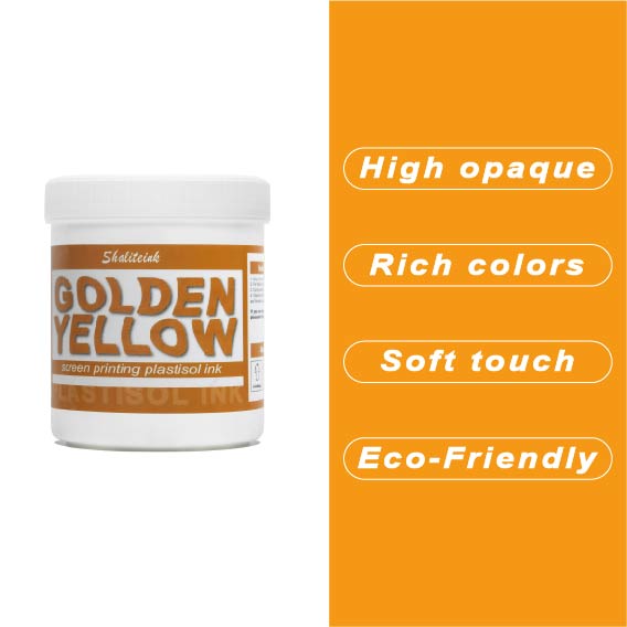
深みのあるゴールデンイエローのスクリーン印刷用プラスチゾルインク
安っぽく見えて色落ちする「安全ベスト」のような黄色で妥協するのはやめましょう。 濃い黄金色のプラスチゾルインク 太陽の光を浴びたような、豊かで温かみのある色合いをデザインにもたらし、最初の洗濯後も鮮やかな色合いが長持ちする、高級感あふれるバーシティスタイルを実現します。高い不透明度と、まるでバターのように滑らかで、手首に負担をかけずにメッシュの上を滑らせるほどの滑らかさを持ちながら、濃い色の生地にもしっかりと密着する適度な厚みを兼ね備えた、まさに理想的なインクです。.
丈夫なパーカーから繊細なストリートウェアまで、どんな素材にも使えるこのインクは、スクリーン上では濡れた状態を保ち、作業性も抜群ですが、320°F(約160℃)に達すると、耐久性に優れたプロ仕様の仕上がりへと変化します。見た目だけでなく着心地も優れたプレミアムアパレルを生産するために必要な、安定した品質のフタル酸エステル不使用の頼れるインクです。「ピーナッツバター」のような質感や、くすんだプリントとはもうおさらば。印刷機に、純粋な液体の黄金をお届けします。.
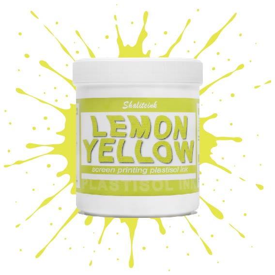
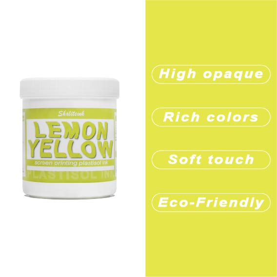
濃いレモンイエローのスクリーン印刷用プラスチゾルインク
紺色や黒のシャツに触れた途端に濁って透明になってしまう「幽霊のような」黄色との戦いはもう終わりにしましょう。Shaliteinkのディープレモンイエローは、このパレットのヘビー級チャンピオン。圧倒的な顔料濃度で、硬くて「防弾」のような感触ではなく、驚くほどの不透明度を実現しています。鮮やかなプリムローズと深みのあるゴールデンロッドの中間に位置する、パンチの効いた高彩度の色合いで、最も暗い生地でも、その鮮やかでエネルギッシュな雰囲気を保ちます。.
印刷作業の「プリント→フラッシュ→プリント」という単調な作業にうんざりしている印刷業者向けに設計されたこのインクは、クリーミーで粘度が低く、まるでバターのようにメッシュをスムーズに通過します。100%コットンでも、扱いの難しい混紡素材でも、洗濯を繰り返しても鮮やかな発色を保つ、小売店向けのソフトな仕上がりを実現します。くすんだ黄色で満足する必要はありません。このインクを使えば、デザインにふさわしい「ハイボルテージ」なインパクトを与え、際立った存在感を放つことができます。.
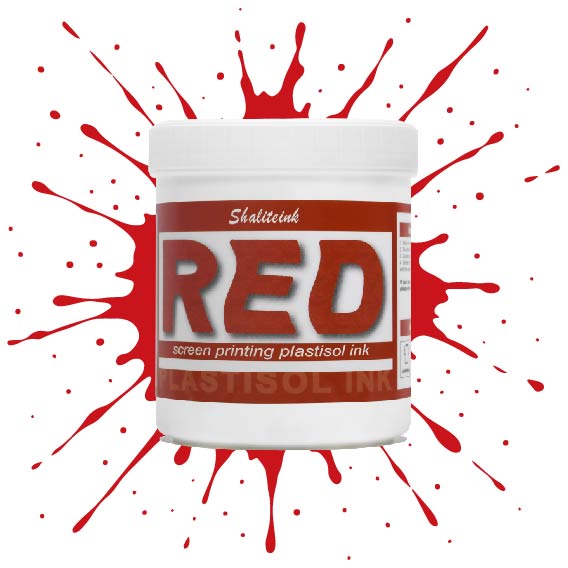
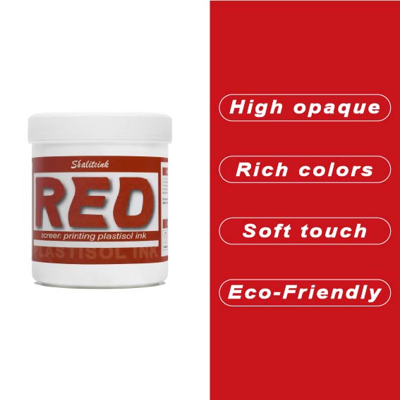
深紅のスクリーン印刷プラスチゾルインク
濃い色の衣類に「赤がピンクに変色」してしまうような失敗はもうやめましょう。当社のインクは、繊維化学の専門家が、技術的な問題に悩まされることなく、店頭に並べられるような深みのある鮮やかな赤色を求める印刷業者向けに開発しました。DIY愛好家の方にも、成長中のブティックブランドの方にも、このインクはバターのように滑らかな質感で、メッシュから簡単に洗い流せ、洗濯を繰り返しても鮮やかな色を保ちます。.
当社は安全性と高性能の両方を最優先事項とし、OEKO-TEXなどの厳格な国際基準を満たすため、フタル酸エステルを含まない配合を採用しています。標準硬化環境と低温硬化環境(270°F~280°Fまで設定可能)の両方に最適化されており、扱いにくいポリエステル混紡素材における染料のにじみを効果的に最小限に抑えながら、高級アパレルを特徴づける柔らかくプロフェッショナルな肌触りを維持します。.
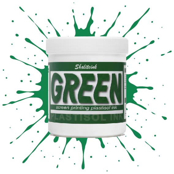
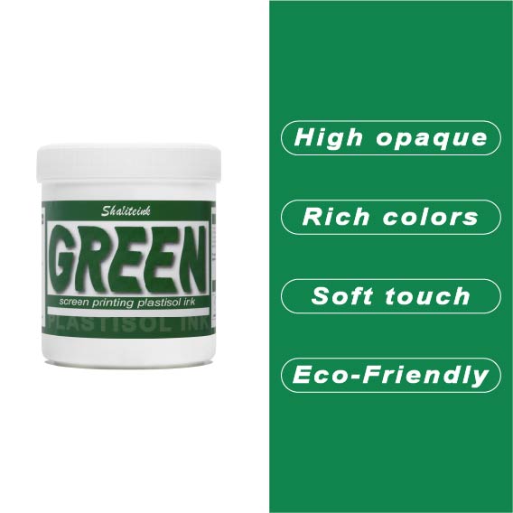
グリーンスクリーン印刷プラスチゾルインク
ガレージで夜遅くまで刺激臭を吸い込んで過ごしていましたが、ついにShaliteinkのグリーンインクで解決しました。昔ながらの有害なインクとは違い、自宅の作業場でも安全に使用でき、有害なPVCも一切含まれていません。鮮やかな発色で、まるで工業作業ではなく、焼きたてのケーキにたっぷりとアイシングを塗っているような感覚です。.
このインクは260°F(約127℃)という低温で硬化するので、電気代の節約になり、シャツが縮んで人形の服のようになってしまうこともありません。濃い色の綿生地にソフトな肌触りでプリントでき、50回以上の洗濯後も鮮やかな色を保ちます。有害なガスに悩まされることなく、自宅のキッチンでプロ仕様のプリント用品を作り始めましょう。.
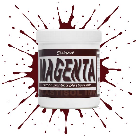
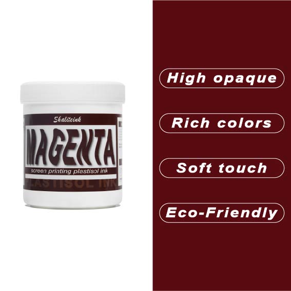
マゼンタスクリーン印刷プラスチゾルインク
正直に言いましょう。薄めたイチゴミルクのようなマゼンタなんて誰も欲しくありません。必要なのは、本当に発色の良いマゼンタスクリーン印刷用プラスチゾルインクです。このShaliteinkのインクはまさに本物。メッシュにしっかり定着するほどの粘度を持ちながら、スキージがスクリーンに触れた瞬間にシルクのように滑らかに伸びます。濃い色の印刷なら、妥協は禁物。鮮やかなホワイトスクリーン印刷用プラスチゾルインクをベースに重ねて使用すれば、色が本当に鮮やかに映えます。すぐに印刷に使用でき、メンテナンスも簡単。コーヒーを買いに行っている間にスクリーン上でインクが固まってしまう心配もありません。.
実際に印刷機を操作しているプラスチゾルインク専門店として、私たちは安価で粉っぽい顔料の悪夢をよく知っています。当社のマゼンタインクは100%で、フタル酸エステル不使用、耐久性に優れています。ひび割れや剥がれがなく、洗濯にも強く、通常は衣類自体よりも長持ちします。スクリーン印刷のスターターキットで始めたばかりの方でも、自動印刷機で何千枚も印刷している方でも、このインクを使えば、一般的なプラスチゾルインクにつきものの悩みを解消し、高級感のある仕上がりを実現できます。.
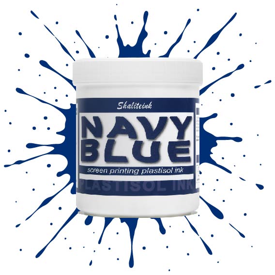
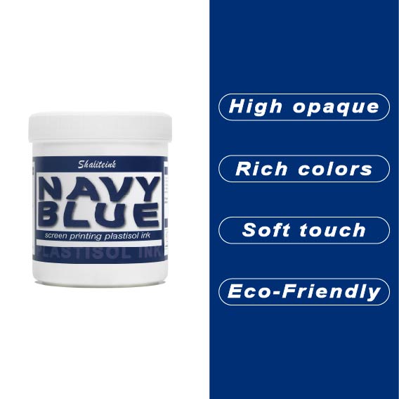
ネイビーブルースクリーン印刷プラスチゾルインク
薄くて水っぽいブルーインクでパーカーを台無しにしてきた経験から、しっかりとしたネイビーブルーインクはなかなか見つからないものだと痛感しています。当社のネイビーブルースクリーン印刷用プラスチゾルインクは、濃い色の生地にも一度でしっかり発色し、スクリーン上でもクリーミーな質感を保つため、まさに本物です。濃い色の衣類にもしっかりと定着するほどの濃さがありながら、メッシュをスムーズにクリアできるほど滑らかです。深みのあるプロフェッショナルなミッドナイトブルーの仕上がりを実現しながら、スクリーンの目詰まりという厄介な問題に悩まされることもありません。.
自社ブランドやカスタムオーダーの印刷では、段ボールのような質感ではなく、しっかりとした仕上がりを求めるものです。通気性と柔軟性に優れたPVCフリーのプラスチゾルインク「ブルー ソフトハンド」をお試しください。乾燥機や洗濯機にも対応し、耐久性にも優れています。この環境に優しいスクリーン印刷インクは無毒で使い方も非常に簡単なので、化学的な知識に気を取られることなく、作品制作に集中できます。もう推測に頼る必要はありません。本当に優れた性能を発揮するネイビーカラーのインクで印刷を始めましょう。.
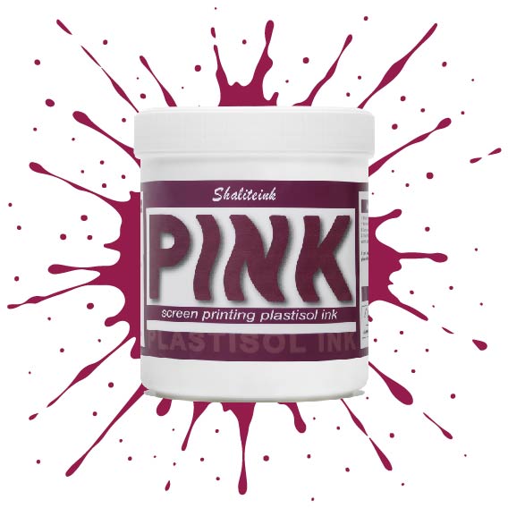
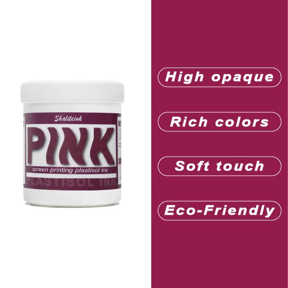
ピンクスクリーン印刷プラスチゾルインク
濃い色の生地に「あざ」のように見えるピンクで妥協するのはもうやめましょう。Shaliteinkのピンクプラスチゾルは、鮮やかで長持ちする色を求める印刷業者にとって最適な高彩度インクです。超高密度顔料配合で設計されたこのインクは、濃い色の衣類染料にも負けず、繊維の上にしっかりと定着し、鮮やかでブティック品質の仕上がりを実現します。バケツから出した直後はクリーミーな質感で、スクリーン上ではほぼ永久に色褪せることなく、休憩中にメッシュ内で乾燥することはありません。スキージを引くたびに、鮮やかで目を引く色合いを再現します。.
長期間の使用を想定して開発された当社のフタル酸エステル不使用のフォーミュラは、320°F(約160℃)で「防弾」フィルムに融合し、デザインがひび割れたり色褪せたりすることなく、50回以上の洗濯サイクルに耐えることを保証します。丈夫なストリートウェアでも、柔らかなコットン混紡素材でも、Shaliteinkは、硬くて「凍ったヨガマット」のような感触なしに、必要なプロ仕様の不透明度を提供します。ただシャツをプリントするのではなく、ついに思い通りのピンク色になったShaliteinkで、お客様にあなたの職人技に夢中になる理由を与えましょう。.
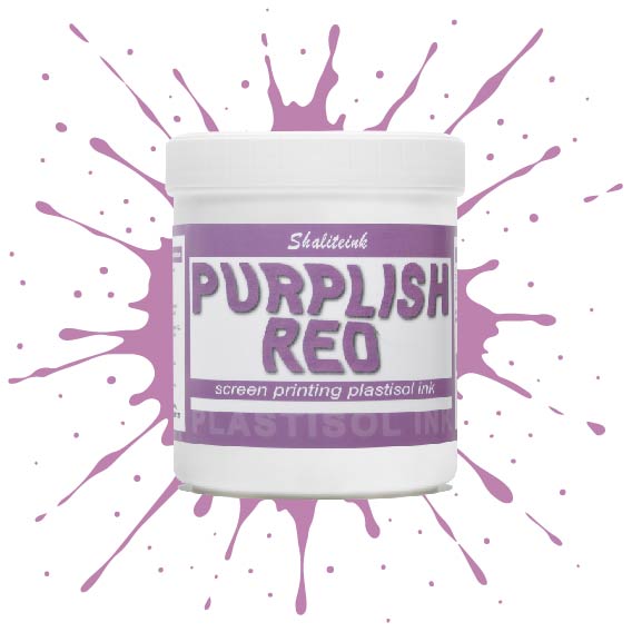
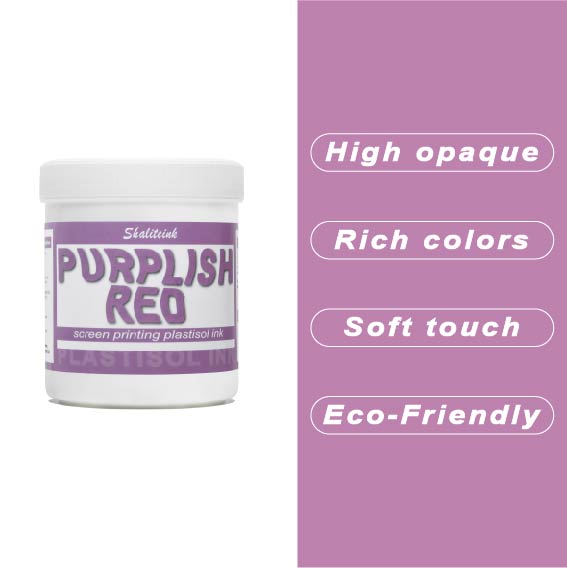
紫がかった赤のスクリーン印刷プラスチゾルインク
暗い色の衣類にプリントするとすぐに色が消えてしまう、つまらない赤色で妥協するのはもうやめましょう。当社のパープルレッド・スクリーン印刷用プラスチゾルインクは、高貴なバイオレットとエネルギッシュなクリムゾンの中間に位置する、深みのある魅力的な色合いです。それでいて、Tシャツをプラスチックの盾のように硬くすることなく、柔らかな手触りを保ちます。言葉にせずとも「高級感」をデザインに表現したい印刷業者にとって、まさに秘密兵器となるでしょう。.
このプロ仕様のインクは、画面上で何時間も乾きにくく、時間を気にすることなく作品制作に集中できます。高不透明で無毒性のブレンドで、厚手のコットンパーカーから軽量の合成繊維Tシャツまで、あらゆる素材に鮮やかな発色を実現します。Shaliteinkは洗濯や着用にも耐えるように設計されていますが、何よりも、ありきたりな原色ばかりの世界で、あなたの個性を際立たせるために開発されました。.
 EN
EN  DE
DE  ES
ES  PT
PT  JA
JA
ルーカス・ゴメス –
優れた評価と迅速な取り組み。最高の利益。優れた評価と迅速な取り組み。ああ
フェリックス・ウェーバー –
Hochwertige Qualität und Schnelle Lieferung。 Hochwertige Qualität und Schnelle Lieferung。 Hat meine Erwartungen übertroffen。 Hochwertige Qualität und Schnelle Lieferung。 Hochwertige Qualität und Schnelle Lieferung。すべての機能を理解しておく必要があります。 Sehr グーテス Preis‑Leistungs‑Verhältnis。アインファッヘ・アンヴェ
ルイス・トーレス –
会話に最適なアプリケーションです。楽しい日記です。会話に最適なアプリケーションです。ムイブエナ関係、カリダッドプレシオ。ファンシオナ ムイ ビエン パラ ミス ディアス
サラ・ミラー –
お金に見合った価値が大いにあります。.
マリア・オリヴェイラ –
Superou minhas 期待しています。 Q
ピオトル・ジエリンスキ –
Łatwy w użyciu i powtarzalne rezultaty.ワトワアプリ
ローラ・ワグナー –
Leicht zu Nutzen und konstante Ergebnisse。すべての機能を理解しておく必要があります。すべての機能を理解しておく必要があります。 Einfache Anwendung und zuverlässige Leistung。 Sehr グーテス Preis‑Leistungs‑Verhältnis。アインファク
ルイス・トーレス –
楽しい日記です。会話に最適なアプリケーションです。会話に最適なアプリケーションです。ムイブエナ関係、カリダッドプレシオ。ユーザーと結果の一貫性を維持する