
ロイヤルブルースクリーン印刷プラスチゾールインク
価格帯: $15.99 – $30.99
暗い生地に触れた途端に憂鬱な気分が消えてしまうのにうんざりしていませんか? ロイヤルブルースクリーン印刷プラスチゾールインク は、あなたのショップに必要な「頼れるヒーロー」です。高輝度顔料で設計されたこのインクは、黒のTシャツでもくすまず鮮やかな発色を保ちます。バターのように滑らかでクリーミーなテクスチャーで、メッシュを驚くほどスムーズにクリアします。また、自然乾燥しないため、印刷中にスクリーンが詰まる心配もなく、時間をかけて完璧な位置合わせを行うことができます。.
色の王様:ロイヤルブルーのスクリーン印刷用プラスチゾルインクが、完璧なTシャツを作るための私の秘密兵器である理由
印刷業界で20年も働いているということは、私の肌にはタトゥーアーティストよりも多くのインクが入っているということだ。私の店に入ると、まず最初に鼻がその匂いを嗅ぎつける。硬化中の重く甘い香りが プラスチゾルインク. 私はありとあらゆる色合いを試してきました。頭痛がするほど派手なピンクや、深淵を覗き込んでいるような黒も見てきました。それでも、いつもスプーンが突き出ている特定の容器が一つだけあるのです。.
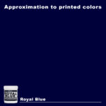
それは ロイヤルブルースクリーン印刷プラスチゾールインク.
なぜかって?ロイヤルブルーは、アパレル業界における「ブルーカラーのヒーロー」だからです。プロフェッショナルで、大胆。ネイビーは控えめすぎ、シアンは派手すぎます。ロイヤルブルーはまさに絶妙なバランス。主張しすぎることなく、存在感を放ちます。襟が擦り切れるまで着続けるようなTシャツを作りたいなら、この色を選ぶべきです。.
今日は、その秘密を明かします。このインクがなぜ画期的なのか、汚さずに扱う方法、そしてなぜ シャライトインク プラスチゾルインク 良いものを買うなら、ここが一番です。.
1. プラスチゾルとは一体何なのか?(そして、なぜそれが重要なのか?)
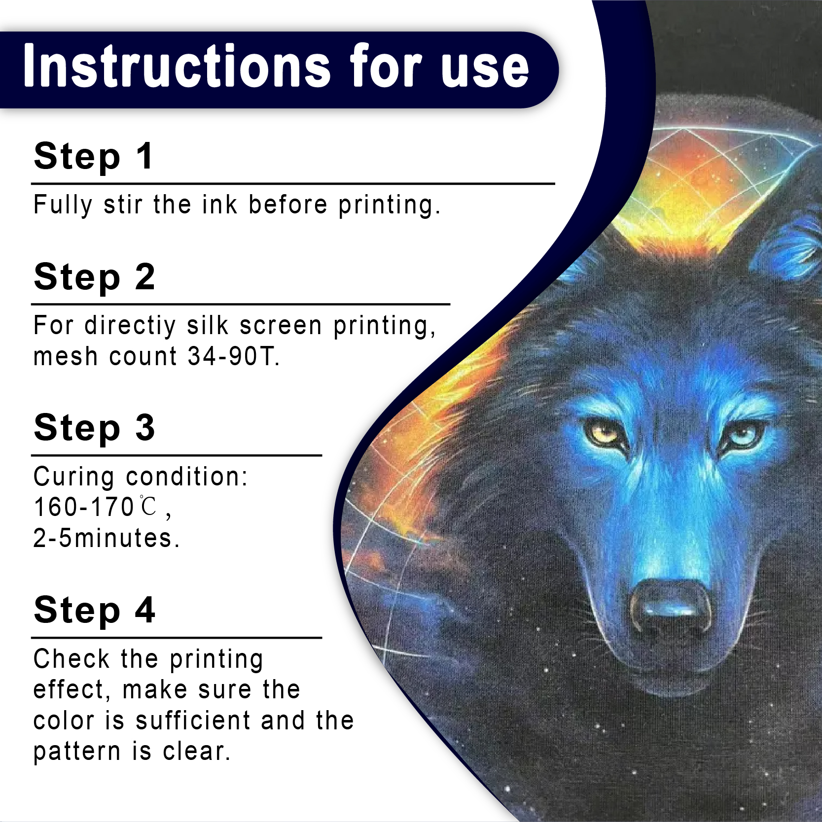
ちょっと「インク」について話しましょう。 プラスチゾルインク あれって美術の授業で使った固い糊じゃないの?あれはPVCの混合物で、乾かないんだよ。マジで。湖で3連休を取って、網戸を出しっぱなしにしてみて。帰ってきてもまだ濡れてるよ。熱を加えて初めて生地に定着するんだ。だいたい160℃(320°F)くらいがちょうどいい温度なんだよ。.
「ブライ」の福利厚生の内訳
コピーライティングの世界では、ロバート・ブライは常に、 利点, ではなく 特徴. プラスチゾルが優れている理由は以下のとおりです。
-
特徴: 自然乾燥はできません。. 利点: 急ぐ必要はありません。メッシュが作業中に詰まる心配をせずに、登録が完璧になるまでじっくり調整できます。.
-
特徴: 高い不透明度。. 利点: あなたの ロイヤルブルースクリーン印刷プラスチゾールインク 実際に見える 青 黒いシャツについたもので、泥だらけのあざのようなものではない。.
-
特徴: 耐久性。. 利点: そのグラフィックは、50回以上の洗濯後も鮮明で明るいままです。剥がれたり色褪せたりすることはありません。.
2. 完璧な印刷へのロードマップ
スクリーンにインクをぶちまけて祈るだけでは、返金されるのがオチです。スクリーン印刷は科学です。要素を間違えると、ひどい結果になります。ここでは、私が成功するためにショップをどのように構築したかをご紹介します。.
メッシュ数:最適な範囲
のために 標準プラスチゾルスクリーン印刷インク, メッシュ数こそがすべてだ。.
-
86~110メッシュ: これは「本格的な仕上がりを求める人」向けです。濃い色のパーカーに、厚く不透明なロイヤルブルーの層を重ねたいときに使用してください。.
-
156~230メッシュ: これは「アーティスト」向けです。細い線を描きたいときや、「ソフトな手触り」(印刷業界で言うところの、鎧のような感触ではないシャツのこと)に使うと良いでしょう。.
スクイージーストローク
私は硬度70のスキージを好みます。これは世間一般で言うところの「中程度」の硬さです。インクをメッシュを通して押し出すのに十分な硬さがありながら、スクリーンをきれいに拭き取るのに十分な柔軟性も備えています。.
3. データと業界標準:「冷酷な真実」“
私の言葉を鵜呑みにしないでください。業界に基準があるのには理由があります。 プリンティング・ユナイテッド・アライアンス(旧SGIA), 不適切な硬化は、アパレル業界における顧客クレームの主な原因です。.
表1:ロイヤルブルーの硬化および性能仕様
| パラメータ | 推奨設定 | ソース |
| フラッシュ温度 | 220°F (104°C) | Shaliteinkの技術データ |
| 完全硬化温度 | 320°F (160°C) | 業界標準仕様 |
| スクイージーの角度 | 15~25度 | エキスパートショップの実践 |
| 洗濯堅牢度 | 小学4年生~5年生 | ISO 105-C06 |
4. アンダーベースの秘密:ブルーを際立たせる方法
初心者がよくやってしまう間違いがあります。黒いTシャツを着て、 ロイヤルブルースクリーン印刷プラスチゾールインク, そして、なぜそれがゴミのように見えるのか不思議に思う。.
黒い生地は光を吸収します。ロイヤルブルーを王様のように見せるには、「プライマー」が必要です。これを 下地.
-
層を印刷する ホワイトスクリーン印刷プラスチゾルインク.
-
“「軽く加熱する」(触っても乾いている程度に加熱する)。.
-
ロイヤルブルーを上部に印刷してください。.
白いステージに青いスポットライトを当てたようなものです。色は鮮烈になります。白は避けたいけれど品質は欲しいという方は、 スクリーン印刷用インクの卸売 高不透明度「LB」(低滲み)インクを提供するオプション。.
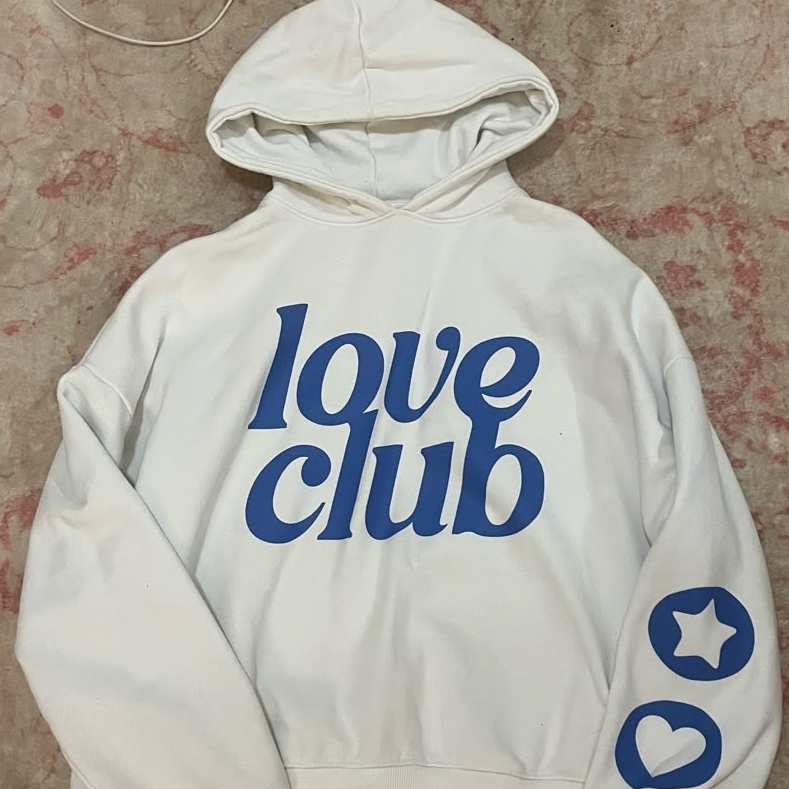
5. 環境に配慮する:PVCフリー革命
正直に言うと、昔ながらのインクは環境に悪影響を与えていました。しかし、時代は変わりつつあります。私の顧客は以前にも増して「環境に優しい」選択肢を求めています。.
の世界へようこそ PVCフリープラスチゾルインク. バターのような滑らかな流れと鮮やかな発色はそのままに、有害な化学物質は一切使用しません。正直言って、ベビー用品や高級ブティックブランドを扱っているなら、これを使わないのはもったいないですよ。 環境に優しいスクリーン印刷インク.
表2:標準ロイヤルブルーとPVCフリーロイヤルブルーの比較
| 特徴 | 標準プラスチゾル | PVCフリープラスチゾルインク |
| 感じる | やや厚め | より柔らかく、より通気性に優れている |
| 硬化 | 320°F | 通常は低め(280°F~300°F) |
| コンプライアンス | 標準 | OEKO-TEXおよびGOTS認証取得済み |
| 価格 | 手頃な価格 | プレミアム |
6.実例研究:「ローカルジム」プロジェクト
去年の春、近所のクロスフィットジムが立ち寄った。注文は500枚で、黒のポリエステル混紡生地。胸には大きな「ロイヤルブルー」のロゴを入れてほしいとのことだった。.
安価なインクを使うと、ポリエステルの赤い染料が青いインクに「にじみ」、ロゴが濁った紫色になってしまうだろう。.
解決策:
-
私は アンチマイグレーションスクリーン印刷インク(プラスチゾル) ベースとして。.
-
上に乗せたのは シャライトインク プラスチゾルインク ロイヤルブルー。.
-
しっかり乾燥させるために、乾燥機のベルトを低速で回しました。.
結果: オーナーは驚愕した。会員が着たシャツの中で一番かっこいいと言った。それから6ヶ月後、ジムバッグ100個と高温乾燥機のサイクルを経ても、その青いシャツはまだ新品のように見える。これが、 プラスチゾルインクサプライヤー 自分の仕事に精通している人たち。.
7. 高度なエフェクト:組み合わせ方
時には、単調な青色だけでは物足りない。もっと凝った色にしたくなる時もある。.
-
「きらめき」ルック: 少し加える 銀スクリーン印刷インクプラスチゾル ロイヤルブルーにメタリックな仕上がりを加える。.
-
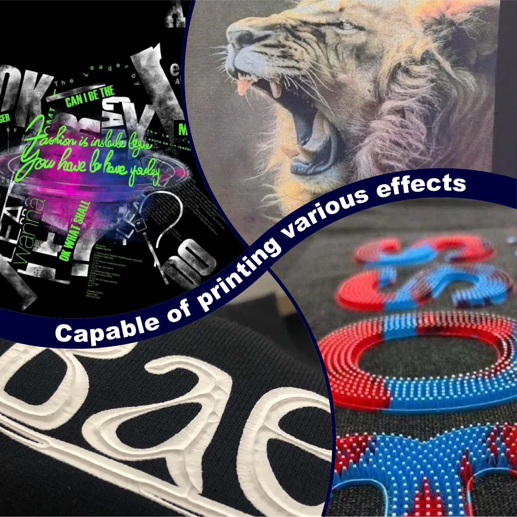
3Dの雰囲気: いくつか手に入れよう パフスクリーン印刷インクプラスチゾル. 熱いオーブンで焼かれたパンのように熱に反応して膨張し、文字通り生地からデザインが剥がれてしまうのです。.
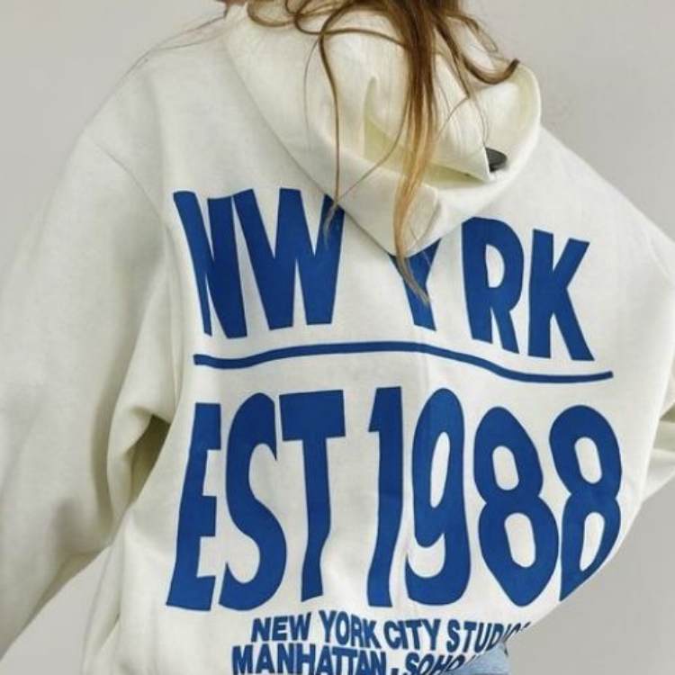
8.シャツを台無しにする5つの方法(そしてそれらを避ける方法)
-
「ステッカー」の失敗: もしデザインが最初の洗濯で安っぽいステッカーのように剥がれてしまうなら、おそらく乾燥機の温度が十分ではなかったのでしょう。「ドーナツ型温度計」か赤外線温度計を購入してください。そうすればあなたの評判を守ることができます。.
-
スクイージーは優しく使いましょう。 タオルから水を絞り出す必要はありません。ただ、一定の力でしっかりと引っ張れば十分です。.
-
ゴースティング: これは、インクに含まれる化学物質がシャツの染料と反応したときに起こります。 PVCフリープラスチゾルインク 多くの場合、これで解決します。.
-
緊張感が低い: スクリーンが濡れた麺のようにぐにゃぐにゃしていると、印刷がぼやけてしまいます。スクリーンはしっかりと張っておきましょう!
-
用途に合わないインク: スパンデックスには標準インクを使用しないでください。 弾性スクリーン印刷インクプラスチゾル アスリートが動いてもプリントが割れないようにするためです。.
9.よくある質問(FAQ)にお答えします
Q1:ロイヤルブルーを他の塗料と混ぜて使うことはできますか?
もちろんです。素晴らしいベースです。 プロセスイエロースクリーン印刷プラスチゾルインク 深い森のような緑色にするために。.
Q2:ロイヤルブルーを使った後の片付け方は?
乾かないので、スクリーンクリーナーかミネラルスピリットが必要です。スクリーンをきれいに拭けば、後で別の色に再利用できます。.
Q3:ロイヤルブルーのインクは子供服に使用しても安全ですか?
標準的なプラスチゾルは硬化すれば安全ですが、最高の安全性評価を得るには、私は常に フタル酸エステル不使用のプラスチゾルインク.
Q4:インクバケツの中のインクが濃すぎるように感じます。どうすればいいですか?
水を加えないでください!「硬化型希釈剤」を使用してください。少量でもインクの色を損なうことなく薄めることができます。.
Q5:入門用のフルセットはどこで購入できますか?
初心者なら、 スクリーン印刷インクキット. 最初の100着の衣料品を出荷するために必要なものがすべて揃っています。.
結論:質の良いものを投入すれば、質の良いものが出来上がる
この業界では、あなたの作品が名刺代わりです。クライアントは盲目ではありません。薄くて質の悪いインクを使っていることはすぐに分かります。しかし、プロ仕様のインク、つまりちゃんとした店で売っているようなインクを購入すれば、 スクリーン印刷用インクショップ品質は言うまでもない。.
この青は単なるカードの見本ではありません。それは主張です。それはチャンピオンの色であり、巨大企業の色であり、あなたの次のお気に入りのTシャツの色です。1ガロンの ロイヤルブルースクリーン印刷プラスチゾールインク, 乾燥機を320度に設定して、何か美しいものを作りましょう。.
印刷所で会いましょう。.
| サイズ |
8オンス ,16オンス ,32オンス |
|---|
Royal Blue Screen Printing Plastisol Ink に対するレビュー9件
フィルターをクリア以前にこの商品を購入したことのあるログイン済みのユーザーのみレビューを残すことができます。
関連商品
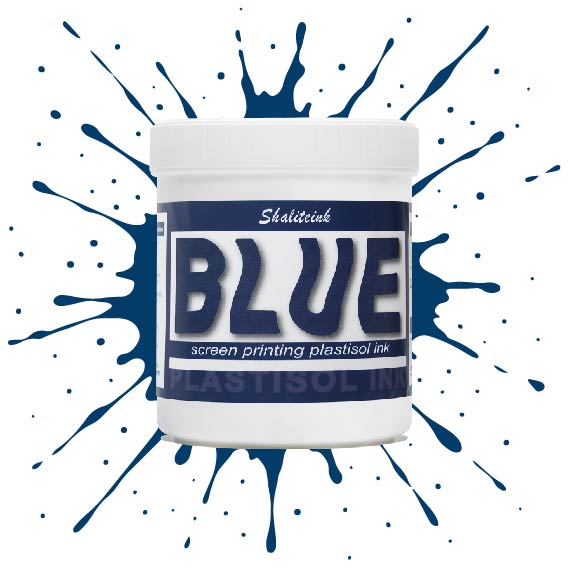
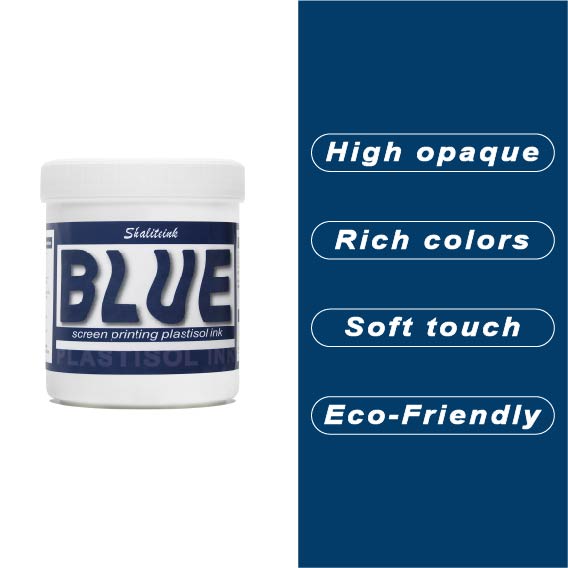
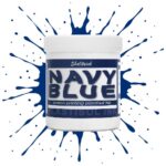
ブルースクリーン印刷プラスチゾルインク
薄くて透明感のあるブルーインクは、生地に触れた瞬間に消えてしまうため、もう悩む必要はありません。当社のブルースクリーン印刷用プラスチゾルインクは、バケツから出した瞬間からクリーミーな質感で、腕を疲れさせることなく、メッシュを通して完璧な透け感を実現します。濃いネイビーブルーでも鮮やかなブルーでも、 鮮やかな青, このインクは発色が鮮やかでしっかりと定着しますが、休憩中に画面上で乾いてしまうこともありません。.
長期間の使用に耐えるよう設計されており、適切な温度で洗濯すれば、何度洗ってもひび割れたり剥がれたりしません。有害なフタル酸エステル類を排除し、丈夫な作業服から柔らかいベビー服まで、あらゆる用途に安全にご使用いただけます。「まあまあ」では満足できない、あらゆる店舗にとって必要な、信頼性が高く不透明なブルーです。.
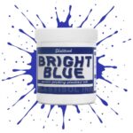
明るい青色のスクリーン印刷プラスチゾルインク
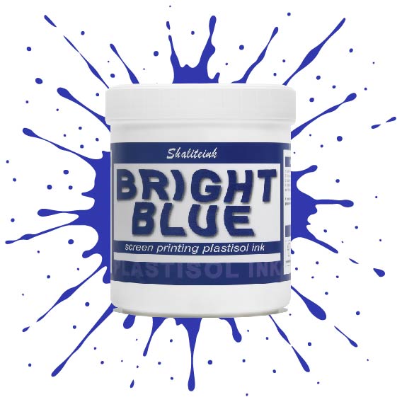
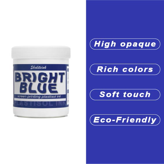
オフィスカーペットのようなくすんだ青色で妥協するのはもうやめましょう。Shaliteinkのブライトブルー・プラスチゾルインクを使えば、シャツに地中海の夏の空のような鮮やかな色合いを与えることができます。まるで上質なベシャメルソースのように滑らかに伸び、プリントが終われば使い込んだ革ブーツのように丈夫です。このインクは作業中にスクリーン上で乾くことがないので、焦らずにじっくりと作品作りに集中できます。.
ご自宅のスタジオや小規模な店舗でプリントされる方が多いことを考慮し、この製品は高い不透明度と環境への配慮を両立させました。「NB」シリーズはフタル酸エステル不使用で、OEKO-TEXなどの世界で最も厳しい安全基準を満たしています。160℃(320°F)で適切に硬化させれば、最初の洗濯後も色落ちしない鮮やかなシャツが完成します。.
濃いレモンイエローのスクリーン印刷用プラスチゾルインク
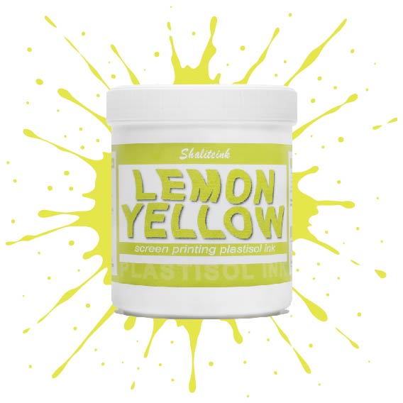
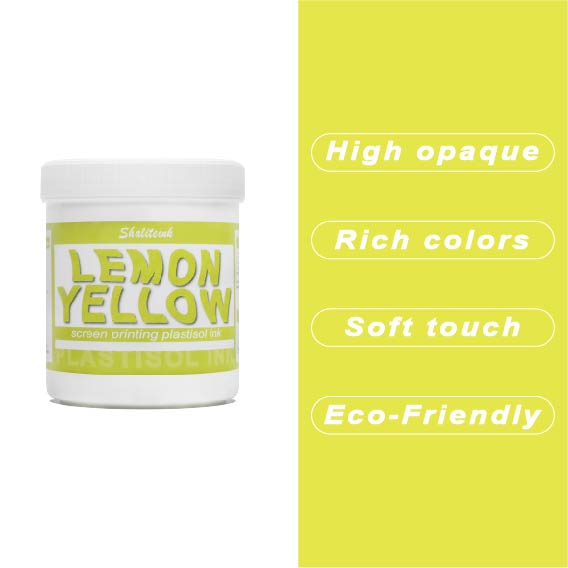
紺色や黒のシャツに触れた途端に濁って透明になってしまう「幽霊のような」黄色との戦いはもう終わりにしましょう。Shaliteinkのディープレモンイエローは、このパレットのヘビー級チャンピオン。圧倒的な顔料濃度で、硬くて「防弾」のような感触ではなく、驚くほどの不透明度を実現しています。鮮やかなプリムローズと深みのあるゴールデンロッドの中間に位置する、パンチの効いた高彩度の色合いで、最も暗い生地でも、その鮮やかでエネルギッシュな雰囲気を保ちます。.
印刷作業の「プリント→フラッシュ→プリント」という単調な作業にうんざりしている印刷業者向けに設計されたこのインクは、クリーミーで粘度が低く、まるでバターのようにメッシュをスムーズに通過します。100%コットンでも、扱いの難しい混紡素材でも、洗濯を繰り返しても鮮やかな発色を保つ、小売店向けのソフトな仕上がりを実現します。くすんだ黄色で満足する必要はありません。このインクを使えば、デザインにふさわしい「ハイボルテージ」なインパクトを与え、際立った存在感を放つことができます。.
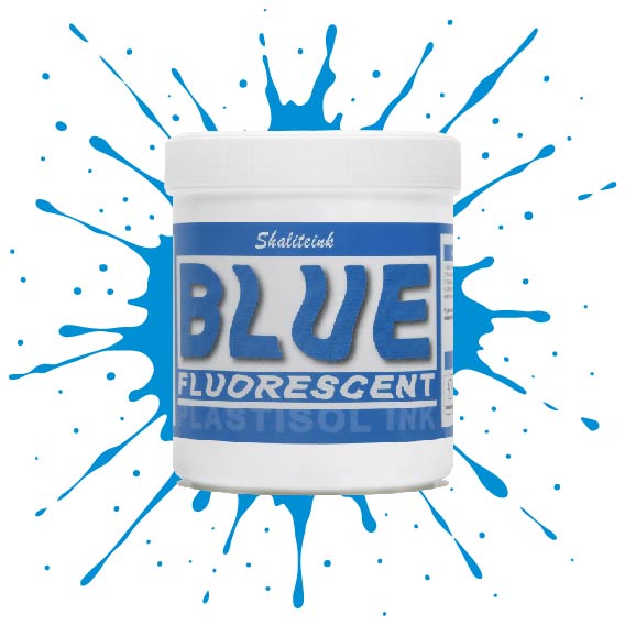
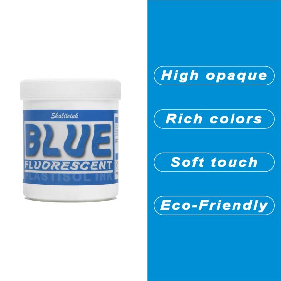
蛍光ブルースクリーン印刷プラスチゾルインク
「やや明るめの」青で満足するのはやめて、あなたのデザインにふさわしい、刺激的なエッジを与えましょう。 蛍光ブループラスチゾルインク まさにボトルに詰められた稲妻――高顔料で紫外線に反応するフォーミュラは、ブラックライトの下では鮮烈な輝きを放ち、明るい日光の下では部屋全体を圧倒します。バケツから出してすぐにバターのように滑らかな書き心地なので、最初のひと塗り前にインクと格闘する必要はもうありません。また、フタル酸エステルを一切使用していないため、どんなクライアントにも安心して印刷できます。.
濃い色の衣類に、目を奪うような鮮やかな発色を実現するには、まずはくっきりとした白い下地を軽く塗るだけで、あとはこのブルーインクにお任せください。厚みのあるジューシーな仕上がりを求めるなら110メッシュ、よりシャープなディテールを求めるなら156メッシュ。どちらのサイズでも、完璧なせん断力で、剥がれたり色褪せたりしない、耐久性に優れたプロフェッショナルな仕上がりになります。ただの印刷業者から、誰もが話題にする印刷会社へとステップアップしたいなら、このインクこそがそれを可能にするのです。.
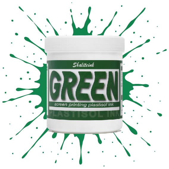
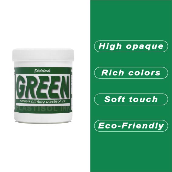
グリーンスクリーン印刷プラスチゾルインク
ガレージで夜遅くまで刺激臭を吸い込んで過ごしていましたが、ついにShaliteinkのグリーンインクで解決しました。昔ながらの有害なインクとは違い、自宅の作業場でも安全に使用でき、有害なPVCも一切含まれていません。鮮やかな発色で、まるで工業作業ではなく、焼きたてのケーキにたっぷりとアイシングを塗っているような感覚です。.
このインクは260°F(約127℃)という低温で硬化するので、電気代の節約になり、シャツが縮んで人形の服のようになってしまうこともありません。濃い色の綿生地にソフトな肌触りでプリントでき、50回以上の洗濯後も鮮やかな色を保ちます。有害なガスに悩まされることなく、自宅のキッチンでプロ仕様のプリント用品を作り始めましょう。.
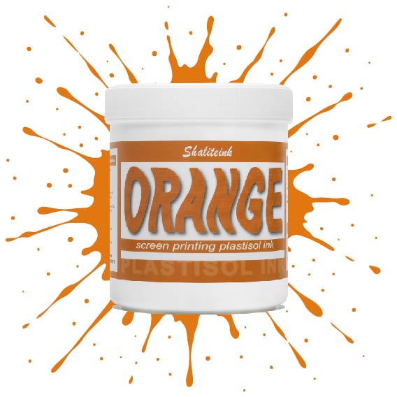
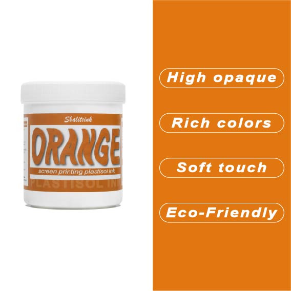
オレンジスクリーン印刷プラスチゾルインク
生地に染み込んでしまうことなく、鮮やかでエネルギッシュな「オレンジクラッシュ」カラーをお探しですか?当店のオレンジプラスチゾルインクは、多くのお客様にご愛用いただいている理由があります。クリーミーでプレスしやすいテクスチャーは、高密度の生地にもスムーズに印刷でき、大胆なグラフィックに必要な高い不透明度を維持します。もう濁ったプリントに悩む必要はありません。鮮やかなシトラスカラーが、最初の印刷から最終乾燥まで、鮮やかさを保ちます。.
長期間の使用を想定して設計されたこのインクは、印刷途中でスクリーン上で乾くことなく、洗濯にも耐える丈夫で柔軟な仕上がりを実現します。濃い色のパーカーに鮮やかな白の下地をプリントする場合でも、淡い色の綿生地に直接プリントする場合でも、Shaliteinkは、インクを頻繁に薄めたり、インク詰まりを起こしたりする手間をかけずに、プロフェッショナルな「店頭販売対応」の仕上がりを実現します。.
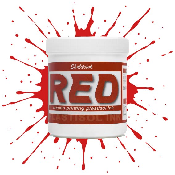
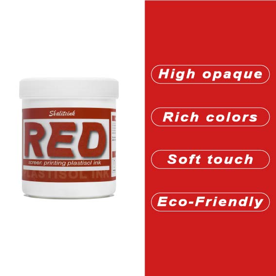
赤色スクリーン印刷プラスチゾルインク
暗いパーカーに色あせたシミのような赤インクで苦労するのはもうやめましょう。インクの芯が弱くて「鮮やかな」赤が濁った茶色になってしまうのを朝から見てきたなら、このインクが必要です。黒生地にも負けない高い不透明度を持ちながら、クリーミーな質感で、長時間プリントしてもムラになりません。もうインク詰まりも、乾燥機の前で慌てふためく必要もありません。鮮やかでパンチのある、まさに期待通りの赤インクです。.
下地を塗る場合でも、綿に直接印刷する場合でも、このプラスチゾルインクは硬化するまでメッシュ上で開いた状態を保ちます。「まあまあ」で満足せず、人目を引く鮮やかな赤色で、洗濯を繰り返しても色落ちしないものを求める印刷業者のために開発されました。水っぽくて薄いインクで時間を無駄にするのはやめて、一度で完璧な赤色を手に入れましょう。.
ホワイトスクリーン印刷プラスチゾルインク
生地に溶け込んでしまうような「幽霊のような」白いプリントで妥協するのはもうやめましょう。Shaliteinkのホワイトプラスチゾルインクは、濃色の衣類にしっかりとした不透明度を与えるために開発されました。クリーミーで滑らかな質感でスクリーンに塗布でき、硬いプラスチックというよりはホイップバターのような感触です。そのため、手作業でのプリント作業がスムーズになり、生産性が向上します。たった一度のフラッシュで、鮮やかで明るい白の「ポップ」な仕上がりを実現し、最初の洗濯でインクがひび割れたり色褪せたりする心配もありません。.
週末に趣味でプリントを楽しむ方にも、忙しいショップを経営されている方にも、これはまさにあなたが探し求めていた頼れる相棒です。高発色で、驚くほど簡単に混ぜることができ、数秒で硬化するので、機材の扱いに時間を費やすことなく、実際にプリント作業に集中できます。プロ仕様の性能をバケツに詰め込んだこのインクは、最初のプリントから1000回目のプリントまで、白を鮮やかに保ち、デザインをシャープに仕上げるように設計されています。.
黄色のスクリーン印刷プラスチゾルインク
太陽の光のような鮮やかなプリントを目指しているのに、「沼のような緑」のプリントで妥協するのはもうやめましょう。黄色はインク棚の女王様です。本来半透明で、濃い色の生地にプリントすると濁ったり弱々しく見えたりすることが非常に難しいことで知られています。だからこそ、シャライトインクは顔料を豊富に含んだイエロープラスチゾルを開発しました。白い下地の上に完璧に定着するように特別に設計されており、遠くからでもはっきりと見えるほど鮮やかで、乾燥機にかけた後も明るさが持続します。.
鮮やかでエネルギッシュなレモンイエロー、あるいは温かみのあるバーシティジャケットのようなゴールデンイエロー、どちらの色をお探しでも、このインクはバターのように滑らかで、プリント中にメッシュが乾くこともありません。薄くムラのある仕上がりになるよう配合を調整し、クリーミーな質感を実現。プリントするたびに満足感を得られます。数回の洗濯後もひび割れたり色褪せたりしない、すぐに店頭に並べられるシャツをお求めなら、このイエローこそ、あなたのスクイージーが待ち望んでいた色です。.
 EN
EN  DE
DE  ES
ES  PT
PT  JA
JA
ピーター・フィッシャー –
Hochwertige Qualität und Schnelle Lieferung。 Einfache Anwendung und zuverlässige Leistung。アインファシュ
アナ・コスタ –
優れた評価と迅速な取り組み。機能はありません。最高の利益。オティモ
アナ・コスタ –
優れた評価と迅速な取り組み。機能はありません。最高の利益。オティモ
アンナ・ノワク –
ヴィソカ・ヤコシチ・イ・シュプカ・ドスタワ。プゼクロチウォ・モジェ・オチェキワニア。 Działa bardzo dobrze na co dzień。 Łatwy w użyciu i powtarzalne rezultaty. Bardzo dobry stosunek jakości do ceny。 Bardzo dobry stosunek jakości do ceny。プゼクロチウォ・モジェ・オチェキワニア。ヴィソカ・ヤコシチ・イ・シュプカ・ドスタワ。ヴィソカ・ヤコシチ・イ・シュブカ
ベアトリス・ロシャ –
優れた評価と迅速な取り組み。ユーザーと結果の一貫性を維持します。ユーザーと結果の一貫性を維持します。機能はありません。優れた評価と迅速な取り組み。アプリケーション
ローラ・ワグナー –
Hat meine Erwartungen übertroffen。 Hat meine Erwartungen übertroffen。 Hochwertige Qualität und schne
サラ・ミラー –
品質は高級感があり、配送も早かったです。
フェリックス・ウェーバー –
Hat meine Erwartungen übertroffen。すべての機能を理解しておく必要があります。 Hat meine Erwartungen übertroffen。 Hochwertige Qualität und Schnelle Lieferung。 Einfache Anwendung und zuverlässige Leistung。ホッホウェ
ローラ・ワグナー –
Hat meine Erwartungen übertroffen。 Einfache Anwendung und zuverlässige Leistung。 Hochwertige Qualität und Schnelle Lieferung。 Hat meine Erwartungen übertroffen。 Einfache Anwendung und zuverlässige Leistung。 Einfache Anwendung und zuverlässige Leistung。 Hat meine Erwartungen übertroffen。ハットマイネエル