
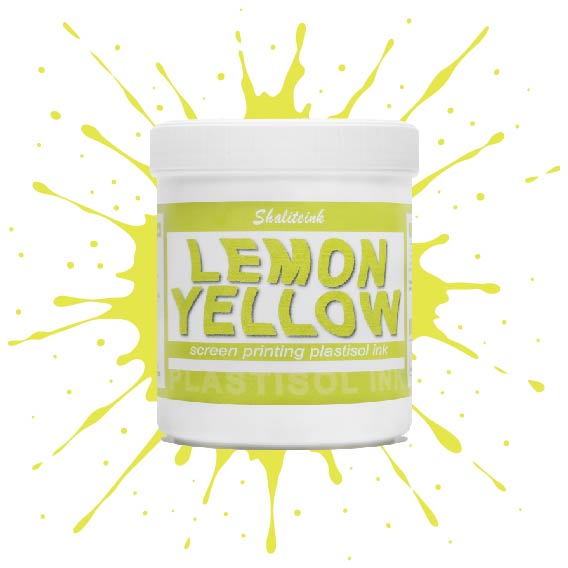
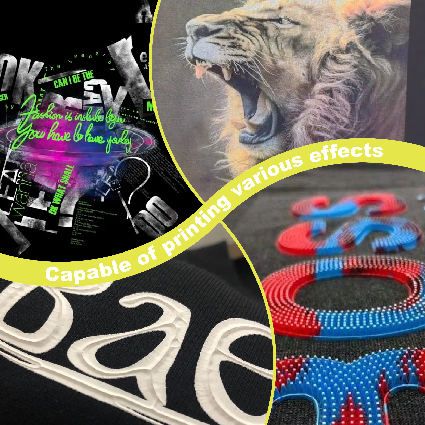
濃いレモンイエローのスクリーン印刷用プラスチゾルインク
価格帯: $14.99 – $30.90
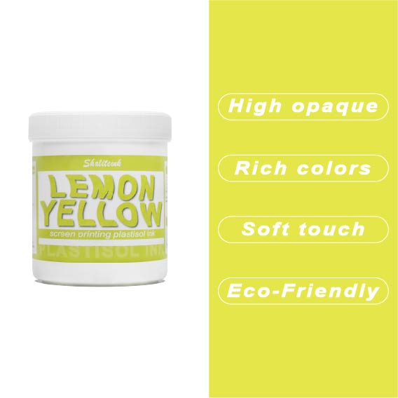
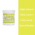
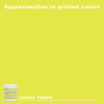
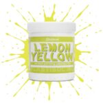
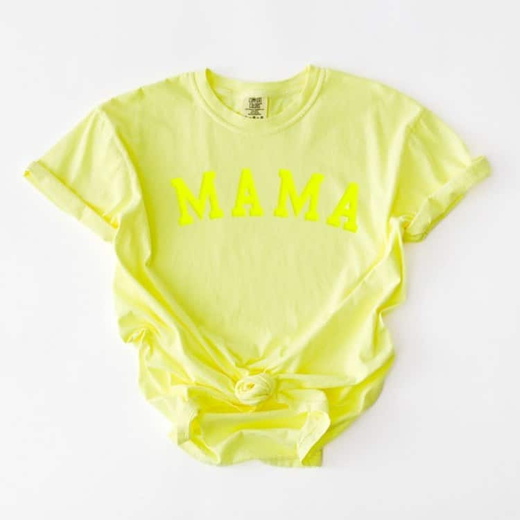
紺色や黒のシャツに塗るとすぐに濁って透明になってしまう「幽霊のような」黄色との戦いはもう終わりにしましょう。Shaliteinkのディープレモンイエローは、このパレットのヘビー級チャンピオン。圧倒的な顔料濃度で、硬くて「防弾」のような感触ではなく、驚くほどの不透明度を実現しています。鮮やかなプリムローズと深みのあるゴールデンロッドの中間に位置する、パンチの効いた高彩度の色合いで、最も暗い生地でも、その鮮やかでエネルギッシュな雰囲気を保ちます。.
印刷作業の繰り返しにうんざりしている印刷業者向けに設計されたこのインクは、クリーミーで粘度が低く、まるでバターのようにメッシュをスムーズに通過します。100%コットンでも、扱いの難しい混紡素材でも、洗濯を繰り返しても鮮やかな発色を保つ、小売店向けのソフトな仕上がりを実現します。くすんだ黄色で満足する必要はありません。このインクを使えば、デザインにふさわしい「ハイボルテージ」なインパクトを与え、際立った存在感を放つことができます。.
「バケツの中の太陽」の秘密:なぜ濃いレモンイエローが印刷に最適なのか
ちょっとお話させてください。数年前、マルセイユの非常にこだわりの強いブティックオーナーが、500枚の黒の厚手のパーカーに「鮮やかな柑橘系」のロゴを入れてほしいと依頼してきました。私は地元の業者から安価な標準的なレモンイエローのインクを仕入れました。そのインクと格闘するのに3日間かかりました。インクは薄くて透明で、黒い生地の上で泥のような緑色の塊のように見えました。フラッシュを挟みながら4回も重ね塗りしなければなりませんでした。ようやく完成したプリントは、まるで合板をスウェットシャツに貼り付けたような感じでした。.
顧客はそれをひどく嫌がった。私は損をした。危うくスクイージーを窓に投げつけるところだった。.
その時私は気づいた 濃いレモンイエローのスクリーン印刷用プラスチゾルインク. その日以来、私の店は以前とは全く変わってしまいました。もしあなたが「幽霊のような」黄色に飽き飽きしていて、プリントを本当に際立たせたいと思っているなら、ぜひ耳を傾けてください。私は、正気を失うことなくこの色をマスターする方法を具体的にお伝えします。.
「痩せた友達」問題:あなたの黄色が弱く見える理由
誰しも、引っ越しを手伝ってくれると約束しておきながら、重いピアノを運ばなければならない日に「うっかり」現れない友人が一人や二人いるでしょう。レモンイエローもまさにそんな感じです。視認性が高いと謳われているのに、暗い色の服に当たるとたちまち消えてしまうのです。.
一般的なインクは固形分が少ないことで知られています。紺色や黒色のシャツの濃い色の繊維は顔料を吸い込んでしまうため、くすんだ色合いになってしまいます。それを修正しようとインクを重ね塗りすると、誰も着たがらない「防弾仕様」のプリントになってしまうのです。.
その シャライトインク プラスチゾルインク この処方は他とは違います。私が言うところの「芯」があるんです。顔料が非常に多く含まれているので、繊維の中に埋もれるのではなく、繊維の上に浮かぶように定着します。.
「深い」とは一体どういう意味なのか?
「ディープ」レモンイエローについて話すとき、マスタードやゴールドのように色を濃くするだけではありません。 真の飽和.
こう考えてみてください。
-
標準レモン: 薄めたレモネード。.
-
ディープレモン: 絞りたてのレモンの皮が、そのまま目に飛び込んできたような感覚。.
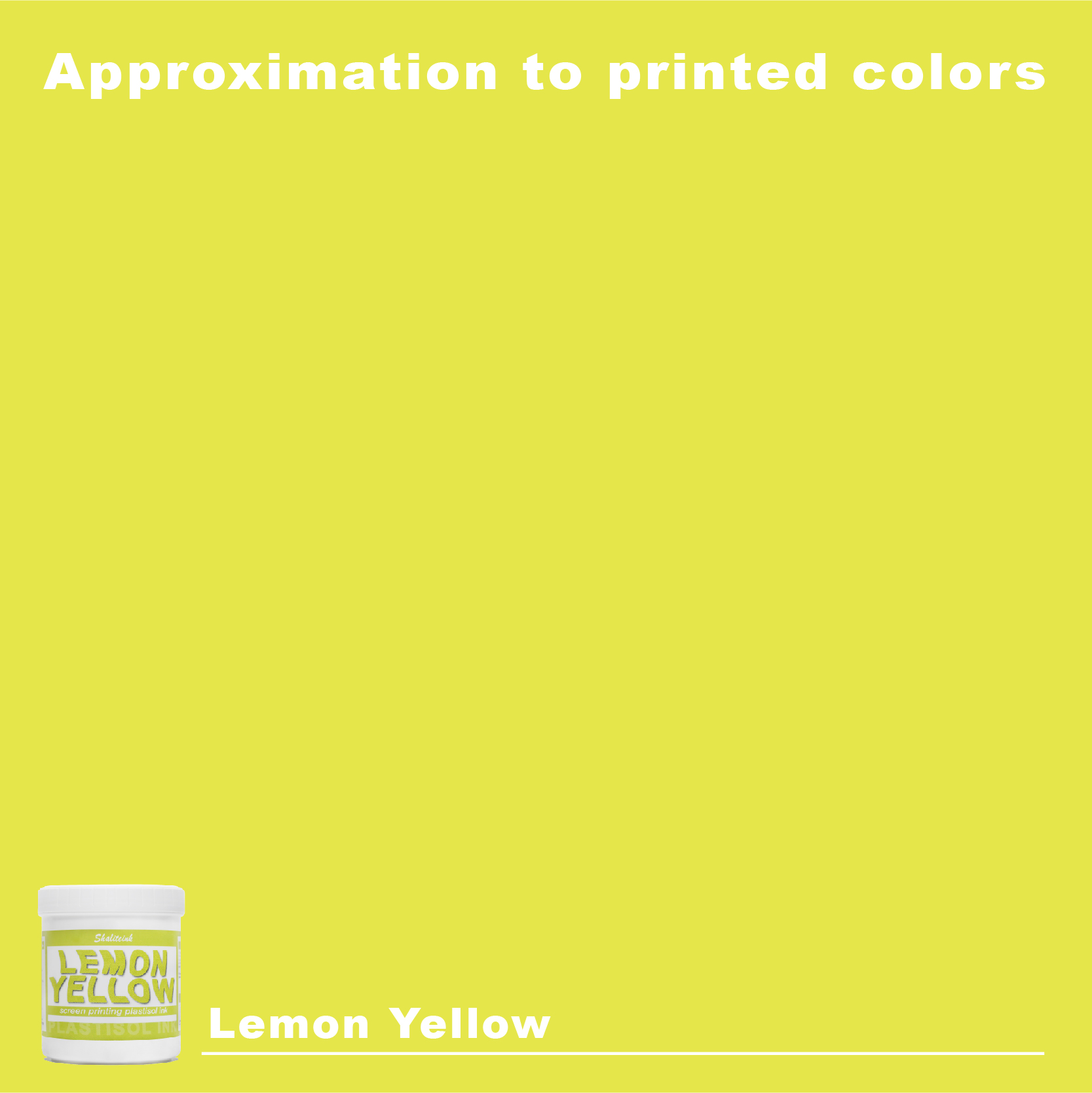
淡いプリムローズと濃いゴールデンロッドのちょうど中間の絶妙な色合いです。パンチがあり、鮮やかで、小売店の照明の下では驚くほど美しく見える、爽やかな柑橘系の雰囲気を保っています。 濃いレモンイエローのスクリーン印刷用プラスチゾルインク 通りを挟んで向かい側からでも目を引くような、「ハイボルテージ」な印象を与えます。.
現場の現実:実際に印刷する方法
画面にインクをぶちまけるだけで奇跡が起こるわけではありません。戦略が必要です。私の店では、どんな場合でも厳格な手順に従っています。 プラスチゾルインク 仕事だが、特に黄色人種にとって。.
1. 画面設定
ふっくらとジューシーな見た目を求めるなら、メッシュ選びは慎重に行う必要があります。.
-
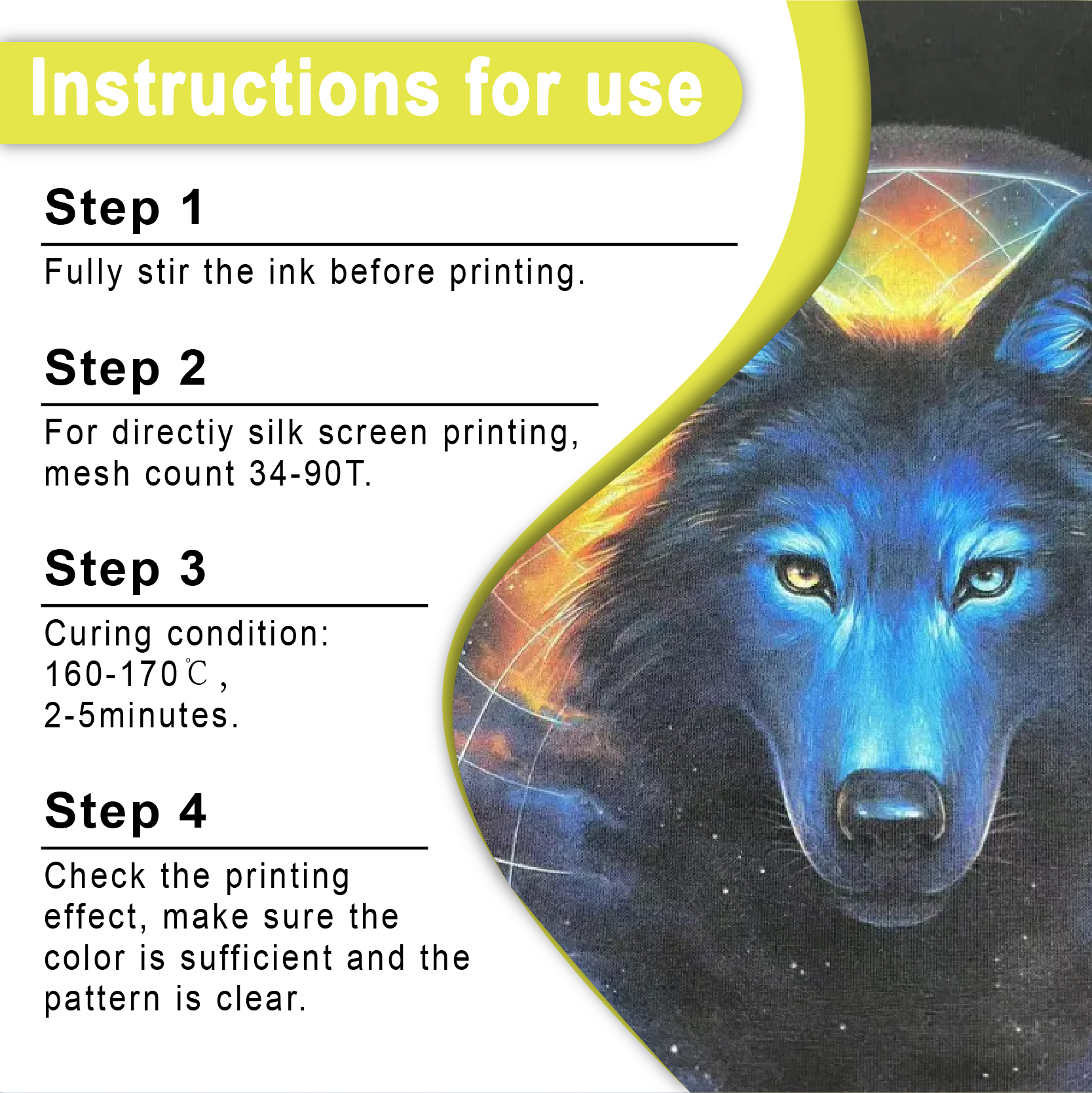
低メッシュ(86-110): 白い下地を使わずに、濃い色のシャツに黄色を直接プリントする場合に使用してください。インクが厚く定着します。.
-
高メッシュ(156-230): オーバープリントする場合はこれを使用してください ホワイトスクリーン印刷プラスチゾルインク ベースカラーとして白が重要な役割を果たしているので、黄色は薄く鮮やかな純粋な色の層として使うだけで良い。.
2. スクイージー技術
私は硬度70/90/70の3段階のスキージを好んで使います。インクをメッシュに押し通すには中央の硬さが必要ですが、インクがスクリーンからきれいに剥がれるようにするには端の柔らかさが必要です。スキージが柔らかすぎると、インクをただ「押し付ける」だけで、ぼやけた仕上がりになってしまいます。.
3. アンダーベースの利点
インクの品質がどんなに優れていても、黒いシャツに黄色をプリントする場合は、下地を使うべきです。まず、不透明度の高い白インクを塗ります。数秒間、触っても乾いている程度になるまで乾燥させます。それから、その上にディープレモンイエローを垂らします。こうすることで、黄色がまるでバックライトで照らされているかのように見えます。.
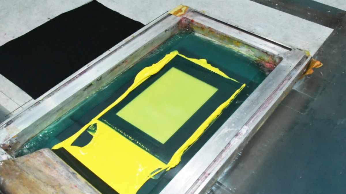
比較:高不透明度の内訳
| パフォーマンス指標 | 低価格の「レモン」インク | シャリテインク ディープレモンイエロー |
| 暗い生地の不透明度 | 半透明(劣悪) | 高い(非常に良い) |
| 色素負荷 | 低(充填剤多め) | 高(色素が豊富) |
| 必要なヒット数 | 3~4回のパス | 1-2パス |
| 最終印刷テクスチャ | 粗くて厚い | 滑らかで柔軟 |
| 一貫性 | 水っぽい、または塊状 | クリーミーで「軽めの口当たり」“ |
| 製品アクセス | スタンダードショップ | ディープレモン製品 |
ひび割れを起こさずに硬化させる:160℃ルール
ここで多くのプリンターが失敗するのを目にします。プラスチゾルは水性インクとは異なり、蒸発によって「乾燥」するわけではありません。液体から固体プラスチックに変化するには、特定の温度に達する必要があります。.
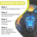
コンベア式乾燥機やヒートプレス機が 全体 インク膜が160℃(320°F)まで加熱されると、洗濯時にプリントが剥がれてしまいます。私は常にレーザー温度計で表面温度を確認し、すべてのバッチで「伸縮テスト」を行っています。生地を引っ張ったときに黄色の部分にひび割れが生じる場合は、硬化が不十分であることを意味します。.
生地が繊細な高級な仕事には、 PVCフリーNBスクリーン印刷インク. 美しく硬化し、洗濯機で20回洗っても鮮やかな色を保ちます。.
高度な戦術:ストレッチとパフ
標準的な平面印刷では不十分な場合もあります。顧客にプレミアム価格を請求したいのであれば、プレミアムな効果を提供する必要があります。.
ヨガの苦闘(柔軟性)
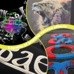
スパンデックスや伸縮性の高いスポーツウェアにプリントする場合、通常のプリントでは乾いた小枝のようにパキッと折れてしまいます。 弾性スクリーン印刷インクプラスチゾル 生地に混ぜることで、インクに「形状記憶」が生まれます。シャツが伸びても、インクはひび割れることなく元の位置にすぐに戻ります。「アスレジャー」市場にとって不可欠な機能です。.
3Dポップ(パフ)
90年代のヴィンテージルックが欲しいですか?ディープレモンに パフスクリーン印刷インクプラスチゾル. 乾燥機に入れると、生地が膨張してシャツから浮き上がります。これにより、黄色が柔らかくマシュマロのような質感になり、人々はその感触をとても気に入ります。.
よくある質問(FAQ)
1. 100%ポリエステル生地にディープレモンイエローを使用できますか?
できますが、「にじみ」に注意する必要があります。ポリエステル染料は不安定で、黄色のインクを不気味な緑色に変えてしまう傾向があります。これを防ぐには、 抗移動スクリーン印刷インク プラスチゾル バリアとして機能します。まず、インクの移行を防ぐグレーを印刷し、次に白、最後に黄色を印刷します。層が多くなりますが、黄色を純粋な状態に保つ唯一の方法です。.
2. シャツの黄色をより「柔らかい」感じにするにはどうすればいいですか?
インクに「ソフトハンド」ベースまたは硬化性希釈剤を加えてください。これにより、プラスチックのような感触が薄まります。ただし、10% 以上加えると、あの素晴らしいディープレモンの不透明度が失われます。可能な限りソフトな感触を求めるなら、 PVCフリープラスチゾルインク ライン。.
3. なぜインクが画面の裏側に付着するのですか?
これは通常、温まったスクリーン上にインクが蓄積することによって起こります。シャツを高温でフラッシュすると、熱がスクリーンに伝わり、インクがゲル化し始めます。パレットを冷たく保ち、長時間の作業を行う場合は、スクリーン潤滑剤を少量使用してください。.
4. このインクは環境に優しいですか?
標準的なプラスチゾルにはPVCとフタル酸エステルが含まれています。環境に優しい印刷を求めるクライアントがいる場合は、 環境に優しいスクリーン印刷インク Shaliteinkの製品なら、有害な化学物質を使わずに、鮮やかな発色を実現できます。.
5. 細かいディテールを黄色で表現するのに最適なメッシュはどれですか?
小さな文字や細い線には230メッシュを使用します。印刷→フラッシュ→印刷の工程が必要になりますが、ディテールは鮮明に保たれます。 シャリテインク ディープレモンイエロー クリーミーな質感なので、細かいメッシュの穴を詰まらせることはありません。.
私がShaliteinkに切り替えた理由(そしてあなたもそうすべき理由)
大手企業のブランド品も試したし、eBayの「安い」商品も試した。ほとんどは高すぎるか、品質が不安定だった。私が気に入っているのは シャライトインク プラスチゾルインク 一番のメリットは信頼性です。どのバケツも同じように使えます。30分もかけて混ぜたり薄めたりして、ようやく使えるようになるということはありません。.
始めたばかりなら、 スクリーン印刷インクキット. 品質を自分でテストできるように、必要なものが揃っています。でも、他に何もできなくても、少なくとも1クォート購入してください。 濃いレモンイエロー.
それはあなたの時間を節約し、あなたの評判を守り、顧客がより多くの注文を持って再び来店してくれるようになるでしょう。.
印刷機を点灯させる準備はできていますか?
「まあまあ」のプリントで満足するのはやめましょう。 スクリーン印刷用インクショップ そして、良質なインクを選びましょう。あなたのお店には、あなたと同じくらい働き者のインクが必要です。.
| サイズ |
8オンス ,16オンス ,32オンス |
|---|
Deep Lemon Yellow Screen Printing Plastisol Ink に対するレビュー7件
フィルターをクリア以前にこの商品を購入したことのあるログイン済みのユーザーのみレビューを残すことができます。
関連商品
酸性ブルースクリーン印刷プラスチゾルインク
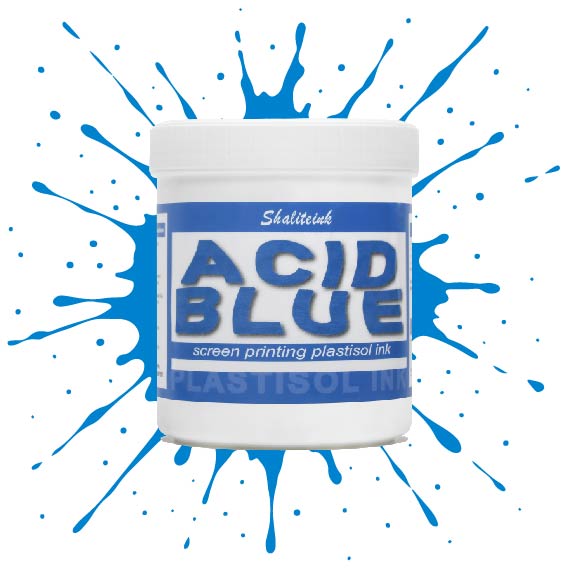
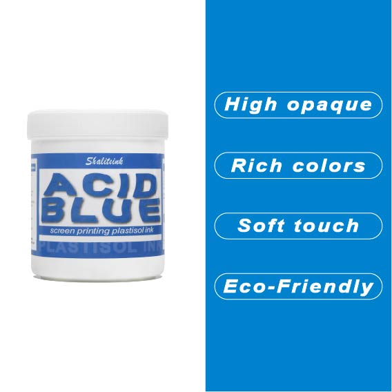
生地に触れた瞬間に消えてしまうような、平坦で濁った青色で妥協するのはもうやめましょう。 酸性ブルースクリーン印刷プラスチゾルインク この製品は、人目を引くような、インパクトのある仕上がりを求める印刷業者向けに開発されました。クリーミーで高濃度の顔料配合により、メッシュをスムーズに通過し、スクリーン内部ではなくスクリーン上で湿った状態を保つため、ステンシルが詰まる心配なく、休憩を取ることができます。.
細かいディテールを狙って230メッシュの細密な紙に通す場合でも、パーカーに大胆な110メッシュのブロックプリントを施す場合でも、このインクはプロ仕様の不透明度とバターのように滑らかな手触りを実現します。乾燥機や洗濯機にも耐え、ひび割れや剥がれのない、まさに「秘密兵器」のようなインクです。洗濯を繰り返しても鮮やかなブルーが色褪せない、ストリートウェアのスタイルをワンランクアップさせたいなら、まさにこれです。.
黒スクリーン印刷プラスチゾルインク
「ダークグレー」で満足して、それを黒と呼ぶのはやめましょう。 黒色プラスチゾルインク このインクは、スクリーンを詰まらせ、シャツの仕上がりをくすませる、粘り気のある濃いインクに悩まされている印刷業者向けに開発されました。バターのように滑らかでクリーミーな質感で、高密度のメッシュでもスムーズに印刷でき、しかも一度の印刷で生地の色をしっかり定着させます。100%コットンTシャツでも、扱いの難しい混紡生地でも、このインクは柔軟でマットな「ミッドナイト」カラーに仕上がり、最初の洗濯後もひび割れたり剥がれたりしません。お客様が期待する、プロ仕様の高品質なブラックです。.
安全性は必ずしも性能を犠牲にすることを意味するわけではありません。当社のフォーミュラはフタル酸エステルを一切使用していません( PVCフリーのオプション (入手可能)なので、化学薬品のトラブルを気にすることなく、高級ブランドの印刷が可能です。発色が良く、スクリーン上でインクが定着しやすく、インクの蓄積も少なく、鮮明なディテールを維持します。印刷作業の効率化と、まるでブティックで作られたような仕上がりを実現する、頼りになるインクをお探しなら、このインクを印刷機に常備しておくのがおすすめです。.
深紅のスクリーン印刷プラスチゾルインク
濃い色の衣類に「赤がピンクに変色」してしまうような失敗はもうやめましょう。当社のインクは、繊維化学の専門家が、技術的な問題に悩まされることなく、店頭に並べられるような深みのある鮮やかな赤色を求める印刷業者向けに開発しました。DIY愛好家の方にも、成長中のブティックブランドの方にも、このインクはバターのように滑らかな質感で、メッシュから簡単に洗い流せ、洗濯を繰り返しても鮮やかな色を保ちます。.
当社は安全性と高性能の両方を最優先事項とし、OEKO-TEXなどの厳格な国際基準を満たすため、フタル酸エステルを含まない配合を採用しています。標準硬化環境と低温硬化環境(270°F~280°Fまで設定可能)の両方に最適化されており、扱いにくいポリエステル混紡素材における染料のにじみを効果的に最小限に抑えながら、高級アパレルを特徴づける柔らかくプロフェッショナルな肌触りを維持します。.
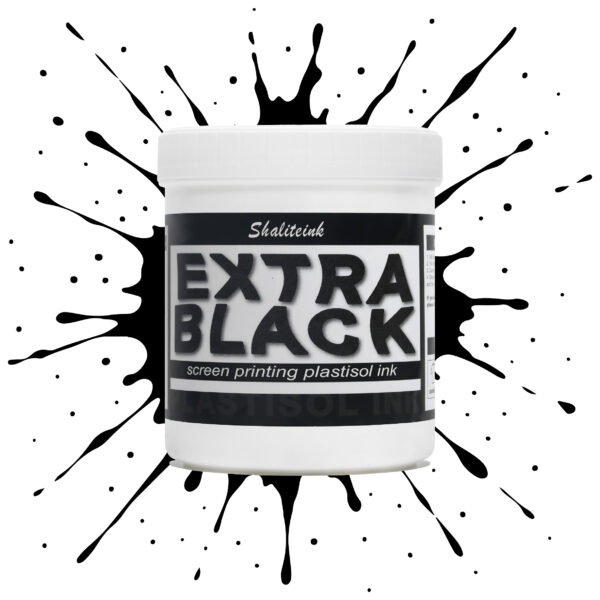
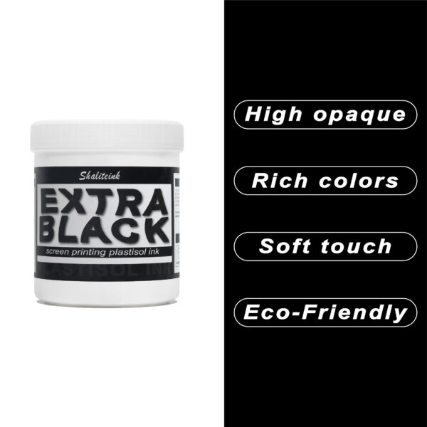
エクストラブラックスクリーン印刷プラスチゾルインク
お客様が真夜中のような濃さを求めているのに、「チャコールグレー」で妥協するのはもうやめましょう。Shaliteinkのエクストラブラックは、単なる濃いインクではありません。透明感を一筆で完全に消し去るために設計された、高顔料配合の強力なインクです。安価な黒インクは、濃い色の綿に色あせたエスプレッソのように見えることが多いですが、当社のフォーミュラは、見た目と同じくらい手触りの良い、プロフェッショナルなマットな質感で、濃密な「ブラックホール」のような仕上がりを実現します。.
日々の酷使に耐えるように設計されており、細かいメッシュも難なく切断できるほど滑らかでありながら、100回の洗濯後も深みのある色合いを保ちます。しっかりとしたベタ塗りを得るために何度も印刷を繰り返すことにうんざりしているなら、このインクはあなたの印刷機にふさわしいアップグレードです。増量剤もグレーの色調も一切なし。業界で最も深く、最も信頼性の高い黒を実現します。.
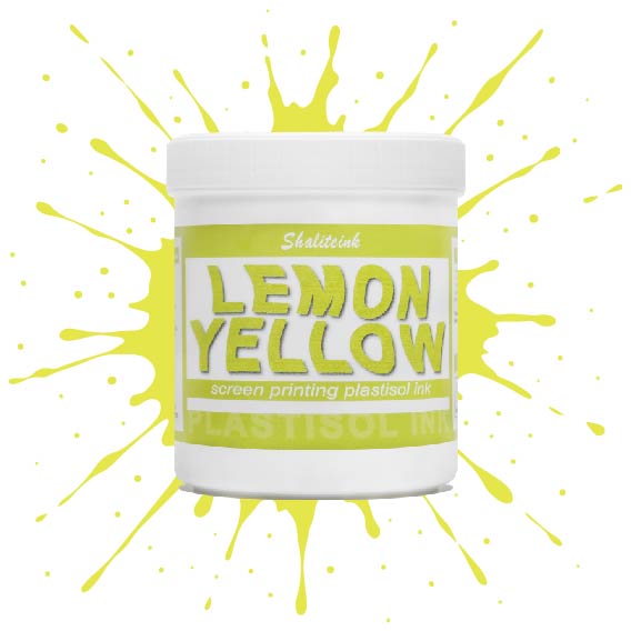
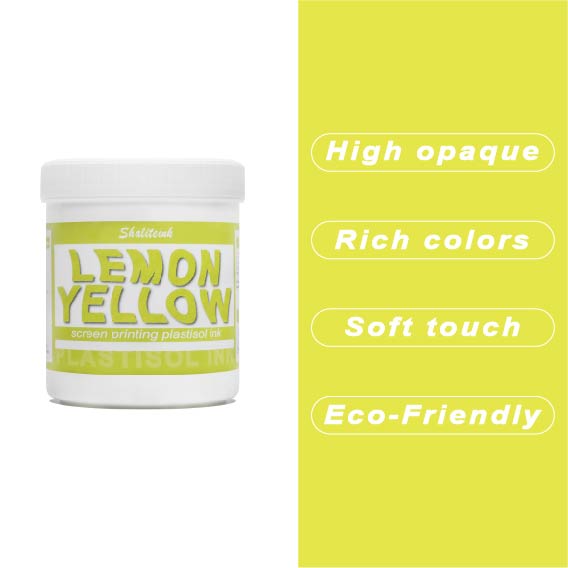
レモンイエロースクリーン印刷プラスチゾルインク
黄色いインクが生地に染み込んで消えてしまったり、暗い色のパーカーの上で透明な汚れのように見えたりした経験があれば、そのイライラはよくわかるでしょう。私たちはこれを実現するために レモンイエロースクリーン印刷プラスチゾルインク まさにその悩みを解決するために開発されました。下地の上に塗れば、鮮やかで力強い仕上がりになる十分な顔料濃度でありながら、目の細かいスクリーンでもスムーズに塗ることができます。遠くからでも目を引くほどの鮮やかさで、何度洗ってもその輝きが持続します。.
このインクが当店で大人気な理由は、にじみにくい処方にある。通常、黄色が不健康な緑色になってしまう厄介なポリエステル混紡素材にとって、まさに救世主だ。胸に分厚いプラスチックシートを貼ったような感触ではなく、柔らかくしなやかなプリントに仕上がる。信頼性の高いプロ仕様のインクが面倒な作業を代行してくれるので、機器と格闘することなく、プリント作業そのものを楽しむことができる。.
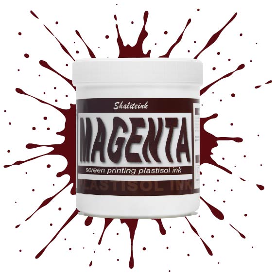
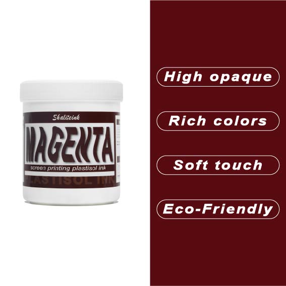
マゼンタスクリーン印刷プラスチゾルインク
正直に言いましょう。薄めたイチゴミルクのようなマゼンタなんて誰も欲しくありません。必要なのは、本当に発色の良いマゼンタスクリーン印刷用プラスチゾルインクです。このShaliteinkのインクはまさに本物。メッシュにしっかり定着するほどの粘度を持ちながら、スキージがスクリーンに触れた瞬間にシルクのように滑らかに伸びます。濃い色の印刷なら、妥協は禁物。鮮やかなホワイトスクリーン印刷用プラスチゾルインクをベースに重ねて使用すれば、色が本当に鮮やかに映えます。すぐに印刷に使用でき、メンテナンスも簡単。コーヒーを買いに行っている間にスクリーン上でインクが固まってしまう心配もありません。.
実際に印刷機を操作しているプラスチゾルインク専門店として、私たちは安価で粉っぽい顔料の悪夢をよく知っています。当社のマゼンタインクは100%で、フタル酸エステル不使用、耐久性に優れています。ひび割れや剥がれがなく、洗濯にも強く、通常は衣類自体よりも長持ちします。スクリーン印刷のスターターキットで始めたばかりの方でも、自動印刷機で何千枚も印刷している方でも、このインクを使えば、一般的なプラスチゾルインクにつきものの悩みを解消し、高級感のある仕上がりを実現できます。.
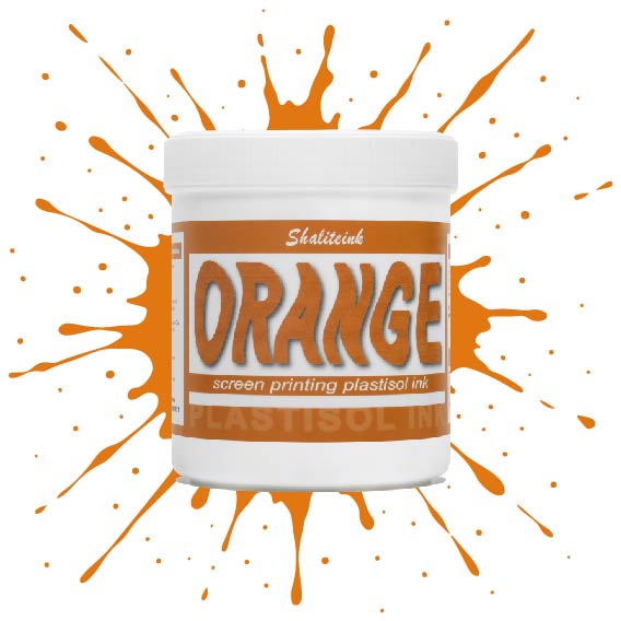
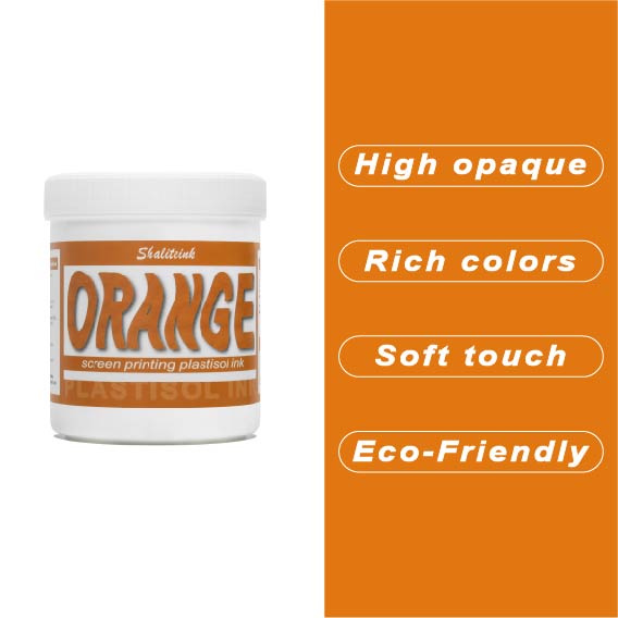
オレンジスクリーン印刷プラスチゾルインク
生地に染み込んでしまうことなく、鮮やかでエネルギッシュな「オレンジクラッシュ」カラーをお探しですか?当店のオレンジプラスチゾルインクは、多くのお客様にご愛用いただいている理由があります。クリーミーでプレスしやすいテクスチャーは、高密度の生地にもスムーズに印刷でき、大胆なグラフィックに必要な高い不透明度を維持します。もう濁ったプリントに悩む必要はありません。鮮やかなシトラスカラーが、最初の印刷から最終乾燥まで、鮮やかさを保ちます。.
長期間の使用を想定して設計されたこのインクは、印刷途中でスクリーン上で乾くことなく、洗濯にも耐える丈夫で柔軟な仕上がりを実現します。濃い色のパーカーに鮮やかな白の下地をプリントする場合でも、淡い色の綿生地に直接プリントする場合でも、Shaliteinkは、インクを頻繁に薄めたり、インク詰まりを起こしたりする手間をかけずに、プロフェッショナルな「店頭販売対応」の仕上がりを実現します。.
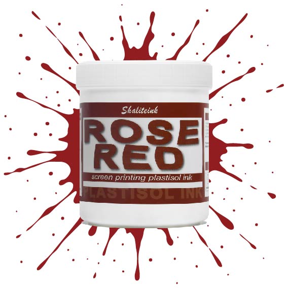
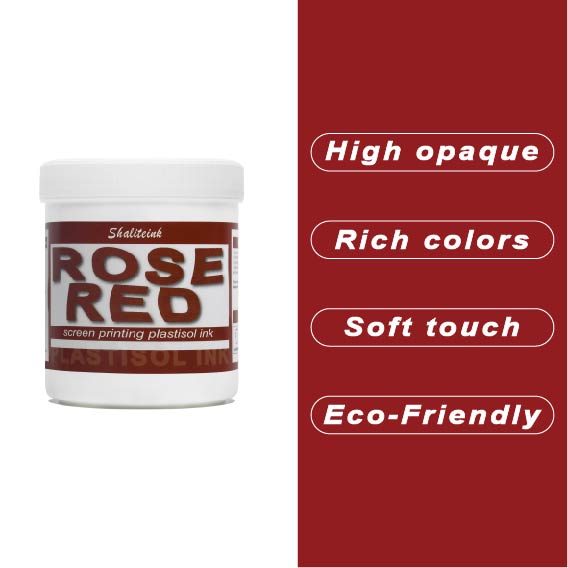
ローズレッドスクリーン印刷プラスチゾルインク
「ほぼ赤」で満足するのはもうやめて、本当に目を引く鮮やかな色で空間を支配しましょう。このローズレッドのスクリーン印刷用プラスチゾルインクは、何千回も試作を重ねてきましたが、濃色のTシャツに高級感あふれる鮮やかな発色を実現し、生地が硬いプラスチックシートのように感じられることも決してありません。ランチ休憩中にメッシュの中でインクが乾いてしまうといった面倒な心配をせずに、プロ並みの仕上がりを求めるすべての人にとって、まさに究極のプラスチゾルインクです。.
環境意識の高い顧客層やハイエンドのストリートウェアブランド向けに印刷するなら、PVCフリーのプラスチゾルインク「ローズレッド ショップセーフ 耐久性インク」がおすすめです。肌に優しく、作業場を無毒に保つので、有害なガスを気にすることなく、作品制作に集中できます。これは単なるインクではありません。顧客を惹きつけ、リピーターを増やす秘訣なのです。.
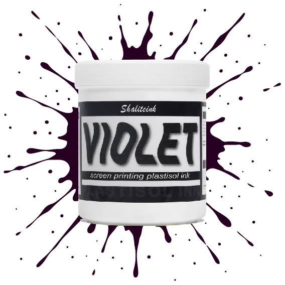
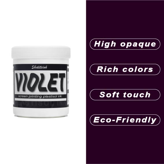
バイオレットレッドスクリーン印刷プラスチゾルインク
正直言って、ほとんどの赤インクはファストフードのロゴに似合いそうな、派手で明るすぎる、ちょっと安っぽい印象です。でも、このバイオレットレッドは全く別物。深みのある、落ち着いたワインのような色合いで、ごく普通の$5の無地のシャツが、まるで高級ブティックの$40のシャツのように見えます。真っ黒なパーカーにこのインクを使ってみたところ、高い不透明度のおかげで、色がくすんで濁ったような色にならず、本来の色合いを保ってくれました。クライアントが、ありきたりなジムシャツではなく、洗練されたデザインのシャツを求めている時に、まさに「圧倒的なアドバンテージ」となるでしょう。.
冷たいピーナッツバターのようなインクと格闘するのはもうやめましょう。このインクはバケツから出した瞬間からバターのように滑らかで、かき混ぜたり薄めたりする必要は一切ありません。コーヒーを買いに行ったり、配達の対応をしたりしても、インクが固まったり、スクリーンを傷めたりすることはありません。それに、正直に言って、誰かが実際に着用した瞬間にひび割れてしまうプリントほど、ブランドをあっという間にダメにするものはありません。このインクは生地の動きに合わせて伸縮し、手触りも柔らかく、高温洗浄テストにも耐え、剥がれることもありません。とにかく使いやすいので、スクリーンをこする時間を減らし、印刷作業に集中できます。.
 EN
EN  DE
DE  ES
ES  PT
PT  JA
JA
アンナ・ノワク –
ジアワ バルゾ ドブジェ ナ コ ジ
ケビン・ターナー –
品質は高級感があり、配送も早かったです。品質は高級感があり、配送も早かったです。品質は高級感があり、配送も早かったです。品質は高級感があり、配送も早かったです。期待以上でした。
ピーター・フィッシャー –
Hat meine Erwartungen übertroffen。 Sehr グーテス Preis‑Leistungs‑Verhältnis。 Hochwertige Qualität und Schnelle Lieferung。 Leicht zu Nutzen und konstante Ergebnisse。 Leicht zu Nutzen und konstante Ergebnisse。 Sehr グーテス Preis‑Leistungs‑Verhältnis。 Einfache Anwendung und zuverlässige Leistung。ライヒト・ズ
エミリー・デイビス –
ほとんどの場合、期待を上回りました。使いやすく、結果も安定しています。スムーズな塗布と信頼性の高いパフォーマンス。私のdには非常に効果的です。
アナ・コスタ –
安全な情報を提供します。 Superou minhas 期待しています。最高の利益。アプリケーション
サラ・ミラー –
日々の業務に非常に役立っています。期待以上でした。
ルーカス・ゴメス –
ユーザーと結果を容易にする