
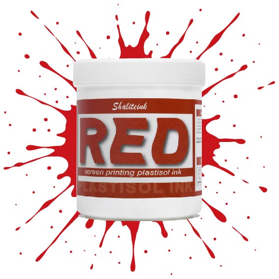
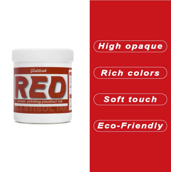
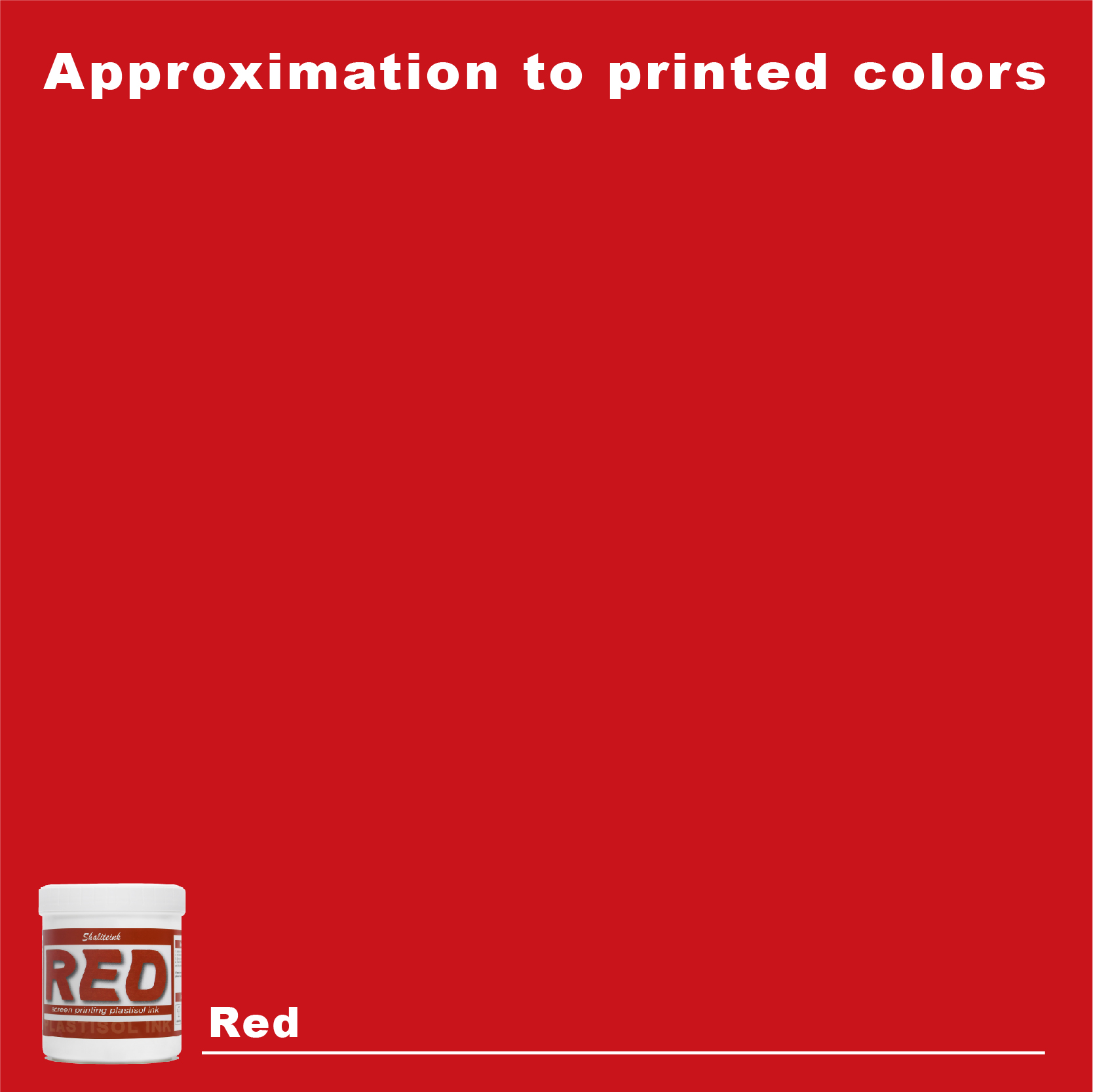
深紅のスクリーン印刷プラスチゾルインク
価格帯: $15.90 – $30.88
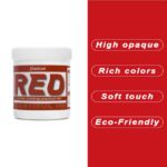
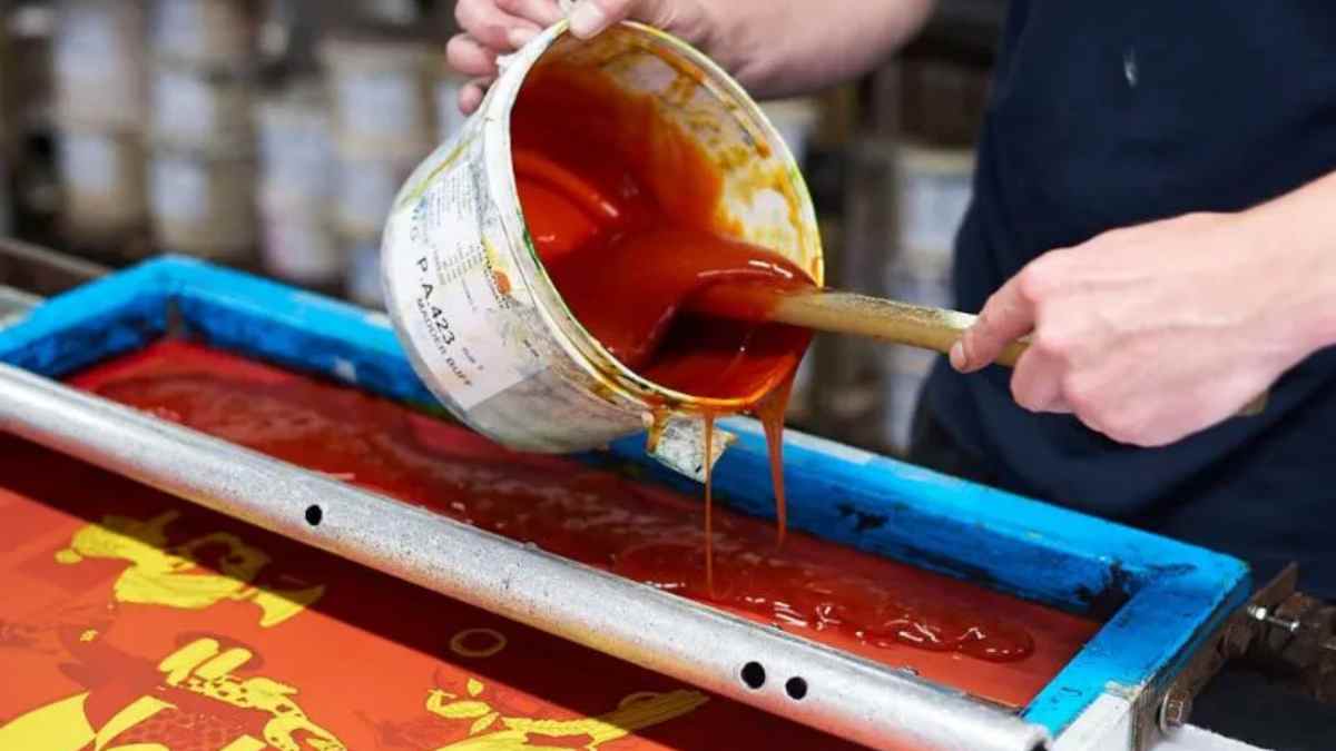
濃い色の衣類に「赤がピンクに変色」してしまうような失敗はもうやめましょう。当社のインクは、繊維化学の専門家が、技術的な問題に悩まされることなく、店頭に並べられるような深みのある鮮やかな赤色を求める印刷業者向けに開発しました。DIY愛好家の方にも、成長中のブティックブランドにも、このインクはバターのように滑らかな質感で、メッシュから簡単に洗い流せ、洗濯を繰り返しても鮮やかな色を保ちます。.
当社は安全性と高性能の両方を最優先事項とし、OEKO-TEXなどの厳格な国際基準を満たすため、フタル酸エステルを含まない配合を採用しています。標準硬化環境と低温硬化環境(270°F~280°Fまで設定可能)の両方に最適化されており、扱いにくいポリエステル混紡素材における染料のにじみを効果的に最小限に抑えながら、高級アパレルを特徴づける柔らかくプロフェッショナルな肌触りを維持します。.
クリムゾン・キング:深紅のプラスチゾルインクを使いこなすための実践ガイド
聞いてください、私はこの業界を隅々まで経験してきました。そして、コンベア式乾燥機も使いこなしてきました。もしあなたが、漆黒のパーカーに深みのある鮮やかなクリムゾン色のロゴをプリントしようとして、たった一度の洗濯で色あせたピンク色の惨状になってしまった経験があるなら、私がなぜこんなことを書いているのか、お分かりでしょう。赤は繊維業界の「ディーバ」です。気まぐれで、透けやすく、敬意を持って扱わなければ、305メッシュのスクリーンが詰まるよりも早く、あなたの評判を地に落としてしまうでしょう。.
私が プラスチゾルインク製造業者, 完璧な「血のような赤」を実現するには、インクの量だけでなく、インクを絞り出す技術も重要だと学びました。今日は、調達担当者が絶賛するような、高級感あふれる店頭販売に適した仕上がりを実現するために、私たちがどのように深紅のスクリーン印刷用プラスチゾルインクを扱っているのか、その秘密を明かします。.
1. 完璧な赤ワインの構造:なぜ他とは違うのか
ほとんどの印刷業者は赤色を他の色と同じように扱いますが、これは大きな間違いです。赤色顔料、特に濃いマルーンやバーガンディは、レモンイエローやブライトホワイトのような本来の不透明度を持たない分子構造を持っていることが多いのです。.
調達先が プラスチゾルインクサプライヤー, つまり、単に色を買うのではなく、レオロジー的な配合を買うのです。一般的な赤色は半透明であることが多いのですが、濃い色の生地で「深みのある赤」の色合いを出すには、スクリーン上でレンガのように固まらない、高濃度の顔料が必要です。.
不透明度の物理学
濃い赤色の難点は「光の吸収」です。白いシャツなら簡単ですが、黒いシャツでは黒い基材が赤い光の波長を吸収してしまいます。そのため、私たちはほぼ必ず白色のPVCフリーNBスクリーン印刷インクの下地についてお話しします。この白い「鏡」がないと、濃い赤色はただの暗い影になってしまいます。.
2. 技術仕様と2026年の市場データ
業界は変化しつつあります。2026年4月現在、世界のプラスチゾル市場は14兆9200億ドルという驚異的な規模に達しています。その理由は?デジタル技術の台頭にもかかわらず、高品質に印刷されたプラスチゾルデザインの「鮮やかさ」と耐久性に勝るものはないからです。.
硬化:成否を分ける重要な局面
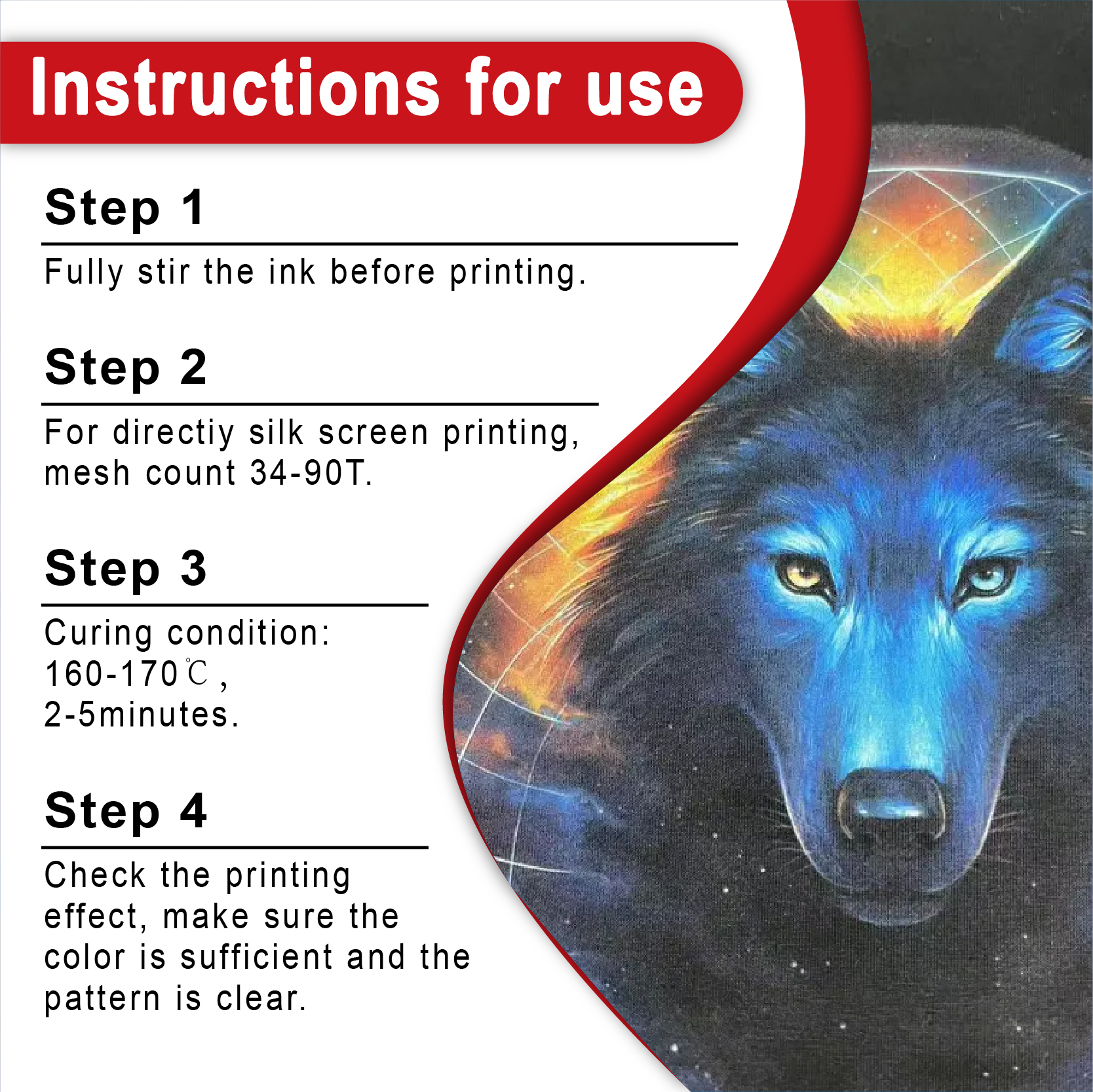
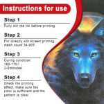
「最適な温度」に当てなければ、赤色は剥がれてしまいます。それだけです。以下は、私たちが研究室で使用しているデータです。
| インクの種類 | 理想的なゲル温度 | 最終硬化温度 | 共通アプリケーション |
| 標準プラスチゾル | 110℃(230°F) | 160℃(320°F) | 100% コットン |
| 低硬化型(NBシリーズ) | 90℃(194°F) | 135℃(275°F) | 合成ブレンド |
| 高密度インク | 120℃(248°F) | 165℃(330°F) | 3Dテクスチャプリント |
プロのヒント: 必ずレーザー温度計を使用してください。赤色のスクリーン印刷用プラスチゾルインクが芯温に達しないと、樹脂と顔料が完全に架橋せず、恐ろしい「洗い流し」現象が発生します。.
3.「環境に優しい」革命:PVCフリーの選択肢
2026年には、コンプライアンスは選択肢ではなく、ゲームへの参加条件となります。高級ブランドをターゲットにする場合は、 PVCフリープラスチゾルインク.
昨年、あるクライアントが大手スポーツブランドとの契約を失いかけたことがありました。そのクライアントの「深紅」のインクに微量のフタル酸エステルが含まれていたためです。そこで、PVCフリーのNBスクリーン印刷インクに切り替えたところ、OEKO-TEXのすべてのテストに合格しただけでなく、手触りも格段に柔らかくなりました。.
なぜPVCフリーを選ぶのか?
-
コンプライアンス: REACHおよびGOTS規格に適合しています。.
-
ソフトな手触り: PVCフリーのプラスチゾルインクブルーソフトハンド配合(およびその赤色バージョン)は、胸にプラスチックのシールドを被せているような感覚ではなく、生地の一部のような感触です。.
-
マーケティング: 「環境に優しい」印刷物には、割増料金を設定できます。.
4. 特殊効果:ディープ・レッドを次のレベルへ
高額な料金を請求したいなら、ただの「平面的」な印刷物ではダメだ。「驚き」を与える要素が必要だ。.
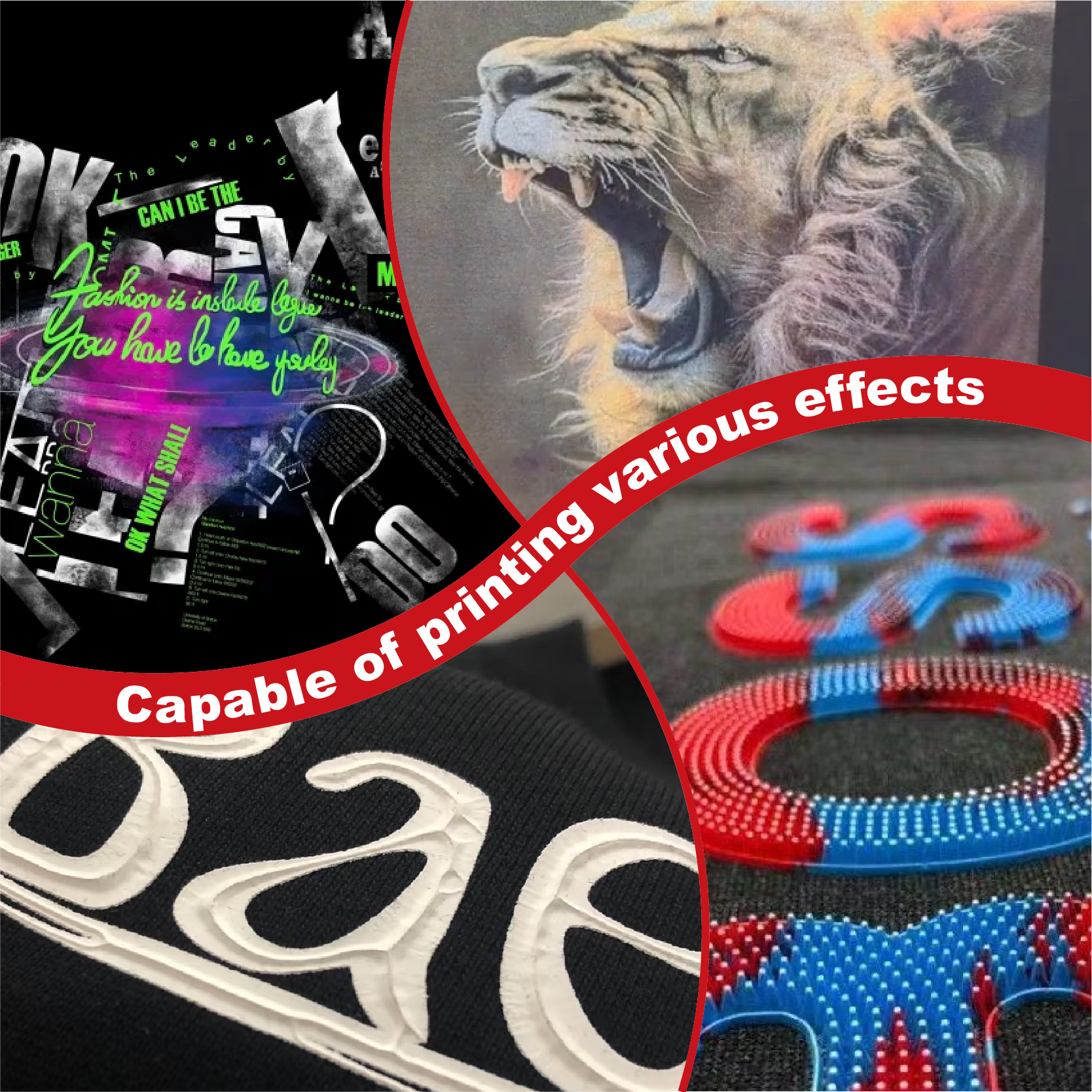
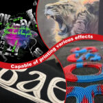
3D「パフ」効果
シャツから文字通り浮き上がるような、深みのあるバーガンディ色のロゴを想像してみてください。パフスクリーン印刷インク(プラスチゾル)を深紅色のロゴに混ぜることで、触り心地の良い、高級感のある仕上がりになり、お客様は思わず触れたくなるでしょう。.
メタリックとシマー
ホリデーシーズンや「ラグジュアリー」なストリートウェアには、よく メタリックスクリーン印刷インク ベース。紫がかった赤色のスクリーン印刷用プラスチゾルインクに、少量の銀色のスクリーン印刷用プラスチゾルインクを混ぜると、小売店の照明の下で驚くほど美しく輝く、きらめくワイン色になります。.
5. 究極のトラブルシューティングチャート
誰しも経験したことがあるでしょう。乾燥機から煙が出ていて、シャツの色が変に見える。そんな時に役立つ、深紅色の問題を解決するための「裏技」をご紹介します。.
| 症状 | 診断 | 解決 |
| 黒地では赤が「オレンジ色」に見える | 色素の移動 | ブロック剤として、アンチマイグレーションスクリーン印刷インク(プラスチゾル)を使用してください。. |
| インクが濃すぎて印刷できません | 冷蔵工場/高粘度 | 5分間かき混ぜ、必要に応じて2%希釈剤を加える。. |
| 赤色は洗濯後に「ピンク色」に変わります | 硬化不足/線維化 | 乾燥時間を長くしてください。感光性乳剤の端が鋭利になっていないか確認してください。. |
| インクは伸ばすとひび割れる | 弾力性の欠如 | 伸縮性のあるスクリーン印刷用インク(プラスチゾル)に切り替えましょう。. |
6. 武器の調達
手術にバターナイフを使わないように、プロの仕事には「安価な」インクを使わないでください。新しいショップを立ち上げるときは、 スクリーン印刷インクキット 主要な残高を正しく把握するため。.
大量生産のために、私は常にこれらを棚に保管しています。
-
主力機: シャライトインク プラスチゾルインク 標準の赤色。.
-
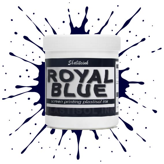
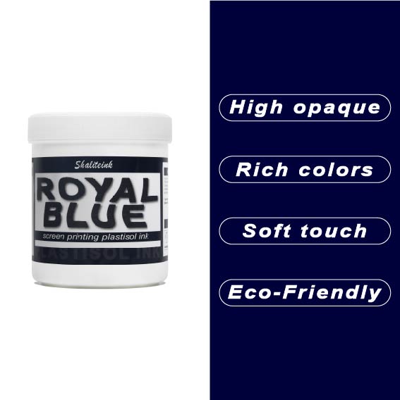
スペシャリスト: 濃い青色のスクリーン印刷用プラスチゾルインクは、濃い色同士のコントラストが重要な用途に最適です。.
-
ディテーラー: 高解像度感光性乳剤を使用することで、深みのある赤色の中間調が鮮明に保たれます。.
7.プロセスについて一言:CMYKとスポットカラーの論争
プラスチゾルCMYKインクについて質問されたら、私はこう答えます。「写真のような仕上がりを求めるならCMYK、ブランドイメージを表現するならスポットインクを選びなさい。」“
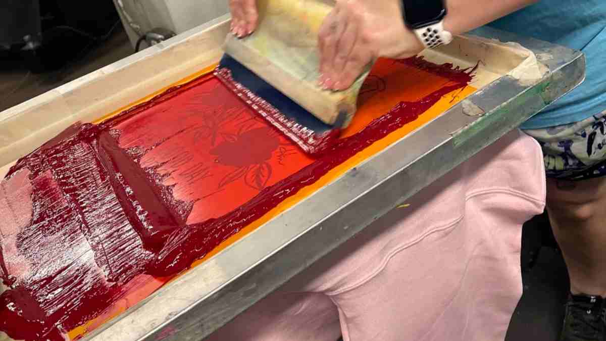
プロセスレッドスクリーン印刷用プラスチゾルインクで深みのある赤色を表現するのは難しいです。しばしばマゼンタが強すぎる仕上がりになってしまいます。真の深みのある赤色を求めるなら、特色として専用のレッドスクリーン印刷用プラスチゾルインクを使用することをお勧めします。お客様のブランドガイドラインにも合致するでしょう。.
8. よくある質問:私の受信箱に溢れている質問
Q1:標準的な赤色に黒色を混ぜて濃い赤色を作ることはできますか?
-
答え: あなた できる, しかし、通常は濁った色になってしまいます。色の鮮やかさを保つには、濃い青色のスクリーン印刷用プラスチゾルインクから始めるか、あらかじめ調合された紫がかった赤色のスクリーン印刷用プラスチゾルインクを購入する方が良いでしょう。.
Q2:赤いインクは乾いた後も「ベタベタ」とした感触がするのはなぜですか?
-
答え: それはおそらく「過硬化」または「ポリエステル混紡」でしょう。混紡素材の衣類の場合、ポリエステル染料が気化している可能性があります。これを防ぐには、低温で硬化するNBプリントインクラインが必要です。.
Q3:濃い赤色で「ヴィンテージ」な雰囲気を出すにはどうすればいいですか?
-
答え: 簡単です。メッシュ数の多い(230以上)生地を使用し、PVCフリーのプラスチゾルインク(赤)に「ソフトハンド」ベースを塗布してください。そうすることで、シャツの質感が透けて見えます。.
Q4:「PVCフリー」は「水性」と同じですか?
-
答え: いいえ。PVCフリーのプラスチゾルインクもプラスチゾルインクの一種です。水性インクのようにスクリーン上で乾燥することはありませんが、従来のプラスチゾルインクに含まれる有害な化学物質は含まれていません。.
Q5:真っ赤に染まった後の最適な清掃方法は?
-
答え: 赤色顔料は腐食性が高いので、専用のスクリーン洗浄液を使用し、拭き取り時に破損しない高品質の感光乳剤(メーカー承認済み)ステンシルを使用していることを確認してください。.
最後に:赤を恐れるな
スクリーン印刷は、化学的なプロセスであると同時に、芸術的な側面も持ち合わせています。高級感を出すためにゴールドのスクリーン印刷用プラスチゾルインクを使用する場合でも、標準的なブラックのスクリーン印刷用プラスチゾルインクを使用する場合でも、重要なのは一貫性です。.
深紅は必ずしも敵ではありません。 スクリーン印刷用インクの卸売 パートナーと少しの技術的な知識があれば、上質なボルドーワインのように深みと豊かさのあるプリントを生み出すことができます。.
さあ、スクイージーにインクをつけてください。.
| サイズ |
8オンス ,16オンス ,32オンス |
|---|
Deep Red Screen Printing Plastisol Ink に対するレビュー5件
フィルターをクリア以前にこの商品を購入したことのあるログイン済みのユーザーのみレビューを残すことができます。
関連商品
酸性ブルースクリーン印刷プラスチゾルインク
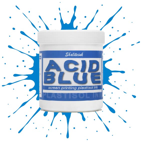
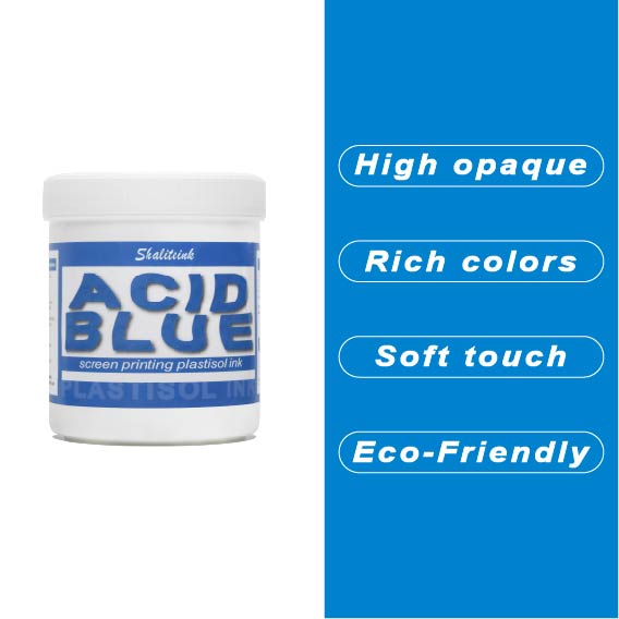
生地に触れた瞬間に消えてしまうような、平坦で濁った青色で妥協するのはもうやめましょう。 酸性ブルースクリーン印刷プラスチゾルインク この製品は、人目を引くような、インパクトのある仕上がりを求める印刷業者向けに開発されました。クリーミーで高濃度の顔料配合により、メッシュをスムーズに通過し、スクリーン内部ではなくスクリーン上で湿った状態を保つため、ステンシルが詰まる心配なく、休憩を取ることができます。.
細かいディテールを狙って230メッシュの細密な紙に通す場合でも、パーカーに大胆な110メッシュのブロックプリントを施す場合でも、このインクはプロ仕様の不透明度とバターのように滑らかな手触りを実現します。乾燥機や洗濯機にも耐え、ひび割れや剥がれのない、まさに「秘密兵器」のようなインクです。洗濯を繰り返しても鮮やかなブルーが色褪せない、ストリートウェアのスタイルをワンランクアップさせたいなら、まさにこれです。.
明るい青色のスクリーン印刷プラスチゾルインク
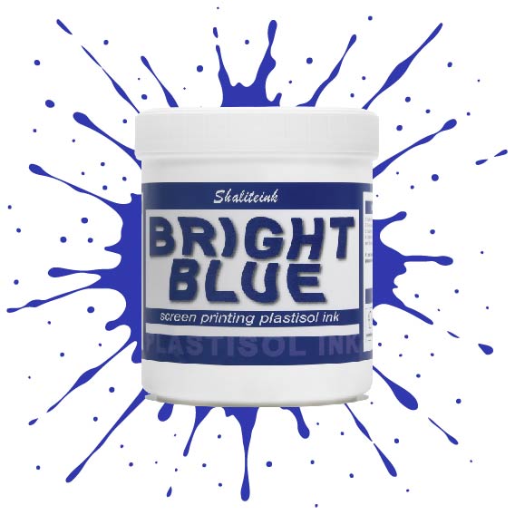
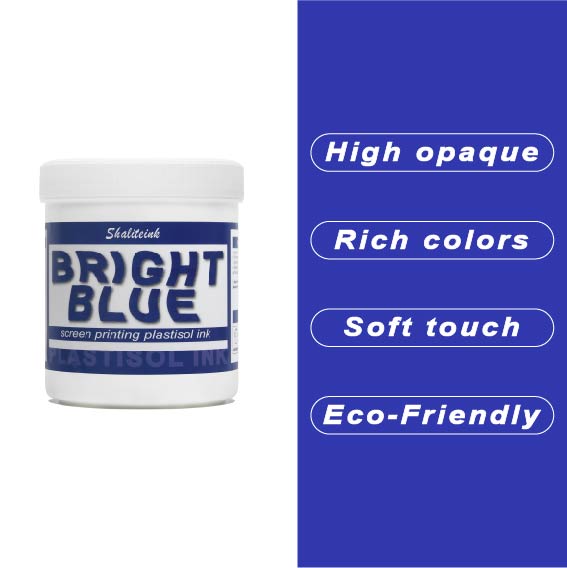
オフィスカーペットのようなくすんだ青色で妥協するのはもうやめましょう。Shaliteinkのブライトブルー・プラスチゾルインクを使えば、シャツに地中海の夏の空のような鮮やかな色合いを与えることができます。まるで上質なベシャメルソースのように滑らかに伸び、プリントが終われば使い込んだ革ブーツのように丈夫です。このインクは作業中にスクリーン上で乾くことがないので、焦らずにじっくりと作品作りに集中できます。.
ご自宅のスタジオや小規模な店舗でプリントされる方が多いことを考慮し、この製品は高い不透明度と環境への配慮を両立させました。「NB」シリーズはフタル酸エステル不使用で、OEKO-TEXなどの世界で最も厳しい安全基準を満たしています。160℃(320°F)で適切に硬化させれば、最初の洗濯後も色落ちしない鮮やかなシャツが完成します。.
ディープブルースクリーン印刷プラスチゾルインク
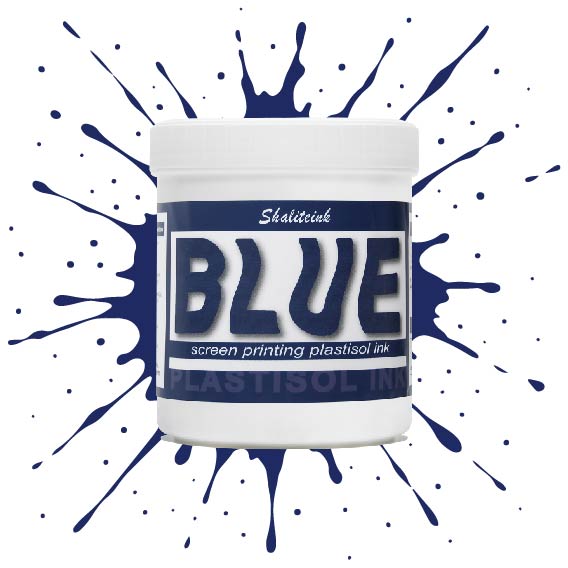
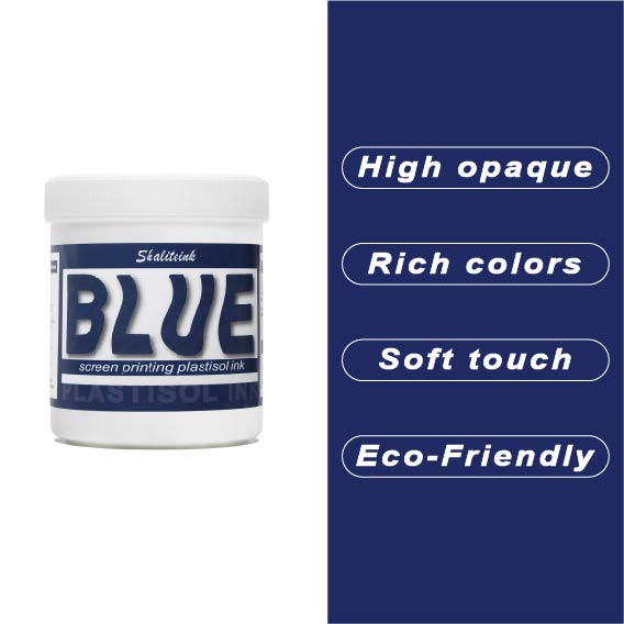
ネオンサインのように派手な青色や、生地の繊維に溶け込んでしまうような青色で妥協するのはもうやめましょう。Shaliteinkのディープブルーは、まさにあの「真夜中の海」のような、洗練された深みのある色合いです。濃いチャコールグレーや黒の衣類にも映える、力強く鮮やかな発色を実現。高い不透明度で、塗った場所にしっかりと定着し、シャープでプロフェッショナルな仕上がりを提供します。まるで高級小売店に並ぶような、洗練された印象を与えるプリントが、趣味のガレージでプリントしたような安っぽさを感じさせません。.
バケツの中のこのインクは、驚くほどクリーミーで、すぐに印刷に使用できます。粘度を調整したので、手動スキージでも自動印刷機でも、メッシュを簡単に通過します。乾燥機で最適な温度である160℃(320°F)に達すると、剥がれたり、ひび割れたり、洗い流されたりしない、非常に強固で柔軟な接着層が形成されます。「まあまあ」な仕上がりに飽き飽きしていて、本当に頼りになるブルーインクをお探しなら、毎日使いたくなるこのインクがきっと見つかるでしょう。.
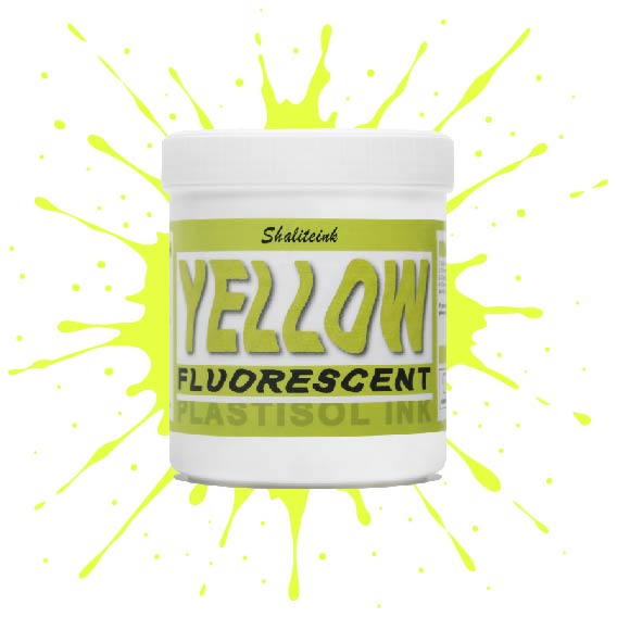
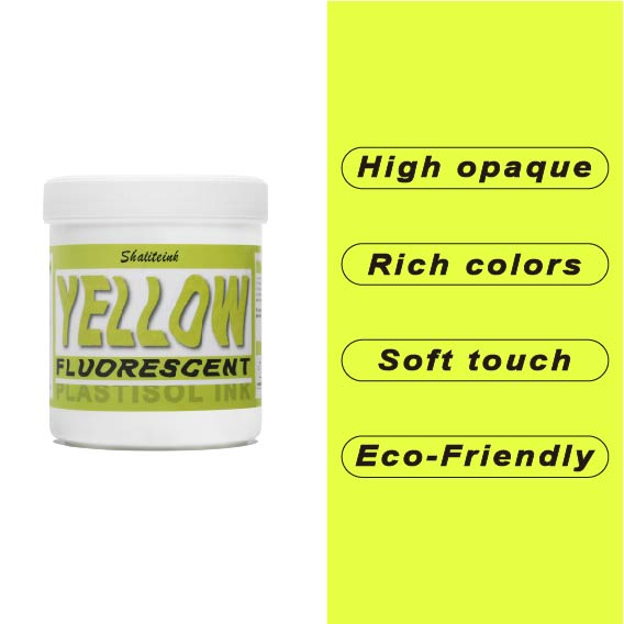
蛍光イエロースクリーン印刷プラスチゾルインク
色あせた蛍光ペンのような「ネオン」インクにうんざりしているなら、この高輝度インクこそ、あなたのショップに必要なものです。当社の蛍光イエローは、ただ明るいだけではありません。目に見えない紫外線を捉え、目を奪うような強烈な発色で、誰も無視できないほどの存在感を放ちます。バターのように滑らかなテクスチャーに仕上げたので、スクイージーと格闘することなく、メッシュをきれいに通過させることができます。.
安全装備でも派手なストリートウェアでも、このインクは塗った場所にしっかりと留まり、色落ちやひび割れを防ぎます。濃厚でクリーミーな質感で生地に完璧に馴染み(最高の仕上がりには白い下地が欠かせません)、有害な化学物質を排除することで作業環境の安全性を確保しました。くすんだ黄色で妥協するのはもうやめて、鮮やかな色でプリントを始めましょう。.
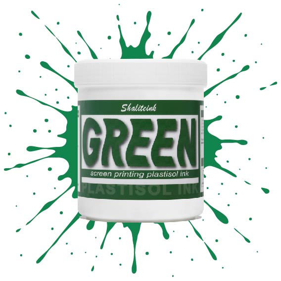
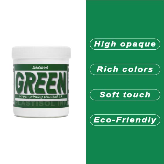
グリーンスクリーン印刷プラスチゾルインク
ガレージで夜遅くまで刺激臭を吸い込んで過ごしていましたが、ついにShaliteinkのグリーンインクで解決しました。昔ながらの有害なインクとは違い、自宅の作業場でも安全に使用でき、有害なPVCも一切含まれていません。鮮やかな発色で、まるで工業作業ではなく、焼きたてのケーキにたっぷりとアイシングを塗っているような感覚です。.
このインクは260°F(約127℃)という低温で硬化するので、電気代の節約になり、シャツが縮んで人形の服のようになってしまうこともありません。濃い色の綿生地にソフトな肌触りでプリントでき、50回以上の洗濯後も鮮やかな色を保ちます。有害なガスに悩まされることなく、自宅のキッチンでプロ仕様のプリント用品を作り始めましょう。.
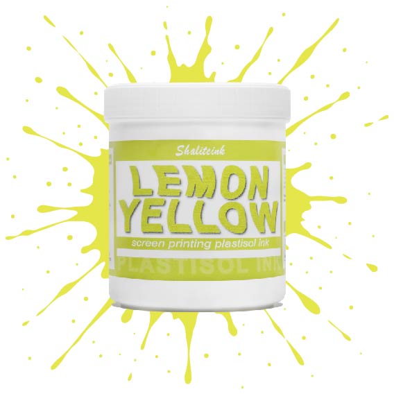
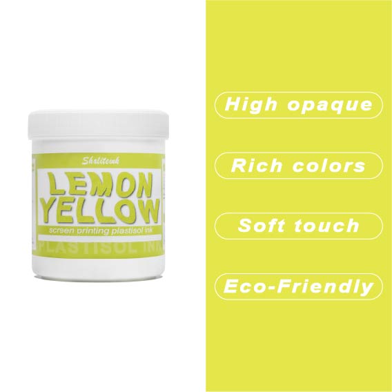
レモンイエロースクリーン印刷プラスチゾルインク
黄色いインクが生地に染み込んで消えてしまったり、暗い色のパーカーの上で透明な汚れのように見えたりした経験があれば、そのイライラはよくわかるでしょう。私たちはこれを実現するために レモンイエロースクリーン印刷プラスチゾルインク まさにその悩みを解決するために開発されました。下地の上に塗れば、鮮やかで力強い仕上がりになる十分な顔料濃度でありながら、目の細かいスクリーンでもスムーズに塗ることができます。遠くからでも目を引くほどの鮮やかさで、何度洗ってもその輝きが持続します。.
このインクが当店で大人気な理由は、にじみにくい処方にある。通常、黄色が不健康な緑色になってしまう厄介なポリエステル混紡素材にとって、まさに救世主だ。胸に分厚いプラスチックシートを貼ったような感触ではなく、柔らかくしなやかなプリントに仕上がる。信頼性の高いプロ仕様のインクが面倒な作業を代行してくれるので、機器と格闘することなく、プリント作業そのものを楽しむことができる。.
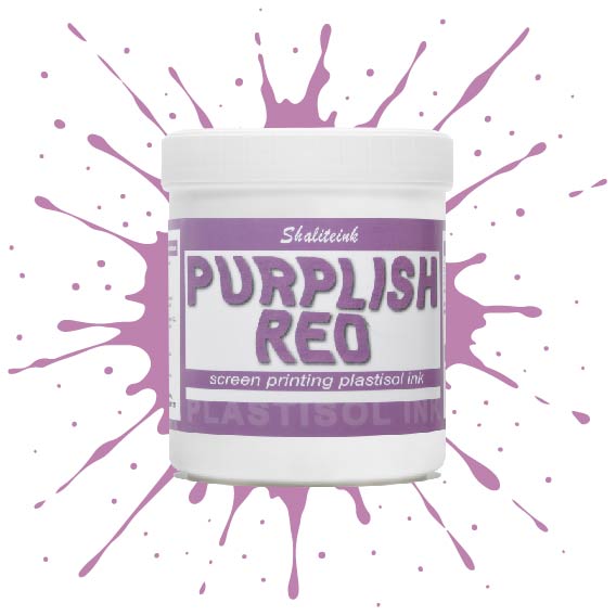
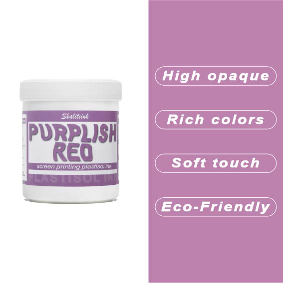
紫がかった赤のスクリーン印刷プラスチゾルインク
暗い色の衣類にプリントするとすぐに色が消えてしまう、つまらない赤色で妥協するのはもうやめましょう。当社のパープルレッド・スクリーン印刷用プラスチゾルインクは、高貴なバイオレットとエネルギッシュなクリムゾンの中間に位置する、深みのある魅力的な色合いです。それでいて、Tシャツをプラスチックの盾のように硬くすることなく、柔らかな手触りを保ちます。言葉にせずとも「高級感」をデザインに表現したい印刷業者にとって、まさに秘密兵器となるでしょう。.
このプロ仕様のインクは、画面上で何時間も乾きにくく、時間を気にすることなく作品制作に集中できます。高不透明で無毒性のブレンドで、厚手のコットンパーカーから軽量の合成繊維Tシャツまで、あらゆる素材に鮮やかな発色を実現します。Shaliteinkは洗濯や着用にも耐えるように設計されていますが、何よりも、ありきたりな原色ばかりの世界で、あなたの個性を際立たせるために開発されました。.
黄色のスクリーン印刷プラスチゾルインク
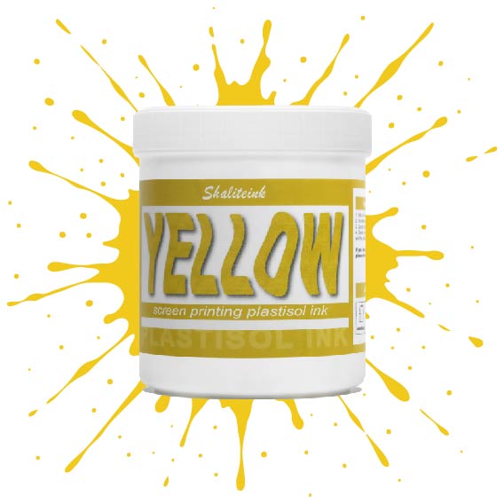
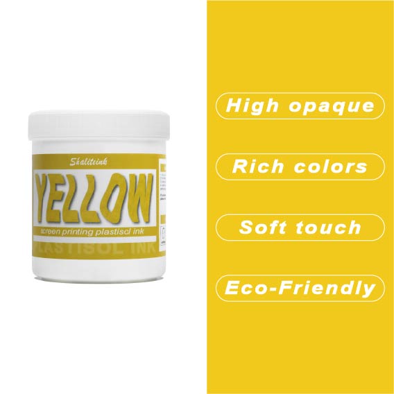
太陽の光のような鮮やかなプリントを目指しているのに、「沼のような緑」のプリントで妥協するのはもうやめましょう。黄色はインク棚の女王様です。本来半透明で、濃い色の生地にプリントすると濁ったり弱々しく見えたりすることが非常に難しいことで知られています。だからこそ、シャライトインクは顔料を豊富に含んだイエロープラスチゾルを開発しました。白い下地の上に完璧に定着するように特別に設計されており、遠くからでもはっきりと見えるほど鮮やかで、乾燥機にかけた後も明るさが持続します。.
鮮やかでエネルギッシュなレモンイエロー、あるいは温かみのあるバーシティジャケットのようなゴールデンイエロー、どちらの色をお探しでも、このインクはバターのように滑らかで、プリント中にメッシュが乾くこともありません。薄くムラのある仕上がりになるよう配合を調整し、クリーミーな質感を実現。プリントするたびに満足感を得られます。数回の洗濯後もひび割れたり色褪せたりしない、すぐに店頭に並べられるシャツをお求めなら、このイエローこそ、あなたのスクイージーが待ち望んでいた色です。.
 EN
EN  DE
DE  ES
ES  PT
PT  JA
JA
エマ・フィリップス –
品質は最高で、配送も迅速でした。スムーズなアプリケーションと信頼性の高いパフォーマンス。日々の作業に非常に役立っています。ほとんどの場合、期待を上回っています。日々の作業に非常に役立っています。ほとんどの場合、期待を上回っています。日々の作業に非常に役立っています。期待を上回っています。
ダニエル・ウィルソン –
日々の作業に非常に役立っています。スムーズな操作性と信頼性の高いパフォーマンス。非常に価値があります。
ケビン・ターナー –
スムーズな塗布と信頼性の高いパフォーマンス。スムーズな塗布と信頼性の高いパフォーマンス。使いやすく、安定した結果。ほとんどの場合、期待を上回りました。使いやすく、安定した結果。使いやすく、安定した結果。使いやすく、安定した結果。品質は高級感があり、
ヤン・コワルスキー –
プゼクロチウォ・モジェ・オチェキワニア。.
ブライアン・クーパー –
お金に見合った価値が大いにあります。.