
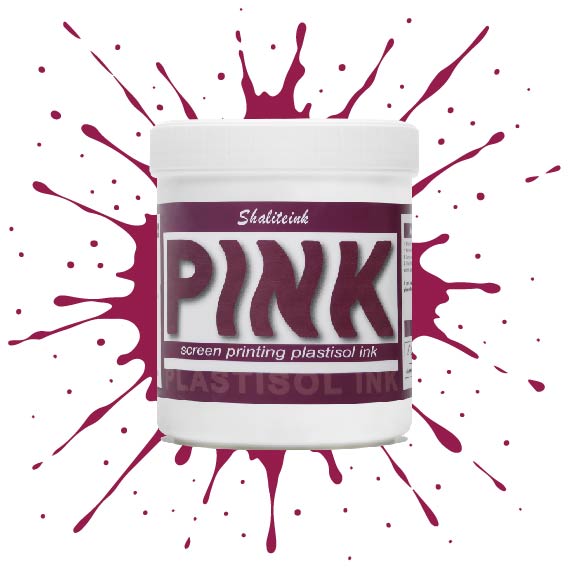
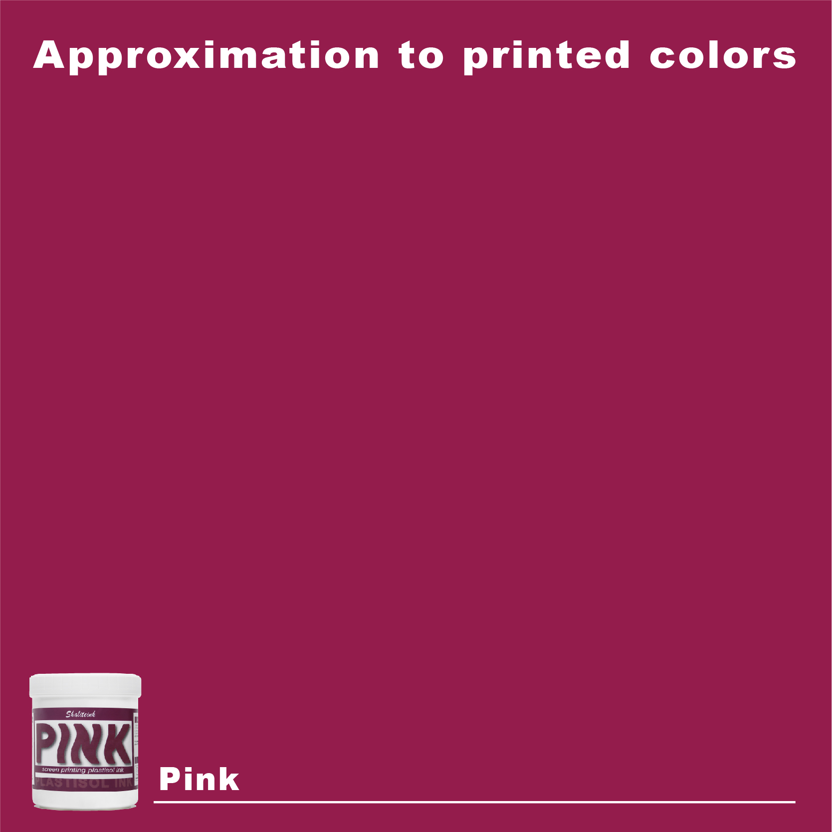
ピンクスクリーン印刷プラスチゾルインク
価格帯: $17.98 – $32.97
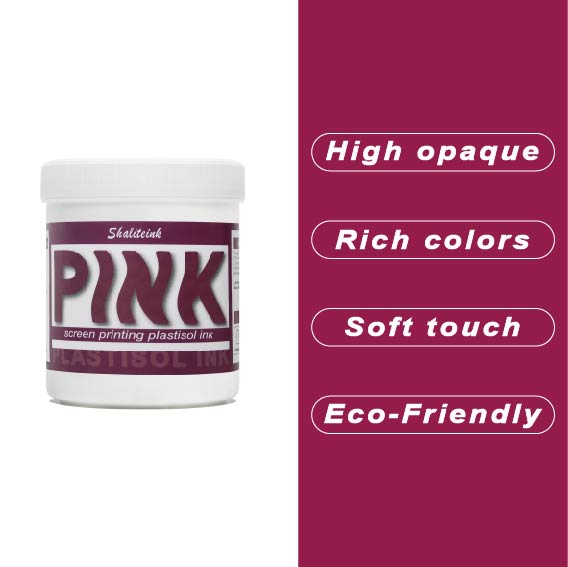
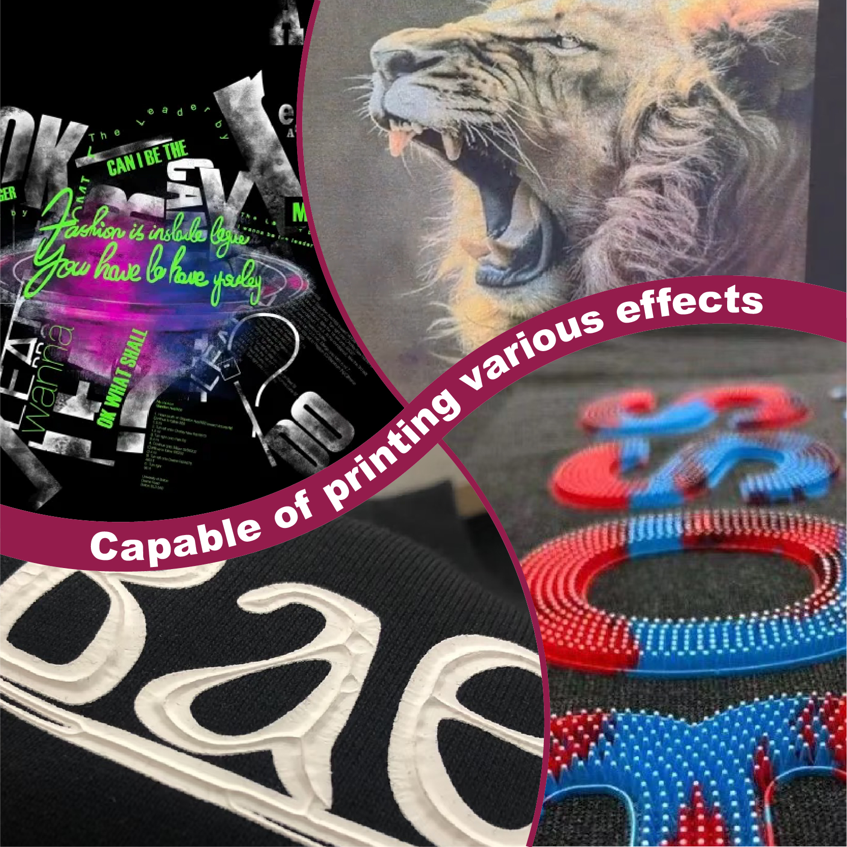
濃い色の生地に「あざ」のように見えるピンクで妥協するのはもうやめましょう。Shaliteinkのピンクプラスチゾルは、鮮やかで長持ちする発色を求める印刷業者にとって最適な高彩度インクです。超高密度顔料配合で設計されたこのインクは、濃い色の衣類染料にも負けず、繊維の上にしっかりと定着し、鮮やかで高級感のある仕上がりを実現します。バケツから出した直後はクリーミーな質感で、スクリーン上ではほぼ永久に色褪せることなく、休憩中にメッシュ内で乾燥することもありません。スキージを引くたびに、鮮やかで目を引く色合いをお楽しみいただけます。.
長期間の使用を想定して開発された当社のフタル酸エステル不使用のフォーミュラは、320°Fで「防弾」フィルムに融合し、デザインがひび割れたり色褪せたりすることなく、50回以上の洗濯サイクルに耐えることを保証します。丈夫なストリートウェアでも、柔らかなコットン混紡素材でも、Shaliteinkは、硬くて「凍ったヨガマット」のような感触なしに、必要なプロ仕様の不透明度を提供します。ただシャツをプリントするのではなく、ついに思い通りのピンク色になったShaliteinkで、お客様にあなたの職人技に夢中になる理由を与えましょう。.
ピンク革命:スクリーン印刷ビジネスに最適なピンクのプラスチゾルインクが必要な理由
ベテランの印刷業者なら誰でも、とっておきの体験談を持っている。私の場合はたいてい、質の悪いインク1ガロンと、カフェインを摂取したスズメバチのように気性の荒いクライアントの話だ。この業界で20年も働いているが、濃い色のフリースにネオンピンクを印刷してほしいという依頼ほど、私を不安にさせるものはない。誰もが経験したことがあるだろう、インクが自分に反抗してくるというあの嫌な予感。ピンクは、素人が下手くそに見えることで悪名高い。不透明なレイヤーに注意を払わないと、プロの作品ではなく、濡れた歩道にイチゴミルクをこぼしたようなプリントになってしまう。しかし、最終的にその彩度を完璧に仕上げるとどうなるか?交通を止めて、見知らぬ人に「一体どこでそのシャツを買ったの?」と叫ばせるような、電光石火のような色合いに変わるのだ。“
今日は、汚れたカーテンを剥がして ピンクスクリーン印刷プラスチゾルインク. この特定の色合いが印刷業界で揺るぎない王者である理由と、それを使って顧客をあなたの職人技に夢中にさせる方法を深く掘り下げていきます。過去にピンクを試した際に、水彩画のような不透明度に苦労したり、印刷物が凍ったヨガマットのように硬く感じたりした経験があるなら、このガイドが救世主となるでしょう。.
私のデザインがまるで痣のように見えた日
駆け出しの頃、世間知らずだった私は、インクは基本的に同じ化学物質を違う容器に入れただけだと信じていました。一番安いインクを探し回って、自分は金銭感覚に優れていると思い込んでいました。しかし、現実を突きつけられました。地元の競技ダンススクールからの高額な注文があった時のことを覚えています。濃い紺色のシャツに、鮮やかなネオンピンクのインクを使いたいという依頼でした。下地を塗らずに直接生地に印刷したところ、ピンクは色褪せるどころか、完全に消えてしまいました。紺色の背景には、まるで巨人の腕にできたあざのようで、泥のような紫色で、正直言って恥ずかしいものでした。.
あの失敗は、私にとって必要な高い教訓だった。 プラスチゾルインク これは、お金持ちの店のための贅沢品というだけではなく、評判を気にする人にとって基本的な生存ツールです。 シャライトインク プラスチゾルインク, 顔料の含有量が非常に高いため、衣服の色とぶつかり合うほどです。.
これは一体何なのか?(プラスチゾル対世界)
この業界に足を踏み入れたばかりの方は、なぜプラスチゾルが水性インクに比べて最高水準なのか、首をかしげるかもしれません。プラスチゾルは「一度設定したらあとは放っておける」インクだと考えてください。サンドイッチを買いに出かけている間にスクリーン上で固まってしまうこともなく、実際に熱を加えるまでは美しいクリーミーな状態を保ちます。.
永久結合の物理学
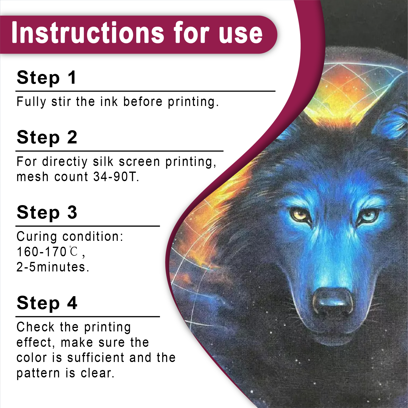
その核心は、, プラスチゾルインクサプライヤー 製品はPVC樹脂と可塑剤の混合物です。基本的には液体プラスチックです。乾燥機を約320°F(160°C)まで上げると、化学反応が起こります。この2つの成分が溶けて融合し、1つの破壊不可能なフィルムになります。これが、プリントの優れたシャツが過酷な洗濯機で50回洗っても新品のように見える秘密です。環境意識の高い方々のために、私たちは今、 PVCフリープラスチゾルインク 化学物質を使わずに、同じ「防弾」級の耐久性を実現している。.
ピンク・サクセスの「3つの柱」
-
画面上での乾燥は一切なし一晩放置しても(お勧めはしませんが)、明日には網目から出てくるでしょう。.
-
表面優位性糸に染み込むことを拒み、まるで誇り高く力強い盾のように、糸の上に鎮座している。.
-
普遍的なファブリック愛綿100%でも、頑固なポリエステル混紡でも、しっかりくっつきます。.
「ポップ」を実現するには:なぜほとんどのプリンターはピンク色の印刷に失敗するのか
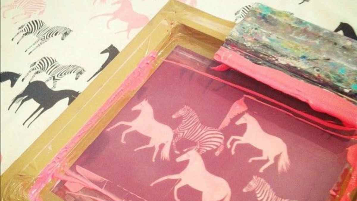
シルクスクリーン印刷における最大の失敗は「フィブリル化」です。これは、シャツの細かい毛羽がインクを通してまるで無精髭のように突き出てしまう現象を指す業界用語です。ピンク色がぼやけて色あせ、安っぽく見えてしまいます。「高級ブティックで買った」ような、くっきりとした仕上がりを求めるなら、基本の手順をきちんと守る必要があります。.
アンダーベース:怠けるな
下地なしで暗い生地にピンクをプリントするのは、蛍光ペンで黒い壁に黄色い太陽を描こうとするようなものです。うまくいきません。下地が必要です。滑らかで薄い層を塗ります。 ホワイトスクリーン印刷プラスチゾルインク まず、表面が固まるまで軽く光を当て、その上にピンク色の絵の具を垂らします。すると、ピンク色が暗い生地に埋もれることなく、鮮やかに輝き始めます。.
スクイージーの極意:圧力は嘘だ
初心者がインクをシャツの奥深くまで押し込もうとしているのをよく見かけますが、それはやめましょう。インクは表面を横切るように塗るのがポイントです。私は通常、刃を75度の急角度に傾け、硬めのスキージを選びます。この角度にすることで、インクが白いベースの上にきれいに留まり、ピンク色が濁ったり、泥のような色になったりするのを防ぐことができます。.
スペクトルを探求する:ネオンからパステルまで
ピンク色もすべて同じではありません。荒々しいパンクロックバンドの印刷物なのか、それとも柔らかなベビーシャワーの印刷物なのかによって、インクの選択はプロジェクト全体の成否を左右する重要な要素となります。.
-
旗手:こちらは、汎用性の高い、普段使いにぴったりのピンクです。ブランディングや認知度向上キャンペーンに最適な、間違いのない選択肢です。こちらからご購入いただけます。 ピンク スクリーン印刷プラスチゾルインク.
-
「私を見て」ネオン: 蛍光ピンクスクリーン印刷プラスチゾルインク 注目を集めるのが大好きなアイテムです。紫外線ライトの下では、まるで振動するかのように明るく輝きます。80年代風のレトログッズを作るなら、これ以外に選択肢はありません。.
-
大人のピンク: 濃いマゼンタやローズトーンは、標準的なピンクにはない洗練された雰囲気を加えます。 ローズレッドスクリーン印刷プラスチゾルインク 高級な花柄やストリートウェアのデザインにおける秘密兵器です。.
ピンクを完璧に仕上げるための私個人の「チートシート」
測定できないものは管理できません。私の工房では、一貫性は偶然の産物ではなく、厳格なルーティンの結果です。ここに、私が印刷機に貼り付けているデータを示します。.
表1:ピンクプラスチゾルのプロレベル設定
| 成分 | 「黄金の」舞台 | その背後にある論理 |
| メッシュ数 | 110(厚手)~160(細密) | 濃いピンク色の顔料が通過できるだけの十分な「穴」が必要です。. |
| スクイージー硬度計 | 70/90/70(トリプルスレット) | 中央の硬い部分と柔軟な縁が、インクをスクリーンからきれいに切り離すので、押しつぶす必要はありません。. |
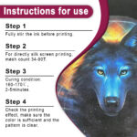
| 硬化温度 | 320°F (160°C) | これは神聖な戒律のように扱ってください。弱火にすると割れてしまいます。焼きすぎると焦げて台無しになります。. |
| フラッシュ温度 | 220°F (105°C) | 揚げ物ではなく、さっぱりとした仕上がりを求めているんです。. |
| 乳剤 | デュアルキュアエマルジョン | プラスチゾル溶剤をものともせず、試合終了のホイッスルが鳴るまで、刃の切れ味を鋭く保ちます。. |
グリーンシフト:あなたの店は安全ですか?
私たちのビジネスの環境負荷について、いつも質問攻めにされます。お客様は賢くなってきており、自分の肌に触れるものが何なのかを知りたがっています。だからこそ、私は仕事量の大部分を 環境に優しいスクリーン印刷インク.
使用する際 フタル酸エステル不使用のプラスチゾルインク, これは単に地球環境に「優しい」だけでなく、自社のビジネスを守ることにもつながります。ベビー服や高級小売ブランドなど、厳格な安全認証を必要とする契約にも入札できるようになります。報道の場では少し違和感があるかもしれませんが、得られる安心感は投資に見合う価値があります。.
トラブルシューティング:ピンク色がうまく表示されない理由
状況が悪化しているなら、深呼吸しましょう。まだスクイージーを壁に投げつけるのは早計です。.
-
「オレンジ」の焦げ跡乾燥後にピンク色が夕焼けのような色になる場合は、乾燥機の温度が高すぎるか、ベルトの回転速度が遅すぎます。熱によって顔料が文字通り加熱されてしまっています。乾燥速度を上げてください。.
-
「毛深い」プリント繊維が突き出ている場合は、インクが濃すぎるか、メッシュが粗すぎる可能性があります。インクが柔らかいバター状になるまでかき混ぜてください。.
-
ゴースティングとブリーディング: 100%ポリエステルでは、生地の染料がピンク色に「移行」する可能性があります。 反移民スクリーン印刷インク 障壁として。それは、あなたの色を守るファイアウォールのようなものです。.

事例研究:ピンクがストリートウェアブランドを救った方法
昨年、ある地元のスタートアップ企業が資金繰りに苦しんでいるところを相談に来ました。彼らは他社から安価なインクを購入していたため、「ホットピンク」のロゴが3回洗濯しただけで色落ちしてしまったのです。顧客からは酷評が寄せられ、企業の評判は地に落ちていました。.
古い在庫を処分して、 シャライトインク プラスチゾルインク. 重厚感のある「防弾」のような感触を出すために110メッシュに変更し、乾燥機の温度を完璧な320°Fに設定しました。その結果、プリントは柔らかい感触でありながら、生地に融合した高精細アート作品のように見えました。ギアは非常に高級感があり、価格は問題になりませんでした。人々は、触れた瞬間に「高級品」だとわかる品質にはお金を惜しみません。品質がようやく実現したため、2か月以内に売上は20%増加しました。.
よくある質問(FAQ)5選
1. ピンクを他の色と混ぜても大丈夫ですか?
もちろん。ベースとして扱います。 ホワイトプラスチゾル 柔らかいパステルカラーにしたり、 プロセスレッド 力強く混ぜるんだ。まるで命がかかっているかのようにかき混ぜろ。.
2. 色落ちせずに「ソフトハンド」な感触を得るにはどうすればよいですか?
「硬化性希釈剤」を加えることができます。インクを薄めることで、生地の中でインクが呼吸できるようになります。ただし、鮮やかさと快適さを両立させることを忘れてはいけません。これは大きな妥協点です。インクが薄ければ薄いほど、ピンクの発色は弱くなります。.
3. ナイロンへの印刷は本当にそんなに難しいのでしょうか?
ナイロンに印刷するのは、油でベタベタしたフライパンにペンキを塗るようなものだ。普通のプラスチゾルインクは、冷えるとすぐに安物のステッカーのように剥がれてしまう。インクに触媒を混ぜて、繊維にしっかりと定着させなければならないのだ。.
4. このインクはバケツの中で期限切れになるのでしょうか?
そのバケツを密閉して日光の当たらない場所に保管すれば、車よりも長持ちします。プラスチゾルは事実上不滅です。私は埃まみれの容器を蘇らせてきました。 シャリテインク 3年前の作品だが、5分間の力仕事でまるで絹のように滑らかに印刷できた。.
5. ピンク色の生地が最初の洗濯後にひび割れてしまうのはなぜですか?
理由は簡単です。硬化が不十分なのです。インク層の中心部が華氏320度(摂氏160度)に達していません。触ると乾いているように感じるかもしれませんが、化学的にはまだ「湿っている」状態です。ドーナツ型の温度計をオーブンに差し込んで、その真偽を確認してみてください。.
最後に一言:平凡で満足するな
ピンクはあなたのショップにとっての悪者ではありません。それは現代のストリートウェアの活気に満ちた魂であり、エネルギー、反逆、そしてハイファッションの色です。 標準プラスチゾルスクリーン印刷インク または遊ぶ 特撮, 違いは、あなたがそのプロセスにどれだけこだわるかにある。.
素晴らしい成果を上げるためのツールを持っているのに、「まあまあ」で満足するのはやめましょう。現在のサプライヤーが期待に応えてくれない場合は、 スクリーン印刷用インクショップ そして、実際の顔料の含有量がどのようなものか見てみましょう。印刷機が待っています。さあ、人々の目を引く作品を作りましょう。.
| サイズ |
8オンス ,16オンス ,32オンス |
|---|
Pink Screen Printing Plastisol Ink に対するレビュー12件
フィルターをクリア以前にこの商品を購入したことのあるログイン済みのユーザーのみレビューを残すことができます。
関連商品
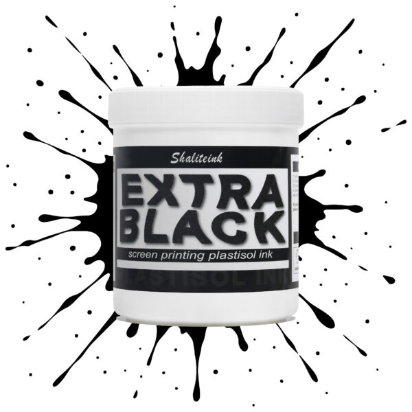
エクストラブラックスクリーン印刷プラスチゾルインク
お客様が真夜中のような濃さを求めているのに、「チャコールグレー」で妥協するのはもうやめましょう。Shaliteinkのエクストラブラックは、単なる濃いインクではありません。透明感を一筆で完全に消し去るために設計された、高顔料配合の強力なインクです。安価な黒インクは、濃い色の綿に色あせたエスプレッソのように見えることが多いですが、当社のフォーミュラは、見た目と同じくらい手触りの良い、プロフェッショナルなマットな質感で、濃密な「ブラックホール」のような仕上がりを実現します。.
日々の酷使に耐えるように設計されており、細かいメッシュも難なく切断できるほど滑らかでありながら、100回の洗濯後も深みのある色合いを保ちます。しっかりとしたベタ塗りを得るために何度も印刷を繰り返すことにうんざりしているなら、このインクはあなたの印刷機にふさわしいアップグレードです。増量剤もグレーの色調も一切なし。業界で最も深く、最も信頼性の高い黒を実現します。.
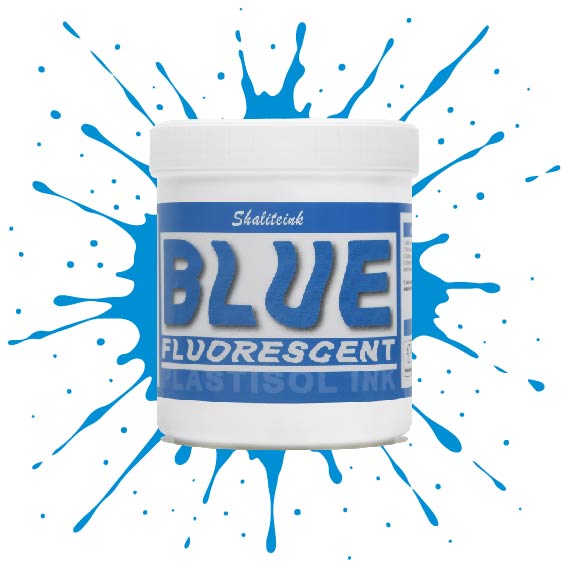
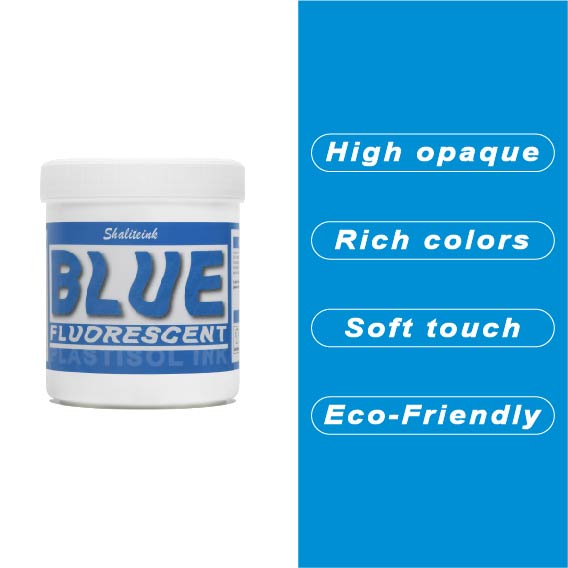
蛍光ブルースクリーン印刷プラスチゾルインク
「やや明るめの」青で満足するのはやめて、あなたのデザインにふさわしい、刺激的なエッジを与えましょう。 蛍光ブループラスチゾルインク まさにボトルに詰められた稲妻――高顔料で紫外線に反応するフォーミュラは、ブラックライトの下では鮮烈な輝きを放ち、明るい日光の下では部屋全体を圧倒します。バケツから出してすぐにバターのように滑らかな書き心地なので、最初のひと塗り前にインクと格闘する必要はもうありません。また、フタル酸エステルを一切使用していないため、どんなクライアントにも安心して印刷できます。.
濃い色の衣類に、目を奪うような鮮やかな発色を実現するには、まずはくっきりとした白い下地を軽く塗るだけで、あとはこのブルーインクにお任せください。厚みのあるジューシーな仕上がりを求めるなら110メッシュ、よりシャープなディテールを求めるなら156メッシュ。どちらのサイズでも、完璧なせん断力で、剥がれたり色褪せたりしない、耐久性に優れたプロフェッショナルな仕上がりになります。ただの印刷業者から、誰もが話題にする印刷会社へとステップアップしたいなら、このインクこそがそれを可能にするのです。.
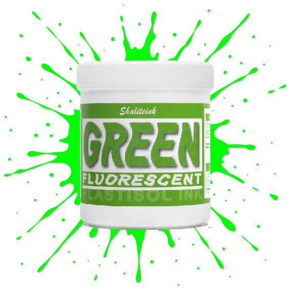
蛍光グリーンスクリーン印刷プラスチゾルインク
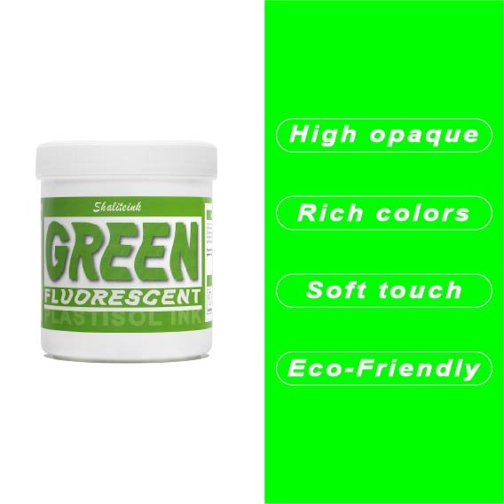
シャリテインク蛍光グリーン:ウェアラブル電気
「安全グリーン」なんて忘れてください。これはまさに物理学の結晶です。当社の蛍光グリーンは、紫外線を捉えて反射するように配合されているため、プリントがまるでコンセントに差し込まれているかのような鮮やかさを実現します。ストリートウェアやイベントグッズに最適な「秘密兵器」です。シャツの上にただ乗っているだけではなく、強烈なインパクトを与えます。顔料の配合量を調整することで、110~156メッシュの紙をきれいにせん断し、ネオンカラー特有の「目詰まり」の悩みを解消し、鮮やかな発色を実現します。.
ネオンカラーの成功は土台作りにかかっています。これをしっかりとした白い下地の上に重ねて、 320°F (160℃洗濯にも強く、ブラックライトの下でも鮮やかな印刷を実現するソリューションです。手動印刷機でも高速自動印刷機でも、Shaliteinkはクリーミーで安定した品質を維持するため、「特殊インク」のプレミアム価格を自信を持って設定できます。ありきたりな印刷はやめて、お客様の目を引く印刷を実現しましょう。.
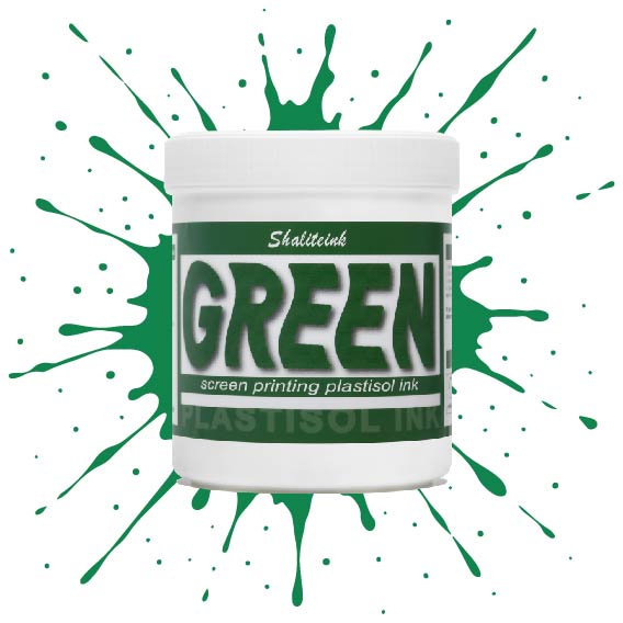
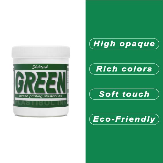
グリーンスクリーン印刷プラスチゾルインク
ガレージで夜遅くまで刺激臭を吸い込んで過ごしていましたが、ついにShaliteinkのグリーンインクで解決しました。昔ながらの有害なインクとは違い、自宅の作業場でも安全に使用でき、有害なPVCも一切含まれていません。鮮やかな発色で、まるで工業作業ではなく、焼きたてのケーキにたっぷりとアイシングを塗っているような感覚です。.
このインクは260°F(約127℃)という低温で硬化するので、電気代の節約になり、シャツが縮んで人形の服のようになってしまうこともありません。濃い色の綿生地にソフトな肌触りでプリントでき、50回以上の洗濯後も鮮やかな色を保ちます。有害なガスに悩まされることなく、自宅のキッチンでプロ仕様のプリント用品を作り始めましょう。.
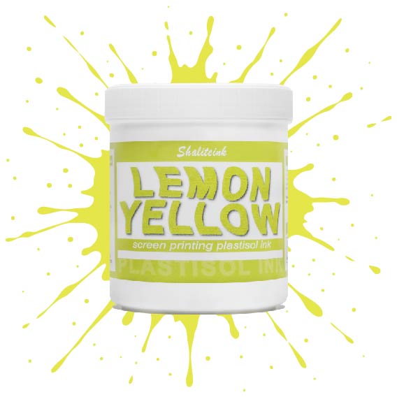
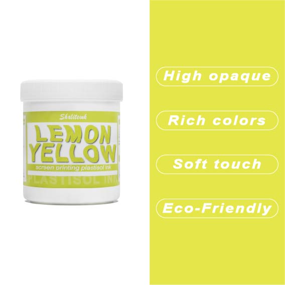
レモンイエロースクリーン印刷プラスチゾルインク
黄色いインクが生地に染み込んで消えてしまったり、暗い色のパーカーの上で透明な汚れのように見えたりした経験があれば、そのイライラはよくわかるでしょう。私たちはこれを実現するために レモンイエロースクリーン印刷プラスチゾルインク まさにその悩みを解決するために開発されました。下地の上に塗れば、鮮やかで力強い仕上がりになる十分な顔料濃度でありながら、目の細かいスクリーンでもスムーズに塗ることができます。遠くからでも目を引くほどの鮮やかさで、何度洗ってもその輝きが持続します。.
このインクが当店で大人気な理由は、にじみにくい処方にある。通常、黄色が不健康な緑色になってしまう厄介なポリエステル混紡素材にとって、まさに救世主だ。胸に分厚いプラスチックシートを貼ったような感触ではなく、柔らかくしなやかなプリントに仕上がる。信頼性の高いプロ仕様のインクが面倒な作業を代行してくれるので、機器と格闘することなく、プリント作業そのものを楽しむことができる。.
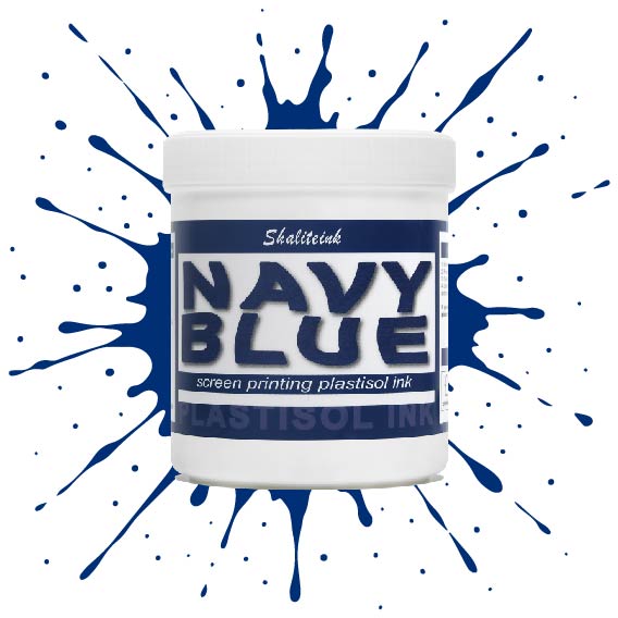
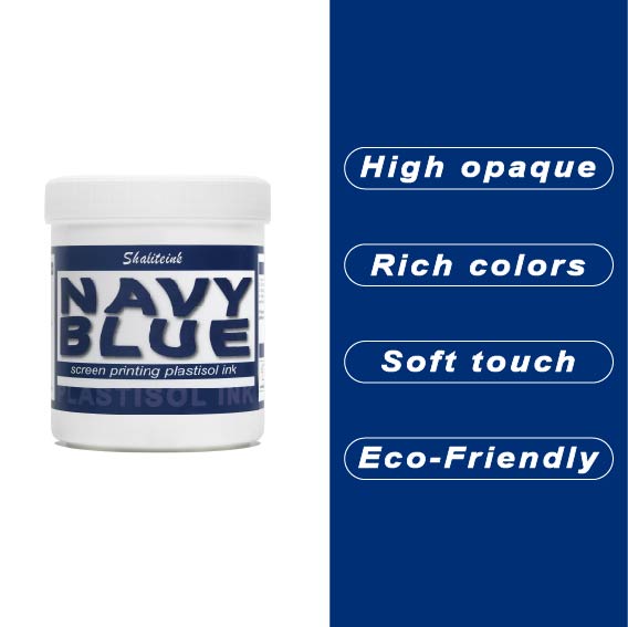
ネイビーブルースクリーン印刷プラスチゾルインク
薄くて水っぽいブルーインクでパーカーを台無しにしてきた経験から、しっかりとしたネイビーブルーインクはなかなか見つからないものだと痛感しています。当社のネイビーブルースクリーン印刷用プラスチゾルインクは、濃い色の生地にも一度でしっかり発色し、スクリーン上でもクリーミーな質感を保つため、まさに本物です。濃い色の衣類にもしっかりと定着するほどの濃さがありながら、メッシュをスムーズにクリアできるほど滑らかです。深みのあるプロフェッショナルなミッドナイトブルーの仕上がりを実現しながら、スクリーンの目詰まりという厄介な問題に悩まされることもありません。.
自社ブランドやカスタムオーダーの印刷では、段ボールのような質感ではなく、しっかりとした仕上がりを求めるものです。通気性と柔軟性に優れたPVCフリーのプラスチゾルインク「ブルー ソフトハンド」をお試しください。乾燥機や洗濯機にも対応し、耐久性にも優れています。この環境に優しいスクリーン印刷インクは無毒で使い方も非常に簡単なので、化学的な知識に気を取られることなく、作品制作に集中できます。もう推測に頼る必要はありません。本当に優れた性能を発揮するネイビーカラーのインクで印刷を始めましょう。.
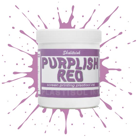
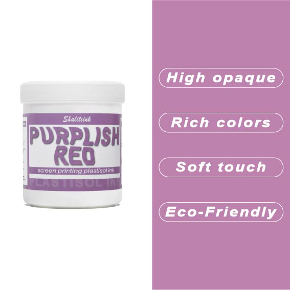
紫がかった赤のスクリーン印刷プラスチゾルインク
暗い色の衣類にプリントするとすぐに色が消えてしまう、つまらない赤色で妥協するのはもうやめましょう。当社のパープルレッド・スクリーン印刷用プラスチゾルインクは、高貴なバイオレットとエネルギッシュなクリムゾンの中間に位置する、深みのある魅力的な色合いです。それでいて、Tシャツをプラスチックの盾のように硬くすることなく、柔らかな手触りを保ちます。言葉にせずとも「高級感」をデザインに表現したい印刷業者にとって、まさに秘密兵器となるでしょう。.
このプロ仕様のインクは、画面上で何時間も乾きにくく、時間を気にすることなく作品制作に集中できます。高不透明で無毒性のブレンドで、厚手のコットンパーカーから軽量の合成繊維Tシャツまで、あらゆる素材に鮮やかな発色を実現します。Shaliteinkは洗濯や着用にも耐えるように設計されていますが、何よりも、ありきたりな原色ばかりの世界で、あなたの個性を際立たせるために開発されました。.
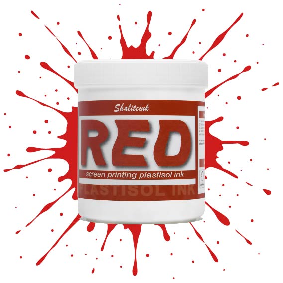
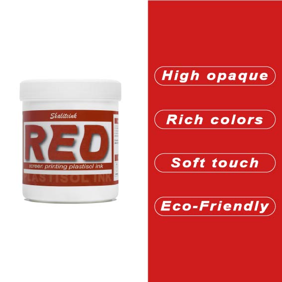
赤色スクリーン印刷プラスチゾルインク
暗いパーカーに色あせたシミのような赤インクで苦労するのはもうやめましょう。インクの芯が弱くて「鮮やかな」赤が濁った茶色になってしまうのを朝から見てきたなら、このインクが必要です。黒生地にも負けない高い不透明度を持ちながら、クリーミーな質感で、長時間プリントしてもムラになりません。もうインク詰まりも、乾燥機の前で慌てふためく必要もありません。鮮やかでパンチのある、まさに期待通りの赤インクです。.
下地を塗る場合でも、綿に直接印刷する場合でも、このプラスチゾルインクは硬化するまでメッシュ上で開いた状態を保ちます。「まあまあ」で満足せず、人目を引く鮮やかな赤色で、洗濯を繰り返しても色落ちしないものを求める印刷業者のために開発されました。水っぽくて薄いインクで時間を無駄にするのはやめて、一度で完璧な赤色を手に入れましょう。.
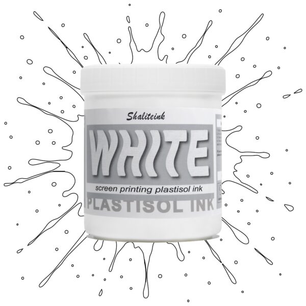
ホワイトスクリーン印刷プラスチゾルインク
生地に溶け込んでしまうような「幽霊のような」白いプリントで妥協するのはもうやめましょう。Shaliteinkのホワイトプラスチゾルインクは、濃色の衣類にしっかりとした不透明度を与えるために開発されました。クリーミーで滑らかな質感でスクリーンに塗布でき、硬いプラスチックというよりはホイップバターのような感触です。そのため、手作業でのプリント作業がスムーズになり、生産性が向上します。たった一度のフラッシュで、鮮やかで明るい白の「ポップ」な仕上がりを実現し、最初の洗濯でインクがひび割れたり色褪せたりする心配もありません。.
週末に趣味でプリントを楽しむ方にも、忙しいショップを経営されている方にも、これはまさにあなたが探し求めていた頼れる相棒です。高発色で、驚くほど簡単に混ぜることができ、数秒で硬化するので、機材の扱いに時間を費やすことなく、実際にプリント作業に集中できます。プロ仕様の性能をバケツに詰め込んだこのインクは、最初のプリントから1000回目のプリントまで、白を鮮やかに保ち、デザインをシャープに仕上げるように設計されています。.
 EN
EN  DE
DE  ES
ES  PT
PT  JA
JA
アンナ・ノワク –
ヴィソカ・ヤコシチ・イ・シュプカ・ドスタワ。プゼクロチウォ・モジェ・オチェキワニア。 Łatwy w użyciu i powtarzalne 結果
ローラ・ワグナー –
Einfache Anwendung und zuverlässige Leistung。 Sehr グーテス Preis‑Leistungs‑Verhältnis。 Sehr グーテス Preis‑Leistungs‑Verhältnis。 Hochwertige Qualität und Schnelle Lieferung。セール・グーテス・プレイス・ライシュトゥングス・ヴァール
ブライアン・クーパー –
使いやすく、安定した結果が得られます。スムーズな塗布と信頼性の高いパフォーマンス。非常にお買い得です。
エマ・フィリップス –
使いやすく、安定した結果が得られます。品質は最高で、配送も迅速でした。日々の作業に非常に役立っています。価格に見合う価値があります。価格に見合う価値があります。価格に見合う価値があります。日々の作業に非常に役立っています。使いやすく、安定した結果が得られます。
ピーター・フィッシャー –
すべての機能を理解しておく必要があります。 Leicht zu Nutzen und konstante Ergebnisse。 Einfache Anwendung und zuverlässige Leistung。 Hochwertige Qualität und Schnelle Lieferung。すべての機能を理解しておく必要があります。.
ピーター・フィッシャー –
すべての機能を理解しておく必要があります。 Leicht zu Nutzen und konstante Ergebnisse。 Einfache Anwendung und zuverlässige Leistung。 Hochwertige Qualität und Schnelle Lieferung。すべての機能を理解しておく必要があります。.
エミリー・デイビス –
期待をはるかに超えた
ローラ・ジョンソン –
品質は高級感があり、配送も迅速でした。日々の作業に非常に役立っています。価格に見合った価値が十分にあります。使いやすく、安定した結果が得られます。
ピーター・フィッシャー –
Hochwertige Qualität und Schnelle Lieferung。 Leicht zu Nutzen und konstante Ergebnisse。アインファッシェ・アンウ
ピオトル・ジエリンスキ –
プシェクロチウォ・モジェ・オチェキワニア。ワトワ・アプリカチャ
ルーカス・ゴメス –
Funciona muito bem no dia a dia.スペロウ・ミーニャス・エクス
アンナ・シュミット –
Leicht zu Nutzen und konstante Ergebnisse。 Sehr グーテス Preis‑Leistungs‑Verhältnis。 Hat meine Erwartungen übertroffen。 Hochwertige Qualität und Schnelle