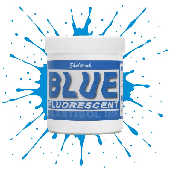
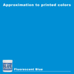
蛍光ブルースクリーン印刷プラスチゾルインク
価格帯: $16.98 – $31.90
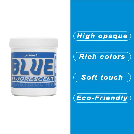
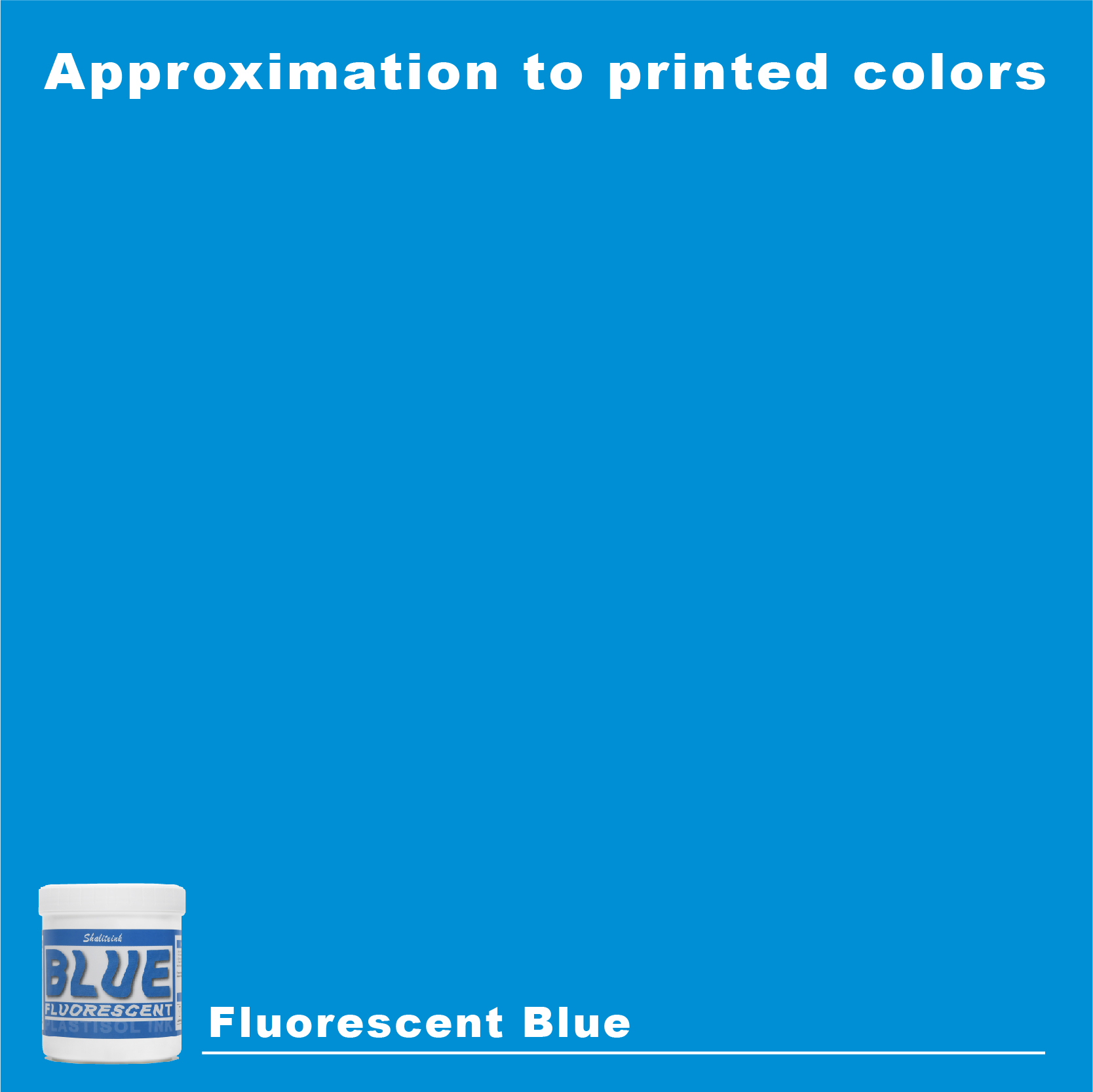
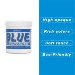
「やや明るめの」青で満足するのはやめて、あなたのデザインにふさわしい、刺激的なエッジを与えましょう。 蛍光ブループラスチゾルインク まさにボトルに詰め込まれた稲妻――高顔料で紫外線に反応するフォーミュラは、ブラックライトの下では鮮烈な輝きを放ち、明るい日光の下では部屋全体を圧倒します。バケツから出してすぐにバターのように滑らかな書き心地なので、最初のひと塗り前にインクと格闘する必要はもうありません。さらに、フタル酸エステルを一切使用していないため、どんなクライアントにも安心して印刷できます。.
濃い色の衣類に、目を奪うような鮮やかな発色を実現するには、まずはくっきりとした白い下地を軽く塗るだけで、あとはこのブルーインクにお任せください。厚みのあるジューシーな仕上がりを求めるなら110メッシュ、よりシャープなディテールを求めるなら156メッシュ。どちらのサイズでも、完璧なせん断力で、剥がれたり色褪せたりしない、耐久性に優れたプロフェッショナルな仕上がりになります。ただの印刷業者から、誰もが話題にする印刷会社へとステップアップしたいなら、このインクこそがそれを可能にするのです。.
「エレクトリックブルー」マニフェスト:退屈なTシャツのプリントをやめて、お金を稼ぎ始める方法
いいかい、友よ。もし君がまだ店に入ってくるTシャツ全てに標準的な紺色をプリントしているなら、君はただの印刷業者じゃない。小惑星の衝突を待つ恐竜みたいなものだ。私は乳剤とパレット接着剤の匂いがする店で何年も過ごしてきたが、一つだけ確かなことがある。市場は変わった。人々はもう「まあまあ」なものを求めていない。視覚的に強烈なインパクトを求めているんだ。.
そこは 蛍光ブルースクリーン印刷プラスチゾルインク 入ってくる。それは スクリーン印刷用インクショップ 高額な料金を請求したいオーナー。.
セットアップに関する「ショップトーク」ガイド
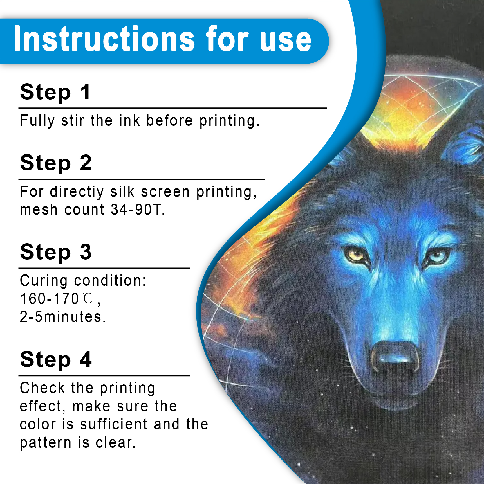
男たちがこれをしょっちゅう間違えているのを見かける。彼らはネオンインクを標準インクのように扱っている。 プラスチゾルインク そして、なぜプリントが色あせた水彩画のように見えるのか不思議に思うのです。化学反応を尊重しなければなりません。実際に「際立つ」結果を得たいときに、私がプレス機をどのようにセットアップするかをご紹介します。“
表1:ネオンブルーの「失敗しない」技術仕様
| 設定 | 私の個人的な基準 | 「何」の背後にある「なぜ」“ |
| メッシュ選択 | 110~156トン/インチ | インクの発色を際立たせたいなら110番のペン先を使い、濃密な顔料濃度を損なわずに細部まで描き込みたいなら156番のペン先を使うと良いでしょう。. |
| スクイージー | ショア硬度70 | インクをしっかり引き抜くだけの強度がありながら、生地に適度なインク層を残せるだけの柔軟性も兼ね備えたものが欲しいのです。. |
| ブレード角度 | 15~20度 | 角度をしっかりつけてください。角度が緩いと輪郭がぼやけてしまい、誰も雑な印刷物には興味がありません。. |
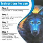
| フラッシュ温度 | 220°F (105°C) | 青色が白い下地と「くっついて」しまわないように、表面に軽く触れる程度で良いのです。. |
| 完全な治療 | 320°F (160°C) | これがゴールです。これを越えなければ、デザインは顧客の洗濯機の底に埋もれてしまうでしょう。. |
| プレッシャー | 羽のように軽い | インクを床板に押し込まないでください。繊維の上に堂々と浮かせておきましょう。. |
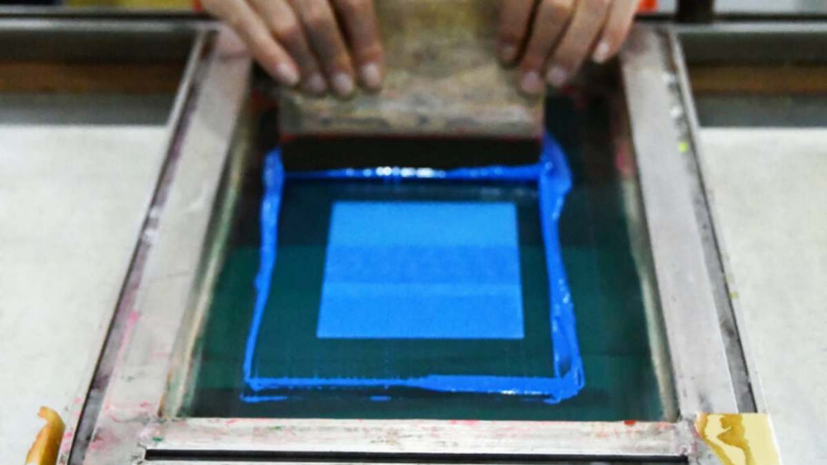
「ミッドナイト・ラッシュ」体験:インクの戦場で過ごす一日
蒸し暑い火曜日の朝、私の携帯電話が鳴り響き始めた。地元のプロモーターがパニック状態だった。彼は金曜日までに地下のネオンレイブ用に500枚のシャツが必要で、「エレクトリック」な見た目にしたいと言っていた。私は定番のロイヤルブルーではなく、新しい1ガロンの シャライトインク プラスチゾルインク.
そのバケツの中の色はあまりにも鮮やかで、思わず涙が出そうになった。まるで瓶詰めの稲妻のようだった。.
110メッシュの糸をプレス機にかけました。 白 PVCフリーNBスクリーン印刷インク 下地を塗って、軽く叩いて、すると魔法が起きたんです。ロゴの細い線をくっきりさせたかったので、青色を156メッシュの紙に通しました。でも、シャツ全体には大量の顔料を沈着させる必要もありました。.
シャツがコンベアから滑り落ち始めたとき、私は乾燥機の表示を鵜呑みにしませんでした。レーザー温度計を取り出して、インクの中心部を測りました。325°F。完璧です。温度を確認しないと、店の評判を賭けたロシアンルーレットをしているようなものです。あなたよりも優れた印刷会社でも、温度が低すぎたシャツのせいで倒産するのを私は見てきました。.
インク供給業者がビジネスパートナーである理由
私も「格安」の絵具に手を出したことがあります。以前、ネットで正体不明の販売者から「お買い得」の青色の絵具を買ったのですが、ひどい目に遭いました。絵具は色付きの水のようにサラサラしていて、顔料は鉛のようにバケツの底に沈殿してしまい、いくら混ぜてもどうにもなりませんでした。.
正規の業者から購入する場合 プラスチゾルインクサプライヤー, つまり、あなたはただバケツに入ったドロドロの液体を買っているのではなく、一貫性を買っているのです。今日私が販売している青色が、お客様が6か月後に再注文に来た時にも全く同じ色合いであることを確認できる必要があります。それが真のブランドを構築する唯一の方法です。.
「キッチンテスト」:実際のプリンターのための真の科学
先月、ちょっとした実験をしてみることにしました。ネオンカラーが標準のものよりどれだけ「魅力的」なのか、正確に知りたかったのです。同じデザインを2つ印刷しました。1つは標準のロイヤルカラーで、もう1つは 蛍光ブルースクリーン印刷プラスチゾルインク.
私はそれらを、考えられる限りのあらゆる照明条件下で試してみた。.
視覚的影響データチャート
-
正午の太陽光: 標準ブルー(6/10)対蛍光ブルー(10/10)。ネオンはまるで独自の電源を持っているかのようだった。.
-
ブラックライトテスト: 標準ブルー(2/10)対蛍光ブルー(桁違い)。ネオンカラーは実際に「光り輝いて」いたのに対し、標準インクはただそこに寂しそうに佇んでいた。.
-
曇り空/どんよりとした日: 蛍光ブルーは高い視認性を維持しており、標準インクは灰色の影のように見えた。.
自分の価値に見合った料金を請求する
購入する場合 スクリーン印刷用インクの卸売, シャツをどれだけ安く売れるか、ということが目標であってはなりません。どれだけ付加価値を提供できるか、ということが目標であるべきです。.
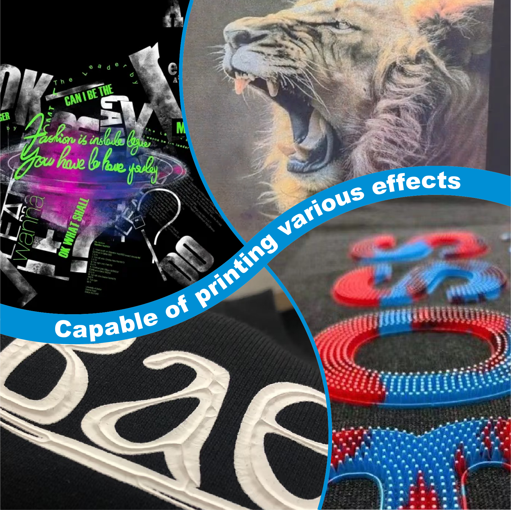
私はクライアントにこう言います。「標準的な青いシャツを渡すと、他の人と同じに見えます。あるいは、これを使うこともできます。」 メタリックスクリーン印刷インク あるいは蛍光ブルーの服を着ていれば、実際に街中で人に呼び止められて「どこで買ったの?」と聞かれるでしょう。”
あれはただのシャツじゃない。歩く広告塔だ。しかも、広告塔には追加料金を払う人もいるんだ。.
表2:収益可能性の比較
| インクの選択 | 印刷難易度 | 付加価値 | 顧客の反応 |
| 標準プラスチゾル | 低い | $0.00 | “「シャツだよ。」” |
| 蛍光ブルー | 中くらい | +$2.50/ユニット | “「わあ、すごく明るい!」” |
| 銀スクリーン印刷インク | 高い | 1ユニットあたり+$4.00 | “「これは高そうだな。」” |
| パフスクリーン印刷インク | 中くらい | 1ユニットあたり+$3.00 | “「この食感が大好き!」” |
印刷業者が実際に尋ねる、核心を突く5つのよくある質問(FAQ)
1. 薄い色のシャツの場合、白い下地を省略できますか?
「ソフト」な仕上がりを求めるなら省略しても構いませんが、そうすべきでしょうか?おそらくそうすべきではありません。淡いアッシュやグレーの衣服でも、最初に白いベースを塗っておけば、青色は20%ほど鮮やかに見えます。その顧客に次の3回も注文してもらいたいなら、80%「まあまあ」バージョンではなく、100%「全力」バージョンを提供しましょう。.
2. この製品は子供用具に使用しても安全ですか?
小さな子供向けに印刷する場合は、化学で遊んでいる場合ではありません。 シャライトインク プラスチゾルインク このラインはフタル酸エステル不使用です。しかし、完全に防弾仕様にしたい場合は、 PVCフリープラスチゾルインク 選択肢があります。それは子供たちにとっても良いですし、あなたの良心にも良いことです。.
3. ポリエステル生地にネオンインクがにじむのはなぜですか?
それはインクのせいではなく、染料の移行です。乾燥機の熱でポリエステル染料が気化し、青色に染み込んでいます。 アンチマイグレーションスクリーン印刷インク(プラスチゾル) 一種の障壁として。指紋を守るための保険のようなものです。.
4. ネオンで「柔らかなタッチ」を出すにはどうすればいいですか?
使用する PVCフリープラスチゾルインク ブルー ソフトハンド. または、硬化性希釈剤を少量加えてください。ただし、入れすぎると透明度が失われてしまうので注意してください。.
5.その「輝き」は消えてしまうのでしょうか?
蛍光効果は顔料の特性によるものです。インクがシャツに付着している限り、紫外線に反応します。ただし、シャツを直射日光に3ヶ月間も当て続けるのは避けてください。通常の顔料であれネオンカラーの顔料であれ、太陽光に完全に耐性のある顔料は存在しません。.
最後に一言:「ワオ!」ビジネス“
印刷は芸術であると同時に、ビジネスでもあることを忘れてはなりません。蛍光ブルーのような色を使わないとしたら、文字通り収益機会を逃していることになります。これは顧客が喜んで割増料金を支払う特別なサービスなのです。.
今日すぐに1ガロン注文しましょう。迷わずに。黒いシャツを用意して、厚めに白い下地を塗り、その上に青いインクを塗ります。それから電気を消してブラックライトを点灯。暗闇の中でデザインが「浮かび上がる」のを見たら、きっと私と同じように夢中になるでしょう。.
結局のところ、私たちの仕事は単に布にインクを付けることではありません。私たちの目標は、縫い目がほつれるまで着続けたいと思えるようなものを作り出すことです。そうした愛着は、高品質のインクと、昔ながらの職人技から生まれるのです。“
さあ、私の長々とした話を読むのはやめて、乾燥機を回してください。あなたには稼がなければならないお金があるんですから。.
| サイズ |
8オンス ,16オンス ,32オンス |
|---|
Fluorescent Blue Screen Printing Plastisol Ink に対するレビュー7件
フィルターをクリア以前にこの商品を購入したことのあるログイン済みのユーザーのみレビューを残すことができます。
関連商品
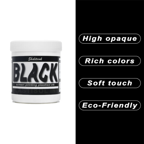
黒スクリーン印刷プラスチゾルインク
「ダークグレー」で満足して、それを黒と呼ぶのはやめましょう。 黒色プラスチゾルインク このインクは、スクリーンを詰まらせ、シャツの仕上がりをくすませる、粘り気のある濃いインクに悩まされている印刷業者向けに開発されました。バターのように滑らかでクリーミーな質感で、高密度のメッシュでもスムーズに印刷でき、しかも一度の印刷で生地の色をしっかり定着させます。100%コットンTシャツでも、扱いの難しい混紡生地でも、このインクは柔軟でマットな「ミッドナイト」カラーに仕上がり、最初の洗濯後もひび割れたり剥がれたりしません。お客様が期待する、プロ仕様の高品質なブラックです。.
安全性は必ずしも性能を犠牲にすることを意味するわけではありません。当社のフォーミュラはフタル酸エステルを一切使用していません( PVCフリーのオプション (入手可能)なので、化学薬品のトラブルを気にすることなく、高級ブランドの印刷が可能です。発色が良く、スクリーン上でインクが定着しやすく、インクの蓄積も少なく、鮮明なディテールを維持します。印刷作業の効率化と、まるでブティックで作られたような仕上がりを実現する、頼りになるインクをお探しなら、このインクを印刷機に常備しておくのがおすすめです。.
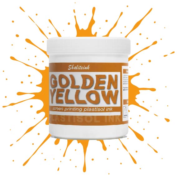
深みのあるゴールデンイエローのスクリーン印刷用プラスチゾルインク
安っぽく見えて色落ちする「安全ベスト」のような黄色で妥協するのはやめましょう。 濃い黄金色のプラスチゾルインク 太陽の光を浴びたような、豊かで温かみのある色合いをデザインにもたらし、最初の洗濯後も鮮やかな色合いが長持ちする、高級感あふれるバーシティスタイルを実現します。高い不透明度と、まるでバターのように滑らかで、手首に負担をかけずにメッシュの上を滑らせるほどの滑らかさを持ちながら、濃い色の生地にもしっかりと密着する適度な厚みを兼ね備えた、まさに理想的なインクです。.
丈夫なパーカーから繊細なストリートウェアまで、どんな素材にも使えるこのインクは、スクリーン上では濡れた状態を保ち、作業性も抜群ですが、320°F(約160℃)に達すると、耐久性に優れたプロ仕様の仕上がりへと変化します。見た目だけでなく着心地も優れたプレミアムアパレルを生産するために必要な、安定した品質のフタル酸エステル不使用の頼れるインクです。「ピーナッツバター」のような質感や、くすんだプリントとはもうおさらば。印刷機に、純粋な液体の黄金をお届けします。.
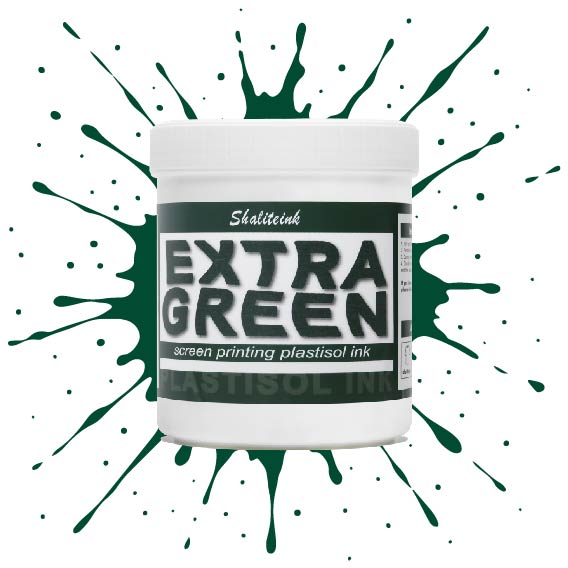
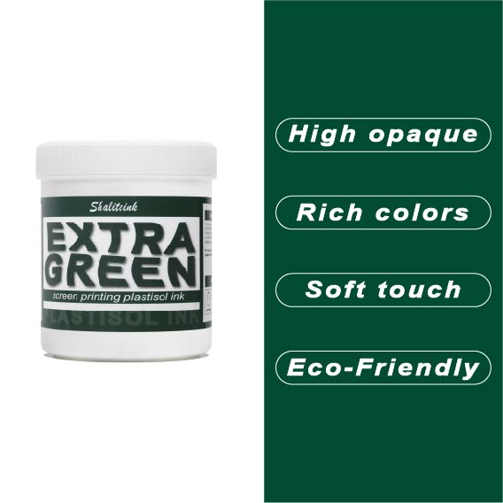
エクストラグリーンスクリーン印刷プラスチゾルインク
生地に溶け込んでしまう緑色や、暗い色のパーカーの上で泥沼のように見える緑色にうんざりしていませんか? エクストラグリーンプラスチゾルインク これは、重厚な「装甲」のような感触なしに、鮮やかで視認性の高い発色を求める印刷業者にとってまさに理想的な製品です。バターのように滑らかな室温での質感は、スキージで夢のようにスムーズにせん断できるため、手首を痛めるような攪拌作業やメッシュの目詰まりとは無縁です。156メッシュのスキージに一度通せば、その違いがすぐにわかります。鮮やかで、驚くほど不透明でありながら、「ゴリラストレッチ」テストにも耐えうる柔軟性を保ち、ひび割れも発生しません。.
DIY愛好家であろうと、高速自動印刷機を運用していようと、このインクは最優先で保管しておくべきものです。フラッシュキュアに素早く対応し、スクリーンではなくシャツにしっかりと定着するため、在庫の無駄遣いをなくし、顧客が「これはプリントだ!」と尋ねたくなるようなプリントを提供できるようになります。, "「どうやってそんなに明るくしたの?」" 「まあまあ」な緑色で妥協しないでください。耐久性と鮮やかな発色を追求したプロ仕様のフォーミュラを選びましょう。.
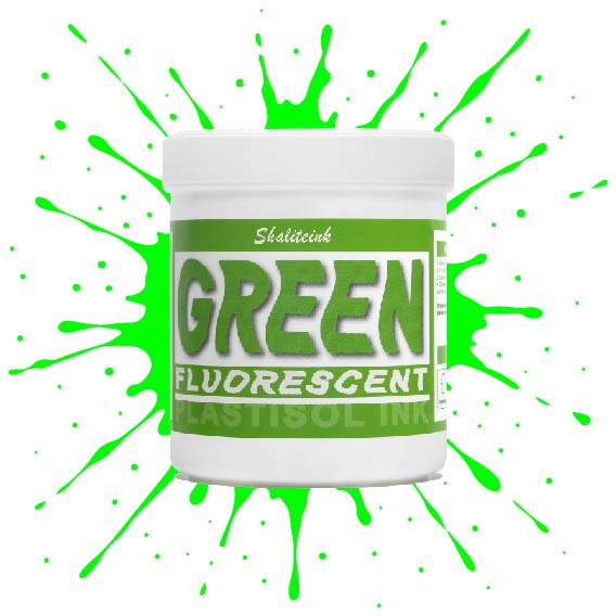
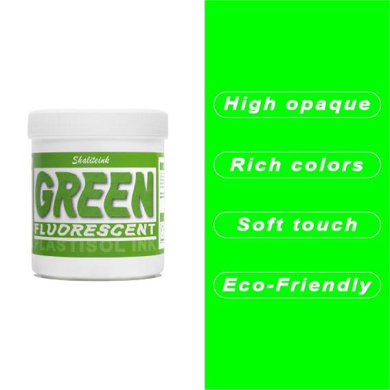
蛍光グリーンスクリーン印刷プラスチゾルインク
シャリテインク蛍光グリーン:ウェアラブル電気
「安全グリーン」なんて忘れてください。これはまさに物理学の結晶です。当社の蛍光グリーンは、紫外線を捉えて反射するように配合されているため、プリントがまるでコンセントに差し込まれているかのような鮮やかさを実現します。ストリートウェアやイベントグッズに最適な「秘密兵器」です。シャツの上にただ乗っているだけではなく、強烈なインパクトを与えます。顔料の配合量を調整することで、110~156メッシュの紙をきれいにせん断し、ネオンカラー特有の「目詰まり」の悩みを解消し、鮮やかな発色を実現します。.
ネオンカラーの成功は土台作りにかかっています。これをしっかりとした白い下地の上に重ねて、 320°F (160℃洗濯にも強く、ブラックライトの下でも鮮やかな印刷を実現するソリューションです。手動印刷機でも高速自動印刷機でも、Shaliteinkはクリーミーで安定した品質を維持するため、「特殊インク」のプレミアム価格を自信を持って設定できます。ありきたりな印刷はやめて、お客様の目を引く印刷を実現しましょう。.
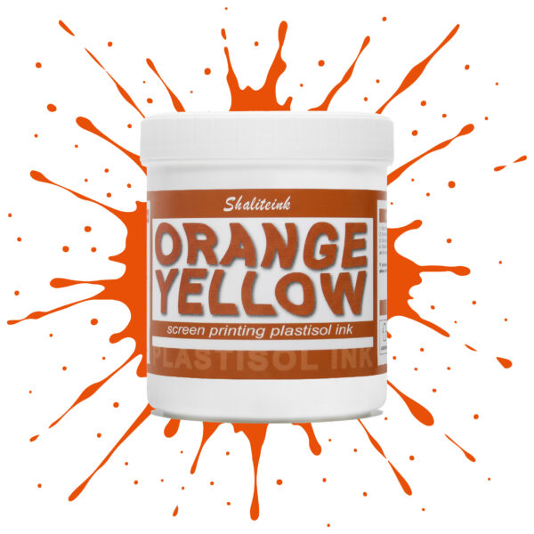
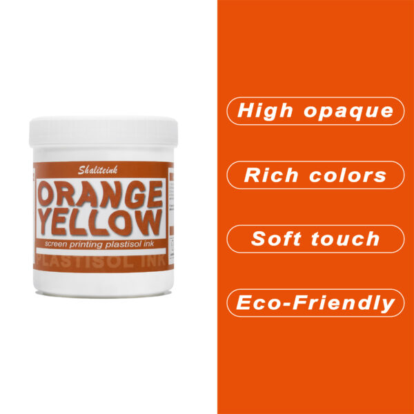
オレンジイエロースクリーン印刷プラスチゾルインク
暗い生地に溶け込んでしまうような「くすんだ」黄色で妥協するのはもうやめましょう。人目を引く鮮やかな発色の秘訣は、妥協を嫌う印刷業者向けに設計された、高不透明度の強力なオレンジイエロースクリーン印刷用プラスチゾルインクです。スポーツウェアでも小売店のTシャツでも、このインクは豊富な顔料含有量のおかげで鮮やかな発色を保ちます。ゴールドとオレンジの中間のような、大胆で太陽の光を浴びたような色合いでありながら、厚塗り感のないしっかりとした存在感を放ちます。.
安全対策は面倒な作業であってはなりません。そこで、この製品はPVCとフタル酸エステルを一切使用せず、お客様の店舗が法令を遵守し、環境にも配慮できるよう開発しました。独自のノンブリード(NB)技術により、扱いにくいポリエステル混紡素材でも染料のにじみを防ぎ、鮮やかな色合いを洗濯後も保ちます。滑らかで切りやすく、上質なソフトな手触りで、お客様にまるで魔法の手を持っているかのような印象を与えます。ぜひ一度お試しいただき、プロがShaliteinkを信頼する理由をご実感ください。.
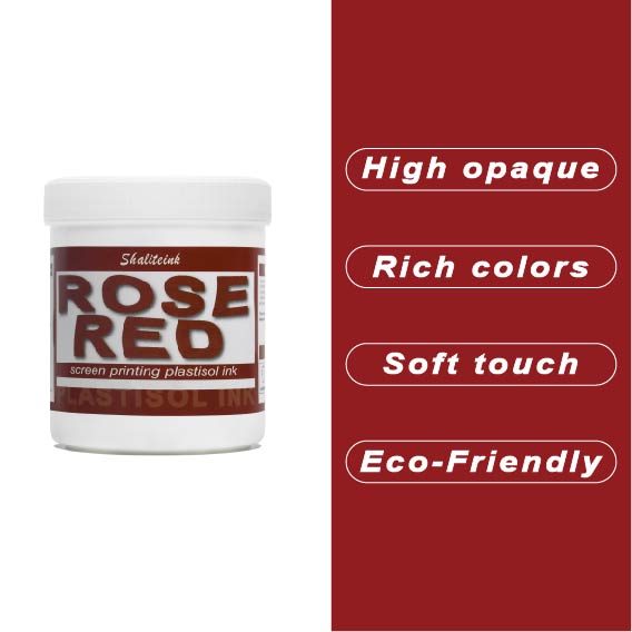
ローズレッドスクリーン印刷プラスチゾルインク
「ほぼ赤」で満足するのはもうやめて、本当に目を引く鮮やかな色で空間を支配しましょう。このローズレッドのスクリーン印刷用プラスチゾルインクは、何千回も試作を重ねてきましたが、濃色のTシャツに高級感あふれる鮮やかな発色を実現し、生地が硬いプラスチックシートのように感じられることも決してありません。ランチ休憩中にメッシュの中でインクが乾いてしまうといった面倒な心配をせずに、プロ並みの仕上がりを求めるすべての人にとって、まさに究極のプラスチゾルインクです。.
環境意識の高い顧客層やハイエンドのストリートウェアブランド向けに印刷するなら、PVCフリーのプラスチゾルインク「ローズレッド ショップセーフ 耐久性インク」がおすすめです。肌に優しく、作業場を無毒に保つので、有害なガスを気にすることなく、作品制作に集中できます。これは単なるインクではありません。顧客を惹きつけ、リピーターを増やす秘訣なのです。.
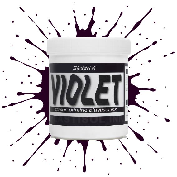
バイオレットスクリーン印刷プラスチゾルインク
暗い生地に触れるとすぐに消えてしまう、くすんだ紫色で妥協するのはもうやめましょう。 バイオレットスクリーン印刷プラスチゾルインク 顔料を豊富に配合しているため、デザインが鮮やかで生き生きとした仕上がりで際立ちます。安価なインクのように、冷たいピーナッツバターをスクリーンに塗りつけるような感触とは異なり、このインクはメッシュをスムーズに通過し、厚手のコットンや濃い色の混紡素材でも、くっきりとしたエッジと均一な不透明度を実現します。.
すべては化学反応にかかっています。このインクは繊維の表面にしっかりと定着し、最大限の鮮やかさを実現すると同時に、12回洗濯してもひび割れしない柔軟性を保ちます。乾燥機で色落ちして「あざ」のようなプリントに悩んでいるなら、この高固形分インクは、一度の洗濯で理想的な色合いを実現するために必要なソリューションです。この鮮やかで信頼性の高いバイオレットカラーは、普通のTシャツを際立たせるアイテムへと変身させます。.
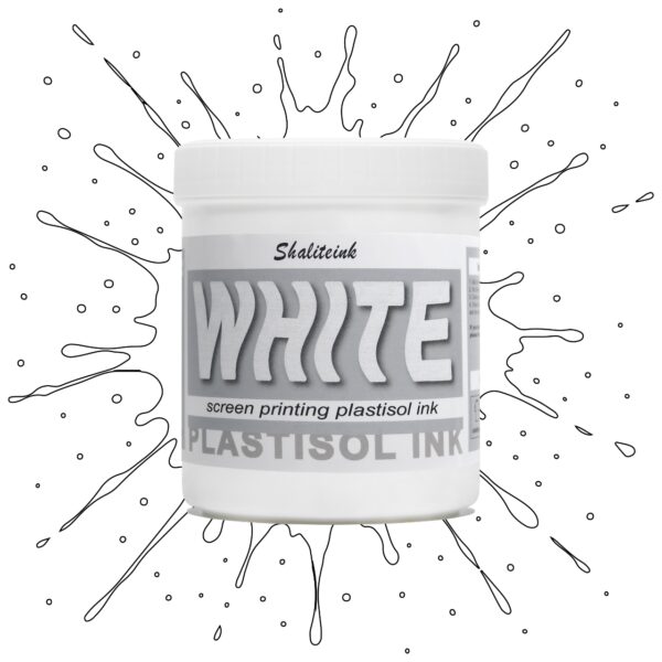
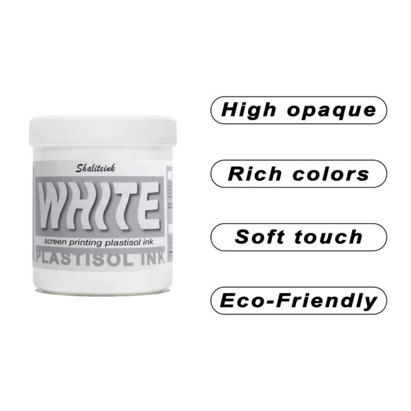
ホワイトスクリーン印刷プラスチゾルインク
生地に溶け込んでしまうような「幽霊のような」白いプリントで妥協するのはもうやめましょう。Shaliteinkのホワイトプラスチゾルインクは、濃色の衣類にしっかりとした不透明度を与えるために開発されました。クリーミーで滑らかな質感でスクリーンに塗布でき、硬いプラスチックというよりはホイップバターのような感触です。そのため、手作業でのプリント作業がスムーズになり、生産性が向上します。たった一度のフラッシュで、鮮やかで明るい白の「ポップ」な仕上がりを実現し、最初の洗濯でインクがひび割れたり色褪せたりする心配もありません。.
週末に趣味でプリントを楽しむ方にも、忙しいショップを経営されている方にも、これはまさにあなたが探し求めていた頼れる相棒です。高発色で、驚くほど簡単に混ぜることができ、数秒で硬化するので、機材の扱いに時間を費やすことなく、実際にプリント作業に集中できます。プロ仕様の性能をバケツに詰め込んだこのインクは、最初のプリントから1000回目のプリントまで、白を鮮やかに保ち、デザインをシャープに仕上げるように設計されています。.
 EN
EN  DE
DE  ES
ES  PT
PT  JA
JA
ヤン・コワルスキー –
Działa bardzo dobrze na co dzień。 Łatwa aplikacja i niezawodne działanie。 Łatwa aplikacja i niezawod
マリア・オリヴェイラ –
Superou minhas 期待しています。優秀な資格
マリア・オリヴェイラ –
Qualidade excelente e entrega
オリビア・ハリス –
品質は高級感があり、配送も迅速でした。日々の作業に非常に役立っています。スムーズに使えます。
ピーター・フィッシャー –
Hat meine Erwartungen übertroffen。 Leicht zu Nutzen und konstante Ergebnisse。 Leicht zu Nutzen und konstante Ergebnisse。 Einfache Anwendung und zuverlässige Leistung。 Einfache Anwendung und zuverlässige Leistung。 Leicht zu Nutzen und konstante Ergebnisse。 Hat meine Erwartungen übertroffen。ホッホヴェルティ
オリビア・ハリス –
品質は最高で、配送も迅速でした。使いやすく、仕上がりも安定しています。品質は最高で、配送も迅速でした。期待以上でした。
マリア・オリヴェイラ –
安全な情報を提供します。最高の利益。あなたの秘密を守るためのアプリケーション