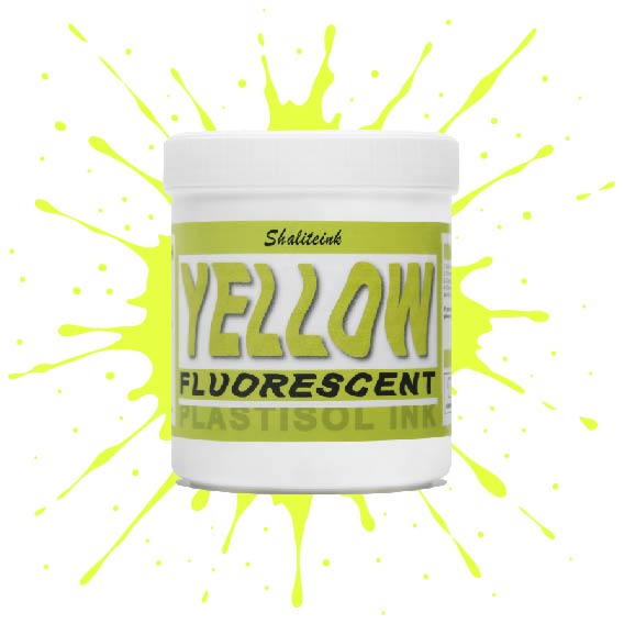
蛍光イエロースクリーン印刷プラスチゾルインク
価格帯: $18.98 – $50.98
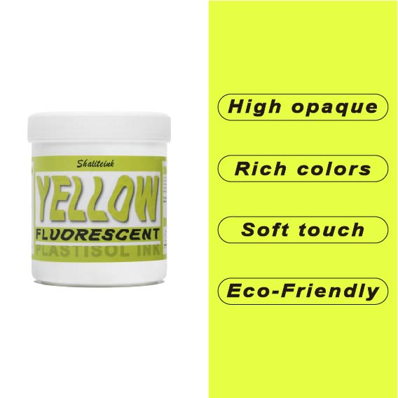
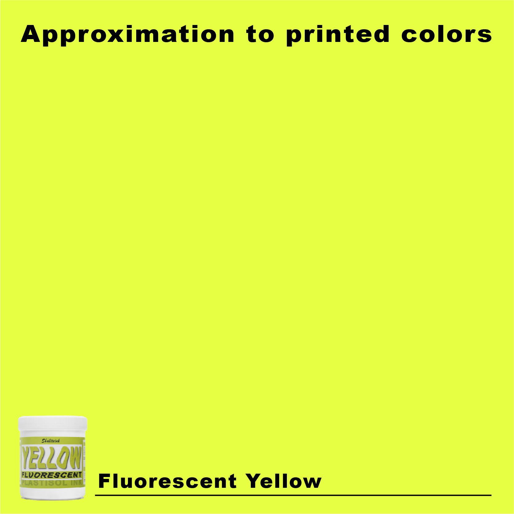
色あせた蛍光ペンのような「ネオン」インクにうんざりしているなら、この高輝度インクこそ、あなたのショップに必要なものです。当社の蛍光イエローは、ただ明るいだけではありません。目に見えない紫外線を捉え、目を奪うような強烈な発色で、誰も無視できないほどの存在感を放ちます。バターのように滑らかなテクスチャーに仕上げたので、スクイージーと格闘することなく、メッシュをきれいに通過させることができます。.
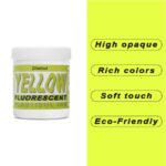
安全装備でも派手なストリートウェアでも、このインクは塗った場所にしっかりと留まり、色落ちやひび割れを防ぎます。濃厚でクリーミーな質感で生地に完璧に馴染み(最高の仕上がりには白い下地が欠かせません)、有害な化学物質を排除することで作業環境の安全性を確保しました。くすんだ黄色で妥協するのはもうやめて、鮮やかな色でプリントを始めましょう。.
「グロウアップ」ハンドブック:蛍光イエローのプラスチゾルインクがあなたのショップの新たな親友になる理由
派手な展示会では通常教えてくれない真実を一つお教えしましょう。私は20年間、薄暗くインクが飛び散った部屋にこもり、リズミカルな カチカチ コンベア式乾燥機の音だけが、私の唯一の話し相手です。潮のように押し寄せ、同じ速さで洗い流されるトレンドを見てきました。「ダメージ加工のヴィンテージ」ルックは、基本的にカバー力の悪さを言い訳にしたものでしたが、数年間、皆の生活を困難にした「水性ミニマリズム」もありました。しかし、20年経っても変わらないことが一つあります。特定の色合いの 蛍光イエロー スクリーン印刷プラスチゾルインク それは、まるで隠しておいたお菓子を見つけた子供のように、顧客の顔を輝かせる。.
しかし、ちょっと待ってください。このネオンカラーを普通のレモンイエローのように扱おうとすると、トリプルショットのエスプレッソでも解決できない大惨事を招くことになります。ネオンカラーは手のかかるディーバなのです。派手で傲慢で、その気まぐれを尊重しなければ、ゴミ箱いっぱいのボロボロのパーカーと、危険なほどに減った銀行口座という形で報われることになるでしょう。.
このハンドブックでは、ベールを剥がします。インクが実際にどのように利益を生み出すのか、スキージを窓に投げつけずに印刷する方法、そしてなぜ シャリテインク は、新しい環境に優しい処方で、現在他社の市場を席巻している。.
1. 「ポップ」の物理学:なぜそれが叫ぶのか
ほとんどの印刷業者は、蛍光インクは単に「黄色がもっと派手な色」だと思っています。しかし、実際にはちょっとした科学的奇跡なのです。通常の顔料は、当たった光を反射するだけの受動的なものです。ところが蛍光顔料は?とんでもない働きをします。目に見えない紫外線を捉え、物理的に可視光に変換するのです。この化学変化によって、通常の黄色よりも最大300%も明るく見えるようになります。.
地元のマラソン大会で初めて大きな契約を結んだ時のことは決して忘れません。主催者は3つの郵便番号区域先からでも見えるベストを求めていました。私は高品質の「アスレチックゴールド」を試してみました。クライアントはそれを見て顔を曇らせました。夕暮れ時、そのゴールドは濡れた泥のように見えたのです。私はすぐに方向転換し、 真の蛍光イエロー. そのコントラストは単に鮮烈というだけでなく、天文学的なほどだった。プリントはまるで壁のコンセントに差し込まれているかのように、光を反射するのではなく、放射しているように見えた。.
プラスチゾルがネオン王国を支配する理由
「環境保護活動家」は水性塗料を推奨するかもしれないが、ネオンに関しては私は シャライトインク プラスチゾルインク. 理由は以下のとおりです。
-
「身体」の問題: ネオン顔料は本来、粘度が低い。. 水性ネオン塗料でしっかり色を塗ろうとするのは、蛍光ペンで壁を塗るようなもので、ムラになってしまい、なかなかうまくいきません。しかし、プラスチゾル塗料は、濃厚でバターのような粘度があり、メッシュにしっかりと密着し、塗った場所に正確に留まります。.
-
生存率: 蛍光顔料は扱いにくい。水性のバケツに入れると、あっという間に沈殿して固まってしまう。「再注文」と言う間もないほどだ。“ 水性インクはちょっと触っただけで劣化してしまうのに対し、シャリインクのバケツは非常に扱いやすい。作業場の隅に何ヶ月も置いておいても、蓋を開けた瞬間にすぐに使える状態だ。.
-
輝きをキープする: プラスチゾル樹脂は、高セキュリティの金庫のようなものだと考えてください。顔料を生地の表面に閉じ込め、繊維がスポンジのように色を吸い取ってしまうのを防ぎます。.
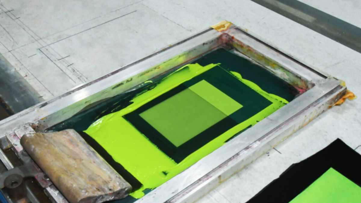
2. 黄金律:アンダーベースはあなたの宗教である
私の忠告を聞いてください。濃い色の生地に白い下地を塗らないと、お金を乾燥機に放り込んで燃やしてしまうようなものですよ。.
紺色や黒色の生地は色を吸収しやすい性質があり、半透明のネオンカラーをあっという間に飲み込んでしまいます。ベースカラーがないと、鮮やかな黄色はくすんだオリーブ色になり、中学校の体育の授業でも通用しないような色になってしまうのです。. ファンデーションは必須です。私はいつも高級品を選びます。 ホワイトスクリーン印刷プラスチゾルインク 「入門書」としての役割を果たす。“
「アンダーベースサンドイッチ」戦略
-
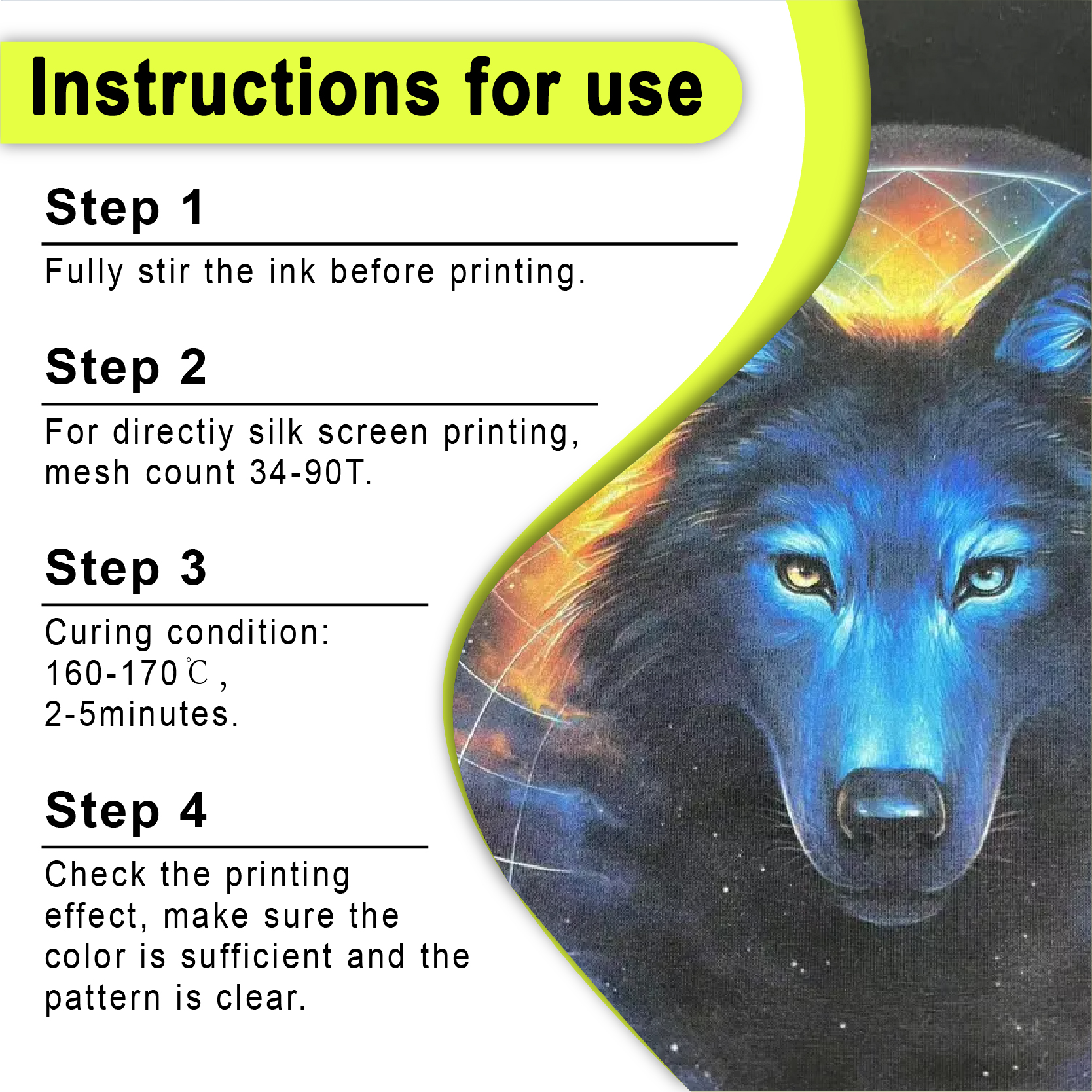
基礎を築く: 白いベースには、86メッシュまたは110メッシュを使用してください。.
-
フラッシュキス: 焼かないでください。触ってもほとんど乾いていない程度に軽く炙るだけで十分です。.
-
ネオン層: より細かいメッシュ(156または200)を使用して、滑らかでレーザーのようにシャープな層を敷きます。 蛍光イエロー 一番上。.
| 戦略 | 黒色の生地での結果 | 店舗の収益性 |
| ダイレクトプリント | 泥のような、「見えない」黄色 | 高(顧客喪失) |
| 白色下地 | 眩しいほどのプロフェッショナルなポップ | 高(リピート注文) |
3. 技術仕様:ハードウェアは重要
ネオン印刷は、単にインクの「質」だけではなく、それを活かすための道具も重要です。間違ったスクリーンを使ったり、切れ味の悪いスキージを使ったりすると、散々な午後を過ごすことになるでしょう。.
メッシュ数
-
156メッシュ: これは私がスポーツ用品に使う定番のインクカートリッジです。ポリエステル製のジャージの伸縮性にも十分対応できるインク量です。.
-
230メッシュ: 細い線で描かれたロゴにはこれを使用してください。白い下地が大部分の役割を果たしているので、 蛍光イエロー 薄くきれいに印刷できる。.
スクイージーの論理
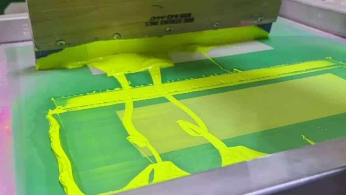
柔らかいスクイージーは使わないでください。 70/90/70 トリプルデュロメーター. 硬めの90ショアの中心部は、インクをメッシュを通してきれいに押し出すのに必要です。一方、柔らかい外側の層は、インクの付着部分に「タイヤの跡」が残らないようにする役割を果たします。力強く押しましょう。ネオンインクは、はっきりとした力強いストロークを好みます。.
治癒:魔法(あるいは災難)が起こる場所
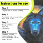
プラスチゾルはペンキのように乾くのではなく、完全な化学融合を起こします。 プラスチゾルインクショップ あなたに打つように言う 320°F (160°C).
-
寒すぎる場合: 洗濯するとインクが剥がれ落ち、土曜日の午前中は返金依頼への対応に追われることになるでしょう。.
-
暑すぎる場合: ネオンカラーが「焦げてしまう」でしょう。高温は蛍光顔料を破壊し、鮮やかな黄色をくすんだ茶色に変えてしまいます。また、ポリエステル素材の場合は「ガス抜き」現象も引き起こします。.
専門家のアドバイス: レーザー温度計を買ってください。たった20ドルで、何千ドルもの在庫損失を防げますよ。.
4.環境意識に基づく転換:PVCフリーの登場
正直に言って、昔ながらのプラスチゾル塗料は化学工場のような臭いがして、肺にもあまり良くなかった。しかし、業界はついに成熟した。.
私は自分の店を PVCフリープラスチゾルインク. 具体的には、 PVCフリー蛍光イエロー Shaliteink製。なぜかって?それは、私のハイエンド顧客であるヨガスタジオや環境意識の高いテクノロジー系スタートアップ企業がそれを求めているからです。フタル酸エステル類や環境負荷を一切伴わずに、同じように「目が焼けるような」明るさを実現します。.
「グリーン」な利点
-
安全性: あなたの店は製油所のような臭いはしません。.
-
柔らかさ: PVCフリーインクは「より柔らかな手触り」が特徴で、プリントが胸に貼り付けられた合板ではなく、生地の一部のように感じられる。.
-
コンプライアンス: 大手ブランド向けに印刷したい場合は、 しなければならない 使用 フタル酸エステル不使用のプラスチゾルインク.
5. 事例研究:「グローラン」の奇跡
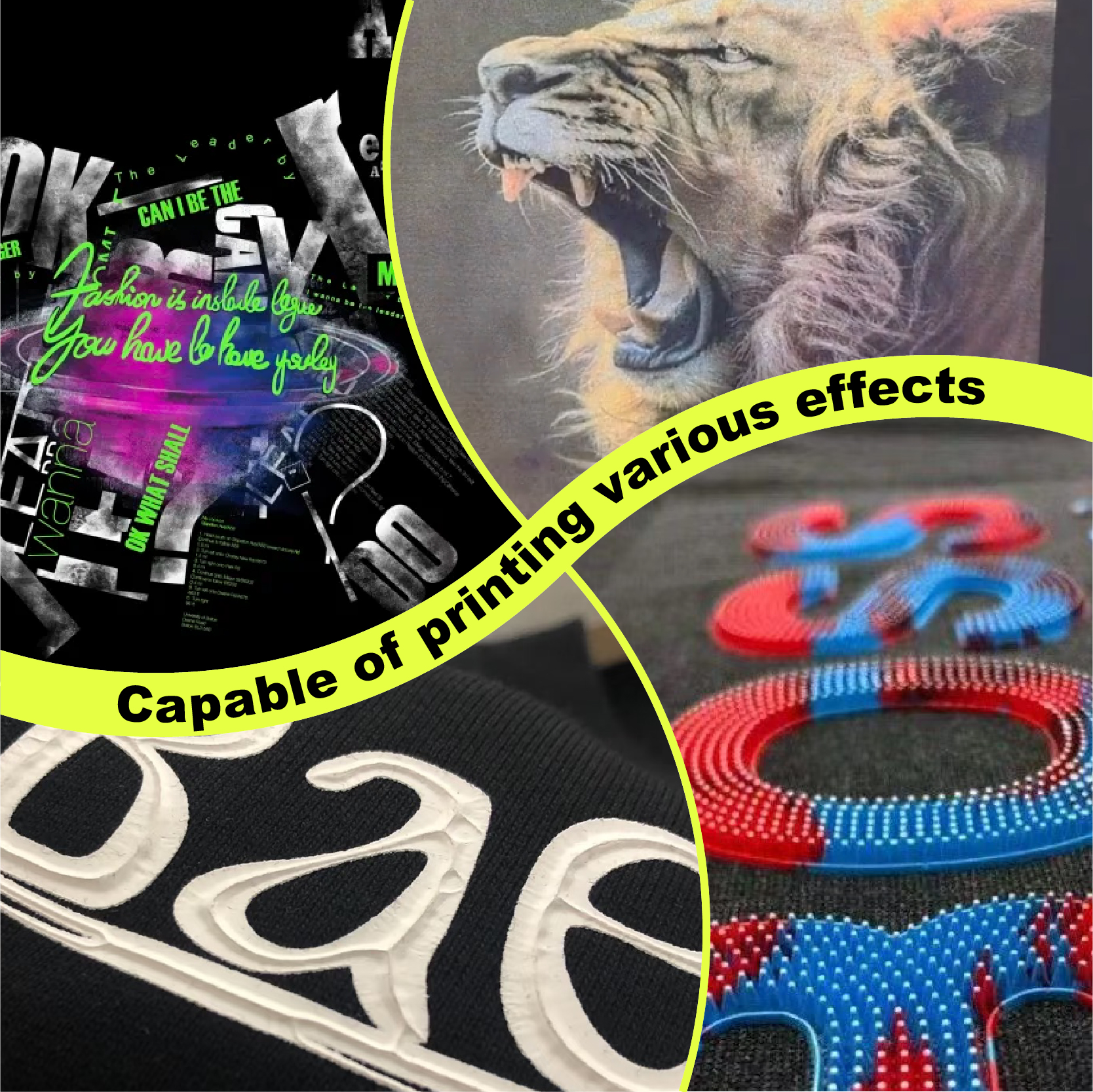
去年の夏、地元の慈善団体から「グローラン」用のシャツ500枚を依頼されました。締め切りは1週間と短く、彼らの夢は、黒地に蛍光イエローと 銀スクリーン印刷インク 金属的なエッジを出すために。.
ワークフロー:
-
ベース: 白色プラスチゾルインク (110メッシュ).
-
ネオン: 蛍光イエロー (156メッシュ).
-
詳細: シルバーメタリック 細かい文字には(200メッシュ)を使用します。.
その結果は?あのシャツはあまりにも派手だったので、まるでランニングコースを照らし出すかのようだった。. イベント主催者は、最初のランナーがゴールラインを越える前に、すべてのTシャツを運び終えました。私たちは単にグッズを届けたのではなく、人々が誇りを持って持ち帰ることができる、まさにコレクターズアイテムを手渡したのです。.
よくある質問:簡潔明瞭な回答
Q1:ネオンイエローを他の標準インクと混ぜて使うことはできますか?
不可能ではないが、輝きが失われても私を責めないでくれ。ネオンに普通の顔料を加えるのは、高級ウイスキーを水道水で薄めるようなものだ。つまり、そのウイスキーを特別なものにしている要素そのものを殺してしまうことになる。. 特注のネオンが必要な場合は、専門業者にご相談ください。 プラスチゾールCMYKインク セット。.
Q2:インクは3回洗濯するとひび割れますか?
乾燥時間を怠った場合のみ、ひび割れが発生します。インクが華氏320度(摂氏160度)に達すると、シャツ自体よりも長持ちする柔軟なプラスチック状の結合剤に変化します。ひび割れが発生する場合は、乾燥機の温度が高すぎるか、ヒーター部分に温度の低い箇所がある可能性があります。.
Q3:自作のプレス機でこれを実現できますか?
世界クラスのプリントを作るのに、大規模な工業設備は必要ありません。ヒートプレスや信頼できるフラッシュなど、最適な硬化温度に達する方法さえあれば、基本的な方法で小売店向けのシャツを大量生産できます。 スクリーン印刷スターターキット.
Q4:100%ポリエステルにも使えますか?
はい、ただし「染料移行」(シャツの色がインクににじむこと)には注意が必要です。 反移民スクリーン印刷インク 赤色または濃色のポリエステルシャツに印刷する場合のバリアとして。.
Q5:なぜ「標準的な」黄色よりも高価なのですか?
なぜなら、顔料は文字通り「期待以上の性能」を発揮するように設計されているからです。つまり、光り輝くための化学反応にお金を払っているのです。しかし、ここが重要な点です。「ネオンエディション」のプリントは、通常20%高く請求できます。.
結論:大胆にやるか、家に帰るか。
考えてみてください。世の中は既に退屈で無難な「ベージュ」デザインで溢れています。お客様はもううんざりしています。彼らは注目されたいのです。彼らはエネルギーを求めているのです。.
マスターしたとき 蛍光イエロースクリーン印刷プラスチゾルインク, あなたはただのスクイージーを持った男ではなく、スペシャリストです。生き残るために印刷が必要な建設作業員のために印刷する場合でも、スタジアムを満員にしたいレイブプロモーターのために印刷する場合でも、このインクはあなたの秘密兵器です。.
安全策をやめる準備ができたら、その分野に精通したサプライヤーに行きましょう。私はバルクで仕入れています。 シャリテインク なぜなら彼らの スクリーン印刷用インクの卸売 価格設定のおかげで、高い利益率を維持しながら、最高水準の品質を保つことができています。.
読むのをやめて、印刷を開始してください。乾燥機が温まりました。.
| サイズ |
8オンス ,16オンス ,32オンス |
|---|
Fluorescent Yellow Screen Printing Plastisol Ink に対するレビュー2件
フィルターをクリア以前にこの商品を購入したことのあるログイン済みのユーザーのみレビューを残すことができます。
関連商品
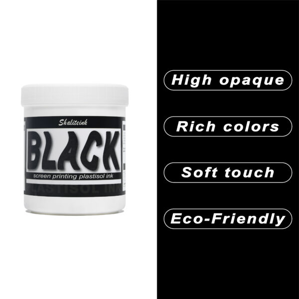
黒スクリーン印刷プラスチゾルインク
「ダークグレー」で満足して、それを黒と呼ぶのはやめましょう。 黒色プラスチゾルインク このインクは、スクリーンを詰まらせ、シャツの仕上がりをくすませる、粘り気のある濃いインクに悩まされている印刷業者向けに開発されました。バターのように滑らかでクリーミーな質感で、高密度のメッシュでもスムーズに印刷でき、しかも一度の印刷で生地の色をしっかり定着させます。100%コットンTシャツでも、扱いの難しい混紡生地でも、このインクは柔軟でマットな「ミッドナイト」カラーに仕上がり、最初の洗濯後もひび割れたり剥がれたりしません。お客様が期待する、プロ仕様の高品質なブラックです。.
安全性は必ずしも性能を犠牲にすることを意味するわけではありません。当社のフォーミュラはフタル酸エステルを一切使用していません( PVCフリーのオプション (入手可能)なので、化学薬品のトラブルを気にすることなく、高級ブランドの印刷が可能です。発色が良く、スクリーン上でインクが定着しやすく、インクの蓄積も少なく、鮮明なディテールを維持します。印刷作業の効率化と、まるでブティックで作られたような仕上がりを実現する、頼りになるインクをお探しなら、このインクを印刷機に常備しておくのがおすすめです。.
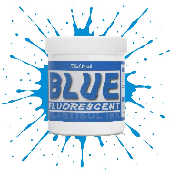
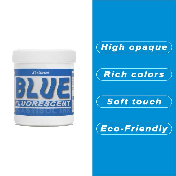
蛍光ブルースクリーン印刷プラスチゾルインク
「やや明るめの」青で満足するのはやめて、あなたのデザインにふさわしい、刺激的なエッジを与えましょう。 蛍光ブループラスチゾルインク まさにボトルに詰められた稲妻――高顔料で紫外線に反応するフォーミュラは、ブラックライトの下では鮮烈な輝きを放ち、明るい日光の下では部屋全体を圧倒します。バケツから出してすぐにバターのように滑らかな書き心地なので、最初のひと塗り前にインクと格闘する必要はもうありません。また、フタル酸エステルを一切使用していないため、どんなクライアントにも安心して印刷できます。.
濃い色の衣類に、目を奪うような鮮やかな発色を実現するには、まずはくっきりとした白い下地を軽く塗るだけで、あとはこのブルーインクにお任せください。厚みのあるジューシーな仕上がりを求めるなら110メッシュ、よりシャープなディテールを求めるなら156メッシュ。どちらのサイズでも、完璧なせん断力で、剥がれたり色褪せたりしない、耐久性に優れたプロフェッショナルな仕上がりになります。ただの印刷業者から、誰もが話題にする印刷会社へとステップアップしたいなら、このインクこそがそれを可能にするのです。.
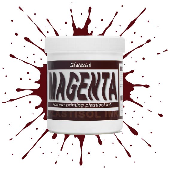
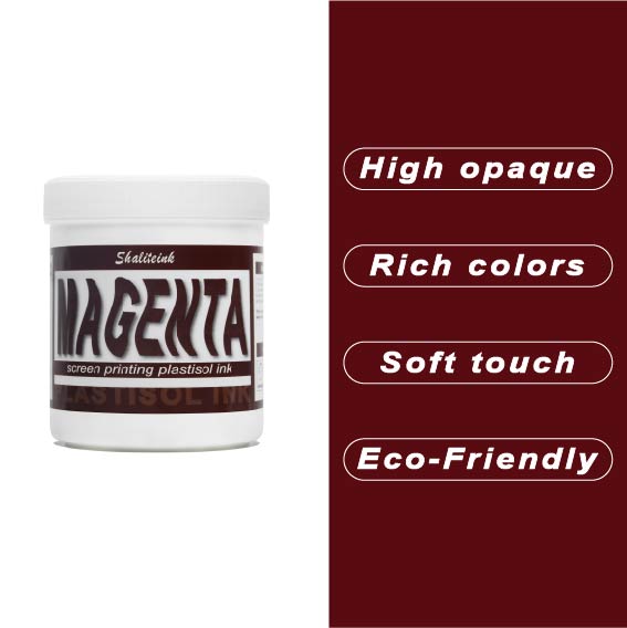
マゼンタスクリーン印刷プラスチゾルインク
正直に言いましょう。薄めたイチゴミルクのようなマゼンタなんて誰も欲しくありません。必要なのは、本当に発色の良いマゼンタスクリーン印刷用プラスチゾルインクです。このShaliteinkのインクはまさに本物。メッシュにしっかり定着するほどの粘度を持ちながら、スキージがスクリーンに触れた瞬間にシルクのように滑らかに伸びます。濃い色の印刷なら、妥協は禁物。鮮やかなホワイトスクリーン印刷用プラスチゾルインクをベースに重ねて使用すれば、色が本当に鮮やかに映えます。すぐに印刷に使用でき、メンテナンスも簡単。コーヒーを買いに行っている間にスクリーン上でインクが固まってしまう心配もありません。.
実際に印刷機を操作しているプラスチゾルインク専門店として、私たちは安価で粉っぽい顔料の悪夢をよく知っています。当社のマゼンタインクは100%で、フタル酸エステル不使用、耐久性に優れています。ひび割れや剥がれがなく、洗濯にも強く、通常は衣類自体よりも長持ちします。スクリーン印刷のスターターキットで始めたばかりの方でも、自動印刷機で何千枚も印刷している方でも、このインクを使えば、一般的なプラスチゾルインクにつきものの悩みを解消し、高級感のある仕上がりを実現できます。.
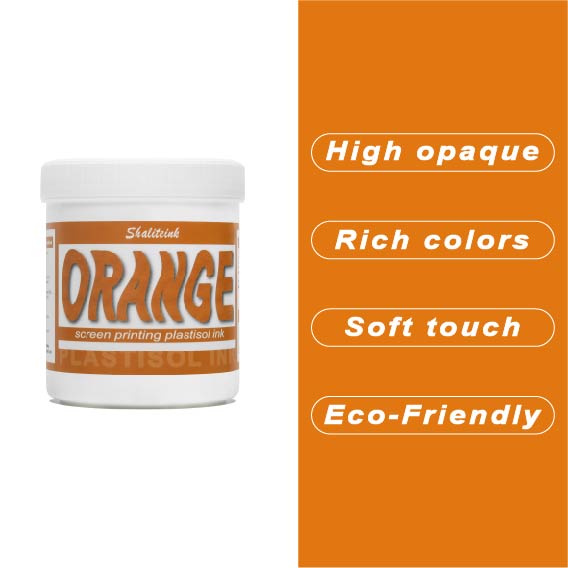
オレンジスクリーン印刷プラスチゾルインク
生地に染み込んでしまうことなく、鮮やかでエネルギッシュな「オレンジクラッシュ」カラーをお探しですか?当店のオレンジプラスチゾルインクは、多くのお客様にご愛用いただいている理由があります。クリーミーでプレスしやすいテクスチャーは、高密度の生地にもスムーズに印刷でき、大胆なグラフィックに必要な高い不透明度を維持します。もう濁ったプリントに悩む必要はありません。鮮やかなシトラスカラーが、最初の印刷から最終乾燥まで、鮮やかさを保ちます。.
長期間の使用を想定して設計されたこのインクは、印刷途中でスクリーン上で乾くことなく、洗濯にも耐える丈夫で柔軟な仕上がりを実現します。濃い色のパーカーに鮮やかな白の下地をプリントする場合でも、淡い色の綿生地に直接プリントする場合でも、Shaliteinkは、インクを頻繁に薄めたり、インク詰まりを起こしたりする手間をかけずに、プロフェッショナルな「店頭販売対応」の仕上がりを実現します。.
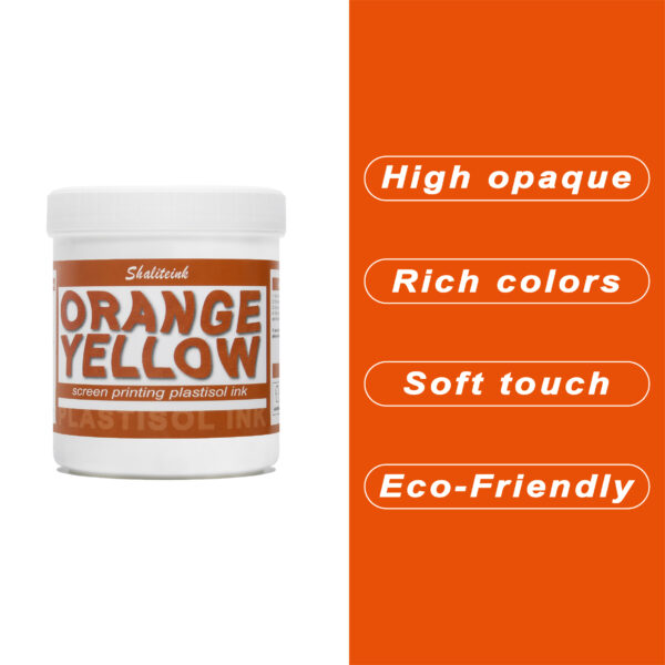
オレンジイエロースクリーン印刷プラスチゾルインク
暗い生地に溶け込んでしまうような「くすんだ」黄色で妥協するのはもうやめましょう。人目を引く鮮やかな発色の秘訣は、妥協を嫌う印刷業者向けに設計された、高不透明度の強力なオレンジイエロースクリーン印刷用プラスチゾルインクです。スポーツウェアでも小売店のTシャツでも、このインクは豊富な顔料含有量のおかげで鮮やかな発色を保ちます。ゴールドとオレンジの中間のような、大胆で太陽の光を浴びたような色合いでありながら、厚塗り感のないしっかりとした存在感を放ちます。.
安全対策は面倒な作業であってはなりません。そこで、この製品はPVCとフタル酸エステルを一切使用せず、お客様の店舗が法令を遵守し、環境にも配慮できるよう開発しました。独自のノンブリード(NB)技術により、扱いにくいポリエステル混紡素材でも染料のにじみを防ぎ、鮮やかな色合いを洗濯後も保ちます。滑らかで切りやすく、上質なソフトな手触りで、お客様にまるで魔法の手を持っているかのような印象を与えます。ぜひ一度お試しいただき、プロがShaliteinkを信頼する理由をご実感ください。.
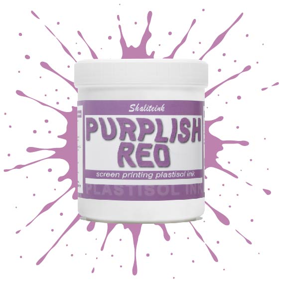
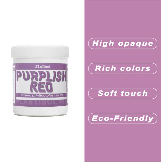
紫がかった赤のスクリーン印刷プラスチゾルインク
暗い色の衣類にプリントするとすぐに色が消えてしまう、つまらない赤色で妥協するのはもうやめましょう。当社のパープルレッド・スクリーン印刷用プラスチゾルインクは、高貴なバイオレットとエネルギッシュなクリムゾンの中間に位置する、深みのある魅力的な色合いです。それでいて、Tシャツをプラスチックの盾のように硬くすることなく、柔らかな手触りを保ちます。言葉にせずとも「高級感」をデザインに表現したい印刷業者にとって、まさに秘密兵器となるでしょう。.
このプロ仕様のインクは、画面上で何時間も乾きにくく、時間を気にすることなく作品制作に集中できます。高不透明で無毒性のブレンドで、厚手のコットンパーカーから軽量の合成繊維Tシャツまで、あらゆる素材に鮮やかな発色を実現します。Shaliteinkは洗濯や着用にも耐えるように設計されていますが、何よりも、ありきたりな原色ばかりの世界で、あなたの個性を際立たせるために開発されました。.
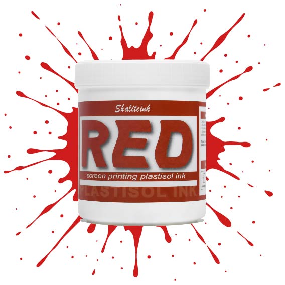
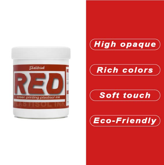
赤色スクリーン印刷プラスチゾルインク
暗いパーカーに色あせたシミのような赤インクで苦労するのはもうやめましょう。インクの芯が弱くて「鮮やかな」赤が濁った茶色になってしまうのを朝から見てきたなら、このインクが必要です。黒生地にも負けない高い不透明度を持ちながら、クリーミーな質感で、長時間プリントしてもムラになりません。もうインク詰まりも、乾燥機の前で慌てふためく必要もありません。鮮やかでパンチのある、まさに期待通りの赤インクです。.
下地を塗る場合でも、綿に直接印刷する場合でも、このプラスチゾルインクは硬化するまでメッシュ上で開いた状態を保ちます。「まあまあ」で満足せず、人目を引く鮮やかな赤色で、洗濯を繰り返しても色落ちしないものを求める印刷業者のために開発されました。水っぽくて薄いインクで時間を無駄にするのはやめて、一度で完璧な赤色を手に入れましょう。.
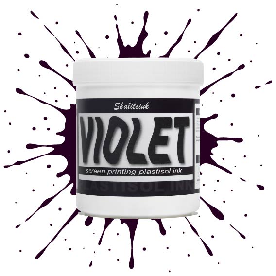
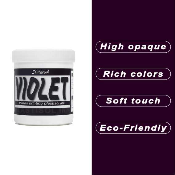
バイオレットスクリーン印刷プラスチゾルインク
暗い生地に触れるとすぐに消えてしまう、くすんだ紫色で妥協するのはもうやめましょう。 バイオレットスクリーン印刷プラスチゾルインク 顔料を豊富に配合しているため、デザインが鮮やかで生き生きとした仕上がりで際立ちます。安価なインクのように、冷たいピーナッツバターをスクリーンに塗りつけるような感触とは異なり、このインクはメッシュをスムーズに通過し、厚手のコットンや濃い色の混紡素材でも、くっきりとしたエッジと均一な不透明度を実現します。.
すべては化学反応にかかっています。このインクは繊維の表面にしっかりと定着し、最大限の鮮やかさを実現すると同時に、12回洗濯してもひび割れしない柔軟性を保ちます。乾燥機で色落ちして「あざ」のようなプリントに悩んでいるなら、この高固形分インクは、一度の洗濯で理想的な色合いを実現するために必要なソリューションです。この鮮やかで信頼性の高いバイオレットカラーは、普通のTシャツを際立たせるアイテムへと変身させます。.
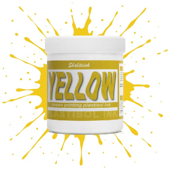
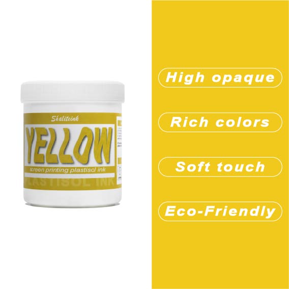
黄色のスクリーン印刷プラスチゾルインク
太陽の光のような鮮やかなプリントを目指しているのに、「沼のような緑」のプリントで妥協するのはもうやめましょう。黄色はインク棚の女王様です。本来半透明で、濃い色の生地にプリントすると濁ったり弱々しく見えたりすることが非常に難しいことで知られています。だからこそ、シャライトインクは顔料を豊富に含んだイエロープラスチゾルを開発しました。白い下地の上に完璧に定着するように特別に設計されており、遠くからでもはっきりと見えるほど鮮やかで、乾燥機にかけた後も明るさが持続します。.
鮮やかでエネルギッシュなレモンイエロー、あるいは温かみのあるバーシティジャケットのようなゴールデンイエロー、どちらの色をお探しでも、このインクはバターのように滑らかで、プリント中にメッシュが乾くこともありません。薄くムラのある仕上がりになるよう配合を調整し、クリーミーな質感を実現。プリントするたびに満足感を得られます。数回の洗濯後もひび割れたり色褪せたりしない、すぐに店頭に並べられるシャツをお求めなら、このイエローこそ、あなたのスクイージーが待ち望んでいた色です。.
 EN
EN  DE
DE  ES
ES  PT
PT  JA
JA
ピーター・フィッシャー –
Leicht zu Nutzen und konstante Ergebnisse。 Leicht zu Nutzen und konstante Ergebnisse。ライヒト・ズ・ナッツ
ローラ・ワグナー –
Hochwertige Qualität und Schnelle Lieferung。 Sehr グーテス Preis‑Leistungs‑Verhältnis。 Sehr グーテス Preis‑Leistungs‑Verhältnis。 Hochwertige Qualität und Schnelle Lieferung。ライヒト ツー ヌッツェン ウント コンスタンテ E