
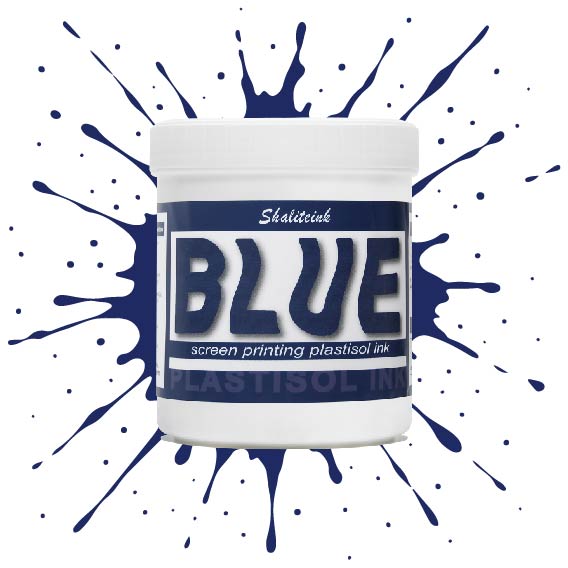
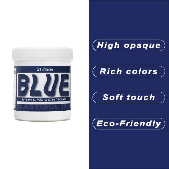
ディープブルースクリーン印刷プラスチゾルインク
価格帯: $14.99 – $31.99
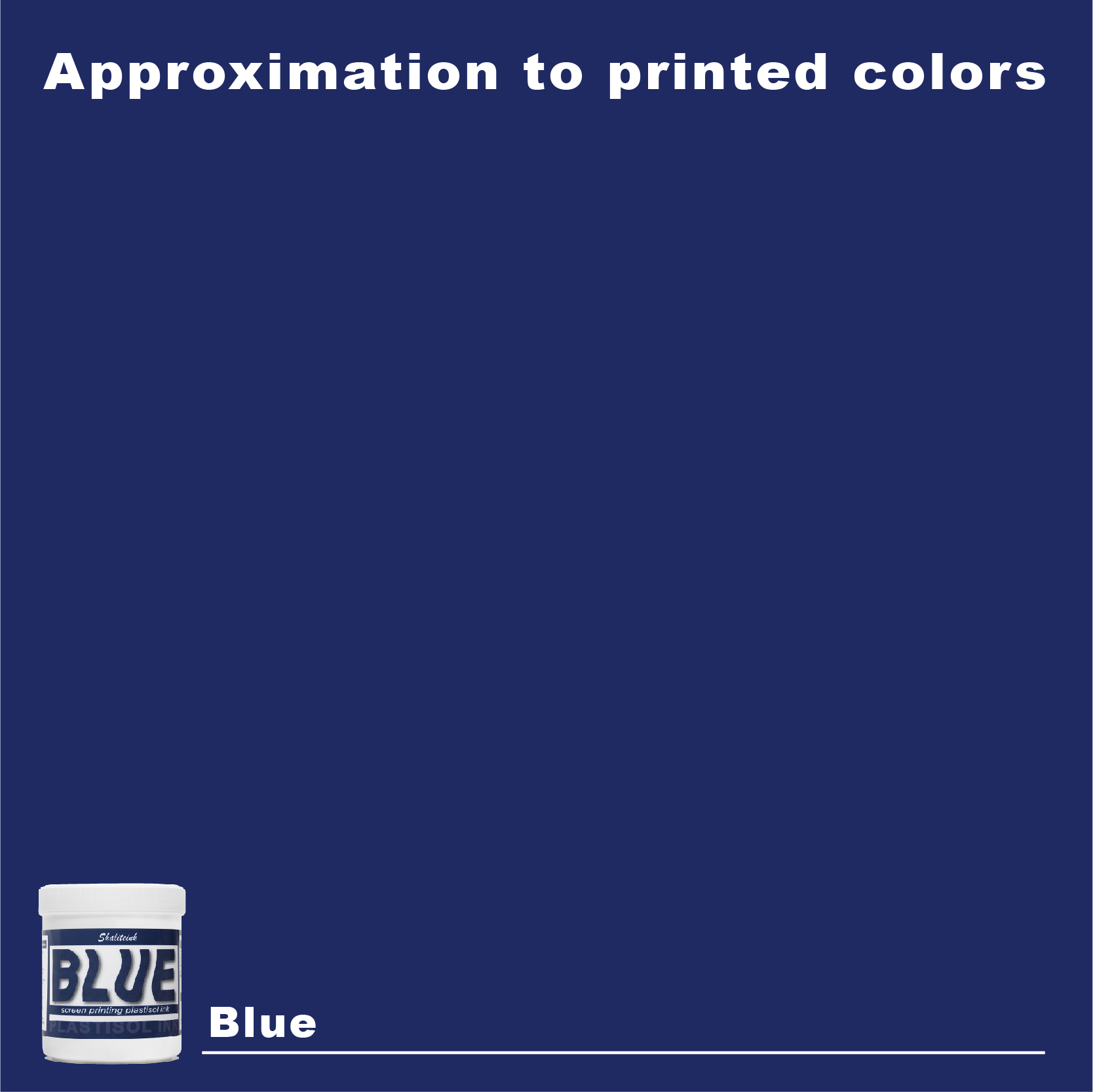
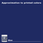
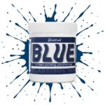
ネオンサインのように派手な青色や、生地の繊維に溶け込んでしまうような青色で妥協するのはもうやめましょう。Shaliteinkのディープブルーは、まさにあの「真夜中の海」のような、洗練された深みのある色合いです。濃いチャコールグレーや黒の衣類にも映える、力強く鮮やかな発色を実現。高い不透明度で、塗った場所にしっかりと定着し、シャープでプロフェッショナルな仕上がりを提供します。まるで高級小売店に並ぶような、洗練された印象を与えるプリントが、趣味のガレージでプリントしたような安っぽさを感じさせません。.
バケツの中のこのインクは、驚くほどクリーミーで、すぐに印刷に使用できます。粘度を調整したので、手動スキージでも自動印刷機でも、メッシュを簡単に通過します。乾燥機で最適な温度である160℃(320°F)に達すると、剥がれたり、ひび割れたり、洗い流されたりしない、非常に強固で柔軟な接着層が形成されます。「まあまあ」な仕上がりに飽き飽きしていて、本当に頼りになるブルーインクをお探しなら、毎日使いたくなるこのインクがきっと見つかるでしょう。.
「真夜中の秘密」:なぜディープブルーのプラスチゾルインクが私の印刷所の基盤なのか
私は20年以上もの間、狭くてインクまみれの店の奥深くで過ごし、熱い乾燥機のベルトと縮み防止加工された綿の匂いが肌に染み付いたまま目を覚ましてきた。2008年の「インク大惨事」、今でも夢に出てくる山積みの台無しになった白いパーカー、そして「ネイビー」と「ロイヤルブルー」は同じ色だと目を合わせて言い張る素敵な顧客たち(信じてください、そんなことを言ったら大変なことになりますよ)。.
でも、私を天才に見せてくれる唯一の色について話しましょう。 ディープブルースクリーン印刷プラスチゾルインク.
まさに「スイートスポット」と言える色だ。ネオンブルーのように派手で耳障りな色ではなく、薄暗いバーで黒っぽく見えて消えてしまうようなこともない。くっきりとしていて、プロフェッショナルな印象を与える。しかし、ここが肝心な点だ。もしこの色を後回しにしてしまうと、制作スケジュールが台無しになってしまうだろう。.
1. 「バケツいっぱいのグープ」を超えて:技術を極める
キャリアの初期、私はインクを家のペンキのように扱っていました。スクリーンにインクをぶちまけて押すだけだと思っていました。高級ボクシングジムからの500個の注文の際に、私は痛い目に遭って学びました。 シャライトインク プラスチゾルインク それは単なる商品ではない。それは精密工具だ。.
真夜中の海のような色合いを、最初の洗濯で剥がれ落ちることなく完璧に仕上げるには、インクと基材の化学反応を熟知している必要があります。高品質なプリントとは、インクと基材がどのように反応し合うか、あるいはどのように調和するかを正確に把握することによって生まれるものなのです。.
完璧なディープブルーの解剖学
| 成分 | 本当の仕事 | なぜそれが重要なのか |
| PVC樹脂 | 骸骨 | プリントに「弾力」と耐久性を与える。. |
| 高濃度顔料 | 魂 | 深みのある、鮮やかな「高級感のある」青色を再現します。. |
| 可塑剤 | グリース | 画面上でインクが固まって塊になるのを防ぎます。. |
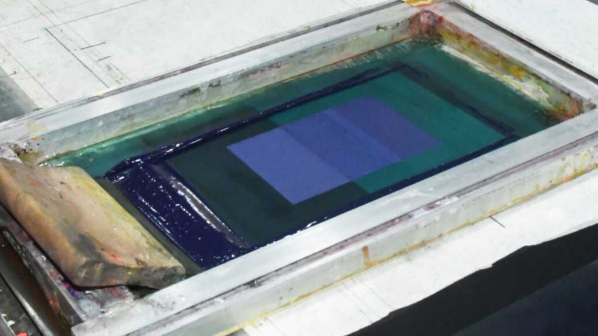
2.ディープブルーが「コントラスト戦争」に勝利する理由“
品質を使用する際 スクリーン印刷用インクショップ この染料は、単に色を買うだけではありません。不透明度を買うのです。ディープブルーは、まさに重量級の色です。衣服の繊維に染み込んで消えてしまうのではなく、表面にとどまるように設計されています。.
-
薄手のシャツについて: シャープで威厳のある印象だ。.
-
濃い色のシャツについて: 基本的な黒や真っ白に代わる、洗練された選択肢となる。.
始めたばかりなら、推測しないでください。 スクリーン印刷インクキット 様々な色合いが、あなたの店舗特有の照明の下でどのように見えるかを確認するためです。.
3.「不十分な硬化」の悪夢:あなたには絶対に起こらないように
これが冷酷な真実だ。この業界における最大の罪は、ロゴが少し歪んでいることではなく、乾燥機を急いで使ったためにインクが剥がれてしまうことだ。.
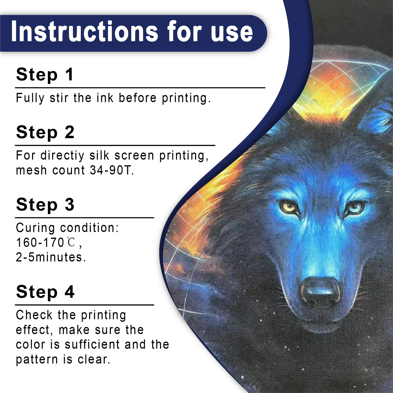
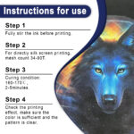
プラスチゾルインク 頑固な生き物です。自然乾燥しません。特定の内部温度に達する必要があります。通常は 320°F (160°C)「融合」状態に達すること。これは単なる提案ではなく、インク分子が物理的に結合する時点を指します。.
硬化が不十分だと、インクはもろいままです。お客様がそのシャツを初めて洗濯機に入れた瞬間、あなたの評判はすすぎ水と一緒に流れ落ちてしまいます。私はいつもチームにこう言っています。 “「直感ではなく、レーザー温度計を信じなさい。」”
4. 現場の秘密:正気を保つための3つの方法
私は苦労して学んだので、皆さんは同じ苦労をしなくて済みます。プリントで常にシャープでプロフェッショナルな仕上がりを求めるなら、以下のルールに従ってください。
ショップの気候をチェック
冬の朝にあなたの店が50°Fに保たれている場合、 プラスチゾルインクの卸売 出来上がったものは、冷たいピーナッツバターのような感触になるでしょう。そのため、大量の希釈剤を加えたくなるかもしれません。. やめてください。. とにかくかき混ぜてください。力強く。プラスチゾルはチキソトロピー性なので、かき混ぜればかき混ぜるほどクリーミーになります。 しなければならない 薄めてください。重量比で5%を超えないようにしてください。さもないと、あの深みのあるディープブルーが、かつての面影もない透明な幽霊のような色になってしまいます。.
接触外の「ニッケル」ルール
スクリーンは、疲れた犬のようにシャツに張り付いていてはいけません。5セント硬貨くらいの厚さの隙間が必要です。この「接触しない」状態によって、スキージが通過した後にメッシュが瞬時に剥がれ、にじんだ跡ではなく、くっきりとしたシャープな仕上がりになります。.
刃を鋭く保つ
切れ味の悪いスキージは、細部の描写を阻害します。インクを削るのではなく、押し付けてしまうからです。ディープブルーの色がぼやけて見える場合は、刃の状態を確認してください。この色には、切れ味の良い70デュロメーターのスキージが最適です。.
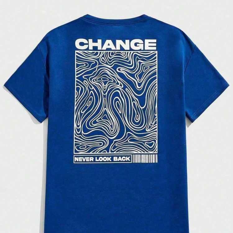
5. Deep Blue Masteryの技術仕様表
| 変数 | おすすめ | プロのヒント |
| メッシュ数 | 110~160 | 厚塗りには110、細線には160を使用してください。. |
| スクイージーの角度 | 75度 | 平坦すぎると、インクを使いすぎてしまう。. |
| フラッシュタイム | 3~5秒 | 触ってもベタつかない程度に。. |
| 下地 | ホワイト PVCフリー NB | 黒い衣服の鮮やかさを引き出すのに不可欠です。. |
6. 実務上のトラブルシューティング(よくある質問)
Q:なぜ私の青色は、特定のパーカーでは紫色に見えるのでしょうか?
A: それは「染料移行」です。パーカーのポリエステル染料がインクににじんでいます。 抗移動プラスチゾル または、硬化温度を低く設定してください。.
Q: Deep Blueの着心地を胸に「より柔らかく」することはできますか?
A:はい。「ソフトハンドベース」を少し混ぜてください。重たいプラスチック感を軽減しつつ、ミッドナイトカラーの色合いをあまり損なわずに済みます。.
Q:長時間の印刷で、均一な色合いを得るにはどうすればよいですか?
A: 一貫性は、あなたの流し込みストロークから生まれます。 プラスチゾールCMYKインク セットアップやスポットカラーの場合、最初のシャツから100枚目のシャツまで、圧力が一定に保たれるようにしてください。.
Q:この色を印刷するのに環境に優しい方法はありますか?
A: まさにその通りです。業界は PVCフリープラスチゾルインク. 地球環境にも優しいし、正直なところ、年々扱いやすくなっている。.
Q:成長中のショップにとって最適な仕入れ方法は何ですか?
A: クォート単位で買うのはやめましょう。ディープブルーがあなたの主力商品なら、ガロン単位で購入しましょう。 プラスチゾルインクサプライヤー. 価格割引は大きく、金曜日の午後に「緊急」注文が入った時にも、いつでも手元に置いておくことができます。.
| サイズ |
8オンス ,16オンス ,32オンス |
|---|
Deep Blue Screen Printing Plastisol Ink に対するレビュー12件
フィルターをクリア以前にこの商品を購入したことのあるログイン済みのユーザーのみレビューを残すことができます。
関連商品
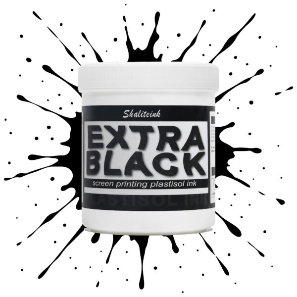
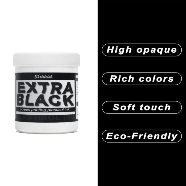
エクストラブラックスクリーン印刷プラスチゾルインク
お客様が真夜中のような濃さを求めているのに、「チャコールグレー」で妥協するのはもうやめましょう。Shaliteinkのエクストラブラックは、単なる濃いインクではありません。透明感を一筆で完全に消し去るために設計された、高顔料配合の強力なインクです。安価な黒インクは、濃い色の綿に色あせたエスプレッソのように見えることが多いですが、当社のフォーミュラは、見た目と同じくらい手触りの良い、プロフェッショナルなマットな質感で、濃密な「ブラックホール」のような仕上がりを実現します。.
日々の酷使に耐えるように設計されており、細かいメッシュも難なく切断できるほど滑らかでありながら、100回の洗濯後も深みのある色合いを保ちます。しっかりとしたベタ塗りを得るために何度も印刷を繰り返すことにうんざりしているなら、このインクはあなたの印刷機にふさわしいアップグレードです。増量剤もグレーの色調も一切なし。業界で最も深く、最も信頼性の高い黒を実現します。.
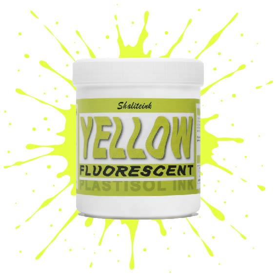
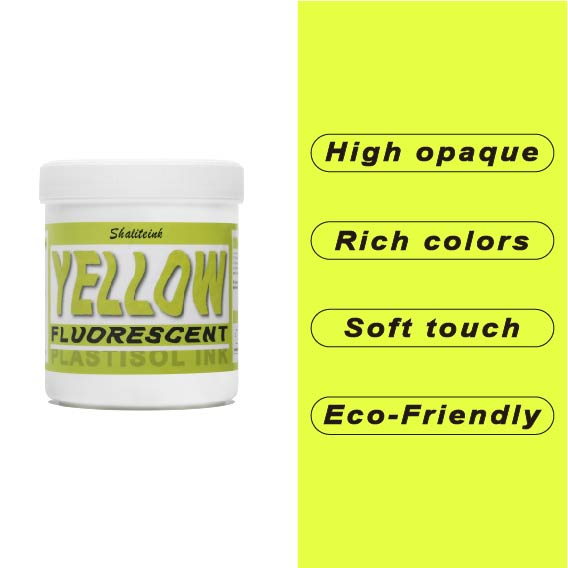
蛍光イエロースクリーン印刷プラスチゾルインク
色あせた蛍光ペンのような「ネオン」インクにうんざりしているなら、この高輝度インクこそ、あなたのショップに必要なものです。当社の蛍光イエローは、ただ明るいだけではありません。目に見えない紫外線を捉え、目を奪うような強烈な発色で、誰も無視できないほどの存在感を放ちます。バターのように滑らかなテクスチャーに仕上げたので、スクイージーと格闘することなく、メッシュをきれいに通過させることができます。.
安全装備でも派手なストリートウェアでも、このインクは塗った場所にしっかりと留まり、色落ちやひび割れを防ぎます。濃厚でクリーミーな質感で生地に完璧に馴染み(最高の仕上がりには白い下地が欠かせません)、有害な化学物質を排除することで作業環境の安全性を確保しました。くすんだ黄色で妥協するのはもうやめて、鮮やかな色でプリントを始めましょう。.
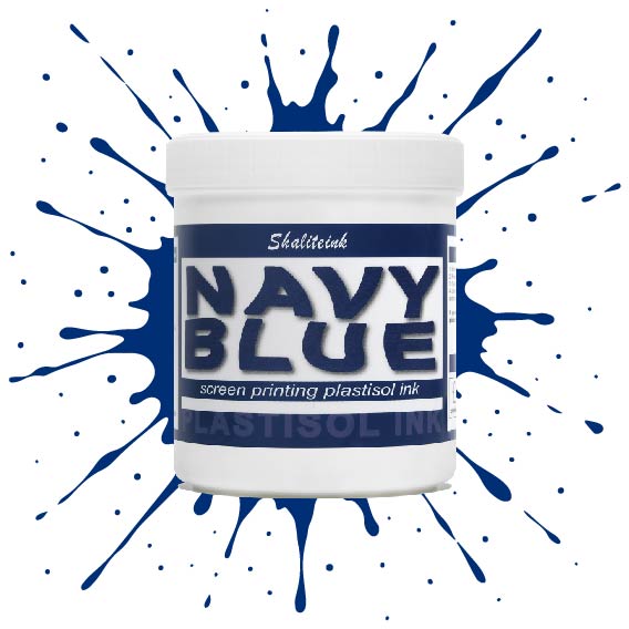
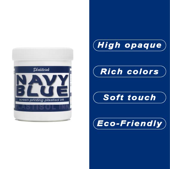
ネイビーブルースクリーン印刷プラスチゾルインク
薄くて水っぽいブルーインクでパーカーを台無しにしてきた経験から、しっかりとしたネイビーブルーインクはなかなか見つからないものだと痛感しています。当社のネイビーブルースクリーン印刷用プラスチゾルインクは、濃い色の生地にも一度でしっかり発色し、スクリーン上でもクリーミーな質感を保つため、まさに本物です。濃い色の衣類にもしっかりと定着するほどの濃さがありながら、メッシュをスムーズにクリアできるほど滑らかです。深みのあるプロフェッショナルなミッドナイトブルーの仕上がりを実現しながら、スクリーンの目詰まりという厄介な問題に悩まされることもありません。.
自社ブランドやカスタムオーダーの印刷では、段ボールのような質感ではなく、しっかりとした仕上がりを求めるものです。通気性と柔軟性に優れたPVCフリーのプラスチゾルインク「ブルー ソフトハンド」をお試しください。乾燥機や洗濯機にも対応し、耐久性にも優れています。この環境に優しいスクリーン印刷インクは無毒で使い方も非常に簡単なので、化学的な知識に気を取られることなく、作品制作に集中できます。もう推測に頼る必要はありません。本当に優れた性能を発揮するネイビーカラーのインクで印刷を始めましょう。.
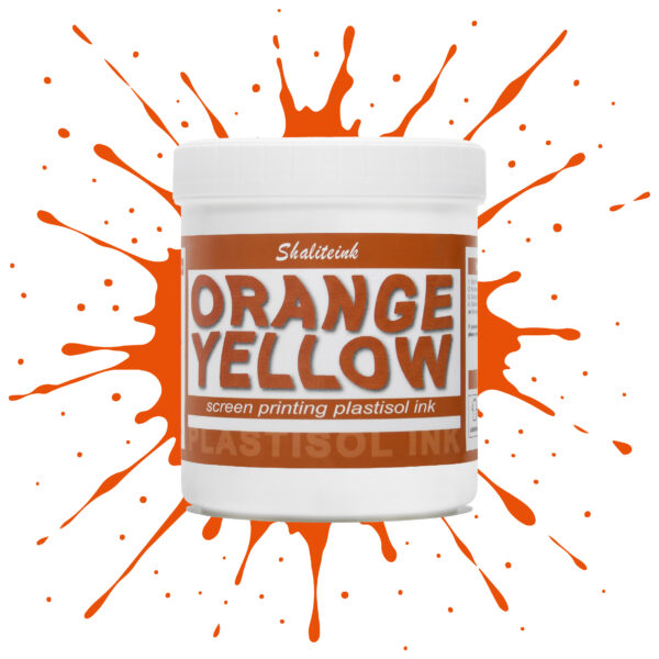
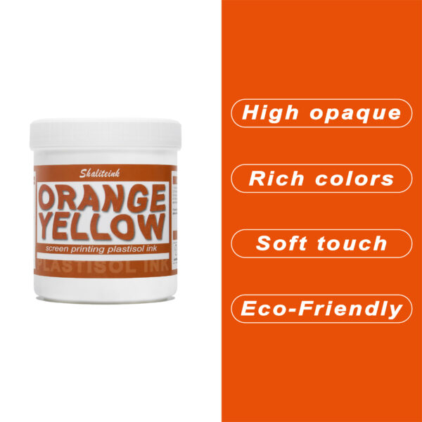
オレンジイエロースクリーン印刷プラスチゾルインク
暗い生地に溶け込んでしまうような「くすんだ」黄色で妥協するのはもうやめましょう。人目を引く鮮やかな発色の秘訣は、妥協を嫌う印刷業者向けに設計された、高不透明度の強力なオレンジイエロースクリーン印刷用プラスチゾルインクです。スポーツウェアでも小売店のTシャツでも、このインクは豊富な顔料含有量のおかげで鮮やかな発色を保ちます。ゴールドとオレンジの中間のような、大胆で太陽の光を浴びたような色合いでありながら、厚塗り感のないしっかりとした存在感を放ちます。.
安全対策は面倒な作業であってはなりません。そこで、この製品はPVCとフタル酸エステルを一切使用せず、お客様の店舗が法令を遵守し、環境にも配慮できるよう開発しました。独自のノンブリード(NB)技術により、扱いにくいポリエステル混紡素材でも染料のにじみを防ぎ、鮮やかな色合いを洗濯後も保ちます。滑らかで切りやすく、上質なソフトな手触りで、お客様にまるで魔法の手を持っているかのような印象を与えます。ぜひ一度お試しいただき、プロがShaliteinkを信頼する理由をご実感ください。.
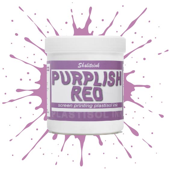
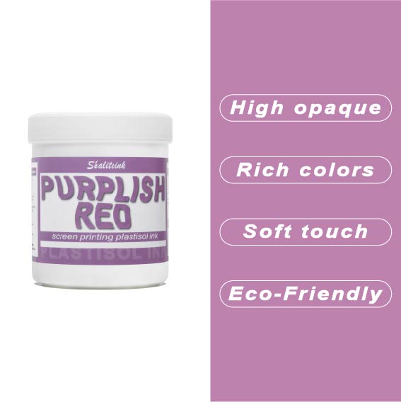
紫がかった赤のスクリーン印刷プラスチゾルインク
暗い色の衣類にプリントするとすぐに色が消えてしまう、つまらない赤色で妥協するのはもうやめましょう。当社のパープルレッド・スクリーン印刷用プラスチゾルインクは、高貴なバイオレットとエネルギッシュなクリムゾンの中間に位置する、深みのある魅力的な色合いです。それでいて、Tシャツをプラスチックの盾のように硬くすることなく、柔らかな手触りを保ちます。言葉にせずとも「高級感」をデザインに表現したい印刷業者にとって、まさに秘密兵器となるでしょう。.
このプロ仕様のインクは、画面上で何時間も乾きにくく、時間を気にすることなく作品制作に集中できます。高不透明で無毒性のブレンドで、厚手のコットンパーカーから軽量の合成繊維Tシャツまで、あらゆる素材に鮮やかな発色を実現します。Shaliteinkは洗濯や着用にも耐えるように設計されていますが、何よりも、ありきたりな原色ばかりの世界で、あなたの個性を際立たせるために開発されました。.
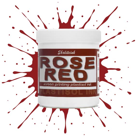
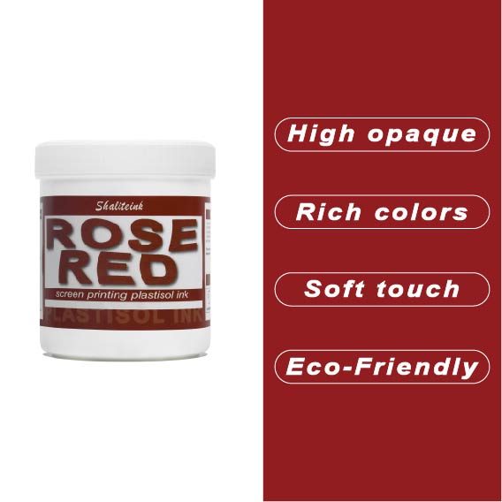
ローズレッドスクリーン印刷プラスチゾルインク
「ほぼ赤」で満足するのはもうやめて、本当に目を引く鮮やかな色で空間を支配しましょう。このローズレッドのスクリーン印刷用プラスチゾルインクは、何千回も試作を重ねてきましたが、濃色のTシャツに高級感あふれる鮮やかな発色を実現し、生地が硬いプラスチックシートのように感じられることも決してありません。ランチ休憩中にメッシュの中でインクが乾いてしまうといった面倒な心配をせずに、プロ並みの仕上がりを求めるすべての人にとって、まさに究極のプラスチゾルインクです。.
環境意識の高い顧客層やハイエンドのストリートウェアブランド向けに印刷するなら、PVCフリーのプラスチゾルインク「ローズレッド ショップセーフ 耐久性インク」がおすすめです。肌に優しく、作業場を無毒に保つので、有害なガスを気にすることなく、作品制作に集中できます。これは単なるインクではありません。顧客を惹きつけ、リピーターを増やす秘訣なのです。.
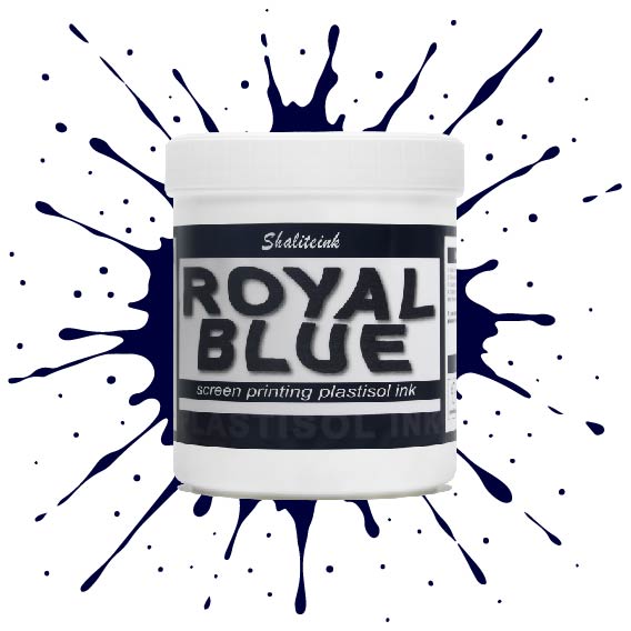
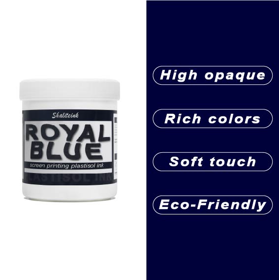
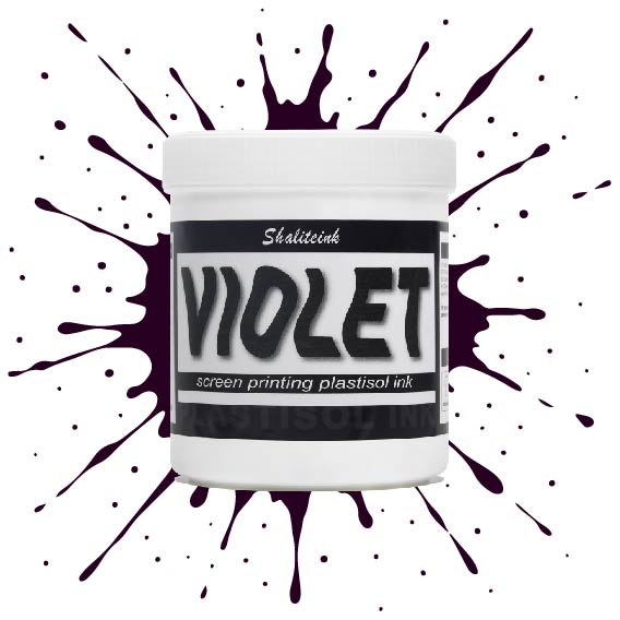
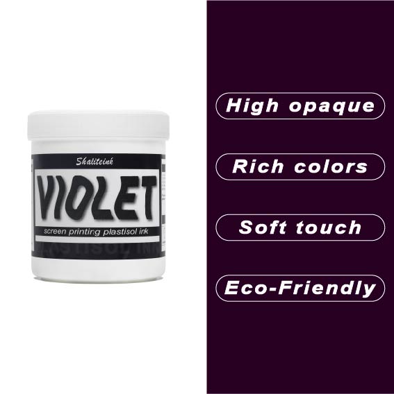
バイオレットレッドスクリーン印刷プラスチゾルインク
正直言って、ほとんどの赤インクはファストフードのロゴに似合いそうな、派手で明るすぎる、ちょっと安っぽい印象です。でも、このバイオレットレッドは全く別物。深みのある、落ち着いたワインのような色合いで、ごく普通の$5の無地のシャツが、まるで高級ブティックの$40のシャツのように見えます。真っ黒なパーカーにこのインクを使ってみたところ、高い不透明度のおかげで、色がくすんで濁ったような色にならず、本来の色合いを保ってくれました。クライアントが、ありきたりなジムシャツではなく、洗練されたデザインのシャツを求めている時に、まさに「圧倒的なアドバンテージ」となるでしょう。.
冷たいピーナッツバターのようなインクと格闘するのはもうやめましょう。このインクはバケツから出した瞬間からバターのように滑らかで、かき混ぜたり薄めたりする必要は一切ありません。コーヒーを買いに行ったり、配達の対応をしたりしても、インクが固まったり、スクリーンを傷めたりすることはありません。それに、正直に言って、誰かが実際に着用した瞬間にひび割れてしまうプリントほど、ブランドをあっという間にダメにするものはありません。このインクは生地の動きに合わせて伸縮し、手触りも柔らかく、高温洗浄テストにも耐え、剥がれることもありません。とにかく使いやすいので、スクリーンをこする時間を減らし、印刷作業に集中できます。.
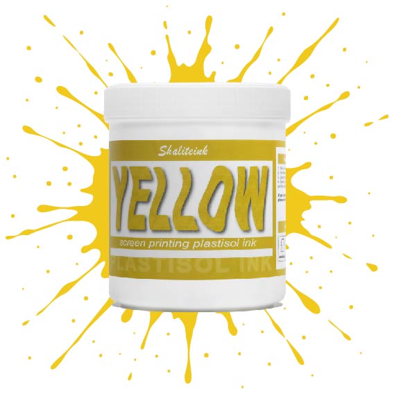
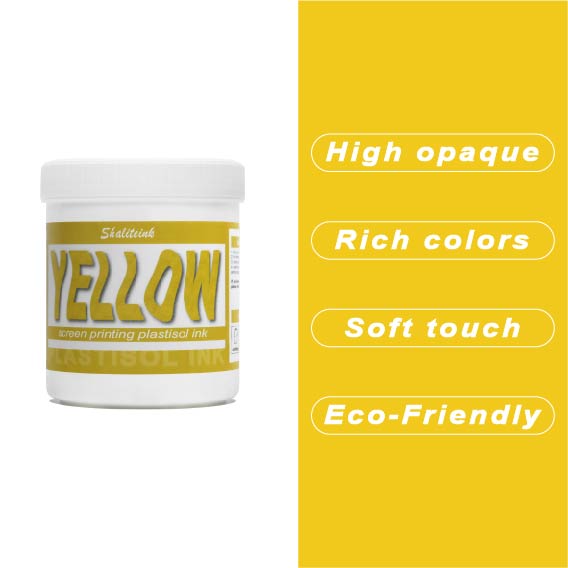
黄色のスクリーン印刷プラスチゾルインク
太陽の光のような鮮やかなプリントを目指しているのに、「沼のような緑」のプリントで妥協するのはもうやめましょう。黄色はインク棚の女王様です。本来半透明で、濃い色の生地にプリントすると濁ったり弱々しく見えたりすることが非常に難しいことで知られています。だからこそ、シャライトインクは顔料を豊富に含んだイエロープラスチゾルを開発しました。白い下地の上に完璧に定着するように特別に設計されており、遠くからでもはっきりと見えるほど鮮やかで、乾燥機にかけた後も明るさが持続します。.
鮮やかでエネルギッシュなレモンイエロー、あるいは温かみのあるバーシティジャケットのようなゴールデンイエロー、どちらの色をお探しでも、このインクはバターのように滑らかで、プリント中にメッシュが乾くこともありません。薄くムラのある仕上がりになるよう配合を調整し、クリーミーな質感を実現。プリントするたびに満足感を得られます。数回の洗濯後もひび割れたり色褪せたりしない、すぐに店頭に並べられるシャツをお求めなら、このイエローこそ、あなたのスクイージーが待ち望んでいた色です。.
 EN
EN  DE
DE  ES
ES  PT
PT  JA
JA
アナ・コスタ –
ユーザーと結果を容易にする
ピーター・フィッシャー –
Hochwertige Qualität und schne
マイケル・ブラウン –
品質は最高で、配送も早かったです。品質は最高で、配送も早かったです。日々の業務に非常に役立っています。日々の業務に非常に役立っています。期待以上のものでした。
アンナ・シュミット –
Einfache Anwendung und zuverlässige Leistung。 Leicht zu Nutzen und konstante Ergebnisse。ハットマインE
ヤン・コワルスキー –
ジアワ バルゾ ドブジェ ナ コ ジ
ローラ・ジョンソン –
日々の業務に非常に役立っています。日々の業務に非常に役立っています。品質は高級感があり、配送も迅速でした。日々の業務に非常に役立っています。
ピオトル・ジエリンスキ –
Łatwy w użyciu i powtarzalne rezultaty. Bardzo dobry stosunek jakości do ceny。 Łatwa aplikacja i niezawodne działanie。バルゾ・ドブリー・ストスネク・ヤコシ・ディ
ピーター・フィッシャー –
Sehr グーテス Preis‑Leistungs‑Ver
ジョン・スミス –
価格に見合った価値が非常に高いです。スムーズなアプリケーションと信頼性の高いパフォーマンス。価格に見合った価値が非常に高いです。ほとんどの場合、期待を上回りました。
フェリックス・ウェーバー –
Einfache Anwendung und zuverlässige Leistung。 Leicht zu Nutzen und konstante Ergebnisse。ホッホヴェルティゲ
マイケル・ブラウン –
日々の業務に非常に役立っています。スムーズなアプリケーションと信頼性の高いパフォーマンス。日々の業務に非常に役立っています。日々の業務に非常に役立っています。使いやすく、一貫した結果が得られます。
ルイス・トーレス –
ユーザーと結果の一貫性を維持します。楽しい日記です。会話に最適なアプリケーションです。ファンシオナ ムイ ビエン パラム