
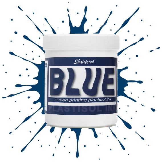
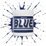
ブルースクリーン印刷プラスチゾルインク
価格帯: $14.99 – $30.99
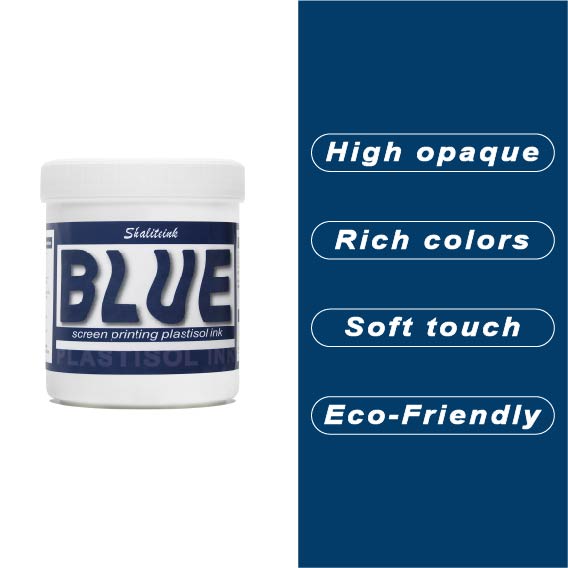
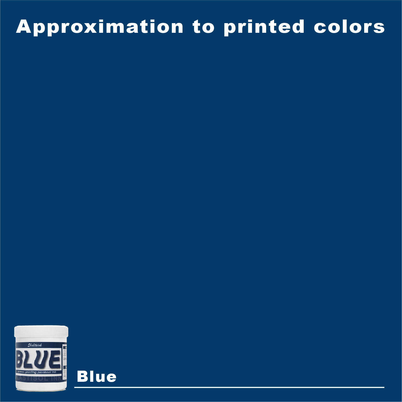
薄くて透明感のあるブルーインクは、生地に触れた瞬間に消えてしまうため、もう悩む必要はありません。当社のブルースクリーン印刷用プラスチゾルインクは、バケツから出した瞬間からクリーミーな質感で、腕を疲れさせることなく、メッシュを通して完璧な透け感を実現します。濃いネイビーブルーでも鮮やかなブルーでも、 鮮やかな青, このインクは発色が鮮やかでしっかりと定着しますが、休憩中に画面上で乾いてしまうこともありません。.
長期間の使用に耐えるよう設計されており、適切な温度で洗濯すれば、何度洗ってもひび割れたり剥がれたりしません。有害なフタル酸エステル類を排除し、丈夫な作業服から柔らかいベビー服まで、あらゆる用途に安心してご使用いただけます。「まあまあ」では満足できない、あらゆる店舗にとって必要な、信頼性が高く不透明なブルーです。.
青色印刷の達人による設計図:プロのように青色プラスチゾルインクを印刷する方法(そして正気を保つ方法)
青色について秘密を一つお教えしましょう。スクリーン印刷の世界では、青はまさに王様です。ニューヨークからパリまで、どこのTシャツショップに入っても、紺色のパーカーやロイヤルブルーのTシャツがずらりと並んだラックを目にするでしょう。青は信頼の色であり、空の色でもありますが、印刷業者にとっては、化学反応を軽視すると、とてつもないフラストレーションの原因となる色にもなり得るのです。.
私は何十年もスクイージーの後ろにいました。ほとんどの人が持っているシャツよりも多くのシャツを台無しにしてきましたが、 プラスチゾルインク それはあなたの親友であり、同時に最も厳しい批評家でもあります。正しく扱えば、スクリーンの中で永遠に開いたままです。硬化を間違えると、ひどい日焼けのように洗濯で剥がれてしまいます。今日は、私が知っているすべてのことについて、そのベールを剥がします。 ブルースクリーン印刷プラスチゾルインク. コーヒーでも飲みながら、じっくりと掘り下げていきましょう。.
青インクが「安全策」とされる理由、しかしそれが必ずしも安全とは限らない理由
誰もが青が好きです。統計的に見ても、世界で最も人気のある色です。クライアントが来店して何が欲しいか分からない場合、たいてい青を選びます。プロフェッショナルでありながらリラックスした印象を与えます。しかし、印刷業者であれば、「青」という言葉が広い意味を持つことをご存知でしょう。私たちは、 明るい青色のスクリーン印刷プラスチゾルインク 白いシャツから飛び出してくるもの?それとも、 ネイビーブルー 暗い色の服に合わせると、洗練された印象になるようなデザインが必要ですか?
青色の化学は実に興味深い。ほとんどの青色顔料はフタロシアニンから作られている。フタロシアニンは安定した顔料だが、透明になることもある。これが最初の難関だ。黒いシャツに直接青色をプリントすると、色が消えてしまう。まるで泥のような、ぼんやりとしたプリントになってしまうのだ。あの「すごい!」と思わせる効果を得るには、不透明度と下地処理について理解する必要がある。.
青の濃淡のスペクトル
すべての青色が同じように作られているわけではありません。私の店では、青色系の色だけを集めた棚を設けています。ここでは、青色を次のように分類しています。
-
ロイヤルブルー: これが標準だ。明るくインパクトがあり、「チームスポーツ」を強く印象づける。“
-
ネイビーブルー: 企業御用達の店。暗くて、暗いままでなければならない。.
-
プロセスブルー(シアン): これはCMYK印刷用です。薄くて透明なデザインです。風景写真を印刷したい場合は、 プロセスブルースクリーン印刷プラスチゾルインク.
-
スペシャリティ・ブルース: これらにはあなたの 蛍光ブルー 90年代のレトロなルックや 銀スクリーン印刷インクプラスチゾル メタリックな仕上がりにするために、青色を混ぜています。.
技術的な現実:青インクの管理方法
ただ画面にインクを垂らして、あとは運任せにするだけではダメです。このビジネスで成功するには、入念な準備と努力が不可欠です。適切なツールと適切な環境が必要なのです。.
メッシュ数の選択
初心者がよく犯す間違いを私はよく目にします。彼らは不透明度の高い青色に230メッシュを使って、なぜ印刷物が灰色に見えるのか不思議に思うのです。あるいは、細かい中間調に110メッシュを使って、ぼやけたひどい仕上がりになってしまうのです。.
| 青インクタイプ | メッシュ数 | 最適な使用例 |
| 不透明なロイヤルブルー | 110~156 | 白い生地をベースにした、濃い色の綿素材の衣類。. |
| ネイビーブルー | 156~196 | 淡い色のシャツに企業のロゴが入っている。. |
| プロセスブルー(CMYK) | 305~355 | 高精細な写真プリント。. |
| メタリック/シマーブルー | 60~86 | 大きな雪片で、通り抜けるには広い扉が必要だ。. |
スクイージー戦略
ほとんどの青色プラスチゾル作業には、70デュロメーターのスキージを好んで使います。インクをきれいにせん断するのに十分な硬さがありながら、適度な量のインクを塗布できるほど柔らかいからです。 ディープブルー 白いシャツにプリントする場合は、シャープなエッジが望ましいです。白い下地にプリントする場合は、インクをより多く押し出すために、エッジを少し丸くした方が良いでしょう。.
アンダーベース:真の青の秘密
黒いパーカーに青色をプリントする場合は、必ず白い下地を使用してください。壁の下塗り材のようなものと考えてください。下地がないと、黒い生地が青色の顔料を「吸収」してしまいます。.
私はいつも生徒たちに「プリント・フラッシュ・プリント」と言っています。白いベースをプリントして、 フラッシュドライヤー 数秒間そのままにしておきます。次に、その上に青色を印刷します。こうすることで、青色がバケツの中の色と全く同じように見えます。高品質のものを使用すれば ホワイトスクリーン印刷プラスチゾルインク ベースカラーとして使う青色は、鮮やかで清潔感のある色合いになります。.
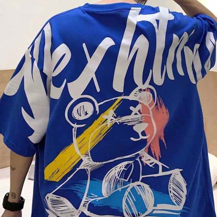
硬化:ほとんどのプリンターが失敗する箇所
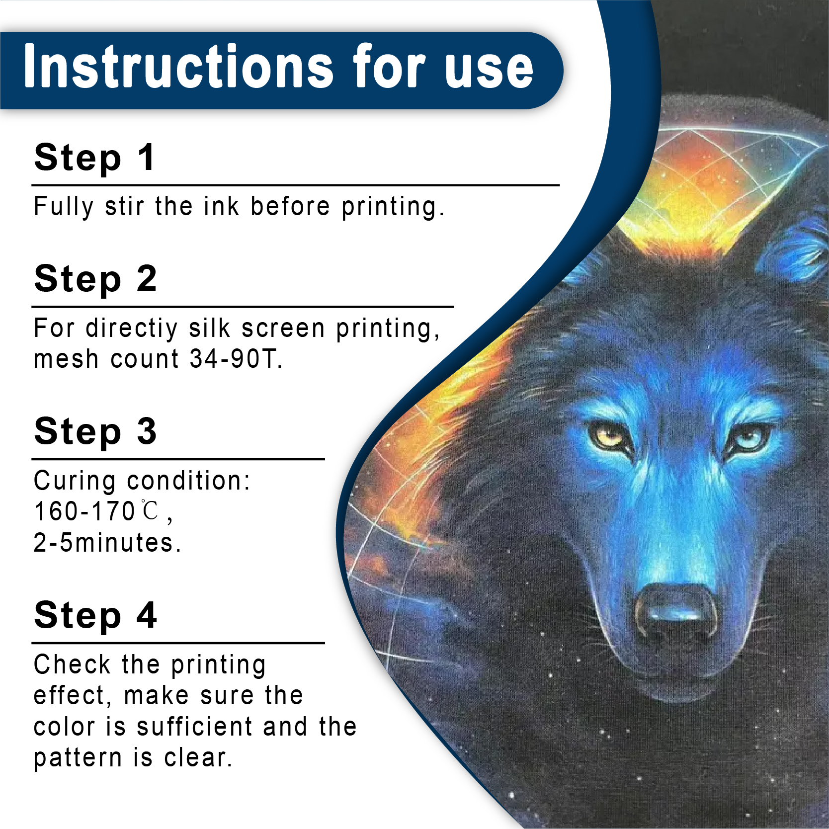
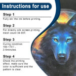
プラスチゾルインクは基本的に液状のプラスチックです。水性インクのように「乾燥」するのではなく、「硬化」します。つまり、インクの分子一つ一つが特定の温度(通常は華氏320度、摂氏160度)に達して生地と融合する必要があるのです。.
以前、地元のマラソン大会用に紺色のシャツを500枚も大量注文したことがあります。乾燥機の設定を急いでしまい、糊付けのテストもせずに仕上げてしまいました。3日後、クライアントから電話がかかってきました。一度洗濯しただけで、青いロゴがひび割れて剥がれ落ちてしまったというのです。結局、無料で全枚印刷し直さなければなりませんでした。これは$2,000ドルの教訓になりました。.
プロのヒント: レーザー温度計を使用するか、できれば「ドーナツ型」(感熱ストリップ)を使用して、インクが融点に達していることを確認してください。乾燥機のデジタル表示だけを鵜呑みにしないでください。重要なのはインクの温度であり、空気の温度ではありません。.
硬化基準表
| インクの種類 | フラッシュ温度 | 完全硬化温度 | トンネル内での時間(推定) |
| 標準プラスチゾル | 220°F (104°C) | 320°F (160°C) | 60~90秒 |
| 滲みにくいブルー | 180°F (82°C) | 280°F (138°C) | 60~90秒 |
| PVCフリーNBインク | 200°F (93°C) | 300°F (149°C) | 70~95秒 |
トラブルシューティング:厄介な染料移行
私はそれを千回も見てきました。あなたは素晴らしい ロイヤルブルー 赤いポリエステルジャージにプリントしたら、完璧に仕上がった。まるでヒーローになった気分で家に帰る。ところが翌朝、お店に行ってみると、青色が不気味な紫色に変色していた。これは染料のにじみで、Yelpの悪いレビューよりも早くあなたの評判を地に落とすことになる。.
何が起こったのですか?乾燥機の熱で赤いポリエステル染料が気化し、そのガスが青いインクに流れ込んで定着してしまいました。これを防ぐには、「にじまない」インクか、 アンチマイグレーションスクリーン印刷インク(プラスチゾル). 生地と色の間に物理的な壁があると考えてください。100%ポリエステルに印刷する場合は、この工程を省略することはできません。省略すると、利益を危険にさらすことになります。.
環境に優しい転換:PVCフリーのブルーインク
業界は昔ながらの重たい化学薬品から離れつつあり、顧客はますます目が肥えてきている。見た目が良いだけでなく、着心地も良く、安全なシャツを求めているのだ。だからこそ私は PVCフリープラスチゾルインク.
最近、私の主力生産ラインの1つを 青色PVCフリーNBスクリーン印刷インク. さて、「NB」とは「ノンブリード」と「ノービルド」の略です。シャツの着心地を劇的に変える画期的な素材です。安物のジムシャツによくある、重たいプラスチックのような感触をご存知ですか?このシャツはそれとは正反対です。柔らかく通気性に優れ、アスリートの動きにも十分対応できる伸縮性があります。さらに、フタル酸エステル不使用なので、安全規制を気にすることなく、ベビー服や高級エコブティックのウェアにもプリントできます。.
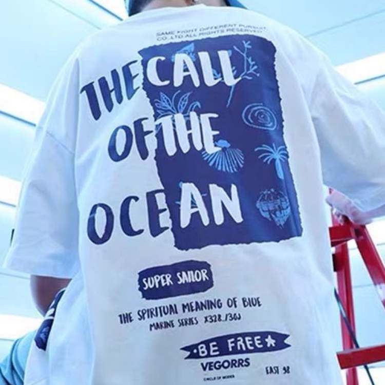
ミックスの芸術
お客様によっては、非常に特定の青色を希望されることがあります。塗料の見本やリボンの切れ端を持参される方もいらっしゃいます。ここで、あなたは科学者のような存在になります。調色システムを使えば、どんな色でも作り出すことができるのです。.
始めに プロセスブルー 少量の 黒 それを暗くするか、 白 淡いスカイブルーに仕上げるには、必要な量よりも多めに混ぜておくのがコツです。シャツを5枚残したところで、特注色の塗料が足りなくなるほど最悪なことはありません。.
メンテナンスと保管
プラスチゾルは丈夫ですが、決して壊れないわけではありません。青インクは涼しく乾燥した場所に保管してください。作業場が高温になると、インクがバケツの中でゲル化してしまうことがあります。そうなると、インクは巨大な青いゴムボールのようになってしまい、使い物にならなくなります。.
蓋をしっかり閉めてください。ほこりはきれいな印刷の敵です。もし糸くずが ネイビーブルー インクバケツからインクが漏れると、シャツに「ピンホール」や筋状の跡が残ってしまいます。私はインクバケツを金のように大切に扱っています。あなたもそうするべきです。.
事例研究:「オーシャンウェーブ」プロジェクト
地元のサーフショップが10周年記念に5色の青のグラデーションを希望していました。 アシッドブルー に ディープブルー.
ハーフトーンとウェット・オン・ウェット印刷技法を用いることで、リアルな水の効果を生み出しました。細部を鮮明に保つため、230メッシュの線を使用しました。鍵となったのはインクの粘度です。プラスチゾルインクをバターのように滑らかにするために、少量のインク希釈剤を使用しました。その結果、Tシャツは2日で完売しました。これは、青色のスペクトルをマスターすれば、単なる衣服ではなく、芸術作品を生み出すことができるということを証明しました。.
結論:なぜ私たちは印刷を続けるのか
正直に言おう。この仕事は汚れるし、うるさいし、7月の午後、エアコンのない店では最悪だ。手はいつも汚れるし、腰はいつも痛む。でも、スクイージーをメッシュの上で滑らせると、何とも言えない魔法のような感覚が生まれるんだ。.
そのスクリーンを持ち上げると、 鮮やかなブライトブルー 生地に叩きつける瞬間は、まるで勝利を収めたような気分だ。これは、情熱を傾ける者には報いがあり、怠惰な者には罰を与える職人技だ。熱加減を細かく調整する忍耐力と、下地の不具合を見抜く目があれば、必ず成功するだろう。この店では、青は単なる色ではなく、品質の証なのだ。.
よくある質問(FAQ)
1. なぜ私の青色のプラスチゾルインクは、濃い色のシャツに塗ると透明になってしまうのですか?
ほとんどの青色顔料は本来半透明です。濃い色の生地に鮮やかな発色を得るには、白い下地を使用するか、濃い色の衣類用に設計された「高不透明度」の青色インクを選択する必要があります。高品質のオプションは以下で見つけることができます。 シャライトインク プラスチゾルインク.
2. プラスチゾルインクの手触りを柔らかくすることはできますか?
はい!インクに「ソフトハンドベース」または希釈剤を加えることができます。これによりインクが薄まり、生地に浸透しやすくなります。または、 PVCフリープラスチゾルインク 当然ながら、より柔らかな感触です。.
3. 青色のプラスチゾルインクはどれくらいで乾きますか?
プラスチゾルは室温では完全に「乾燥」しません。硬化させるには160℃(320°F)まで加熱する必要があります。コンベア式乾燥機の場合、ベルトの速度とヒーターの高さにもよりますが、通常60秒から90秒程度かかります。.
4. 紺色のインクに最適なメッシュ数はいくつですか?
ほとんどの用途では、156メッシュまたは160メッシュが最適です。十分なインク透過性があり、良好なカバー力を実現しながらも、文字の輪郭を鮮明に保つのに十分な細かさを備えています。.
5. 青いインクが赤いシャツに紫色に変色するのを防ぐにはどうすればよいですか?
これは染料の移行です。 インクの移行防止. また、乾燥機の温度は、完全な硬化が得られる範囲でできるだけ低く設定するようにしてください。.
| サイズ |
8オンス ,16オンス ,32オンス |
|---|
Blue Screen Printing Plastisol Ink に対するレビュー9件
フィルターをクリア以前にこの商品を購入したことのあるログイン済みのユーザーのみレビューを残すことができます。
関連商品
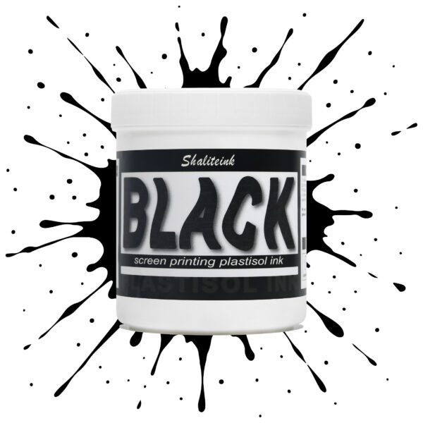
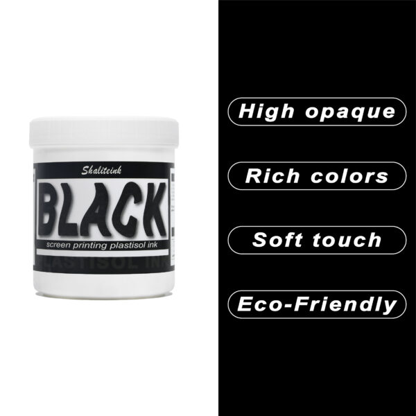
黒スクリーン印刷プラスチゾルインク
「ダークグレー」で満足して、それを黒と呼ぶのはやめましょう。 黒色プラスチゾルインク このインクは、スクリーンを詰まらせ、シャツの仕上がりをくすませる、粘り気のある濃いインクに悩まされている印刷業者向けに開発されました。バターのように滑らかでクリーミーな質感で、高密度のメッシュでもスムーズに印刷でき、しかも一度の印刷で生地の色をしっかり定着させます。100%コットンTシャツでも、扱いの難しい混紡生地でも、このインクは柔軟でマットな「ミッドナイト」カラーに仕上がり、最初の洗濯後もひび割れたり剥がれたりしません。お客様が期待する、プロ仕様の高品質なブラックです。.
安全性は必ずしも性能を犠牲にすることを意味するわけではありません。当社のフォーミュラはフタル酸エステルを一切使用していません( PVCフリーのオプション (入手可能)なので、化学薬品のトラブルを気にすることなく、高級ブランドの印刷が可能です。発色が良く、スクリーン上でインクが定着しやすく、インクの蓄積も少なく、鮮明なディテールを維持します。印刷作業の効率化と、まるでブティックで作られたような仕上がりを実現する、頼りになるインクをお探しなら、このインクを印刷機に常備しておくのがおすすめです。.
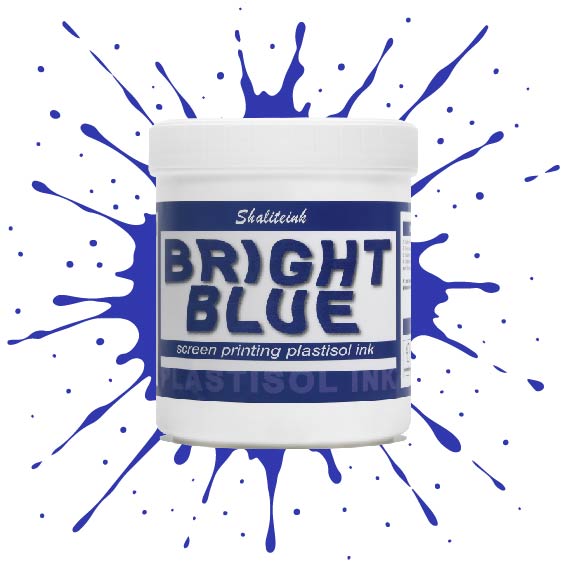
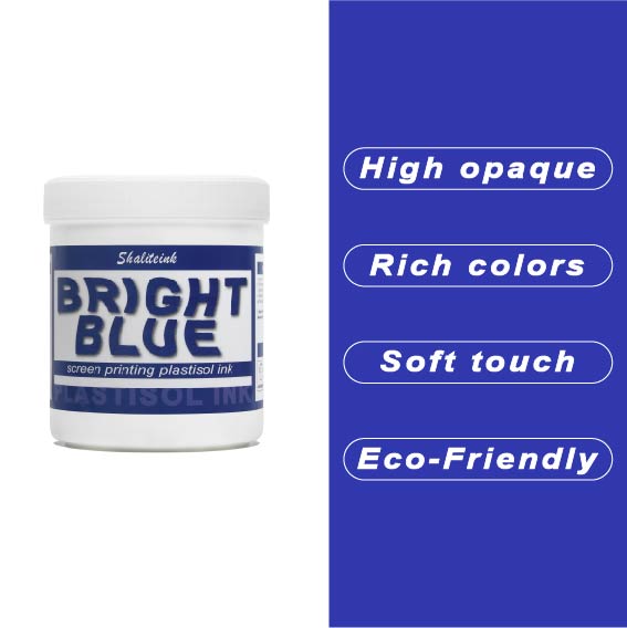
明るい青色のスクリーン印刷プラスチゾルインク
オフィスカーペットのようなくすんだ青色で妥協するのはもうやめましょう。Shaliteinkのブライトブルー・プラスチゾルインクを使えば、シャツに地中海の夏の空のような鮮やかな色合いを与えることができます。まるで上質なベシャメルソースのように滑らかに伸び、プリントが終われば使い込んだ革ブーツのように丈夫です。このインクは作業中にスクリーン上で乾くことがないので、焦らずにじっくりと作品作りに集中できます。.
ご自宅のスタジオや小規模な店舗でプリントされる方が多いことを考慮し、この製品は高い不透明度と環境への配慮を両立させました。「NB」シリーズはフタル酸エステル不使用で、OEKO-TEXなどの世界で最も厳しい安全基準を満たしています。160℃(320°F)で適切に硬化させれば、最初の洗濯後も色落ちしない鮮やかなシャツが完成します。.
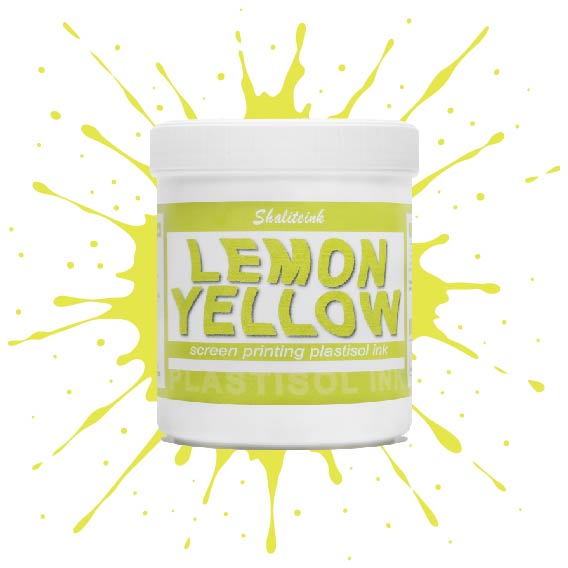
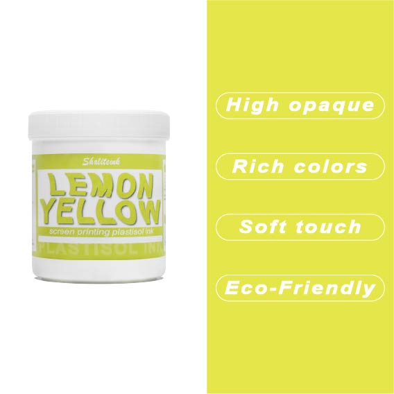
濃いレモンイエローのスクリーン印刷用プラスチゾルインク
紺色や黒のシャツに触れた途端に濁って透明になってしまう「幽霊のような」黄色との戦いはもう終わりにしましょう。Shaliteinkのディープレモンイエローは、このパレットのヘビー級チャンピオン。圧倒的な顔料濃度で、硬くて「防弾」のような感触ではなく、驚くほどの不透明度を実現しています。鮮やかなプリムローズと深みのあるゴールデンロッドの中間に位置する、パンチの効いた高彩度の色合いで、最も暗い生地でも、その鮮やかでエネルギッシュな雰囲気を保ちます。.
印刷作業の「プリント→フラッシュ→プリント」という単調な作業にうんざりしている印刷業者向けに設計されたこのインクは、クリーミーで粘度が低く、まるでバターのようにメッシュをスムーズに通過します。100%コットンでも、扱いの難しい混紡素材でも、洗濯を繰り返しても鮮やかな発色を保つ、小売店向けのソフトな仕上がりを実現します。くすんだ黄色で満足する必要はありません。このインクを使えば、デザインにふさわしい「ハイボルテージ」なインパクトを与え、際立った存在感を放つことができます。.
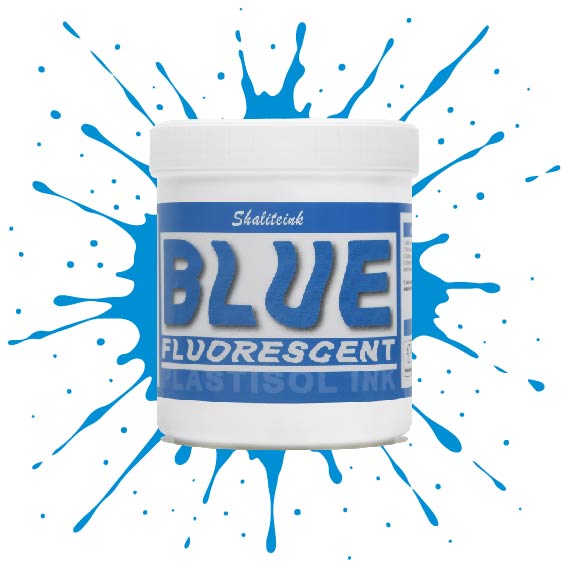
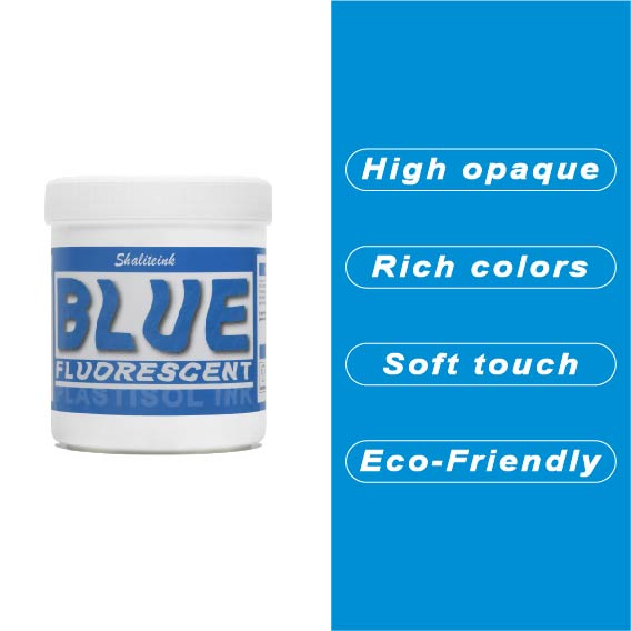
蛍光ブルースクリーン印刷プラスチゾルインク
「やや明るめの」青で満足するのはやめて、あなたのデザインにふさわしい、刺激的なエッジを与えましょう。 蛍光ブループラスチゾルインク まさにボトルに詰められた稲妻――高顔料で紫外線に反応するフォーミュラは、ブラックライトの下では鮮烈な輝きを放ち、明るい日光の下では部屋全体を圧倒します。バケツから出してすぐにバターのように滑らかな書き心地なので、最初のひと塗り前にインクと格闘する必要はもうありません。また、フタル酸エステルを一切使用していないため、どんなクライアントにも安心して印刷できます。.
濃い色の衣類に、目を奪うような鮮やかな発色を実現するには、まずはくっきりとした白い下地を軽く塗るだけで、あとはこのブルーインクにお任せください。厚みのあるジューシーな仕上がりを求めるなら110メッシュ、よりシャープなディテールを求めるなら156メッシュ。どちらのサイズでも、完璧なせん断力で、剥がれたり色褪せたりしない、耐久性に優れたプロフェッショナルな仕上がりになります。ただの印刷業者から、誰もが話題にする印刷会社へとステップアップしたいなら、このインクこそがそれを可能にするのです。.
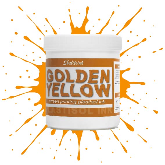
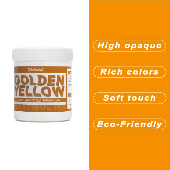
ゴールデンイエロースクリーン印刷プラスチゾルインク
濃い色のシャツに黄色のプリントを施すと、まるで泥のようなマスタード色になってしまうのにうんざりしていませんか?その気持ち、よく分かります。ほとんどの黄色は透けやすく、プリントしづらいものですが、当社のゴールデンイエロー・プラスチゾルは、黒のパーカーや紺のジャージに本当に必要な高い隠蔽力を備えています。クリーミーで粘度の低いこのインクは、メッシュからきれいに剥がれ、5回も重ね塗りしたり、シャツが合板のようにゴワゴワしたりすることなく、鮮やかな「アスレチックゴールド」の発色を実現します。.
色味だけでなく、このインクは作業現場でも扱いやすく、昼食に出かけている間にスクリーン上で乾いてしまうこともありません。100%フタル酸エステル不使用なので、どんなブランドでも安心して印刷でき、最終結果は伸縮テストに合格し、洗濯にも耐えられます。インクと格闘するのはもうやめて、思い通りの仕上がりになるゴールドインクで納期を守りましょう。.
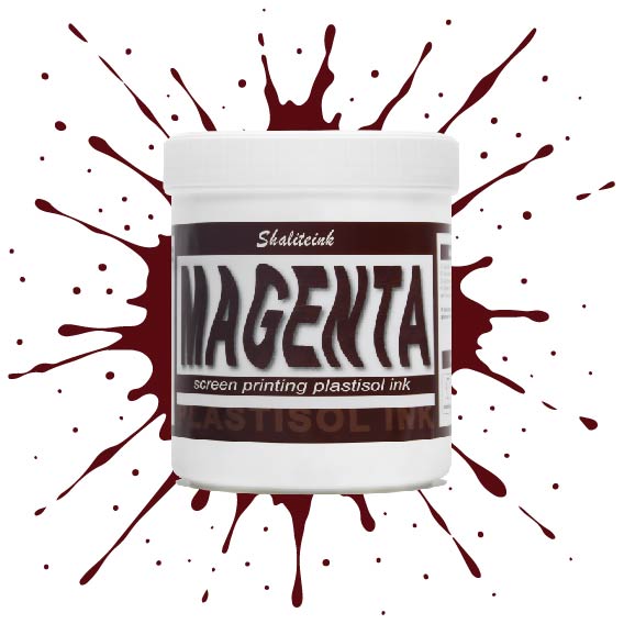
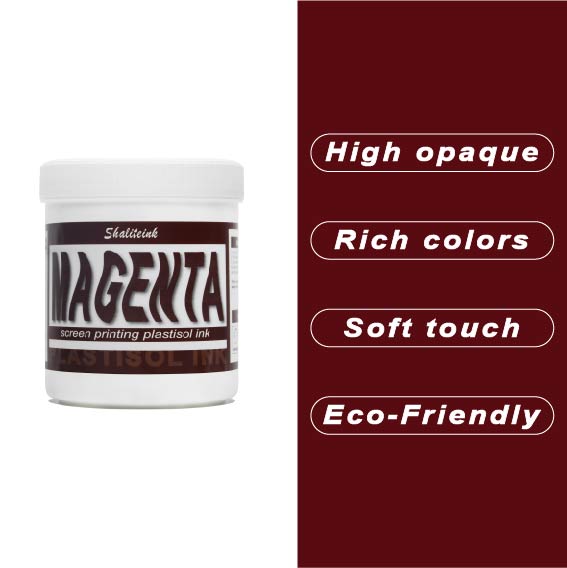
マゼンタスクリーン印刷プラスチゾルインク
正直に言いましょう。薄めたイチゴミルクのようなマゼンタなんて誰も欲しくありません。必要なのは、本当に発色の良いマゼンタスクリーン印刷用プラスチゾルインクです。このShaliteinkのインクはまさに本物。メッシュにしっかり定着するほどの粘度を持ちながら、スキージがスクリーンに触れた瞬間にシルクのように滑らかに伸びます。濃い色の印刷なら、妥協は禁物。鮮やかなホワイトスクリーン印刷用プラスチゾルインクをベースに重ねて使用すれば、色が本当に鮮やかに映えます。すぐに印刷に使用でき、メンテナンスも簡単。コーヒーを買いに行っている間にスクリーン上でインクが固まってしまう心配もありません。.
実際に印刷機を操作しているプラスチゾルインク専門店として、私たちは安価で粉っぽい顔料の悪夢をよく知っています。当社のマゼンタインクは100%で、フタル酸エステル不使用、耐久性に優れています。ひび割れや剥がれがなく、洗濯にも強く、通常は衣類自体よりも長持ちします。スクリーン印刷のスターターキットで始めたばかりの方でも、自動印刷機で何千枚も印刷している方でも、このインクを使えば、一般的なプラスチゾルインクにつきものの悩みを解消し、高級感のある仕上がりを実現できます。.
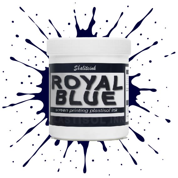
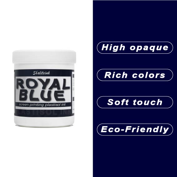
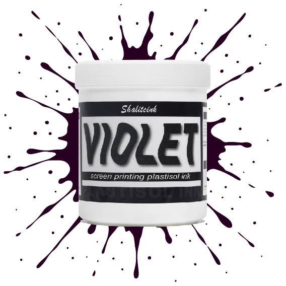
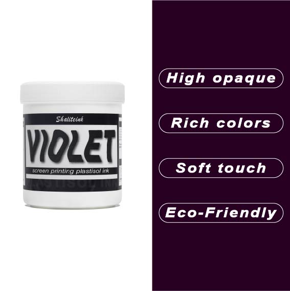
バイオレットレッドスクリーン印刷プラスチゾルインク
正直言って、ほとんどの赤インクはファストフードのロゴに似合いそうな、派手で明るすぎる、ちょっと安っぽい印象です。でも、このバイオレットレッドは全く別物。深みのある、落ち着いたワインのような色合いで、ごく普通の$5の無地のシャツが、まるで高級ブティックの$40のシャツのように見えます。真っ黒なパーカーにこのインクを使ってみたところ、高い不透明度のおかげで、色がくすんで濁ったような色にならず、本来の色合いを保ってくれました。クライアントが、ありきたりなジムシャツではなく、洗練されたデザインのシャツを求めている時に、まさに「圧倒的なアドバンテージ」となるでしょう。.
冷たいピーナッツバターのようなインクと格闘するのはもうやめましょう。このインクはバケツから出した瞬間からバターのように滑らかで、かき混ぜたり薄めたりする必要は一切ありません。コーヒーを買いに行ったり、配達の対応をしたりしても、インクが固まったり、スクリーンを傷めたりすることはありません。それに、正直に言って、誰かが実際に着用した瞬間にひび割れてしまうプリントほど、ブランドをあっという間にダメにするものはありません。このインクは生地の動きに合わせて伸縮し、手触りも柔らかく、高温洗浄テストにも耐え、剥がれることもありません。とにかく使いやすいので、スクリーンをこする時間を減らし、印刷作業に集中できます。.
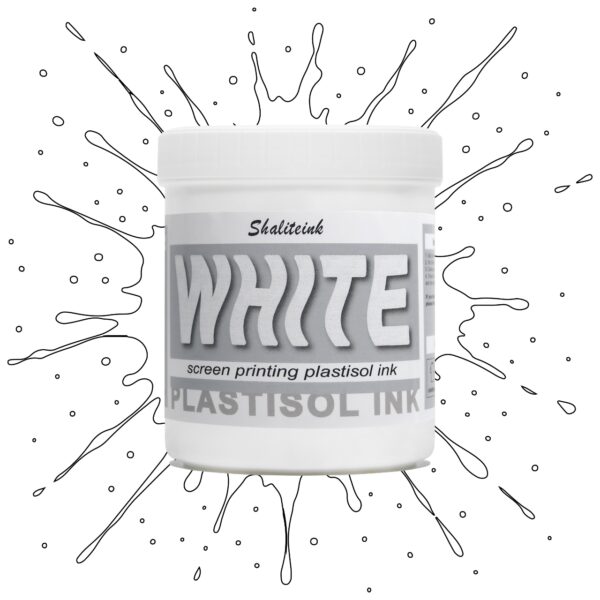
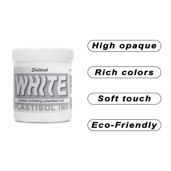
ホワイトスクリーン印刷プラスチゾルインク
生地に溶け込んでしまうような「幽霊のような」白いプリントで妥協するのはもうやめましょう。Shaliteinkのホワイトプラスチゾルインクは、濃色の衣類にしっかりとした不透明度を与えるために開発されました。クリーミーで滑らかな質感でスクリーンに塗布でき、硬いプラスチックというよりはホイップバターのような感触です。そのため、手作業でのプリント作業がスムーズになり、生産性が向上します。たった一度のフラッシュで、鮮やかで明るい白の「ポップ」な仕上がりを実現し、最初の洗濯でインクがひび割れたり色褪せたりする心配もありません。.
週末に趣味でプリントを楽しむ方にも、忙しいショップを経営されている方にも、これはまさにあなたが探し求めていた頼れる相棒です。高発色で、驚くほど簡単に混ぜることができ、数秒で硬化するので、機材の扱いに時間を費やすことなく、実際にプリント作業に集中できます。プロ仕様の性能をバケツに詰め込んだこのインクは、最初のプリントから1000回目のプリントまで、白を鮮やかに保ち、デザインをシャープに仕上げるように設計されています。.
 EN
EN  DE
DE  ES
ES  PT
PT  JA
JA
ベアトリス・ロシャ –
ユーザーと結果を容易にする
アンナ・ノワク –
Łatwa aplikacja i niezawodne działanie。 Działa bardzo dobrze na co dzień。 Łatwa aplikacja i niezawodne działanie。プゼクロチウォ・モジェ・オチェキワニア。 Bardzo dobry stosunek jakości do ceny。 Działa bardzo dobrze na co dzień。 Działa bardzo dobrze na co dzień。プゼクロチウォ・モジェ・オチェキワニア。ワトワ・アプリカチャ・イ
ピオトル・ジエリンスキ –
Łatwa aplikacja i niezawodne działanie。ヴィソカ・ヤコシチ・イ・シュプカ・ドスタワ。 Łatwa aplikacja i niezawodne działanie。ヴィソカ・ヤコシチ・イ・シュプカ・ドスタワ。 Łatwa aplikacja i niezawodne działanie。 Łatwa aplikacja i niezawodne działanie。 Działa bardzo dobrze na co dzień。 Działa bardzo dobrze na co dzień。ワトワ アップ
ピーター・フィッシャー –
Leicht zu Nutzen und konstante Ergebnisse。 Hat meine Erwartungen übertroffen。セール・グーテス・プレイス・ライスト
ピーター・フィッシャー –
Leicht zu Nutzen und konstante Ergebnisse。 Einfache Anwendung und zuverlässige Leistung。 Hochwertige Qualität und Schnelle Lieferung。 Leicht zu Nutzen und konstante Ergebnisse。 Einfache Anwendung und zuverlässige Leistung。 Hochwertige Qualität und Schnelle Lieferung。ハット マイネ エルヴァルトゥンゲン ユーバートロフ
ダニエル・ウィルソン –
日々の業務に非常に役立っています。使いやすく、安定した結果が得られます。品質は高級感があり、配送も迅速でした。日々の業務に非常に役立っています。
アンナ・シュミット –
ライヒト ツー ヌッツェン ウント コンスタンテ
アンナ・シュミット –
Einfache Anwendung und zuverlässige Leistung。 Einfache Anwendung und zuverlässige Leistung。 Hochwertige Qualität und Schnelle Lieferung。 Leicht zu Nutzen und konstante Ergebnisse。 Einfache Anwendung und zuverlässige Leistung。 Hochwertige Qualität und Schnelle Lieferung。ハット マイネ エルヴァルトゥンゲン ユベルトロ
アンナ・ノワク –
ジアワ バルゾ ドブジェ ナ コ ジ