
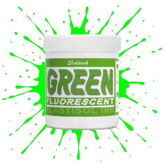
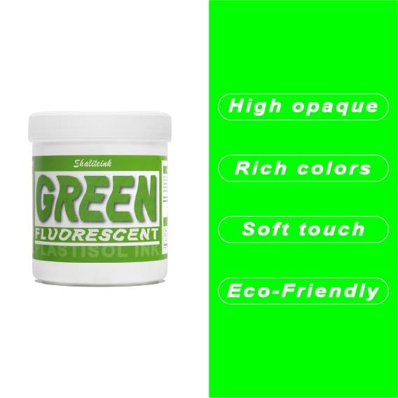
蛍光グリーンスクリーン印刷プラスチゾルインク
価格帯: $16.97 – $48.98
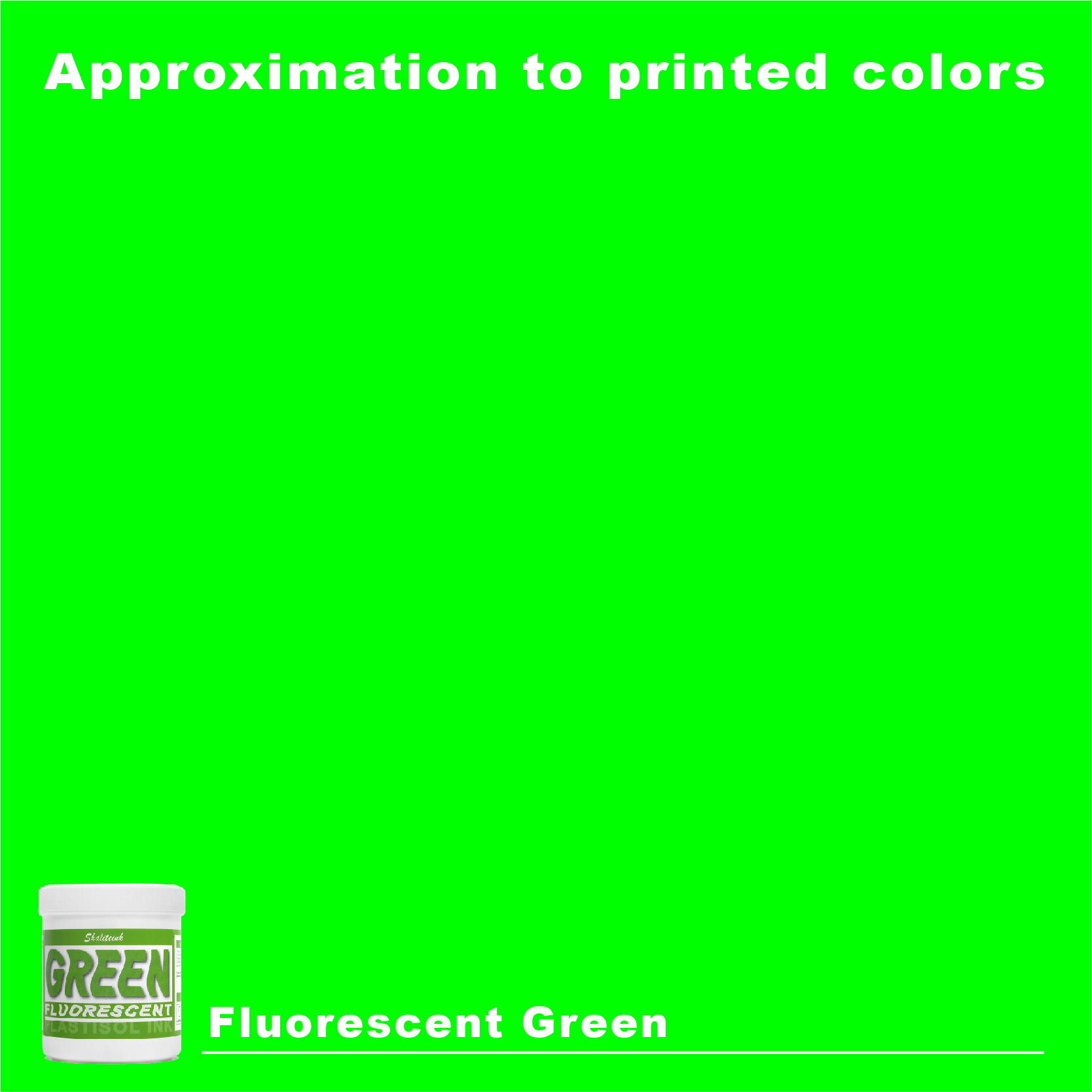
シャリテインク蛍光グリーン:ウェアラブル電気
「安全グリーン」なんて忘れてください。これはまさに物理学の結晶です。当社の蛍光グリーンは、紫外線を捉えて反射するように配合されているため、プリントがまるでコンセントに差し込まれているかのような鮮やかさを実現します。ストリートウェアやイベントグッズに最適な「秘密兵器」です。シャツの上にただ乗っているだけではなく、強烈なインパクトを与えます。顔料の配合量を調整することで、110~156メッシュの紙をきれいにせん断し、ネオンカラー特有の「目詰まり」の悩みを解消し、鮮やかな発色を実現します。.
ネオンカラーの成功は土台作りにかかっています。これをしっかりとした白い下地の上に重ねて、 320°F (160℃洗濯にも強く、ブラックライトの下でも鮮やかな印刷を実現するソリューションです。手動印刷機でも高速自動印刷機でも、Shaliteinkはクリーミーで安定した品質を維持するため、「特殊インク」のプレミアム価格を自信を持って設定できます。ありきたりな印刷はやめて、お客様の目を引く印刷を実現しましょう。.
ネオンマニフェスト:蛍光グリーンスクリーン印刷用プラスチゾルインクが売上アップの秘密兵器となる理由
正直に言うと、ほとんどのスクリーン印刷業者はネオンを恐れています。 蛍光グリーンスクリーン印刷プラスチゾルインク そして彼らが考えるのはただ一つ、頭痛のことだ。彼らは不透明度を心配する。硬化を心配する。ナイトクラブの照明の下では緑色が「十分に明るくない」と文句を言う顧客のことを心配する。.
でも、私はそれが大好きなんです。.
私は20年間スクイージーを握ってきましたが、まるで振動しているかのようなシャツほど顧客の注目を集めるものはないと言えます。まるで魔法のようです。暗い部屋に入ると、あの緑色が強烈に輝きます。もっと商品を売りたい、あるいは顧客をロックスターのように見せたいなら、蛍光灯の輝きを操る技術を習得する必要があります。.
今日は、これらの鮮やかな色を扱うための私の「秘訣」をお伝えします。技術的な側面とビジネス面、そして適切なサプライヤーを選ぶ理由についてお話しします。 シャリテインク 全く違う結果になるよ。コーヒーでも飲んで、思いっきり楽しもう。.
「明るい」だけでは不十分な理由:輝きの科学
私たちが話すとき 蛍光グリーンスクリーン印刷プラスチゾルインク 私たちは単に「薄緑色」について話しているわけではありません。物理学について話しているのです。通常の顔料は光を反射しますが、蛍光顔料は実際には 吸収する 紫外線エネルギーを可視光として再放出する。.
これは現実世界で起こる錯視です。そのため、これらのインクは「セーフティグリーン」や「ライムグリーン」よりもはるかに明るく見えるのです。しかし、インクを正しく塗布しないと、この錯視効果は逆効果になります。.
透明性の罠
蛍光顔料は本来半透明です。黒いTシャツに直接印刷すると、インクが消えてしまいます。まるで泥沼のように見えてしまうでしょう。これを解決するには下地が必要です。家の塗装を想像してみてください。濃い茶色の壁に下地なしで鮮やかな黄色のペンキを塗る人はいませんよね。.
私たちの世界では、そのプライマーは高品質です 白色PVCフリーNBスクリーン印刷インク. しっかりとした白い下地がないと、ネオングリーンはただの幽霊のように見えてしまいます。.
印刷業者のための手引書:メッシュ、スキージ、そして成功
店での成功は運ではなく、細部にかかっている。 シャライトインク プラスチゾルインク 演奏するには、敬意を持って接しなければならない。.
1. メッシュ数が重要
230メッシュのフィルターを通してネオンカラーを印刷しようとしている人たちを見ると、本当にイライラします。インクの流れを阻害しているんですよ!蛍光顔料は、通常のインクとは粒子サイズが若干異なるんです。.
-
下地材について: 86メッシュまたは110メッシュを使用してください。厚みのある白いシールドが必要です。.
-
ネオントップコートの場合: 110または156に留めてください。これにより十分な顔料が透過し、色が「鮮やか」なまま保たれます。“
2. スクイージーの選択
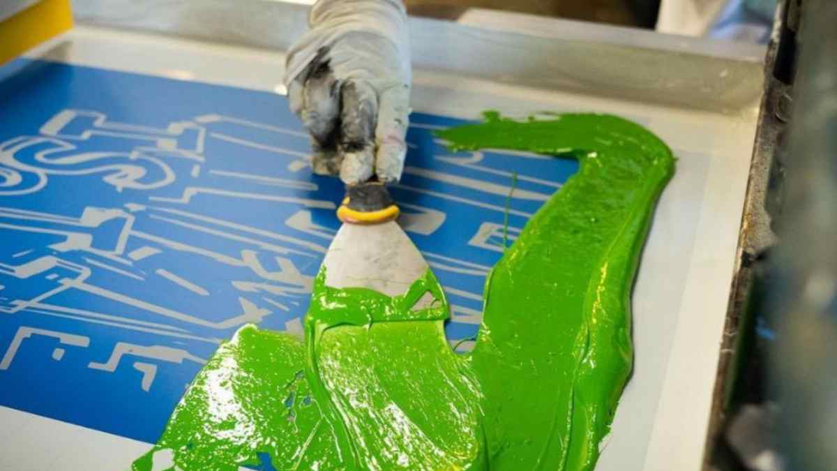
硬度70のスキージを使用してください。これはまさに「ちょうどいい」刃です。柔らかすぎず、硬すぎず。インクをメッシュを通してきれいに切り取るための鋭い刃先が必要ですが、同時に顔料を繊維に押し込むための十分な柔軟性も必要です。.
3. 硬化方程式
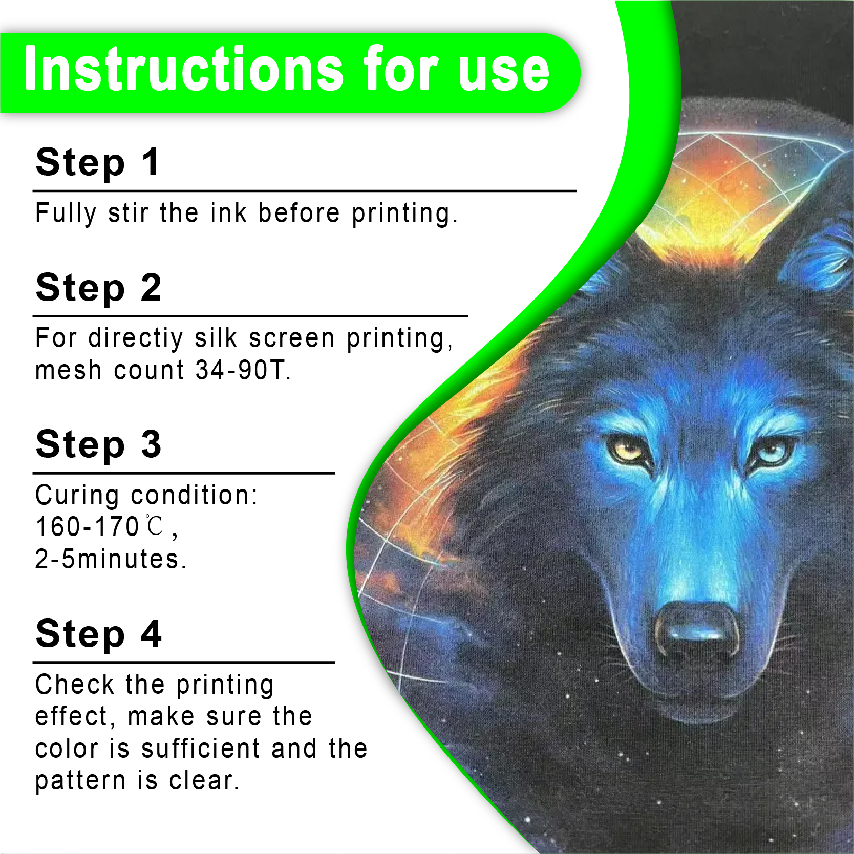
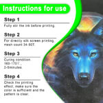
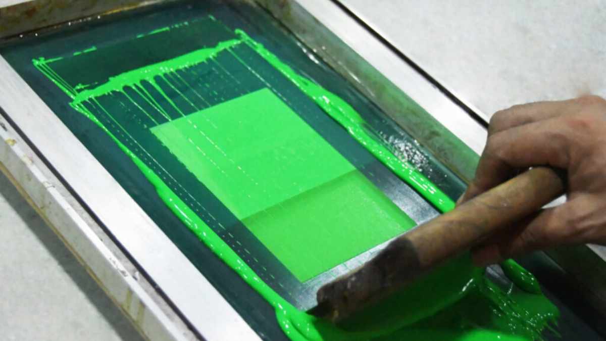
プラスチゾルは「乾燥」するのではなく、「硬化」します。樹脂と可塑剤が融合する化学反応です。 スクリーン印刷用インクショップ 製品の魔法の数字は 320°F (160°C).
その温度に達しないとインクがひび割れます。温度が高すぎるとシャツが焦げてしまう可能性があります。私はいつもチームに「信頼するが確認せよ」と言っています。レーザー温度計を使用するか、ドーナツプローブを使用して確認してください。 全体 インク膜が硬化温度に達する。.
| パラメータ | 推奨設定 | なぜ? |
| フラッシュ温度 | 220°F~240°F | 完全に硬化させることなく表面を整える。. |
| 最終硬化温度 | 320°F (160°C) | 洗濯堅牢度と耐久性を保証します。. |
| コンベア速度 | ゆっくり着実に | インク全体が十分に温まる時間を与える。. |
| 下地メッシュ | 110 | ネオンライトの「鏡」としての役割を果たす。. |
「ダークサイド」への対処:黒い生地へのプリント
白いシャツにプリントするなら簡単です。でも正直に言って、みんな黒いシャツが欲しいですよね。プリント 蛍光グリーンスクリーン印刷プラスチゾルインク 黒盤こそ、プロとアマチュアが分かれる場所だ。.
私の手順は以下のとおりです。
-
下地を印刷する: 不透明度の高いものを使用する ホワイトスクリーン印刷プラスチゾルインク.
-
フラッシュ: 白い部分がべたつかなくなる程度に乾燥させてください。乾燥させすぎると上塗り塗料が密着しなくなります!
-
ネオングリーンを印刷してください: 求める「ポップ感」に応じて、1回または2回パスします。“
-
最終的な治療法: トンネルを通すんだ。.
プロのヒント: 100%ポリエステルに印刷する場合は しなければならない 使用する アンチマイグレーションスクリーン印刷インク(プラスチゾル). ポリエステル染料はネオンカラーに色移りしやすい性質があります。色移り防止剤を使わないと、鮮やかな緑色が24時間以内にくすんだ森のような緑色になってしまいます。.
特殊インク:ネオンカラーを次のレベルへ
標準的なネオンも素晴らしいですが、時には何か特別なものが欲しいと思うこともあります。私の店には、あらゆる種類の質感のリクエストが寄せられます。.
-
スポーツウェア向け: ジャージにプリントする場合は、 弾性スクリーン印刷インクプラスチゾル. 伸縮性があるので、アスリートが動いてもデザインが破れることはありません。.
-
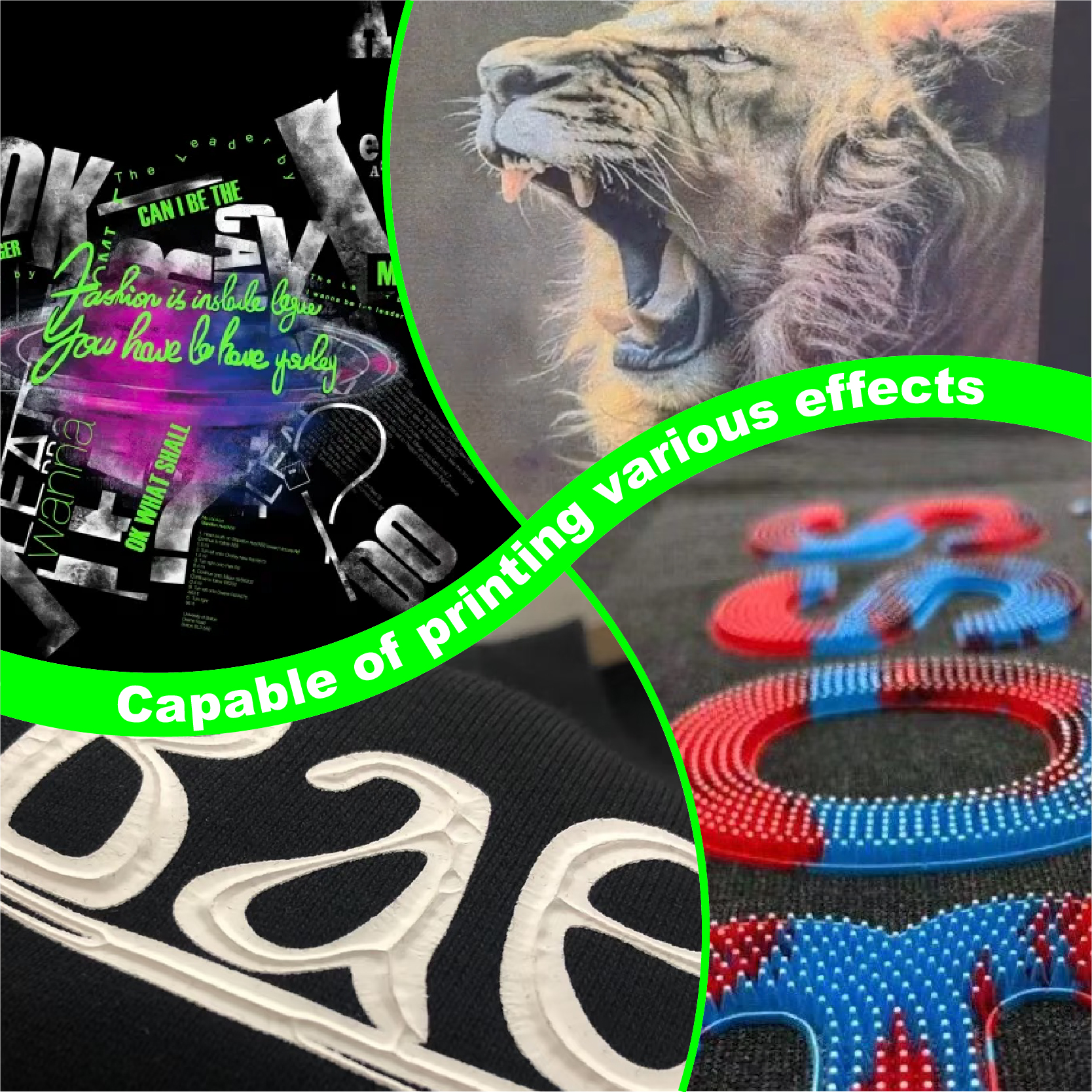
3D効果について: 使用 パフスクリーン印刷インクプラスチゾル. シャツから浮き上がるようなネオングリーンのロゴを想像してみてください。ストリートウェアブランドにとって、それは大ヒット商品になるでしょう。.
-
環境意識の高いお客様へ: 多くの高級ブランドは現在、 PVCフリープラスチゾルインク. 環境負荷を気にすることなく、鮮やかな色彩を実現します。地球にも、あなたのブランドにも良い選択です。.
色彩ビジネス:なぜもっと高い料金を設定すべきなのか
ロバート・ブライは常に価値について語っている。彼の著書の中で コピーライターの手引書 彼は、製品を売るのではなく、メリットを売るのだと強調する。.
その「特徴」は蛍光インクを使用していること。「利点」は高い視認性と安全性、そして通常の色では実現できない「クールさ」です。.
クライアントが要求した場合 メタリックスクリーン印刷インク 蛍光インクを使用する場合は、必ず「特殊インク追加料金」を加算します。なぜなら、これらのインクはコストが高く、印刷にはより高度な技術が必要だからです。あなたはプレミアムサービスを提供しているのですから、それに見合った価格設定をすることをためらわないでください。.
クライアントへの提案のための簡単な比較表
| インクの種類 | 可視性 | 最適な使用例 | |
| スタンダードグリーン | 中くらい | 基本的な景品、シンプルなロゴ。. | |
| ネオン/蛍光灯 | 過激 |
|
ナイトクラブ、安全性、若者向けブランド。. |
| メタリックゴールド/シルバー | 高い |
|
高級ファッション、記念日。. |
| パフ/高密度 | 高い |
|
上質なストリートウェア、触覚に訴えるブランディング。. |
トラブルシューティング:問題が発生したとき(必ず発生します)
窓からスクイージーを投げ捨てたくなる日もありました。ネオングリーンが「ムラ」になっていたり、くすんで見えたりする場合は、すぐに次の3点を確認してください。
-
画面の張力が低いですか? メッシュが柔らかすぎると、インクの付着が不均一になります。.
-
お使いのフラッシュドライヤーは温度が高すぎませんか? 下地を「加熱」すると、ネオングリーンは最初の洗浄後にステッカーのように剥がれ落ちます。.
-
安いインクを使っていますか? 専用の プラスチゾルインクサプライヤー. 安価なインクは顔料が少なく、「充填剤」が多い。同じ明るさを得るために2倍のインクを使うことになり、利益率が低下してしまう。.
安全性と持続可能性
私たちは新しい世界に生きています。顧客は服の中身を気にしています。私は自分の「グリーン」な仕事のほとんどを PVCフリープラスチゾルインク.
印刷の仕上がりは違いますか?少し違います。少しクリーミーな色合いになります。でも、安心感はそれだけの価値があります。さらに、「環境に優しい印刷業者」として自社を売り込むことができます。今日の市場では、これは大きな競争優位性となります。さらに、 NB印刷インク初心者キット これらのより安全な代替手段から始めてみましょう。.
よくある質問:聞くのが怖いことすべて
1. 蛍光インクは暗闇で光りますか?
いいえ。これはよくある間違いです。蛍光インクは 紫外線反応性. ブラックライトを当てると光ります。完全な暗闇で光らせたい場合は、蓄光インクが必要です。.
2. ネオングリーンを標準色と混ぜて使うことはできますか?
混ぜることはできますが、「ネオン」効果はすぐに失われます。 プロセスイエロー 明るさは増すが、暗い色を加えると輝きが「失われる」。.
3. バケツの中のネオングリーンのインクがなぜこんなに濃いのですか?
蛍光顔料は沈殿することがあります。よくかき混ぜてください。 ドリルミキサー スクリーンに塗布する前に、少し厚みが足りない場合は、硬化性希釈剤を少量加えてください。.
4.日光に当たると色が褪せますか?
はい。蛍光顔料は、通常の色に比べて耐光性が低いです。屋外用のバナーを作る場合、数か月で色褪せる可能性があります。Tシャツの場合は、お客様が日差しの強い地域にお住まいでない限り、通常は問題ありません。.
5. ネオンインクで「最も柔らかい」感触を得るにはどうすればよいですか?
印刷する 蛍光グリーン より細かいメッシュ(156)を通して、ソフトハンド添加剤を使用してください。ただし、手触りが柔らかくなるほど、濃い色の生地では「鮮やかさ」が抑えられることを覚えておいてください。.
最後に:未来は明るい
ネオングリーンにするかどうかまだ迷っているなら、もう待つのはやめましょう。信頼できるお店に行きましょう。 スクリーン印刷用インクショップ そして1ガロン注文してください。実験を始めましょう。.
地元の5キロマラソン大会や学校の応援グッズ販売店に「ネオンパッケージ」を提供したところ、昨年の売上が20%増加しました。人々は退屈な色に飽き飽きしています。目立ちたい、輝きたいのです。.
ロバート・ブライが言うように、「伝えれば伝えるほど売れる」。ブラックライトに反応する特性を顧客に伝えましょう。視認性の高さによる安全性の向上についても伝えましょう。目を引くサンプルを見せましょう。.
適切なツールを使用すると、 シャライトインク プラスチゾルインク 技術的なルールを守れば、あなたはもはや単なるプリンターではなく、「ウェアラブル電気」の創造者となるのです。“
さあ、外に出て何か明るいものを作ってみよう。スクイージーが待っているよ。.
| サイズ |
8オンス ,16オンス ,32オンス |
|---|
Fluorescent Green Screen Printing Plastisol Ink に対するレビュー8件
フィルターをクリア以前にこの商品を購入したことのあるログイン済みのユーザーのみレビューを残すことができます。
関連商品
黒スクリーン印刷プラスチゾルインク
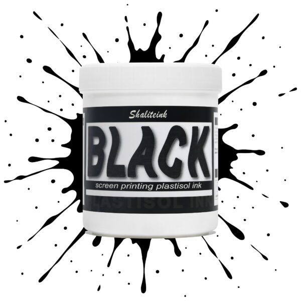
「ダークグレー」で満足して、それを黒と呼ぶのはやめましょう。 黒色プラスチゾルインク このインクは、スクリーンを詰まらせ、シャツの仕上がりをくすませる、粘り気のある濃いインクに悩まされている印刷業者向けに開発されました。バターのように滑らかでクリーミーな質感で、高密度のメッシュでもスムーズに印刷でき、しかも一度の印刷で生地の色をしっかり定着させます。100%コットンTシャツでも、扱いの難しい混紡生地でも、このインクは柔軟でマットな「ミッドナイト」カラーに仕上がり、最初の洗濯後もひび割れたり剥がれたりしません。お客様が期待する、プロ仕様の高品質なブラックです。.
安全性は必ずしも性能を犠牲にすることを意味するわけではありません。当社のフォーミュラはフタル酸エステルを一切使用していません( PVCフリーのオプション (入手可能)なので、化学薬品のトラブルを気にすることなく、高級ブランドの印刷が可能です。発色が良く、スクリーン上でインクが定着しやすく、インクの蓄積も少なく、鮮明なディテールを維持します。印刷作業の効率化と、まるでブティックで作られたような仕上がりを実現する、頼りになるインクをお探しなら、このインクを印刷機に常備しておくのがおすすめです。.
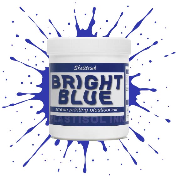
明るい青色のスクリーン印刷プラスチゾルインク
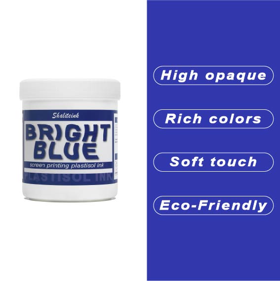
オフィスカーペットのようなくすんだ青色で妥協するのはもうやめましょう。Shaliteinkのブライトブルー・プラスチゾルインクを使えば、シャツに地中海の夏の空のような鮮やかな色合いを与えることができます。まるで上質なベシャメルソースのように滑らかに伸び、プリントが終われば使い込んだ革ブーツのように丈夫です。このインクは作業中にスクリーン上で乾くことがないので、焦らずにじっくりと作品作りに集中できます。.
ご自宅のスタジオや小規模な店舗でプリントされる方が多いことを考慮し、この製品は高い不透明度と環境への配慮を両立させました。「NB」シリーズはフタル酸エステル不使用で、OEKO-TEXなどの世界で最も厳しい安全基準を満たしています。160℃(320°F)で適切に硬化させれば、最初の洗濯後も色落ちしない鮮やかなシャツが完成します。.
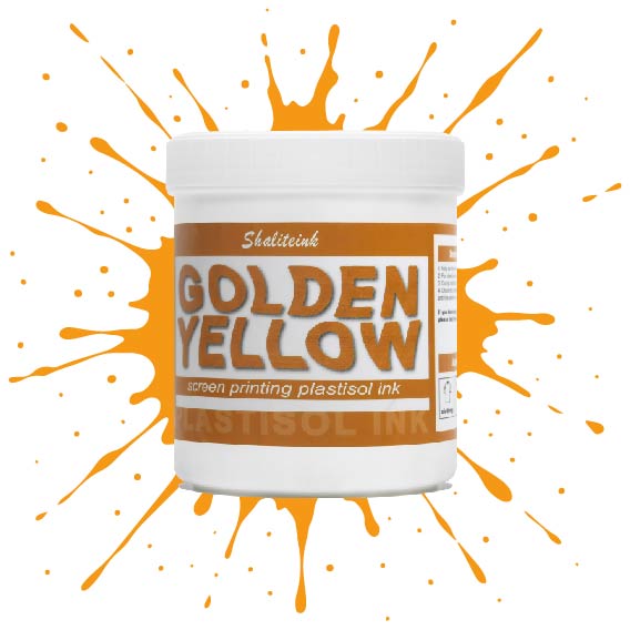
深みのあるゴールデンイエローのスクリーン印刷用プラスチゾルインク
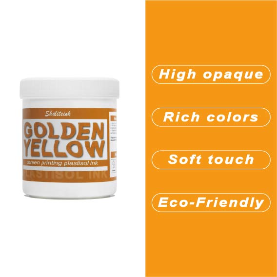
安っぽく見えて色落ちする「安全ベスト」のような黄色で妥協するのはやめましょう。 濃い黄金色のプラスチゾルインク 太陽の光を浴びたような、豊かで温かみのある色合いをデザインにもたらし、最初の洗濯後も鮮やかな色合いが長持ちする、高級感あふれるバーシティスタイルを実現します。高い不透明度と、まるでバターのように滑らかで、手首に負担をかけずにメッシュの上を滑らせるほどの滑らかさを持ちながら、濃い色の生地にもしっかりと密着する適度な厚みを兼ね備えた、まさに理想的なインクです。.
丈夫なパーカーから繊細なストリートウェアまで、どんな素材にも使えるこのインクは、スクリーン上では濡れた状態を保ち、作業性も抜群ですが、320°F(約160℃)に達すると、耐久性に優れたプロ仕様の仕上がりへと変化します。見た目だけでなく着心地も優れたプレミアムアパレルを生産するために必要な、安定した品質のフタル酸エステル不使用の頼れるインクです。「ピーナッツバター」のような質感や、くすんだプリントとはもうおさらば。印刷機に、純粋な液体の黄金をお届けします。.
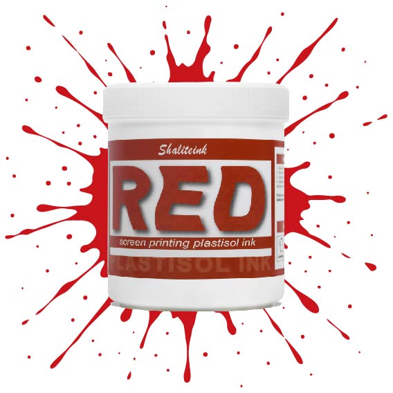
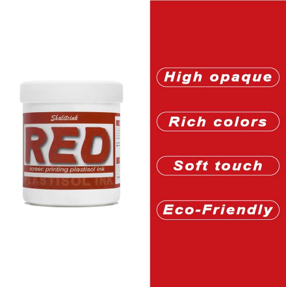
深紅のスクリーン印刷プラスチゾルインク
濃い色の衣類に「赤がピンクに変色」してしまうような失敗はもうやめましょう。当社のインクは、繊維化学の専門家が、技術的な問題に悩まされることなく、店頭に並べられるような深みのある鮮やかな赤色を求める印刷業者向けに開発しました。DIY愛好家の方にも、成長中のブティックブランドの方にも、このインクはバターのように滑らかな質感で、メッシュから簡単に洗い流せ、洗濯を繰り返しても鮮やかな色を保ちます。.
当社は安全性と高性能の両方を最優先事項とし、OEKO-TEXなどの厳格な国際基準を満たすため、フタル酸エステルを含まない配合を採用しています。標準硬化環境と低温硬化環境(270°F~280°Fまで設定可能)の両方に最適化されており、扱いにくいポリエステル混紡素材における染料のにじみを効果的に最小限に抑えながら、高級アパレルを特徴づける柔らかくプロフェッショナルな肌触りを維持します。.
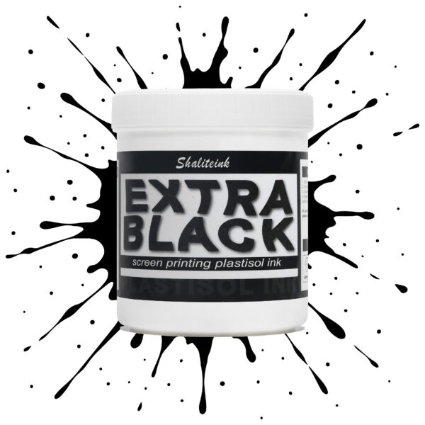
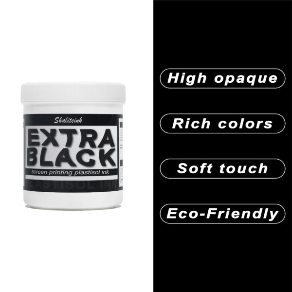
エクストラブラックスクリーン印刷プラスチゾルインク
お客様が真夜中のような濃さを求めているのに、「チャコールグレー」で妥協するのはもうやめましょう。Shaliteinkのエクストラブラックは、単なる濃いインクではありません。透明感を一筆で完全に消し去るために設計された、高顔料配合の強力なインクです。安価な黒インクは、濃い色の綿に色あせたエスプレッソのように見えることが多いですが、当社のフォーミュラは、見た目と同じくらい手触りの良い、プロフェッショナルなマットな質感で、濃密な「ブラックホール」のような仕上がりを実現します。.
日々の酷使に耐えるように設計されており、細かいメッシュも難なく切断できるほど滑らかでありながら、100回の洗濯後も深みのある色合いを保ちます。しっかりとしたベタ塗りを得るために何度も印刷を繰り返すことにうんざりしているなら、このインクはあなたの印刷機にふさわしいアップグレードです。増量剤もグレーの色調も一切なし。業界で最も深く、最も信頼性の高い黒を実現します。.
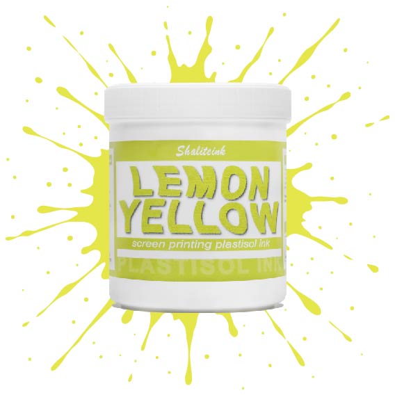
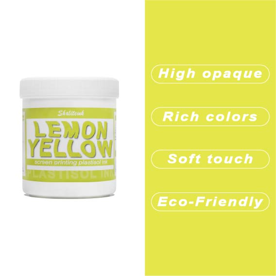
レモンイエロースクリーン印刷プラスチゾルインク
黄色いインクが生地に染み込んで消えてしまったり、暗い色のパーカーの上で透明な汚れのように見えたりした経験があれば、そのイライラはよくわかるでしょう。私たちはこれを実現するために レモンイエロースクリーン印刷プラスチゾルインク まさにその悩みを解決するために開発されました。下地の上に塗れば、鮮やかで力強い仕上がりになる十分な顔料濃度でありながら、目の細かいスクリーンでもスムーズに塗ることができます。遠くからでも目を引くほどの鮮やかさで、何度洗ってもその輝きが持続します。.
このインクが当店で大人気な理由は、にじみにくい処方にある。通常、黄色が不健康な緑色になってしまう厄介なポリエステル混紡素材にとって、まさに救世主だ。胸に分厚いプラスチックシートを貼ったような感触ではなく、柔らかくしなやかなプリントに仕上がる。信頼性の高いプロ仕様のインクが面倒な作業を代行してくれるので、機器と格闘することなく、プリント作業そのものを楽しむことができる。.
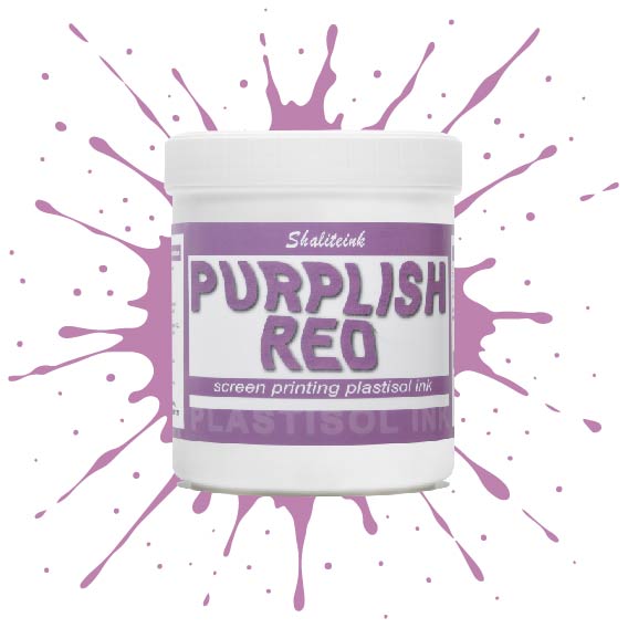
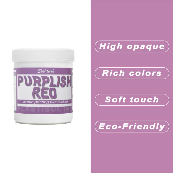
紫がかった赤のスクリーン印刷プラスチゾルインク
暗い色の衣類にプリントするとすぐに色が消えてしまう、つまらない赤色で妥協するのはもうやめましょう。当社のパープルレッド・スクリーン印刷用プラスチゾルインクは、高貴なバイオレットとエネルギッシュなクリムゾンの中間に位置する、深みのある魅力的な色合いです。それでいて、Tシャツをプラスチックの盾のように硬くすることなく、柔らかな手触りを保ちます。言葉にせずとも「高級感」をデザインに表現したい印刷業者にとって、まさに秘密兵器となるでしょう。.
このプロ仕様のインクは、画面上で何時間も乾きにくく、時間を気にすることなく作品制作に集中できます。高不透明で無毒性のブレンドで、厚手のコットンパーカーから軽量の合成繊維Tシャツまで、あらゆる素材に鮮やかな発色を実現します。Shaliteinkは洗濯や着用にも耐えるように設計されていますが、何よりも、ありきたりな原色ばかりの世界で、あなたの個性を際立たせるために開発されました。.
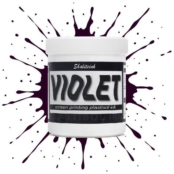
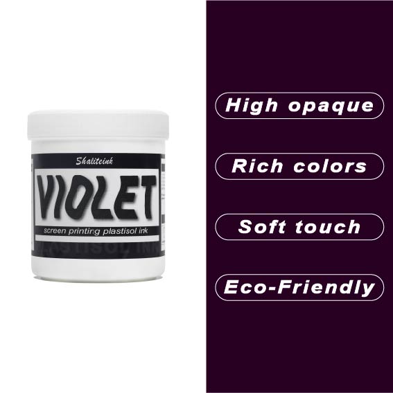
バイオレットレッドスクリーン印刷プラスチゾルインク
正直言って、ほとんどの赤インクはファストフードのロゴに似合いそうな、派手で明るすぎる、ちょっと安っぽい印象です。でも、このバイオレットレッドは全く別物。深みのある、落ち着いたワインのような色合いで、ごく普通の$5の無地のシャツが、まるで高級ブティックの$40のシャツのように見えます。真っ黒なパーカーにこのインクを使ってみたところ、高い不透明度のおかげで、色がくすんで濁ったような色にならず、本来の色合いを保ってくれました。クライアントが、ありきたりなジムシャツではなく、洗練されたデザインのシャツを求めている時に、まさに「圧倒的なアドバンテージ」となるでしょう。.
冷たいピーナッツバターのようなインクと格闘するのはもうやめましょう。このインクはバケツから出した瞬間からバターのように滑らかで、かき混ぜたり薄めたりする必要は一切ありません。コーヒーを買いに行ったり、配達の対応をしたりしても、インクが固まったり、スクリーンを傷めたりすることはありません。それに、正直に言って、誰かが実際に着用した瞬間にひび割れてしまうプリントほど、ブランドをあっという間にダメにするものはありません。このインクは生地の動きに合わせて伸縮し、手触りも柔らかく、高温洗浄テストにも耐え、剥がれることもありません。とにかく使いやすいので、スクリーンをこする時間を減らし、印刷作業に集中できます。.
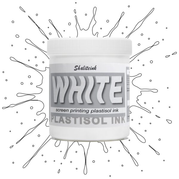
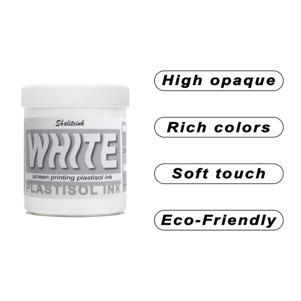
ホワイトスクリーン印刷プラスチゾルインク
生地に溶け込んでしまうような「幽霊のような」白いプリントで妥協するのはもうやめましょう。Shaliteinkのホワイトプラスチゾルインクは、濃色の衣類にしっかりとした不透明度を与えるために開発されました。クリーミーで滑らかな質感でスクリーンに塗布でき、硬いプラスチックというよりはホイップバターのような感触です。そのため、手作業でのプリント作業がスムーズになり、生産性が向上します。たった一度のフラッシュで、鮮やかで明るい白の「ポップ」な仕上がりを実現し、最初の洗濯でインクがひび割れたり色褪せたりする心配もありません。.
週末に趣味でプリントを楽しむ方にも、忙しいショップを経営されている方にも、これはまさにあなたが探し求めていた頼れる相棒です。高発色で、驚くほど簡単に混ぜることができ、数秒で硬化するので、機材の扱いに時間を費やすことなく、実際にプリント作業に集中できます。プロ仕様の性能をバケツに詰め込んだこのインクは、最初のプリントから1000回目のプリントまで、白を鮮やかに保ち、デザインをシャープに仕上げるように設計されています。.
 EN
EN  DE
DE  ES
ES  PT
PT  JA
JA
ルーカス・ゴメス –
Superou minhas 期待しています。ファンシオナ ムイト ベム ノー
サラ・ミラー –
品質はプレミアムでデリケートな感じ
ルイス・トーレス –
素晴らしい安全性と迅速な対応を実現します。ムイブエナ関係、カリダッドプレシオ。素晴らしい安全性と迅速な対応を実現します。期待以上です。期待以上です。期待以上です。会話に最適なアプリケーションです。ユーザーと結果の一貫性を維持します。アプリケーション
ブライアン・クーパー –
使いやすく、結果も安定しています。ほとんどの場合、期待以上でした。品質は高級感があり、配送も迅速でした。
ジョン・スミス –
日々の作業に非常に役立っています。スムーズなアプリケーションと信頼性の高いパフォーマンス。価格に見合った価値が十分にあります。価格に見合った価値が十分にあります。
アンナ・ノワク –
Łatwa aplikacja i niezawodne działanie.プシェクロツィ
ローラ・ワグナー –
Hochwertige Qualität und Schnelle Lieferung。 Leicht zu Nutzen und konstante Ergebnisse。 Hochwertige Qualität und Schnelle Lieferung。すべての機能を理解しておく必要があります。 Sehr グーテス Preis‑Leistungs‑Verhältnis。 Hat meine Erwartungen übertroffen。すべての機能を理解しておく必要があります。 Einfache Anwendung und zuve
マイケル・ブラウン –
ほとんどのケースで期待を上回りました。使いやすく、安定した結果が得られます。品質は高級感があり、配送も迅速でした。日々の作業に非常に役立っています。品質は高級感があり、配送も迅速でした。価格に見合った価値が十分にあります。品質は高級感があり、配送も迅速でした。使いやすく、