
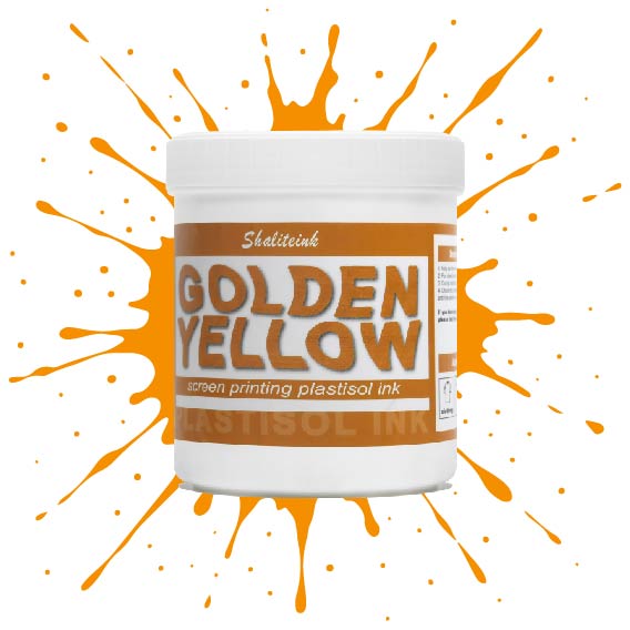
ゴールデンイエロースクリーン印刷プラスチゾルインク
価格帯: $17.98 – $33.98
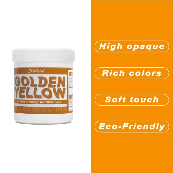
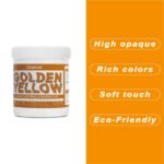
濃い色のシャツに黄色のプリントを施すと、まるで泥のようなマスタード色になってしまうのにうんざりしていませんか?その気持ち、よく分かります。ほとんどの黄色は透けやすく、プリントしづらいものですが、当社のゴールデンイエロー・プラスチゾルは、黒のパーカーや紺のジャージに本当に必要な高い隠蔽力を備えています。クリーミーで粘度の低いこのインクは、メッシュからきれいに剥がれ、5回も重ね塗りしたり、シャツが合板のようにゴワゴワしたりすることなく、鮮やかな「アスレチックゴールド」の発色を実現します。.
色味だけでなく、このインクは作業現場でも扱いやすく、昼食に出かけている間にスクリーン上で乾いてしまうこともありません。100%フタル酸エステル不使用なので、どんなブランドでも安心して印刷でき、最終結果は伸縮テストに合格し、洗濯にも耐えられます。インクと格闘するのはもうやめて、思い通りの仕上がりになるゴールドインクで納期を守りましょう。.
ゴールデンチケット:ゴールデンイエローのプラスチゾルインクが利益の秘訣である理由
いいかい、俺は20年間も爪の下にインクを塗ってきたから、あらゆることを経験してきたんだ。間違ったインクを選ぶと大惨事になるってことを、身をもって学んだ。インクはどれも同じじゃない。バンで売ってる安いインクを買うこともできるし、ちゃんとシャツに定着するインクに投資することもできる。黒いパーカーに鮮やかな黄色を塗ろうとして、結局、悲しみと古くなったマスタードのような色になってしまった経験はない?ああ、俺もだよ。本当に辛い。.
本格的な印刷会社にとって真のMVPとなる要素を掘り下げていきます。 黄金色 スクリーン印刷プラスチゾルインク. これは単なるありふれた顔料ではありません。優勝チームの象徴的な色合いであり、正しく使えばあなたの財布を潤す色でもあるのです。.
黄色との愛憎関係
はっきり言って、黄色は私たちの業界における「問題児」です。黄色は本来透けやすく、濃い色のシャツにきれいに定着させるのは非常に困難です。初心者の多くは黒インクのように印刷しようとしますが、すぐに黄色には「隠蔽力」がないことに気づきます。一度印刷すると消えてしまい、二度重ねても色褪せてしまいます。三度重ねると、まるで合板を着ているようなTシャツになってしまいます。そんなTシャツは誰も着たくありません。.
だからこそトップティア プラスチゾルインク 本当に重要なことなんです。何年も前に地元の高校でやった仕事の悪夢を今でも見ます。コーチは紺色のジャージに「アスレチックゴールド」と書いてほしいと言っていました。私は安売りのインクで済ませたのですが、結果はひどいものでした。シャツが乾燥機にかけられる頃には、病的な緑色になっていました。200枚のシャツの費用を負担しなければならず、その夜は仕事を辞めようかと真剣に考えました。.
しかしその後、私は高不透明度の力を発見しました ゴールデンイエロースクリーン印刷プラスチゾルインク. すべてが変わりました。印刷の仕上がりが鮮明になり、お客様がリピーターになってくれるようになったんです。.
ゴールデンイエロープラスチゾルとは一体何でしょうか?
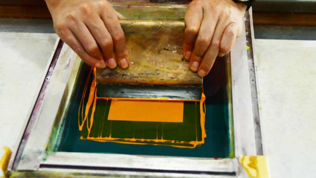
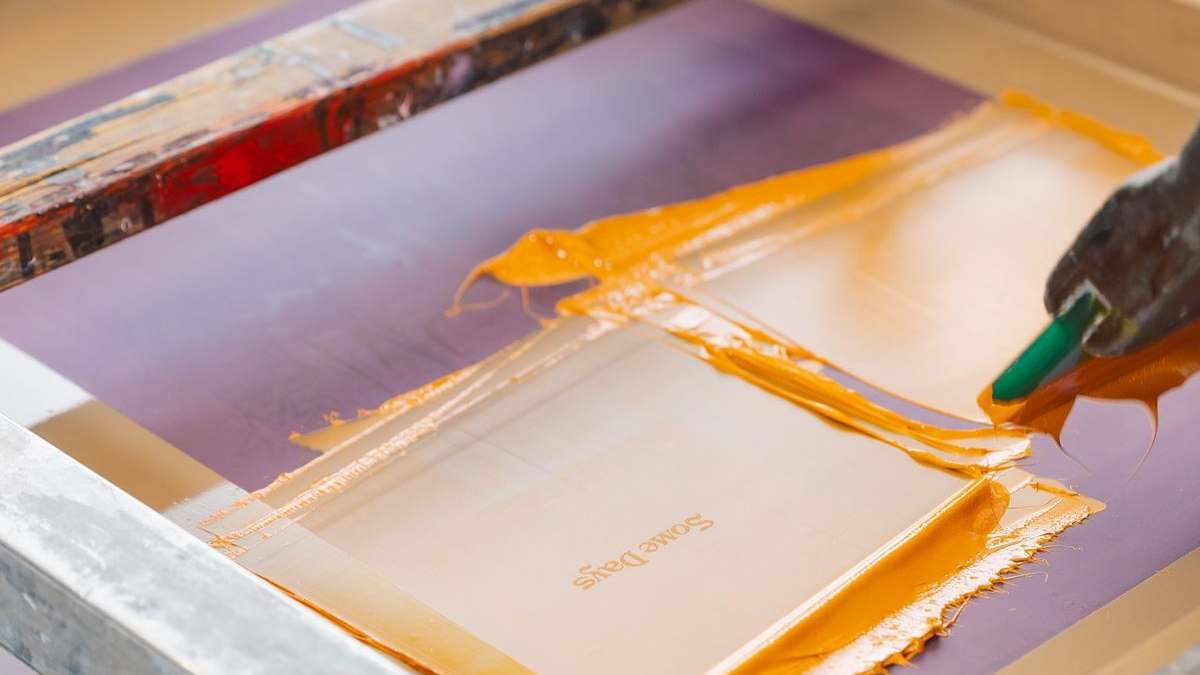
専門的に言うと、プラスチゾルとは、可塑剤液中にPVC粒子が分散した物質です。最大の利点は、水性塗料のように「乾燥」しないこと。熱を加えることで初めて固まります。これは私たちにとって非常に大きなメリットです。釣り旅行に出かける3日間、スクリーンに塗布したままにしておいても、網目が詰まることはありません。.
シャリテインク ゴールデンイエロー このインクは「ショート」になるように特別に配合されています。印刷用語で言うと、糸状にならないということです。スクリーンを持ち上げると、インクがきれいに剥がれます。「毛羽立ち」もなく、汚れも出ず、面倒な作業も一切ありません。.
レモンイエローではなく、ゴールデンイエローを選ぶ理由とは?
| 特徴 | レモンイエロー | ゴールデンイエロー(アスレチックゴールド) |
| 活気 | 高い/ネオンっぽい | 温かみのある/豊かな |
| 不透明度 | 適度 | 非常に高い |
| 使用事例 | 安全ベスト、夏用Tシャツ | スポーツチーム、高級ブランド |
| マッチング | PMS 123に到達するのが難しい | ほとんどのチームカラーにマッチします |
汎用性の高いインクをお探しなら、ゴールドをお選びください。業界の主力製品です。.
成功の秘訣:正しく印刷する方法
行き当たりばったりで仕事をして給料をもらえるなんてありえません。プロはただ画面にインクを垂らして奇跡を祈るようなことはしません。プロのように見られたいなら、プロのように振る舞わなければなりません。完璧な仕上がりを実現するための私の個人的なワークフローをご紹介します。 シャリテインク 仕上げる。.
1. メッシュ数の謎
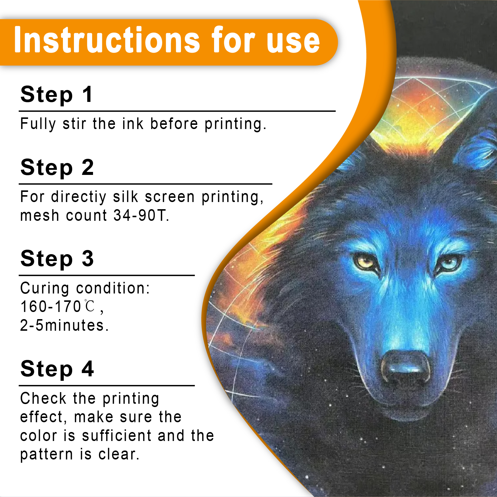
印刷しようとしている人たちを見かける ゴールデンイエローのプラスチゾルインク 230メッシュのスクリーンを通して、私はただ首を横に振るだけです。インクが詰まってるよ!しっかりとした不透明な金色にするには、 110メッシュと156メッシュ.
-
110メッシュ: 高い定着力が必要なスポーツプリントに最適です。.
-
156メッシュ: より柔らかな風合いが求められる、店頭販売に適したシャツにとって最適な「ポイント」。.
2. 白い下地の力
いいですか、インクがどれだけ「高不透明度」だと謳っていても気にしません。黒いシャツに印刷する場合は、 ホワイトスクリーン印刷プラスチゾルインク 下地。暗い壁に黄色を塗る前に下塗りをするようなものです。色が鮮やかに映え、厄介な「染料のにじみ」(シャツの黒い染料が黄色に滲んで灰色になってしまう現象)を防ぎます。.
3. スクイージー技術
使用する 硬度70のスクイージー. インクをせん断するのに十分な硬さがありながら、メッシュを通して適量のインクを押し出すのに十分な柔軟性も備えています。75度の角度で持ち、少し力を入れて押し込んでください。可能であれば、一度の通過でスクリーン全体をクリアしたいものです。.
修復:評判を失わないように
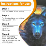
1週間後に顧客から「ロゴが洗濯機で剥がれてしまった」と電話がかかってくるほど最悪なことはありません。インク膜を華氏320度(摂氏160度)まで加熱しないと、全くくっつきません。きちんと接着しなければ、すべてが台無しです。.
私は常にレーザー温度計を手元に置いて表面温度を追跡しています。しかし、怠けてはいけません!インク層の下部も上部と同じくらい加熱する必要があります。 パフスクリーン印刷インクプラスチゾル 立体感を出すには、コンベア式乾燥機の速度を落として、余分な体積全体に熱が行き渡るようにする必要があるかもしれません。.
ストレッチテスト(貧乏人の実験室テスト)
シャツが冷めたら、プリント部分をつかんで軽く引っ張ってみてください。もし引っ張った時に乾燥した砂漠の地面のようにひび割れるようなら、硬化が不十分です。しかし、ゴムバンドのようにしなやかに曲がり、元に戻るようなら、それが最適な状態です。.
持続可能性:新たな業界標準
「環境に優しい」ことについて話しましょう。10年前は化学式なんて気にも留めていませんでしたが、状況は変わりました。今では誰もが注目しています。親たちは子供のサッカーユニフォームに有害物質が含まれていないかと心配し、大手ブランドは訴訟を起こされることを恐れています。.
これが私が切り替えた理由です フタル酸エステル不使用のプラスチゾルインク. Shaliteinkのような企業は、性能を犠牲にすることなく環境に優しいスクリーン印刷インクの開発をリードしてきました。有害なスラッジを一切使用せずに、鮮やかな黄金色の発色を実現できます。地球にも優しく、あなたの肺にもきっと喜ばれるでしょう。.
品質の経済学
人々は私に尋ねます、「なぜもっとお金を払わなければならないのですか プレミアムゴールデンイエローインク もっと安いものが見つかるのに?”
計算してみましょう。安価なインク1ガロンで$10節約できたとしても、シャツ5枚を台無しにしてしまったら、すでに損をしていることになります。さらに悪いことに、シャツの色褪せが原因でリピーターを失ってしまったら、生涯顧客価値で数百ドル、場合によっては数千ドルを失うことになります。高品質のインクは、ビジネスにとって最も安価な保険と言えるでしょう。.
技術仕様表
| 財産 | 価値/推奨度 |
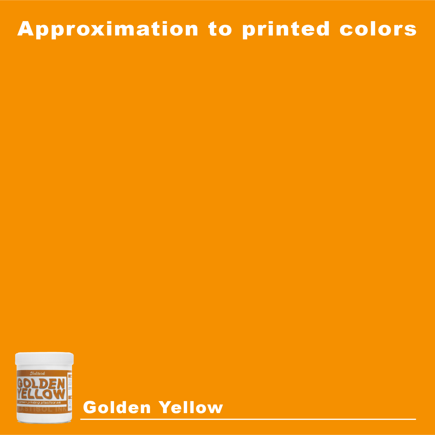
| 色 | ゴールデンイエロー(アスレチックゴールド) |
| インクの種類 | プラスチゾル(PVC/フタル酸エステル不使用のオプションあり) |
| 不透明度 | 10点満点中9点(素晴らしい) |
| 推奨メッシュ | 110~160 tpi |
| 硬化温度 | 320°F / 160°C |
| 掃除 | ミネラルスピリットまたはスクリーンウォッシュ |
| 最適な基材 | 100% コットン、50/50混紡 |
| メーカー | シャリテインク |
ゴールデンイエロープリントのトラブルシューティング
最高の スクリーン印刷インクキット, 物事は思わぬ方向に進むこともあります。よくある問題の対処法は以下のとおりです。
-
インクが濃すぎる: ただ水を注ぎ込むだけではダメです(効果がありません!)。硬化性希釈剤を少量使用してください。そうすることで、分子結合を損なうことなく、粘り気のある物質を薄めることができます。.
-
心房細動: シャツの繊維がインクから突き出ていると、プリントがぼやけて見えます。私は通常、フラッシュプリント後にスムージングスクリーンを使うか、短時間のヒートプレスで繊維を平らにします。.
-
粘着プリント: プリントがベタベタするのは最悪です。乾燥機から出した後にベタベタするようなら、硬化剤に問題があるか、塗りすぎているかのどちらかです。乾燥機の回転速度を確認してください。.
なぜShaliteinkなのか?
私は「有名」ブランドに無駄なお金を使ってきましたし、高級ブティック製品も試しました。Shaliteinkはプロ仕様の性能と適正価格という絶妙なバランスを実現しています。 ゴールデンイエロースクリーン印刷プラスチゾルインク 賞味期限は他のブランドを圧倒するほど長く、最初のバケツから100個目のバケツまで品質の一貫性が保たれている。.
あなたが何をしているか 高密度スクリーン印刷 あるいは、ごく普通のTシャツであっても、色の化学を理解しているパートナーが必要です。.
お店でよく聞かれる質問
Q:ゴールデンイエローを他の色と混ぜてもいいですか?
A: もちろんです。オリジナルのオレンジやアースカラーのグリーンを作りたいなら、最高のベースになりますよ。ただ、初心者みたいに水性塗料と混ぜようとしないでくださいね。化学反応で大惨事になりますから。.
Q:このインクには特別な乳剤が必要ですか?
A: ほとんど 感光性乳剤 プラスチゾルでも問題なく使えます。私は通常、二段階硬化型の乳剤を使います。細かいディテールをよりしっかりと表現でき、長時間の生産でも劣化しにくいからです。.
Q:余ったインクはどのように保管すれば良いですか?
A:蓋をしっかり閉めて、バケツを涼しい場所に置いてください。プラスチゾルインクは熱に弱いので、作業場が暑くなりすぎると、インクがバケツの中でゲル化し始めることがあります。.
Q:赤ちゃんの服に使っても安全ですか?
A:はい、PVCフリー/フタル酸エステルフリーの製品であれば大丈夫です。赤ちゃんのことになると、決して自己判断しないでください。小さなお子様のためにランニングを始める前に、必ず安全データシート(SDS)を確認してください。.
Q:これは熱転写に使用できますか?
A:はい!この金色のインクを転写紙にスキージで塗りつけて、ジェル状にすることができます。あとは、お客様からの注文があったら、ヒートプレスするだけです。狭いお店で棚のスペースを節約する賢い方法です。.
最後に:スクイージーは決して嘘をつかない
いいかい、長時間労働の終わりには、印刷はやはり芸術なんだ。世界一高性能な自動印刷機を持っていても、インクが粗悪品だったら、シャツも粗悪品になる。.
高品質のものに投資する ゴールデンイエロースクリーン印刷プラスチゾルインク これは、あなた自身の心の平穏への投資です。画面と格闘する時間が減り、実際にお金を稼ぐ時間が増えるでしょう。.
さあ、外に出て、きれいなストロークで、美しいものを作りましょう。クライアントは結果を気に入ってくれるでしょうし、あなたの銀行口座もずっと健全に見えるでしょう。もし資金が不足しているなら、 スクリーン印刷用インクショップ そして、ベテランの紹介だと伝えてください。.
印刷を楽しんでください!
| サイズ |
8オンス ,16オンス ,32オンス |
|---|
Golden Yellow Screen Printing Plastisol Ink に対するレビュー10件
フィルターをクリア以前にこの商品を購入したことのあるログイン済みのユーザーのみレビューを残すことができます。
関連商品
黒スクリーン印刷プラスチゾルインク
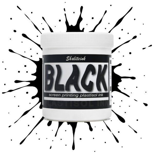
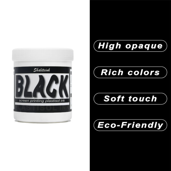
「ダークグレー」で満足して、それを黒と呼ぶのはやめましょう。 黒色プラスチゾルインク このインクは、スクリーンを詰まらせ、シャツの仕上がりをくすませる、粘り気のある濃いインクに悩まされている印刷業者向けに開発されました。バターのように滑らかでクリーミーな質感で、高密度のメッシュでもスムーズに印刷でき、しかも一度の印刷で生地の色をしっかり定着させます。100%コットンTシャツでも、扱いの難しい混紡生地でも、このインクは柔軟でマットな「ミッドナイト」カラーに仕上がり、最初の洗濯後もひび割れたり剥がれたりしません。お客様が期待する、プロ仕様の高品質なブラックです。.
安全性は必ずしも性能を犠牲にすることを意味するわけではありません。当社のフォーミュラはフタル酸エステルを一切使用していません( PVCフリーのオプション (入手可能)なので、化学薬品のトラブルを気にすることなく、高級ブランドの印刷が可能です。発色が良く、スクリーン上でインクが定着しやすく、インクの蓄積も少なく、鮮明なディテールを維持します。印刷作業の効率化と、まるでブティックで作られたような仕上がりを実現する、頼りになるインクをお探しなら、このインクを印刷機に常備しておくのがおすすめです。.
深紅のスクリーン印刷プラスチゾルインク
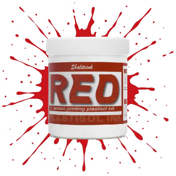
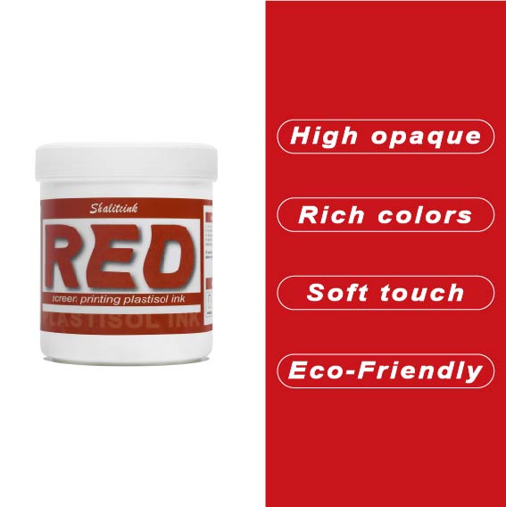
濃い色の衣類に「赤がピンクに変色」してしまうような失敗はもうやめましょう。当社のインクは、繊維化学の専門家が、技術的な問題に悩まされることなく、店頭に並べられるような深みのある鮮やかな赤色を求める印刷業者向けに開発しました。DIY愛好家の方にも、成長中のブティックブランドの方にも、このインクはバターのように滑らかな質感で、メッシュから簡単に洗い流せ、洗濯を繰り返しても鮮やかな色を保ちます。.
当社は安全性と高性能の両方を最優先事項とし、OEKO-TEXなどの厳格な国際基準を満たすため、フタル酸エステルを含まない配合を採用しています。標準硬化環境と低温硬化環境(270°F~280°Fまで設定可能)の両方に最適化されており、扱いにくいポリエステル混紡素材における染料のにじみを効果的に最小限に抑えながら、高級アパレルを特徴づける柔らかくプロフェッショナルな肌触りを維持します。.
エクストラブラックスクリーン印刷プラスチゾルインク
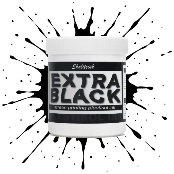
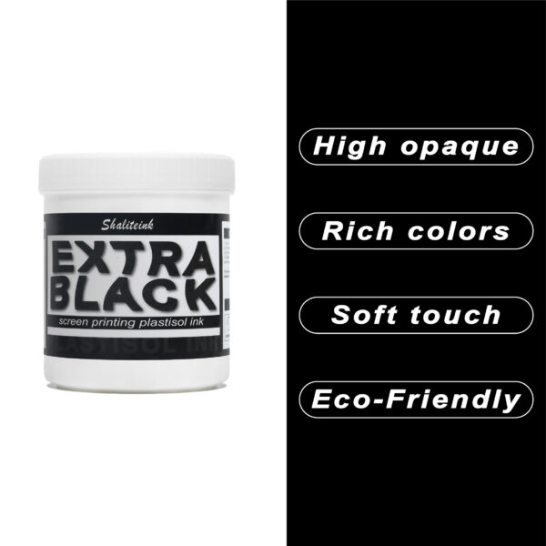
お客様が真夜中のような濃さを求めているのに、「チャコールグレー」で妥協するのはもうやめましょう。Shaliteinkのエクストラブラックは、単なる濃いインクではありません。透明感を一筆で完全に消し去るために設計された、高顔料配合の強力なインクです。安価な黒インクは、濃い色の綿に色あせたエスプレッソのように見えることが多いですが、当社のフォーミュラは、見た目と同じくらい手触りの良い、プロフェッショナルなマットな質感で、濃密な「ブラックホール」のような仕上がりを実現します。.
日々の酷使に耐えるように設計されており、細かいメッシュも難なく切断できるほど滑らかでありながら、100回の洗濯後も深みのある色合いを保ちます。しっかりとしたベタ塗りを得るために何度も印刷を繰り返すことにうんざりしているなら、このインクはあなたの印刷機にふさわしいアップグレードです。増量剤もグレーの色調も一切なし。業界で最も深く、最も信頼性の高い黒を実現します。.
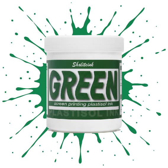
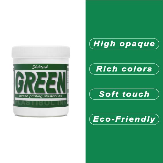
グリーンスクリーン印刷プラスチゾルインク
ガレージで夜遅くまで刺激臭を吸い込んで過ごしていましたが、ついにShaliteinkのグリーンインクで解決しました。昔ながらの有害なインクとは違い、自宅の作業場でも安全に使用でき、有害なPVCも一切含まれていません。鮮やかな発色で、まるで工業作業ではなく、焼きたてのケーキにたっぷりとアイシングを塗っているような感覚です。.
このインクは260°F(約127℃)という低温で硬化するので、電気代の節約になり、シャツが縮んで人形の服のようになってしまうこともありません。濃い色の綿生地にソフトな肌触りでプリントでき、50回以上の洗濯後も鮮やかな色を保ちます。有害なガスに悩まされることなく、自宅のキッチンでプロ仕様のプリント用品を作り始めましょう。.
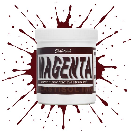
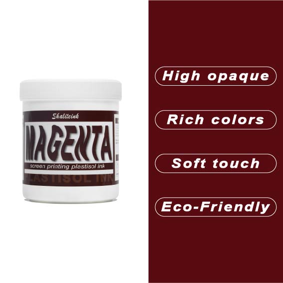
マゼンタスクリーン印刷プラスチゾルインク
正直に言いましょう。薄めたイチゴミルクのようなマゼンタなんて誰も欲しくありません。必要なのは、本当に発色の良いマゼンタスクリーン印刷用プラスチゾルインクです。このShaliteinkのインクはまさに本物。メッシュにしっかり定着するほどの粘度を持ちながら、スキージがスクリーンに触れた瞬間にシルクのように滑らかに伸びます。濃い色の印刷なら、妥協は禁物。鮮やかなホワイトスクリーン印刷用プラスチゾルインクをベースに重ねて使用すれば、色が本当に鮮やかに映えます。すぐに印刷に使用でき、メンテナンスも簡単。コーヒーを買いに行っている間にスクリーン上でインクが固まってしまう心配もありません。.
実際に印刷機を操作しているプラスチゾルインク専門店として、私たちは安価で粉っぽい顔料の悪夢をよく知っています。当社のマゼンタインクは100%で、フタル酸エステル不使用、耐久性に優れています。ひび割れや剥がれがなく、洗濯にも強く、通常は衣類自体よりも長持ちします。スクリーン印刷のスターターキットで始めたばかりの方でも、自動印刷機で何千枚も印刷している方でも、このインクを使えば、一般的なプラスチゾルインクにつきものの悩みを解消し、高級感のある仕上がりを実現できます。.
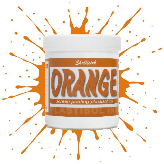
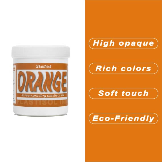
オレンジスクリーン印刷プラスチゾルインク
生地に染み込んでしまうことなく、鮮やかでエネルギッシュな「オレンジクラッシュ」カラーをお探しですか?当店のオレンジプラスチゾルインクは、多くのお客様にご愛用いただいている理由があります。クリーミーでプレスしやすいテクスチャーは、高密度の生地にもスムーズに印刷でき、大胆なグラフィックに必要な高い不透明度を維持します。もう濁ったプリントに悩む必要はありません。鮮やかなシトラスカラーが、最初の印刷から最終乾燥まで、鮮やかさを保ちます。.
長期間の使用を想定して設計されたこのインクは、印刷途中でスクリーン上で乾くことなく、洗濯にも耐える丈夫で柔軟な仕上がりを実現します。濃い色のパーカーに鮮やかな白の下地をプリントする場合でも、淡い色の綿生地に直接プリントする場合でも、Shaliteinkは、インクを頻繁に薄めたり、インク詰まりを起こしたりする手間をかけずに、プロフェッショナルな「店頭販売対応」の仕上がりを実現します。.
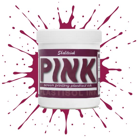
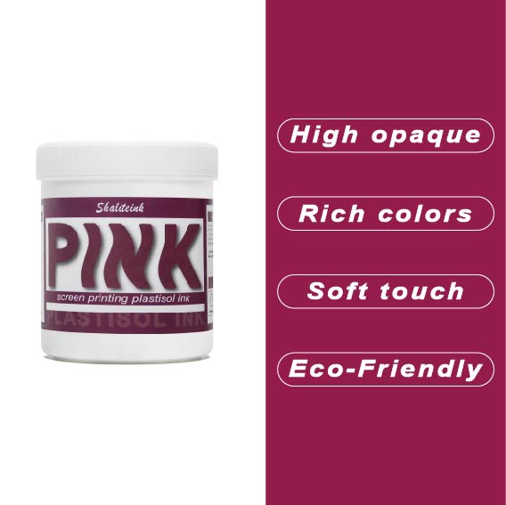
ピンクスクリーン印刷プラスチゾルインク
濃い色の生地に「あざ」のように見えるピンクで妥協するのはもうやめましょう。Shaliteinkのピンクプラスチゾルは、鮮やかで長持ちする色を求める印刷業者にとって最適な高彩度インクです。超高密度顔料配合で設計されたこのインクは、濃い色の衣類染料にも負けず、繊維の上にしっかりと定着し、鮮やかでブティック品質の仕上がりを実現します。バケツから出した直後はクリーミーな質感で、スクリーン上ではほぼ永久に色褪せることなく、休憩中にメッシュ内で乾燥することはありません。スキージを引くたびに、鮮やかで目を引く色合いを再現します。.
長期間の使用を想定して開発された当社のフタル酸エステル不使用のフォーミュラは、320°F(約160℃)で「防弾」フィルムに融合し、デザインがひび割れたり色褪せたりすることなく、50回以上の洗濯サイクルに耐えることを保証します。丈夫なストリートウェアでも、柔らかなコットン混紡素材でも、Shaliteinkは、硬くて「凍ったヨガマット」のような感触なしに、必要なプロ仕様の不透明度を提供します。ただシャツをプリントするのではなく、ついに思い通りのピンク色になったShaliteinkで、お客様にあなたの職人技に夢中になる理由を与えましょう。.
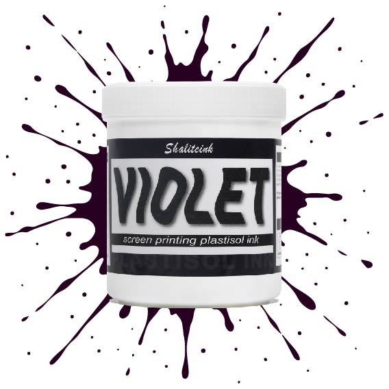
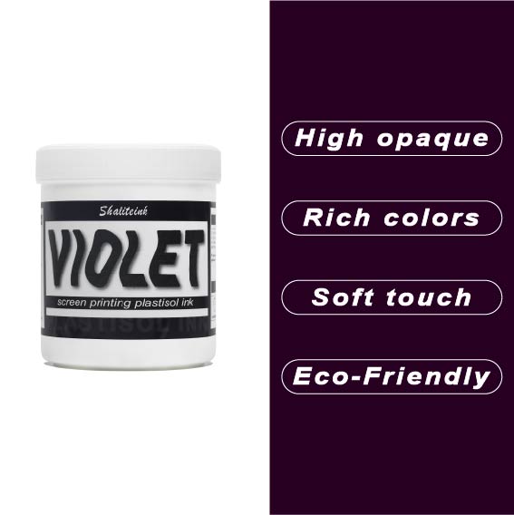
バイオレットレッドスクリーン印刷プラスチゾルインク
正直言って、ほとんどの赤インクはファストフードのロゴに似合いそうな、派手で明るすぎる、ちょっと安っぽい印象です。でも、このバイオレットレッドは全く別物。深みのある、落ち着いたワインのような色合いで、ごく普通の$5の無地のシャツが、まるで高級ブティックの$40のシャツのように見えます。真っ黒なパーカーにこのインクを使ってみたところ、高い不透明度のおかげで、色がくすんで濁ったような色にならず、本来の色合いを保ってくれました。クライアントが、ありきたりなジムシャツではなく、洗練されたデザインのシャツを求めている時に、まさに「圧倒的なアドバンテージ」となるでしょう。.
冷たいピーナッツバターのようなインクと格闘するのはもうやめましょう。このインクはバケツから出した瞬間からバターのように滑らかで、かき混ぜたり薄めたりする必要は一切ありません。コーヒーを買いに行ったり、配達の対応をしたりしても、インクが固まったり、スクリーンを傷めたりすることはありません。それに、正直に言って、誰かが実際に着用した瞬間にひび割れてしまうプリントほど、ブランドをあっという間にダメにするものはありません。このインクは生地の動きに合わせて伸縮し、手触りも柔らかく、高温洗浄テストにも耐え、剥がれることもありません。とにかく使いやすいので、スクリーンをこする時間を減らし、印刷作業に集中できます。.
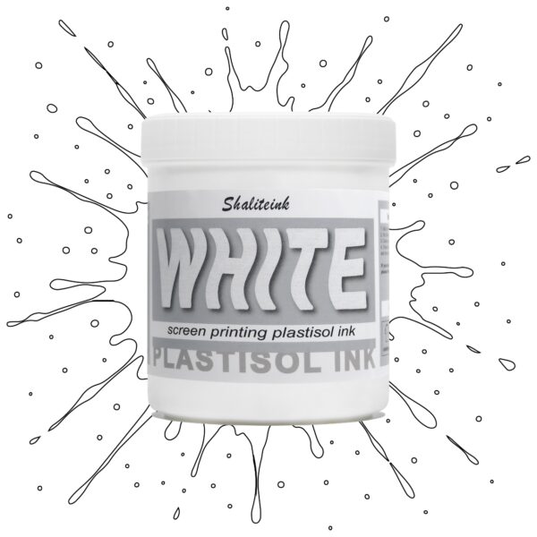
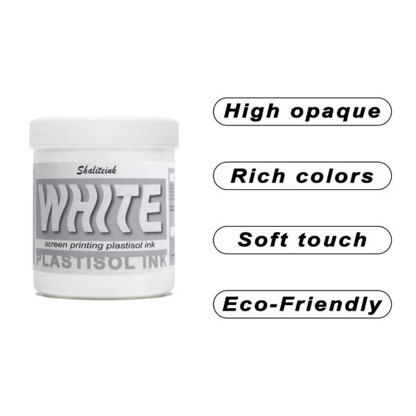
ホワイトスクリーン印刷プラスチゾルインク
生地に溶け込んでしまうような「幽霊のような」白いプリントで妥協するのはもうやめましょう。Shaliteinkのホワイトプラスチゾルインクは、濃色の衣類にしっかりとした不透明度を与えるために開発されました。クリーミーで滑らかな質感でスクリーンに塗布でき、硬いプラスチックというよりはホイップバターのような感触です。そのため、手作業でのプリント作業がスムーズになり、生産性が向上します。たった一度のフラッシュで、鮮やかで明るい白の「ポップ」な仕上がりを実現し、最初の洗濯でインクがひび割れたり色褪せたりする心配もありません。.
週末に趣味でプリントを楽しむ方にも、忙しいショップを経営されている方にも、これはまさにあなたが探し求めていた頼れる相棒です。高発色で、驚くほど簡単に混ぜることができ、数秒で硬化するので、機材の扱いに時間を費やすことなく、実際にプリント作業に集中できます。プロ仕様の性能をバケツに詰め込んだこのインクは、最初のプリントから1000回目のプリントまで、白を鮮やかに保ち、デザインをシャープに仕上げるように設計されています。.
 EN
EN  DE
DE  ES
ES  PT
PT  JA
JA
フェリックス・ウェーバー –
Leicht zu Nutzen und konstante Ergebnisse。 Leicht zu Nutzen und konstante Ergebnisse。 Hochwertige Qualität und Schnelle Lieferung。ライヒト・ツ・ヌッツェン・ウン
サラ・ミラー –
価格に見合った価値が非常に高い。品質は最高です。
エマ・フィリップス –
品質は高級感があり、配送も迅速でした。価格に見合った価値が十分にあります。使いやすく、仕上がりも安定しています。ほとんどの場合、期待以上でした。
ローラ・ワグナー –
Hochwertige Qualität und Schnelle Lieferung。 Sehr グーテス Preis‑Leistungs‑Verhältnis。 Einfache Anwendung und zuverlässige Leistung。すべてのタグに関連する機能を確認してください。 Hochwertige Qualität und Schnelle Lie
マリア・オリヴェイラ –
最高の利益。ユーザーと結果の一貫性を維持します。ユーザーと結果の一貫性を維持します。優れた評価と迅速な取り組み。 Superou minhas 期待しています。ファンシオナ・ムイト・ベム・ノ・ディア・ア
ローラ・ワグナー –
すべての機能を理解しておく必要があります。 Hat meine Erwartungen übertroffen。 Hat meine Erwartungen übertroffen。 Hochwertige Qualität und Schnelle Lieferung。はぁ
マイケル・ブラウン –
使いやすく、仕上がりも安定しています。品質は高級感があり、配送も迅速でした。品質は高級感があり、配送も迅速でした。価格に見合った価値ある製品です。
ルーカス・ゴメス –
ユーザーと結果を容易にする
マイケル・ブラウン –
非常にお買い得です。非常にお買い得です。品質は高級感があり、配送も迅速でした。
エマ・フィリップス –
使いやすく、仕上がりも安定しています。スムーズな塗布と信頼性の高いパフォーマンス。非常に効果的です。