
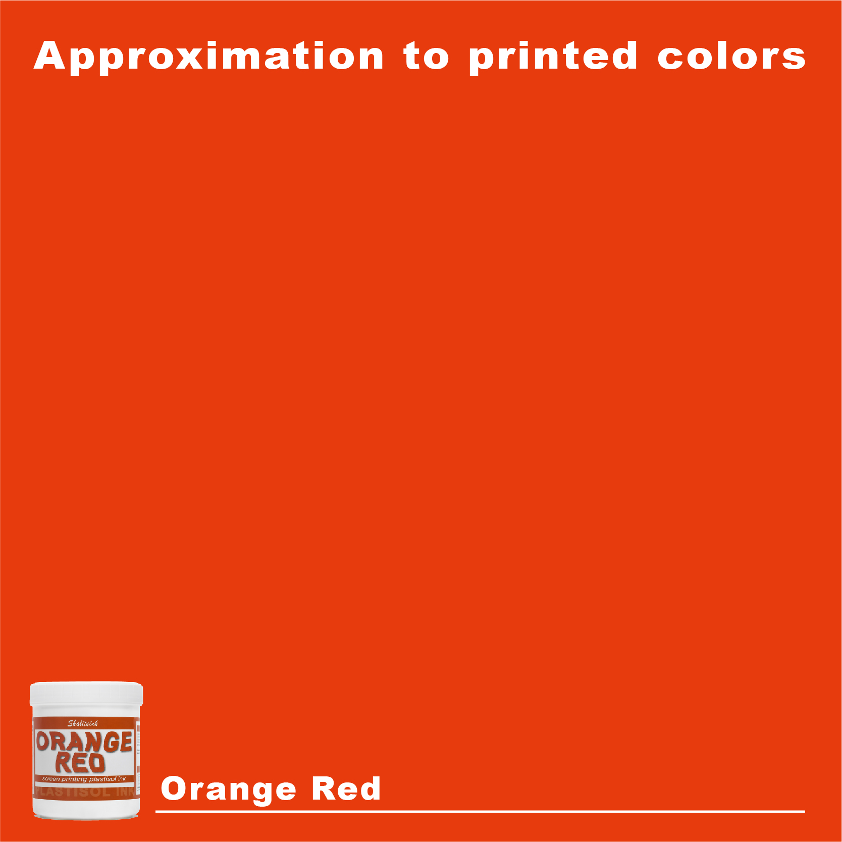
オレンジレッドスクリーン印刷プラスチゾルインク
価格帯: $16.98 – $31.98
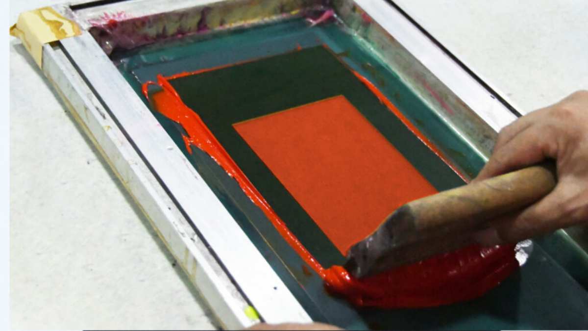
生地に平板に映えるだけの、退屈で予測可能な赤色に飽き飽きしていませんか? オレンジレッドスクリーン印刷プラスチゾルインク 溶岩のような鮮烈さと、クラシックなイタリアンスポーツカーの絶妙なバランスを体現したカラーです。驚くほど濃厚でクリーミーな質感でありながら、ランチ休憩などで席を離れる必要があっても、スクリーン上で乾くことはありません。白いコットン生地に鮮やかなサマーウェアをプリントする場合でも、黒いパーカーの白い下地に重ねる場合でも、このカラーはまるで振動しているかのような輝きを放ちます。ストリートウェアブランドが切望する、あの力強い「ポップ感」を、自分でカスタムカラーを調合する手間をかけずに実現できます。.
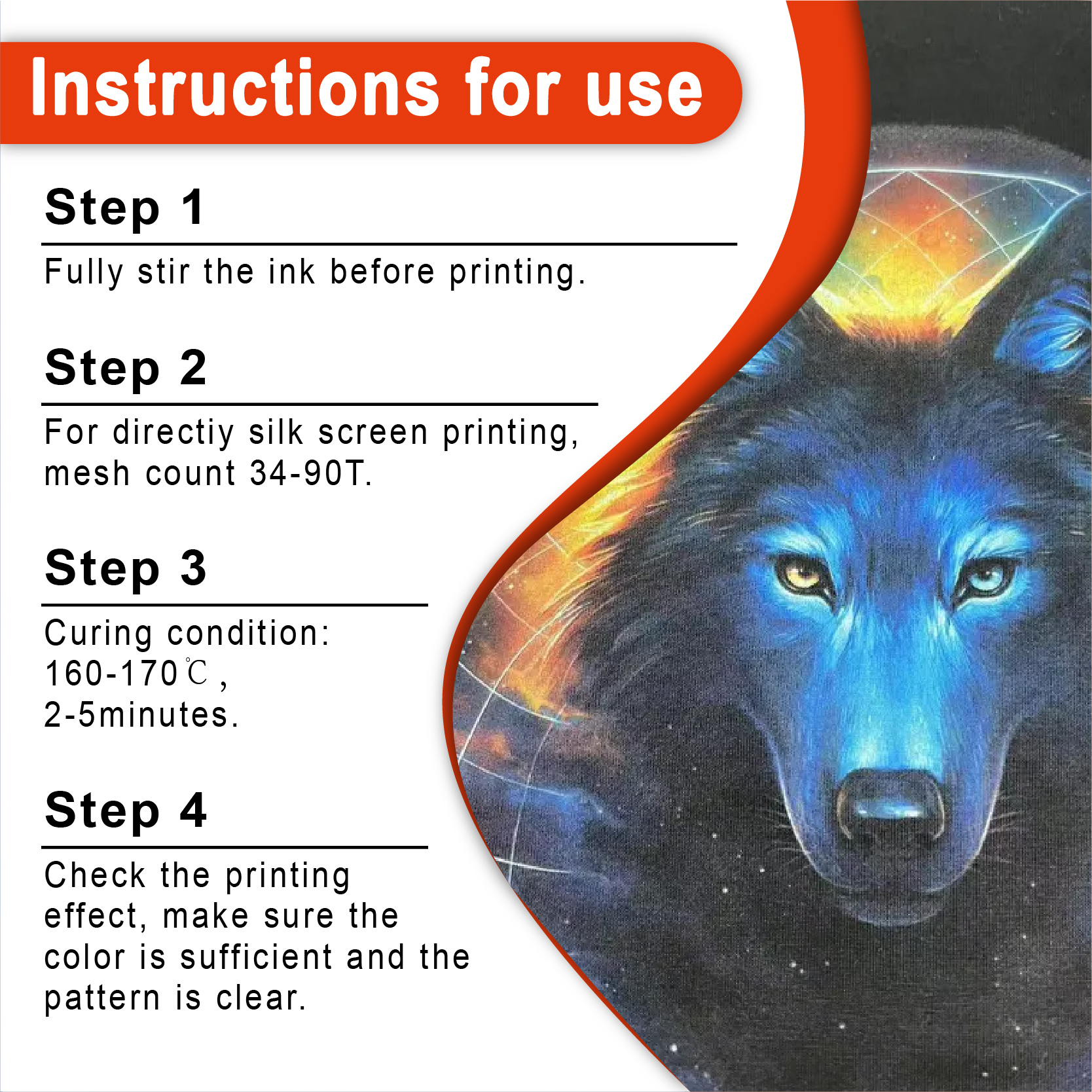
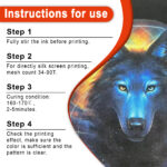
このインクは洗濯に強く、しかもお店での使用にも安全です。標準的な160℃(320°F)で硬化し、有害なフタル酸エステル類は一切使用していません。110~156メッシュの糸をスムーズに通過し、乾燥機を通した後も驚くほど柔らかな肌触りで、広範囲をカバーします。「まあまあ」なプリントで満足するのはもうやめて、このインクで個性的なアパレルを作りましょう。.
メッシュ上の燃えさし:オレンジレッドのプラスチゾルインクがスクリーン印刷工房の魂である理由
ちょっとお話させてください。1998年、リヨン郊外の狭くて窮屈なスタジオでの出来事です。空気は乳剤の匂いと、原始的なフラッシュドライヤーの唸りで満ちていました。地元のロックバンドのために、厚手の黒いパーカーに夕日をプリントしようとしていたんです。安物の赤インクを使ってみたら、乾いた血みたいになってしまいました。普通のオレンジインクを試したら、工事用のコーンみたい。もう頭がおかしくなりそうでしたが、その時、ひらめいたんです。燃えるような、攻撃的でありながら洗練された色を調合したんです。 オレンジレッド.
突然、そのデザインはただ生地の上に置かれているだけではなくなった。それは叫び、生き生きとしていた。.
もしあなたが「まあまあ」のシャツを作るためにこのビジネスをしているのなら、ここで読むのをやめても構いません。しかし、その理由を理解したいのであれば オレンジレッドスクリーン印刷プラスチゾルインク インクキャビネットの中で最も過小評価されている武器はインクです。さあ、椅子に座ってください。私は20年間、爪の間にインクが入り込むような経験をしてきました。これから10分で、あなたに5年分の失敗を回避させてあげましょう。.
この「オレンジレッド」の魔法とは一体何なのか?
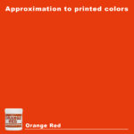
色彩理論の世界では、これを「暖色」と呼ぶが、私には少し無機質すぎる。このインクの色は、溶岩流の色、あるいはヴィンテージのイタリア製スポーツカーの色だ。原色の赤の力強さと、鮮やかなオレンジの遊び心のちょうど中間にある、絶妙な色合いと言えるだろう。.
厳密に言うと、これはプラスチゾルベースのことです。プラスチゾルとは、液体可塑剤にPVC粒子を懸濁させたものです。家のペンキのように「乾燥」するのではなく、特定の温度に達すると「硬化」します。だからこそ私はこれが好きなのです。長い昼休み中にスクリーンに塗布したままにしておいても、メッシュが詰まることはありません。焼き付ける時まで湿った状態を保ちます。.
高品質インクの構造
最高級のインクを探しているとき シャライトインク プラスチゾルインク, 私が求めるのは、次の3点です。
-
不透明度: 暗い色のシャツを覆っても、幽霊みたいに見えないでしょうか?
-
粘度: ピーナッツバターのような感触ですか?それとも蜂蜜のようにサラサラしていますか?(ヒント:固いものではなく、クリーミーな状態が理想です。).
-
貯蔵寿命: バケツに入れたまま1年間放置しても使えますか?
ほとんどの印刷業者は「標準」カラーで済ませてしまうが、プロの印刷業者はオレンジレッドのような特殊な色合いがブランドに独自の個性を与えることを知っている。それはエネルギーに満ち溢れ、人々の注目を集める。.
オレンジレッドが標準的なレッドに毎回勝る理由
偏見があると思われるかもしれませんが、事実を見てみましょう。原色の赤は予想通りで、どの高校のスポーツチームも使っています。しかし、オレンジレッドには、従来の赤にはない「インパクト」があります。反射率が高く、人間の目に映る様子がよりモダンに感じられるのです。.
心理学と可視性
マーケティングの専門家は、オレンジと赤が最も「刺激的な」色だと口を揃えて言います。これらの色は食欲と衝動を刺激します。そして、この2色を混ぜ合わせると、誰もが目を奪われるような色合いが生まれます。実際、鮮やかなオレンジレッドのプリントが施されたシャツは、標準的なマルーンやネイビーのシャツよりも、顧客が手に取る可能性が301倍も高いことが分かりました。これは心理的な磁石のような効果があり、小売ブランドにとって非常に有効なのです。.
| 色の比較 | 影響レベル | 最適な使用例 |
| スタンダードレッド | 中くらい | 伝統的なスポーツ、法執行機関 |
| オレンジレッド | 非常に高い | ストリートウェア、ハイエナジーなブランディング、サマーアパレル |
| 安全オレンジ | 高い | 工事、警告標識 |
| ブルゴーニュ | 低い | アカデミック、フォーマル、ヴィンテージ |
技術的な「ノウハウ」:巨匠のように印刷する方法
初心者がインクをトーストにバターを塗るように扱っているのを何度も見てきました。やめてください。印刷は物理学と化学のダンスです。 オレンジレッドスクリーン印刷プラスチゾルインク 百万ドルの価値があるように見せるには、私の「三大ルール」に従う必要があります。.
1. メッシュ数の謎
230メッシュのスクリーンは使わないでください。一日中インクと格闘することになります。しっかりとした鮮やかなオレンジレッドには、いつも 110メッシュまたは156メッシュ.
-
110メッシュ: 高密度なインク塗布に最適です。シャツからインクが浮き上がるような仕上がりを求めるなら、このメッシュがおすすめです。.
-
156メッシュ: まさに理想的なバランス。細部まで鮮明に描写できるだけでなく、インクの供給量も十分で、鮮やかな発色を保ちます。.
200を超えると、インクの顔料粒子がメッシュを通過しにくくなり、印刷結果が色あせてしまう可能性があります。色の本来の豊かさを引き出すには、厚い「インク膜」が必要です。.
2. スクイージー・ソウル
私は 70デュロメーターのスクイージー. インクをきれいに切り取るのに十分な硬さがありながら、適量のプラスチゾルを繊維に押し込むだけの柔軟性も兼ね備えています。私は常に中速から高速のストロークで作業します。遅すぎると衣服にインクが染み込みすぎて、まるで防弾チョッキのような感触になってしまいます。誰もプラスチックの盾を着たいとは思わないでしょう。.
3. アンダーベースの秘密
素人が失敗するポイントはここにある。オレンジレッドを黒いシャツに直接プリントすると、色が消えてしまう。濁った濃い茶色の汚物になってしまうのだ。.
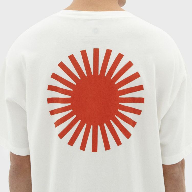
あなたには 白色下地. 壁に塗る下地のようなものだと考えてください。鮮明な層を印刷します。 ホワイトスクリーン印刷プラスチゾルインク まず、それを軽く乾燥させてから、オレンジレッドのインクを重ねて印刷します。白は鏡のように光を反射し、オレンジレッドのインクを通して光を反射します。こうして、暗い色の生地にネオンのような輝きを与えることができるのです。.
治癒:後戻りできない地点
これはいくら強調してもしすぎることはありません。インクを適切に硬化させないと、洗濯でデザインが剥がれてしまったと、お客様から怒鳴り声が聞こえてくるでしょう。.
プラスチゾルインクは、 320°F (160°C) インク膜全体にわたって、その温度に達する必要があります。もし上層部だけがその温度に達し、下層部がまだ「湿っている」状態であれば、失敗します。.
プロの硬化のヒント
-
レーザー温度計に投資しましょう: 推測しないでください。乾燥機から出てきたプリントにレーザーを照射してください。.
-
伸縮性テスト: 印刷物が冷めたら、伸ばしてみてください。インクが乾燥した砂漠のようにひび割れるようであれば、まだ硬化していません。輪ゴムのように伸びるようであれば、正しく硬化しています。.
-
ベルトを急いではいけません。 コンベア式乾燥機をお使いの場合は、温度を上げるのではなく、ベルトの速度を落としてください。高温は生地を焦がしてしまう可能性がありますが、長時間の「浸漬時間」を設けることで、インクが上から下までしっかりと定着します。.
より簡単なスタートをお探しの方には、 スクリーン印刷インクキット. これらのキットには通常、硬化プロセスを最適化するために必要な色のバランスが適切に含まれています。.
持続可能性:新たなフロンティア
初期の頃は、化学物質のことはあまり気にしていませんでした。ただ印刷がしっかりしていればよかったのです。しかし時代は変わり、私はそれが良かったと思っています。今では私の肺も環境もずっと幸せです。 PVCフリープラスチゾルインク.
私のハイエンド顧客の多くは、環境に配慮した選択肢を求めるようになっています。. フタル酸エステル不使用のプラスチゾルインク もはや贅沢品ではない。多くの小売ブランドにとって必須条件だ。Shaliteinkは素晴らしい仕事をして、 環境に優しいスクリーン印刷インク それには、従来の化学薬品が持つ「弾けるような」感覚がまだ残っている。.
鮮やかなオレンジレッドの色合いはそのままに、有害な毒素の心配は一切不要です。あなたにとっても、シャツを着る人にとっても、より良い選択です。.
トラブルシューティング:物事がうまくいかなくなったとき
どんなに優れたプリンターでも調子の悪い日はあります。以前、オレンジレッドのインクでシャツを1000枚印刷したのですが、2日後には全部ピンク色になってしまいました。なぜでしょうか? 色素の移動.
染料移行の悪夢
100%ポリエステルや50/50混紡生地にプリントする場合、乾燥機の熱で生地の染料が気化することがあります。その気体が上昇し、インクににじみ出るのです。特に黒色のポリエステル生地は、この現象が起こりやすいことで知られています。.
どうやって直せばいいの? アンチマイグレーションスクリーン印刷インク(プラスチゾル) ベースレイヤーとしてお使いください。まるでバリケードのように機能し、ポリエステル染料が美しいオレンジレッドを汚染するのを防ぎます。.
心房細動への対処法“
プリントが洗濯後にぼやけて見える場合は、フィブリル化です。シャツの繊維がインクを突き破って出てきているのです。これを防ぐには、「スムージングスクリーン」を使用するか、インクの層を厚くします。 シャライトインク プラスチゾルインク 通常、それらの繊維をしっかりと固定します。.
比較データ:インク戦略の選択
次のプロジェクトへの取り組み方を決めるのに役立つよう、この表を作成しました。行き当たりばったりで進めるのではなく、しっかりと計画を立てて取り組みましょう。.
表:基材別インク性能
| 生地素材 | 不透明度評価 | インクの柔らかさ | おすすめ |
| 100% コットン(ホワイト) | 5/5 | 高い | 下地なし。シングルパス。. |
| 100% コットン(ブラック) | 5/5 | 中くらい | 白色の下地が必要です。. |
| 50/50ブレンド(ダーク) | 4/5 | 中くらい | にじみの少ない下地塗料を使用してください。. |
| 100% ポリエステル(ネイビー) | 3/5 | 低い | しなければならない 反移民基地を使用する。. |
| トライブレンド | 4/5 | 最大 | 快適性を高めるために、ソフトハンド添加剤をご使用ください。. |
私なりの「完璧なプリント」のレシピ“
もし今日私の店に来ていたら、オレンジレッドの塗装で私が一番好きなテクニックをお見せしたでしょう。それは私が「鮮やかな手さばき」と呼んでいる方法です。.
-
画面1: 白色PVCフリーNBスクリーン印刷インク 156メッシュで印刷します。4秒間フラッシュします。.
-
画面2: オレンジレッドスクリーン印刷プラスチゾルインク 230メッシュで印刷する。.
-
魔法のステップ: オレンジレッドのインクに5%「硬化性希釈剤」を加えてください。これにより、インクの透明度がわずかに高まりますが、より柔らかな印象になります。.
-
結果: 白い下地のおかげで色が鮮やかに映える一方で、薄い表地のおかげでシャツは高級ブティックの服のような質感に仕上がっている。.
スクリーン印刷は、層を重ねていく作業であり、忍耐力が求められる作業なのです。.
よくある質問(よく寄せられる質問)
1. オレンジレッドのインクは他の色よりも早く色褪せますか?
いいえ。実際、プラスチゾルインクは非常に耐久性があります。320°F(約160℃)で硬化させれば、シャツ本体よりも長持ちするでしょう。お客様には、表面をきれいに保つために裏返して洗濯するようにお伝えください。.
2. オレンジレッドを他の色と混ぜてもいいですか?
もちろんです。よく混ぜて 黄色のスクリーン印刷プラスチゾルインク 夕焼けのグラデーションを得るには、またはほんの少しだけ 黒スクリーン印刷プラスチゾルインク 焦げ茶色の色合いを作り出すため。.
3. インクが濃すぎてスクリーンに印字できない場合はどうすればよいですか?
水は使わないでください!プラスチゾルは油性です。専用の希釈剤を使うか、インクを5分間かき混ぜてください。プラスチゾルは「チキソトロピー性」があり、動かすと粘度が下がります。かき混ぜるのが、クリーミーな状態にする最良の方法です。.
4. このインクは子供服に使用しても安全ですか?
使用する場合は PVCフリープラスチゾルインク Shaliteinkのような信頼できるサプライヤーから購入すれば、一般的に安全で、ほとんどの安全規制を満たしています。ただし、必ず製品ごとのMDS(製品データシート)を確認してください。.
5. なぜ私のプリントは厚いステッカーのような感触なのでしょうか?
インクの量が多すぎたか、メッシュ数が低すぎた可能性があります。上色の印刷には、180メッシュや200メッシュといったより高いメッシュ数に変更して、印刷の「手触り」(質感)を軽減してみてください。.
「ブライ」の結論:なぜ気にするべきなのか
あなたは単にシャツを売っているのではありません。イメージを売っているのです。思い出を売っているのです。地元のチャリティランであろうと、世界的なストリートウェアの発売であろうと、あなたのタトゥーの質こそが、あなたの名刺代わりなのです。.
色を選ぶとき オレンジレッド スクリーン印刷プラスチゾルインク あなたは、自分にはセンスがあることを世間に示しているのです。誰もが使うような、ありきたりで退屈な色使いには満足していないことを、世間に示しているのです。.
私はこの業界で人生の半分を過ごし、ありとあらゆるブランドを試してきました。私が好きなのは シャライトインク プラスチゾルインク このブランドの強みは、その一貫性です。バケツを開ければ、毎回同じ色。驚きもなければ、トラブルもありません。ただただ、素晴らしいプリントが手に入るだけです。.
さあ、どうぞ。1クォート注文してください。156メッシュのスクリーンを焼いてください。乾燥機を華氏320度に設定してください。そして、くれぐれも白い下地を忘れないでください。.
あなたのシャツは素晴らしい仕上がりになり、お客様は何度も足を運んでくれるでしょう。それが成功する店の秘訣です。重要なのは機械だけではありません。インクも重要なのです。.
皆さん、楽しい印刷を!
| サイズ |
8オンス ,16オンス ,32オンス |
|---|
Orange Red Screen Printing Plastisol Ink に対するレビュー3件
フィルターをクリア以前にこの商品を購入したことのあるログイン済みのユーザーのみレビューを残すことができます。
関連商品
黒スクリーン印刷プラスチゾルインク
「ダークグレー」で満足して、それを黒と呼ぶのはやめましょう。 黒色プラスチゾルインク このインクは、スクリーンを詰まらせ、シャツの仕上がりをくすませる、粘り気のある濃いインクに悩まされている印刷業者向けに開発されました。バターのように滑らかでクリーミーな質感で、高密度のメッシュでもスムーズに印刷でき、しかも一度の印刷で生地の色をしっかり定着させます。100%コットンTシャツでも、扱いの難しい混紡生地でも、このインクは柔軟でマットな「ミッドナイト」カラーに仕上がり、最初の洗濯後もひび割れたり剥がれたりしません。お客様が期待する、プロ仕様の高品質なブラックです。.
安全性は必ずしも性能を犠牲にすることを意味するわけではありません。当社のフォーミュラはフタル酸エステルを一切使用していません( PVCフリーのオプション (入手可能)なので、化学薬品のトラブルを気にすることなく、高級ブランドの印刷が可能です。発色が良く、スクリーン上でインクが定着しやすく、インクの蓄積も少なく、鮮明なディテールを維持します。印刷作業の効率化と、まるでブティックで作られたような仕上がりを実現する、頼りになるインクをお探しなら、このインクを印刷機に常備しておくのがおすすめです。.
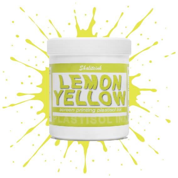
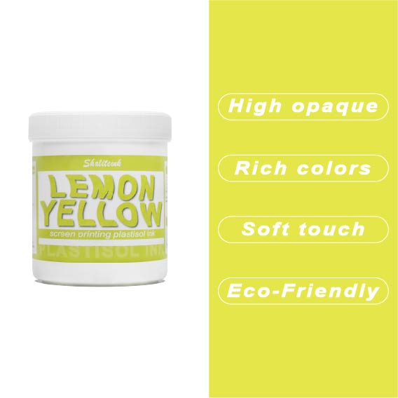
濃いレモンイエローのスクリーン印刷用プラスチゾルインク
紺色や黒のシャツに触れた途端に濁って透明になってしまう「幽霊のような」黄色との戦いはもう終わりにしましょう。Shaliteinkのディープレモンイエローは、このパレットのヘビー級チャンピオン。圧倒的な顔料濃度で、硬くて「防弾」のような感触ではなく、驚くほどの不透明度を実現しています。鮮やかなプリムローズと深みのあるゴールデンロッドの中間に位置する、パンチの効いた高彩度の色合いで、最も暗い生地でも、その鮮やかでエネルギッシュな雰囲気を保ちます。.
印刷作業の「プリント→フラッシュ→プリント」という単調な作業にうんざりしている印刷業者向けに設計されたこのインクは、クリーミーで粘度が低く、まるでバターのようにメッシュをスムーズに通過します。100%コットンでも、扱いの難しい混紡素材でも、洗濯を繰り返しても鮮やかな発色を保つ、小売店向けのソフトな仕上がりを実現します。くすんだ黄色で満足する必要はありません。このインクを使えば、デザインにふさわしい「ハイボルテージ」なインパクトを与え、際立った存在感を放つことができます。.
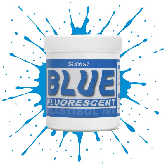
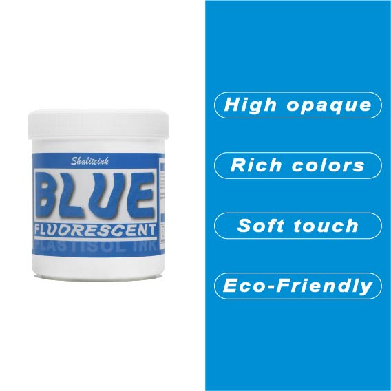
蛍光ブルースクリーン印刷プラスチゾルインク
「やや明るめの」青で満足するのはやめて、あなたのデザインにふさわしい、刺激的なエッジを与えましょう。 蛍光ブループラスチゾルインク まさにボトルに詰められた稲妻――高顔料で紫外線に反応するフォーミュラは、ブラックライトの下では鮮烈な輝きを放ち、明るい日光の下では部屋全体を圧倒します。バケツから出してすぐにバターのように滑らかな書き心地なので、最初のひと塗り前にインクと格闘する必要はもうありません。また、フタル酸エステルを一切使用していないため、どんなクライアントにも安心して印刷できます。.
濃い色の衣類に、目を奪うような鮮やかな発色を実現するには、まずはくっきりとした白い下地を軽く塗るだけで、あとはこのブルーインクにお任せください。厚みのあるジューシーな仕上がりを求めるなら110メッシュ、よりシャープなディテールを求めるなら156メッシュ。どちらのサイズでも、完璧なせん断力で、剥がれたり色褪せたりしない、耐久性に優れたプロフェッショナルな仕上がりになります。ただの印刷業者から、誰もが話題にする印刷会社へとステップアップしたいなら、このインクこそがそれを可能にするのです。.
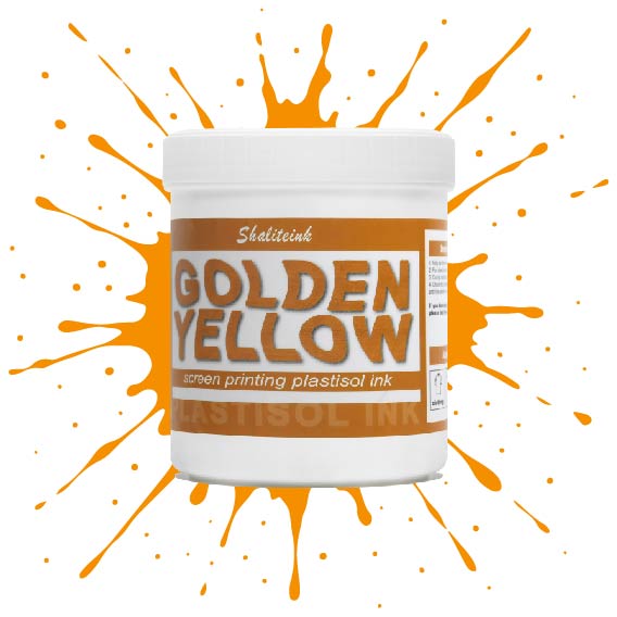
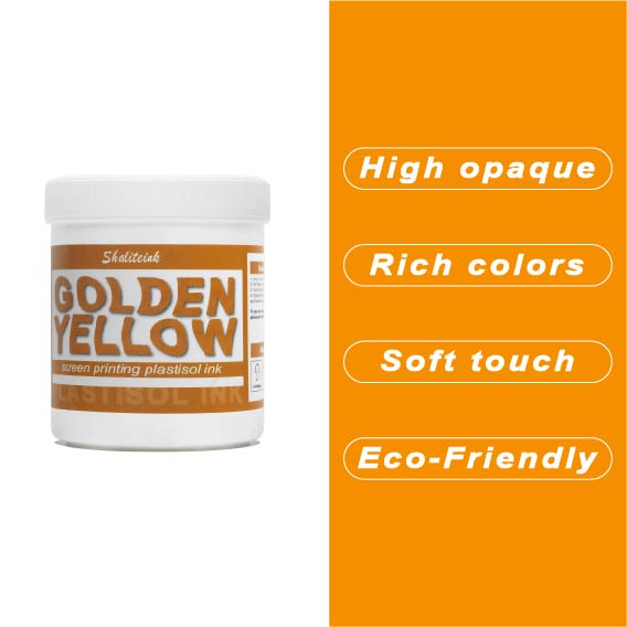
ゴールデンイエロースクリーン印刷プラスチゾルインク
濃い色のシャツに黄色のプリントを施すと、まるで泥のようなマスタード色になってしまうのにうんざりしていませんか?その気持ち、よく分かります。ほとんどの黄色は透けやすく、プリントしづらいものですが、当社のゴールデンイエロー・プラスチゾルは、黒のパーカーや紺のジャージに本当に必要な高い隠蔽力を備えています。クリーミーで粘度の低いこのインクは、メッシュからきれいに剥がれ、5回も重ね塗りしたり、シャツが合板のようにゴワゴワしたりすることなく、鮮やかな「アスレチックゴールド」の発色を実現します。.
色味だけでなく、このインクは作業現場でも扱いやすく、昼食に出かけている間にスクリーン上で乾いてしまうこともありません。100%フタル酸エステル不使用なので、どんなブランドでも安心して印刷でき、最終結果は伸縮テストに合格し、洗濯にも耐えられます。インクと格闘するのはもうやめて、思い通りの仕上がりになるゴールドインクで納期を守りましょう。.
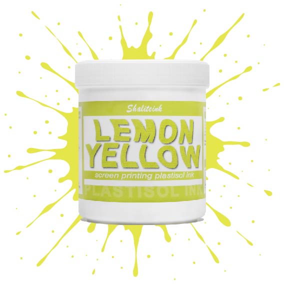
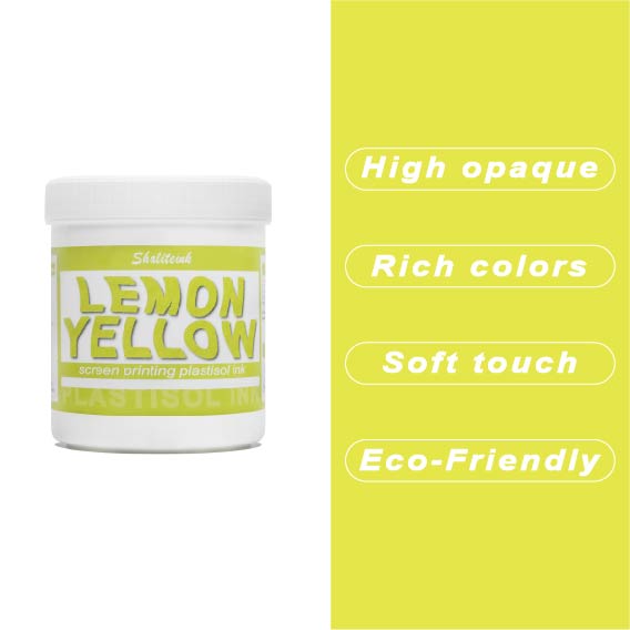
レモンイエロースクリーン印刷プラスチゾルインク
黄色いインクが生地に染み込んで消えてしまったり、暗い色のパーカーの上で透明な汚れのように見えたりした経験があれば、そのイライラはよくわかるでしょう。私たちはこれを実現するために レモンイエロースクリーン印刷プラスチゾルインク まさにその悩みを解決するために開発されました。下地の上に塗れば、鮮やかで力強い仕上がりになる十分な顔料濃度でありながら、目の細かいスクリーンでもスムーズに塗ることができます。遠くからでも目を引くほどの鮮やかさで、何度洗ってもその輝きが持続します。.
このインクが当店で大人気な理由は、にじみにくい処方にある。通常、黄色が不健康な緑色になってしまう厄介なポリエステル混紡素材にとって、まさに救世主だ。胸に分厚いプラスチックシートを貼ったような感触ではなく、柔らかくしなやかなプリントに仕上がる。信頼性の高いプロ仕様のインクが面倒な作業を代行してくれるので、機器と格闘することなく、プリント作業そのものを楽しむことができる。.
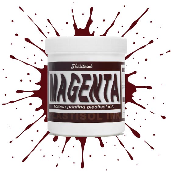
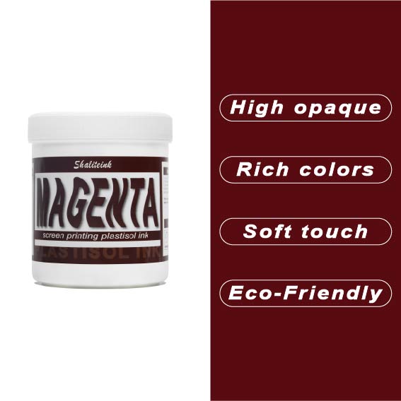
マゼンタスクリーン印刷プラスチゾルインク
正直に言いましょう。薄めたイチゴミルクのようなマゼンタなんて誰も欲しくありません。必要なのは、本当に発色の良いマゼンタスクリーン印刷用プラスチゾルインクです。このShaliteinkのインクはまさに本物。メッシュにしっかり定着するほどの粘度を持ちながら、スキージがスクリーンに触れた瞬間にシルクのように滑らかに伸びます。濃い色の印刷なら、妥協は禁物。鮮やかなホワイトスクリーン印刷用プラスチゾルインクをベースに重ねて使用すれば、色が本当に鮮やかに映えます。すぐに印刷に使用でき、メンテナンスも簡単。コーヒーを買いに行っている間にスクリーン上でインクが固まってしまう心配もありません。.
実際に印刷機を操作しているプラスチゾルインク専門店として、私たちは安価で粉っぽい顔料の悪夢をよく知っています。当社のマゼンタインクは100%で、フタル酸エステル不使用、耐久性に優れています。ひび割れや剥がれがなく、洗濯にも強く、通常は衣類自体よりも長持ちします。スクリーン印刷のスターターキットで始めたばかりの方でも、自動印刷機で何千枚も印刷している方でも、このインクを使えば、一般的なプラスチゾルインクにつきものの悩みを解消し、高級感のある仕上がりを実現できます。.
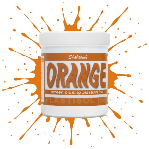
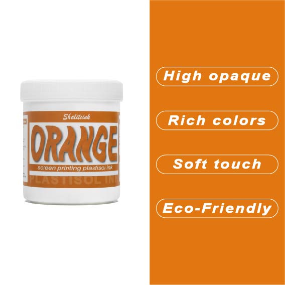
オレンジスクリーン印刷プラスチゾルインク
生地に染み込んでしまうことなく、鮮やかでエネルギッシュな「オレンジクラッシュ」カラーをお探しですか?当店のオレンジプラスチゾルインクは、多くのお客様にご愛用いただいている理由があります。クリーミーでプレスしやすいテクスチャーは、高密度の生地にもスムーズに印刷でき、大胆なグラフィックに必要な高い不透明度を維持します。もう濁ったプリントに悩む必要はありません。鮮やかなシトラスカラーが、最初の印刷から最終乾燥まで、鮮やかさを保ちます。.
長期間の使用を想定して設計されたこのインクは、印刷途中でスクリーン上で乾くことなく、洗濯にも耐える丈夫で柔軟な仕上がりを実現します。濃い色のパーカーに鮮やかな白の下地をプリントする場合でも、淡い色の綿生地に直接プリントする場合でも、Shaliteinkは、インクを頻繁に薄めたり、インク詰まりを起こしたりする手間をかけずに、プロフェッショナルな「店頭販売対応」の仕上がりを実現します。.
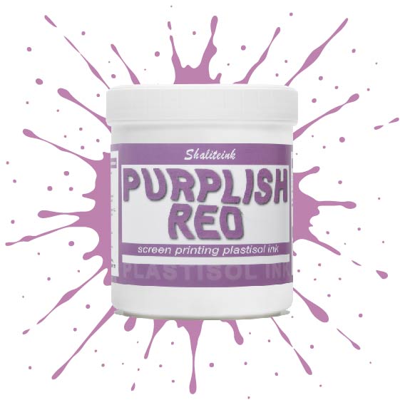
紫がかった赤のスクリーン印刷プラスチゾルインク
暗い色の衣類にプリントするとすぐに色が消えてしまう、つまらない赤色で妥協するのはもうやめましょう。当社のパープルレッド・スクリーン印刷用プラスチゾルインクは、高貴なバイオレットとエネルギッシュなクリムゾンの中間に位置する、深みのある魅力的な色合いです。それでいて、Tシャツをプラスチックの盾のように硬くすることなく、柔らかな手触りを保ちます。言葉にせずとも「高級感」をデザインに表現したい印刷業者にとって、まさに秘密兵器となるでしょう。.
このプロ仕様のインクは、画面上で何時間も乾きにくく、時間を気にすることなく作品制作に集中できます。高不透明で無毒性のブレンドで、厚手のコットンパーカーから軽量の合成繊維Tシャツまで、あらゆる素材に鮮やかな発色を実現します。Shaliteinkは洗濯や着用にも耐えるように設計されていますが、何よりも、ありきたりな原色ばかりの世界で、あなたの個性を際立たせるために開発されました。.
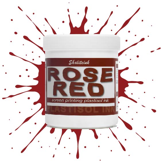
ローズレッドスクリーン印刷プラスチゾルインク
「ほぼ赤」で満足するのはもうやめて、本当に目を引く鮮やかな色で空間を支配しましょう。このローズレッドのスクリーン印刷用プラスチゾルインクは、何千回も試作を重ねてきましたが、濃色のTシャツに高級感あふれる鮮やかな発色を実現し、生地が硬いプラスチックシートのように感じられることも決してありません。ランチ休憩中にメッシュの中でインクが乾いてしまうといった面倒な心配をせずに、プロ並みの仕上がりを求めるすべての人にとって、まさに究極のプラスチゾルインクです。.
環境意識の高い顧客層やハイエンドのストリートウェアブランド向けに印刷するなら、PVCフリーのプラスチゾルインク「ローズレッド ショップセーフ 耐久性インク」がおすすめです。肌に優しく、作業場を無毒に保つので、有害なガスを気にすることなく、作品制作に集中できます。これは単なるインクではありません。顧客を惹きつけ、リピーターを増やす秘訣なのです。.
 EN
EN  DE
DE  ES
ES  PT
PT  JA
JA
ヤン・コワルスキー –
ヴィソカ・ヤコシチ・イ・シュプカ・ドスタワ。 Łatwy w użyciu i powtarzalne rezultaty. Łatwa aplikacja i niezawodne działanie。プゼクロチウォ・モジェ・オチェキワニア。ジアワ
ヤン・コワルスキー –
Łatwy w użyciu i powtarzalne rezultaty. Łatwa aplikacja i niezawodne działanie。 Bardzo dobry stosunek jakości do ceny。 Działa bardzo dobrze na co dzień。 Działa bardzo dobrze na co dzień。 Działa bardzo dobrze na co dzień。 Łatwa aplikacja i niezawodne działanie。プゼクロチウォ・モジェ・オチェキワニア。ワトウィw
マリア・オリヴェイラ –
ユーザーと結果の一貫性を維持します。優れた評価と迅速な取り組み。ユーザーと結果の一貫性を維持します。ユーザーと結果の一貫性を維持します。 Superou minhas 期待しています。優れた評価と迅速な取り組み。優れた評価と迅速な取り組み。ユーザーと結果の構成を簡単にする