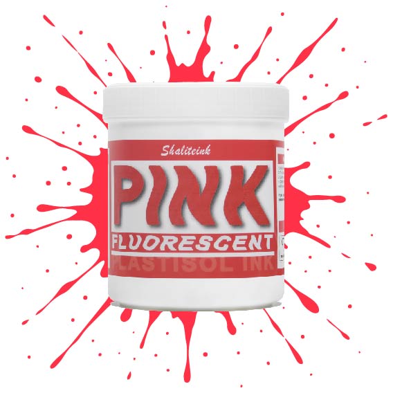
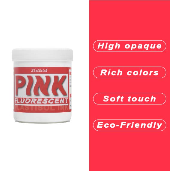
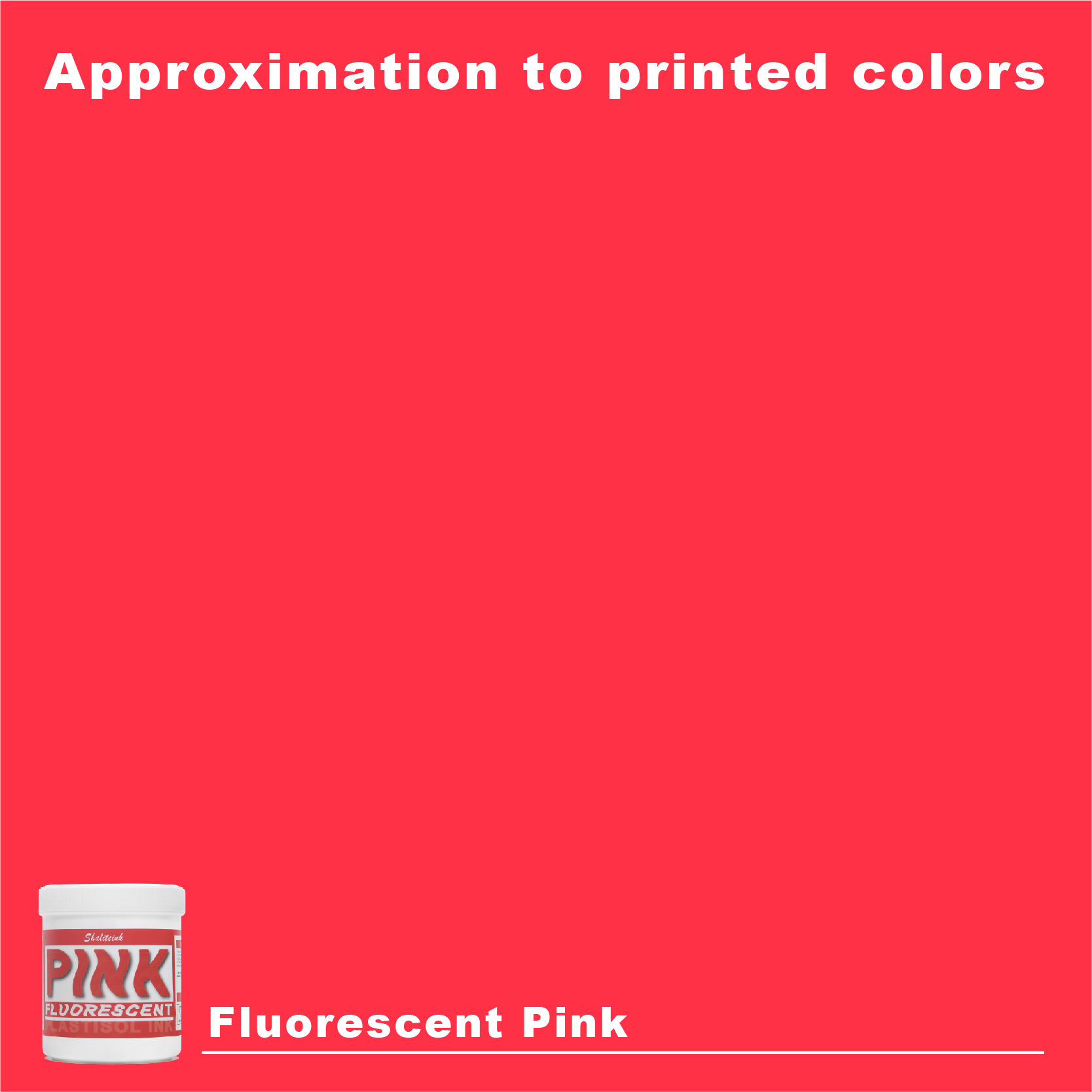
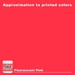
蛍光レッドピンクスクリーン印刷プラスチゾルインク
価格帯: $17.98 – $49.98
暗い路地裏の灰色の猫のように、プリントが背景に溶け込んでしまうのにうんざりしていませんか?くすんだ「ケチャップ」のような赤色で妥協するのはやめて、あなたのデザインにふさわしい、電撃的なインパクトを与えましょう。 蛍光赤ピンクプラスチゾルインク これは単なるありふれた色ではありません。人々の視線を釘付けにする、高発色のパワフルなカラーです。紫外線を吸収し、それを純粋で強烈なエネルギーとして反射することで、真昼の太陽光の下でも生地から鮮やかに輝きを放ちます。.
印刷業者同士でちょっとしたアドバイスですが、このインクは大胆な表現を恐れない人向けです。スクリーン印刷ではクリーミーな質感を保ち、洗濯を繰り返しても「輝き」が持続しますが、濃い色のTシャツに真のネオンカラーのインパクトを与えるには、まず鏡のように真っ白な下地をしっかりと塗る必要があることを覚えておいてください。もしあなたが退屈なデザインをやめて、お客様が実際に触って着たくなるようなシャツを作りたいと思っているなら、これはあなたのショップに欠けていた「秘訣」となるでしょう。.
ネオンマニフェスト:蛍光レッドピンクのプラスチゾルインクが、目を引くプリントの「秘訣」である理由
単刀直入に言いましょう。つまらないデザインのプリントショップを経営するのは、単に見た目が悪いというだけでなく、店を閉める近道です。顧客に稲妻のような衝撃を与えるようなアパレル商品が必要です。目標は、真新しいTシャツを箱から出した瞬間に、顧客が驚きの声を上げることです。私が何を言っているのか、お分かりでしょう。たった一度の洗濯で何百回も洗ったように見える色あせたネイビーブルーや、冷めたトマトスープのような視覚的なインパクトのない「赤」のことです。.
印刷会社を経営しているなら、忘れられるような存在ではいられません。私のビジネスが転換期を迎えた瞬間をはっきりお話ししましょう。それは、より高速な自動印刷機や高価なソフトウェアを購入した時ではありませんでした。. そこで私は救いを見出した。. それは私が安全策をやめてバケツを開けた日だった 蛍光レッドピンクスクリーン印刷プラスチゾルインク.
このガイドでは、この「エレクトリック」な顔料について、ありのままの真実をお伝えします。怠け者にとってはどれほど厄介な存在か、そしてその「秘訣」をマスターすれば、なぜ私の店で最大の利益を生み出す商品になるのかを、詳しく解説します。さあ、椅子に座って、じっくりと語り合いましょう。.
私が「ネオン」ナイトメアに500ドルも費やした時の話をしましょう
80年代風のジムのオーナーが、偏頭痛を引き起こすほど派手なピンク色を求めてやってきた。私は調子に乗って、黒のポリエステルTシャツに基本的なネオンインクを適当に塗ってスタートボタンを押した。とんでもない間違いだった。とんでもない間違いだった。.
乾燥機から出てきたシャツを見た時は、まさに衝撃だった。鮮やかなピンク色になるはずが、濁った、透け感のあるひどい状態になっていたのだ。暗い背景に、色はまるで水浸しのシリアル箱のように生気を失っていた。その時、高視認性プリントはただ色を選ぶだけではなく、化学をマスターする必要があるのだと痛感した。.
私は安いものを捨てて シャライトインク プラスチゾルインク. その時、ようやくひらめきました。高濃度の顔料を使わないと、ただ色付きの水を押し出しているだけだと理解しました。 プラスチゾルインクサプライヤー 光の反射の科学を理解していないと、プリントは常に「安っぽい」見た目になります。“
蛍光灯が異質な存在である理由
ほとんどのインクは、当たった光を反射するだけです。しかし、蛍光顔料は違います。蛍光顔料は、まさに驚異的な性能を発揮します。目に見えない紫外線を吸収し、それを可視光として放出するのです。まさにエネルギー変換と言えるでしょう。.
しかし、綿素材にその魔法を効かせるには、インクの濃度を外科手術のように精密に調整する必要がある。インクの層が薄すぎると、光は裏側から漏れてしまう。厚すぎると、まるでプラスチックの皿を着けているような状態になってしまう。.
マスター設計図:正しく印刷する方法
もしあなたがぶっつけ本番でやろうとするなら 蛍光レッドピンク, そうしないと、最終的にはボロ布の山ができてしまいます。これが、私が「昼光で光る」ような見た目を得るために使用している正確な技術的なセットアップです。.
1. メッシュカウント戦略
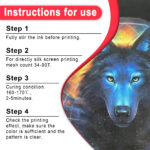
ここでは230メッシュのスクリーンは使わないでください。印刷に必要な顔料が不足し、蛍光発光が阻害されてしまいます。.
-
最適なポイント: 110~125メッシュ。「厚めの」堆積物が必要です。.
-
プロの動き: 細い線を描く場合は、155メッシュを使用してください。ただし、色の鮮やかさを保つためには、「プリント→フラッシュ→プリント」のシーケンスが必要になります。.
2. アンダーベース(あなたの秘密兵器)
絶対に、絶対に、ネオンインクを暗い色の衣服に直接プリントしてはいけません。それは黒板に蛍光ペンで絵を描こうとするようなものです。下に「鏡」が必要です。私はいつも高不透明度の下地を敷きます。 ホワイトスクリーン印刷プラスチゾルインク まず、この白い層がピンク色の層を通して光を反射するため、ピンク色が3倍明るく見えるのです。.
3. 治癒プロトコル
プラスチゾルは基本的に液状のプラスチックです。空気乾燥はせず、熱を加えることで固まります。.
-
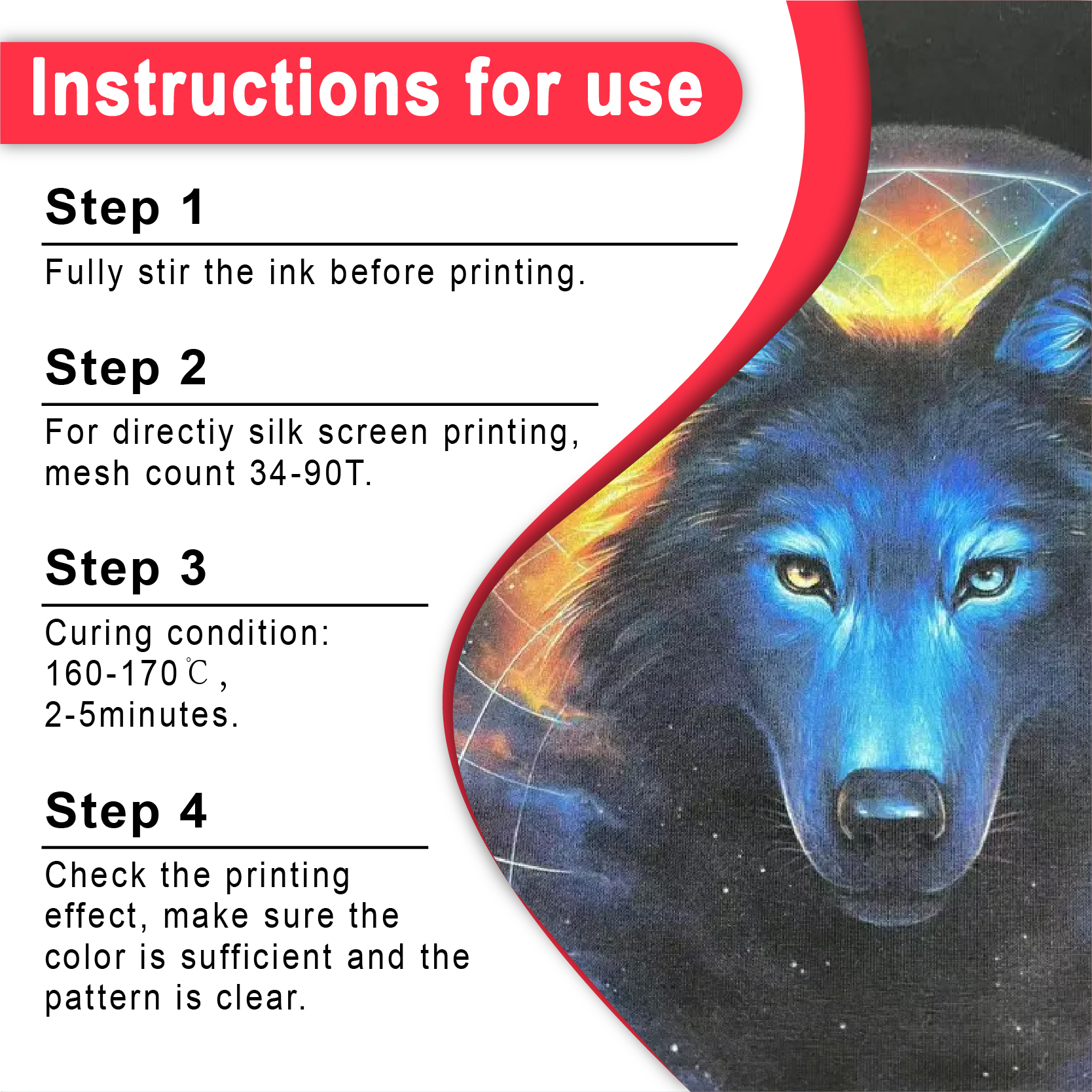
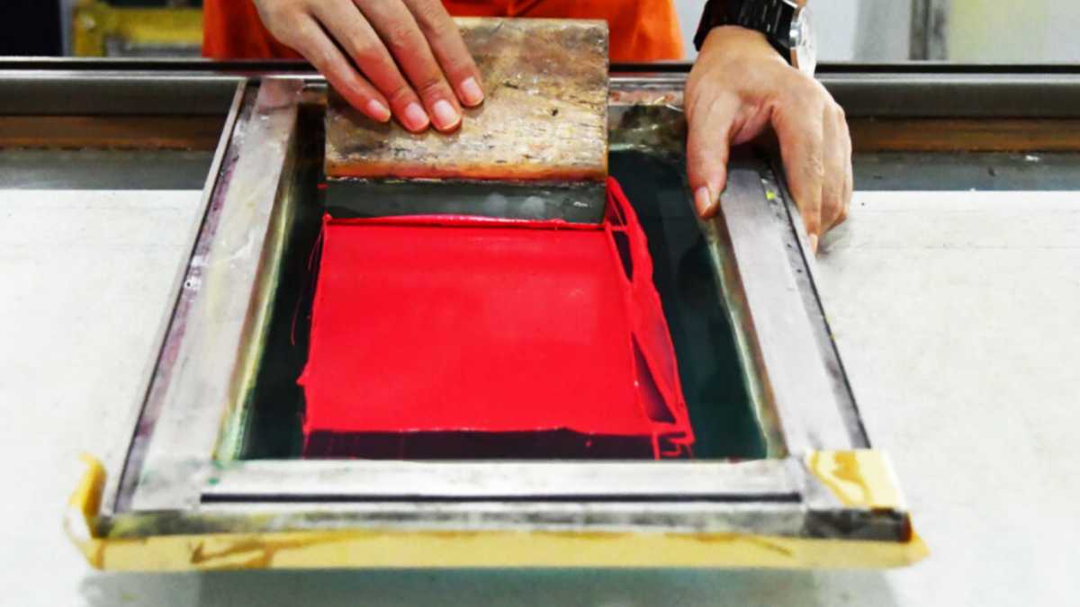
フラッシュキュア: 220°F(104°C)で2~3秒。表面を薄くするだけで十分です。.
-
最終的な治療法: 320°F(160°C)で60~90秒間加熱する。.
比較表:標準赤色 vs. 蛍光赤色ピンク
| パフォーマンス指標 | 標準赤インク | 蛍光レッドピンク |
| ビジュアルインパクト | 堅実で伝統的 | 高強度/「鮮やか」“ |
| 光との相互作用 | 受動反射 | 紫外線活性発光 |
| アンダーベースの必要性 | 中間調はオプション | ダークカラーは必須 |
| 手触り | とても柔らかい | 中程度(密度が必要) |
| 市場価値 | 標準価格 | プレミアム/特別価格 |
「ブティック」要素:特殊インクが選ばれる理由
「白いシャツに黒インクでプリントする」だけのサービスを売っているなら、あなたはただのコモディティです。巨大なウェブ印刷工場とわずかな利益を競い合っているに過ぎません。しかし、特殊効果を提供すれば、あなたはコンサルタントになれるのです。.
私は自分の 蛍光レッドピンク 他の素材を組み合わせることで、地元の店では真似できないようなルックスを作り出す。.
「3D」ネオンハック
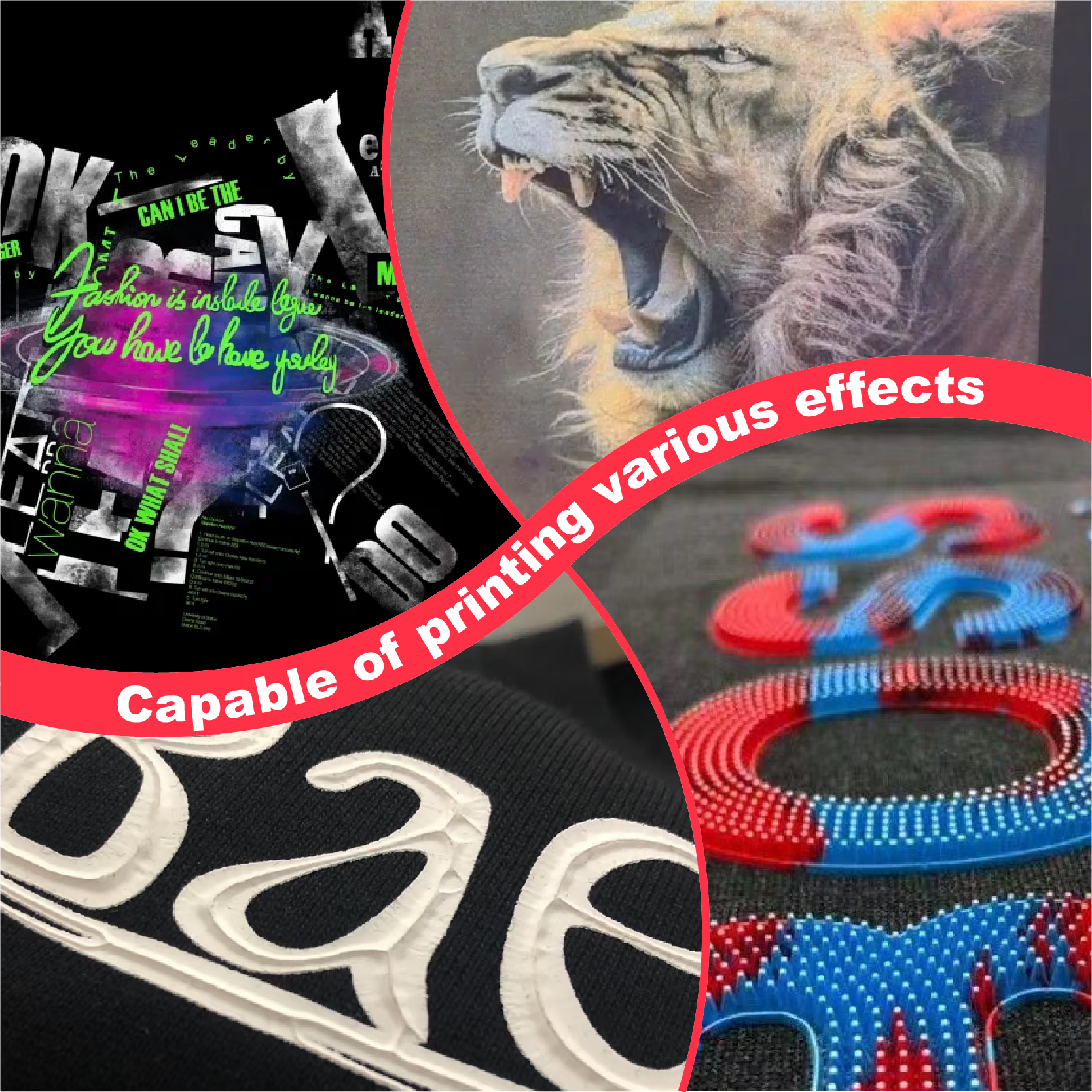
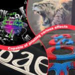
少し混ぜてみてください パフスクリーン印刷インクプラスチゾル ネオンピンクに染まります。乾燥機に入れると膨らみ、高級感のあるストリートウェアのような、立体感のあるネオンピンクの質感が生まれます。触り心地が抜群です。人は質感のあるプリントに思わず指を走らせたくなるもので、まさにその触覚的なつながりが購入の決め手となるのです。.
高コントラストフレーム
私はよくネオンデザインを額装します 銀 スクリーン印刷用インク プラスチゾル. 銀色の冷たく工業的な外観が、「ホット」ピンクの印象をさらに強烈に引き立てます。これらの組み合わせは、 メタリックスクリーン印刷インク セクション。.
「クリーンインク」運動について語りましょう
あなたの商品は安全ですか?現代の消費者はもはやグラフィックだけを見ているわけではありません。健康食品マニアのようにラベルの裏面まで読んでいます。「有害な」店の匂いの時代は終わりました。高級ブランドや環境意識の高い親に販売したいなら、 PVCフリープラスチゾルインク.
無毒で環境に優しいサプライヤーに切り替えることは、単に「良いこと」というだけでなく、現代市場において大きな競争優位性となる。.
私はShaliteinkを使用しています PVCフリープラスチゾルインクレッド なぜなら、それはすべての条件を満たしているからです。
-
フタル酸エステル不使用: 有害な化学物質が溶け出したり、有毒な排水が発生したりする心配はありません。.
-
法令遵守準備完了: これは、世界の海上輸送および衣料品輸出に求められる厳しい規制を完全に遵守しています。.
-
ソフトな手触り: 胸に貼ったステッカーが重たい感じはしない。.
トラブルシューティング:問題が発生した場合
どんなに優れた美容室でも、時折トラブルに見舞われるものです。髪が燃え上がらないように、私が最も厄介な問題にどう対処しているかをご紹介します。
問題点:「印刷がレンガみたいに硬い!」“
-
原因: 印刷しすぎです。レイヤーが多すぎるか、圧力が強すぎます。.
-
解決策: スクイージーの速度を上げて、下地にはメッシュ数の多いものを使用してください。厚い白い層ではなく、薄く滑らかな白い「皮膜」を作るのが理想です。.
問題点:「インクがぼやけていたり、濁っていたりする。」“
-
原因: 繊維状化。インクの間から、小さな綿毛が突き出ている。.
-
解決策: 高品質の 感光乳剤 ステンシルが鮮明になるようにするためです。また、印刷後、シャツにヒートプレスを3秒間当てて繊維を「アイロンがけ」してください。.
販売のヒント:ネオンを20%高く売る方法
価格表に「蛍光ピンク」とだけ記載するのはやめましょう。つまらないです。 結果.
顧客に伝えましょう: “「当社は高視認性ブランディングを専門としています。当社のUV反応性顔料は、フェスティバル、夜間イベント、小売店などにおいて最大限の視認性を発揮するように設計されています。」‘
位置 蛍光レッドピンク プレミアムアップグレードとして提供しています。通常、セットアップに時間がかかるため、特殊インク料金をいただいております。ほとんどのお客様は、近所の安価な熱転写ショップではこのレベルの仕上がりは得られないため、料金を支払うことに抵抗を感じていません。.
どこから始めればいいのか?
ガレージで始めたばかりだったり、小さな店舗を構えるだけなら、5ガロンのドラム缶を買って破産するな。まずはスターターキットを手に入れろ。それが、自分の作業場で様々な顔料がどのように振る舞うかを試す最良の方法だ。 NB印刷インク初心者キット 色が安定していて、ポリエステル混紡生地でも「にじみ」(色移り)しないので、私のおすすめです。.
よくある質問
1. これであなたは暗い映画館で光る人間になってしまうのでしょうか?
そうではありません。この点をはっきりさせておきましょう。 蛍光インクは「紫外線反応性」です。“ ブラックライトの下では確かに派手に光ります。でも、全く光のない洞窟で光るシャツが欲しいなら、蓄光インクを探すべきです。しかし、昼間の「ポップ」な輝きで目が痛くなる(良い意味で)なら、, 蛍光レッドピンクはヘビー級チャンピオンだ。.
2. 費用を抑えるために、これを普通の白で薄めてもいいですか?
あなた できた, しかし、それはひどいアイデアです。標準的な白と混ぜると「パステル」ピンクになってしまいます。蛍光性が失われてしまうのです。あの鮮やかな輝きを保ちたいなら、純粋なまま使うか、他の色とだけ混ぜるようにしてください。 蛍光プラスチゾルインク.
3.簡単に洗い流せますか?
正しく治療すれば、そうはなりません。. 本当の秘密は、使用されている高品質の樹脂です。 シャライトインク プラスチゾルインク. 生地の繊維と永久的に結合します。乾燥機の温度が160℃に達しても、プリント部分はシャツ本体よりも長持ちします。.
4.片付けは悪夢ですか?
あらかじめ警告しておきますが、しばらくの間、掃除ステーションはまるでドールハウスの中でラメ爆弾が爆発したかのような状態になります。ただし、他のプラスチゾル塗料と全く同じです。標準的な分解剤を使用してください。スクイージーはすぐに拭き取ってください!
5. これをポリエステルジャージーにプリントしてもいいですか?
はい、でも注意した方がいいですよ。ポリエステルは染料がインクに「にじむ」(染料移行)しやすい性質があります。 アンチマイグレーションスクリーン印刷インク(プラスチゾル) バリア層として機能します。遮断層がないと、鮮やかなピンク色は、お客様が最初のトレーニングを終える前に、沼のような紫色に変色してしまいます。.
結論:リスクを恐れない印刷業者には幸運が訪れる
私たちは今、「ファストファッション」と、すぐに忘れ去られるような画一的な紙切れの海に溺れています。印刷業者として生き残るには、より良いものを提供しなければなりません。品質は重要です。そして、完璧に仕上げられた、鮮やかな印刷物ほど「高品質」を雄弁に物語るものはありません。 蛍光レッドピンクのプリント.
扱いやすいインクとは言えません。より丁寧な作業、より優れた下地、そして乾燥機の監視が必要です。しかし、その見返りとして、他では味わえない「感動」を何度も繰り返してくれる顧客を獲得できます。.
退屈な生活はもう終わりにしませんか?大手量販店から薄められたインクを買うのはもうやめましょう。本物の顔料は シャリテインク スクリーン印刷インクショップ.
信じてください。一度その違いを知ったら、もう二度と「ケチャップのような赤」には戻れなくなるでしょう。.
| サイズ |
8オンス ,16オンス ,32オンス |
|---|
Fluorescent Red Pink Screen Printing Plastisol Ink に対するレビュー9件
フィルターをクリア以前にこの商品を購入したことのあるログイン済みのユーザーのみレビューを残すことができます。
関連商品
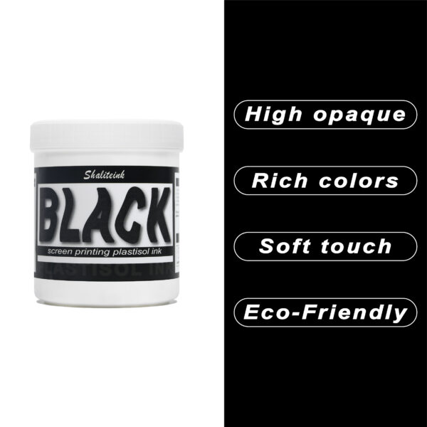
黒スクリーン印刷プラスチゾルインク
「ダークグレー」で満足して、それを黒と呼ぶのはやめましょう。 黒色プラスチゾルインク このインクは、スクリーンを詰まらせ、シャツの仕上がりをくすませる、粘り気のある濃いインクに悩まされている印刷業者向けに開発されました。バターのように滑らかでクリーミーな質感で、高密度のメッシュでもスムーズに印刷でき、しかも一度の印刷で生地の色をしっかり定着させます。100%コットンTシャツでも、扱いの難しい混紡生地でも、このインクは柔軟でマットな「ミッドナイト」カラーに仕上がり、最初の洗濯後もひび割れたり剥がれたりしません。お客様が期待する、プロ仕様の高品質なブラックです。.
安全性は必ずしも性能を犠牲にすることを意味するわけではありません。当社のフォーミュラはフタル酸エステルを一切使用していません( PVCフリーのオプション (入手可能)なので、化学薬品のトラブルを気にすることなく、高級ブランドの印刷が可能です。発色が良く、スクリーン上でインクが定着しやすく、インクの蓄積も少なく、鮮明なディテールを維持します。印刷作業の効率化と、まるでブティックで作られたような仕上がりを実現する、頼りになるインクをお探しなら、このインクを印刷機に常備しておくのがおすすめです。.
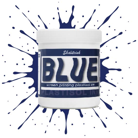
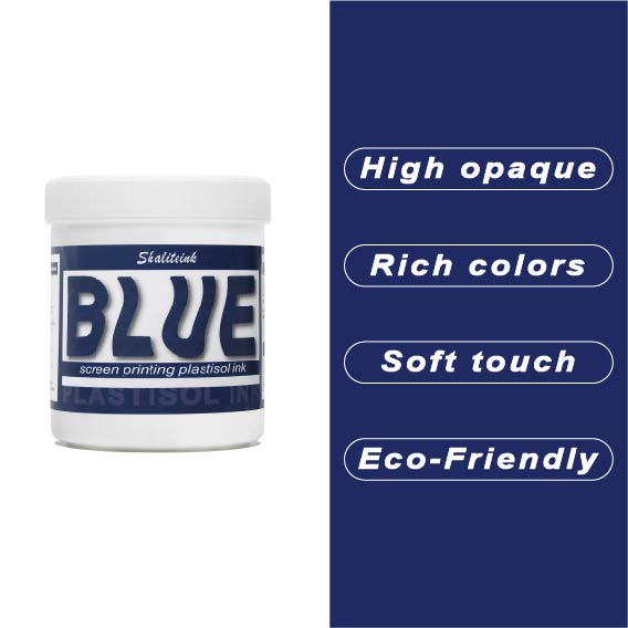
ディープブルースクリーン印刷プラスチゾルインク
ネオンサインのように派手な青色や、生地の繊維に溶け込んでしまうような青色で妥協するのはもうやめましょう。Shaliteinkのディープブルーは、まさにあの「真夜中の海」のような、洗練された深みのある色合いです。濃いチャコールグレーや黒の衣類にも映える、力強く鮮やかな発色を実現。高い不透明度で、塗った場所にしっかりと定着し、シャープでプロフェッショナルな仕上がりを提供します。まるで高級小売店に並ぶような、洗練された印象を与えるプリントが、趣味のガレージでプリントしたような安っぽさを感じさせません。.
バケツの中のこのインクは、驚くほどクリーミーで、すぐに印刷に使用できます。粘度を調整したので、手動スキージでも自動印刷機でも、メッシュを簡単に通過します。乾燥機で最適な温度である160℃(320°F)に達すると、剥がれたり、ひび割れたり、洗い流されたりしない、非常に強固で柔軟な接着層が形成されます。「まあまあ」な仕上がりに飽き飽きしていて、本当に頼りになるブルーインクをお探しなら、毎日使いたくなるこのインクがきっと見つかるでしょう。.
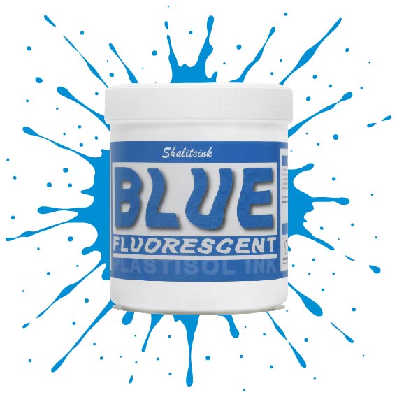
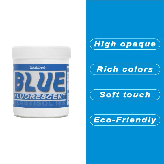
蛍光ブルースクリーン印刷プラスチゾルインク
「やや明るめの」青で満足するのはやめて、あなたのデザインにふさわしい、刺激的なエッジを与えましょう。 蛍光ブループラスチゾルインク まさにボトルに詰められた稲妻――高顔料で紫外線に反応するフォーミュラは、ブラックライトの下では鮮烈な輝きを放ち、明るい日光の下では部屋全体を圧倒します。バケツから出してすぐにバターのように滑らかな書き心地なので、最初のひと塗り前にインクと格闘する必要はもうありません。また、フタル酸エステルを一切使用していないため、どんなクライアントにも安心して印刷できます。.
濃い色の衣類に、目を奪うような鮮やかな発色を実現するには、まずはくっきりとした白い下地を軽く塗るだけで、あとはこのブルーインクにお任せください。厚みのあるジューシーな仕上がりを求めるなら110メッシュ、よりシャープなディテールを求めるなら156メッシュ。どちらのサイズでも、完璧なせん断力で、剥がれたり色褪せたりしない、耐久性に優れたプロフェッショナルな仕上がりになります。ただの印刷業者から、誰もが話題にする印刷会社へとステップアップしたいなら、このインクこそがそれを可能にするのです。.
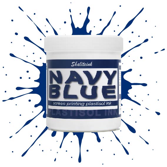
ネイビーブルースクリーン印刷プラスチゾルインク
薄くて水っぽいブルーインクでパーカーを台無しにしてきた経験から、しっかりとしたネイビーブルーインクはなかなか見つからないものだと痛感しています。当社のネイビーブルースクリーン印刷用プラスチゾルインクは、濃い色の生地にも一度でしっかり発色し、スクリーン上でもクリーミーな質感を保つため、まさに本物です。濃い色の衣類にもしっかりと定着するほどの濃さがありながら、メッシュをスムーズにクリアできるほど滑らかです。深みのあるプロフェッショナルなミッドナイトブルーの仕上がりを実現しながら、スクリーンの目詰まりという厄介な問題に悩まされることもありません。.
自社ブランドやカスタムオーダーの印刷では、段ボールのような質感ではなく、しっかりとした仕上がりを求めるものです。通気性と柔軟性に優れたPVCフリーのプラスチゾルインク「ブルー ソフトハンド」をお試しください。乾燥機や洗濯機にも対応し、耐久性にも優れています。この環境に優しいスクリーン印刷インクは無毒で使い方も非常に簡単なので、化学的な知識に気を取られることなく、作品制作に集中できます。もう推測に頼る必要はありません。本当に優れた性能を発揮するネイビーカラーのインクで印刷を始めましょう。.
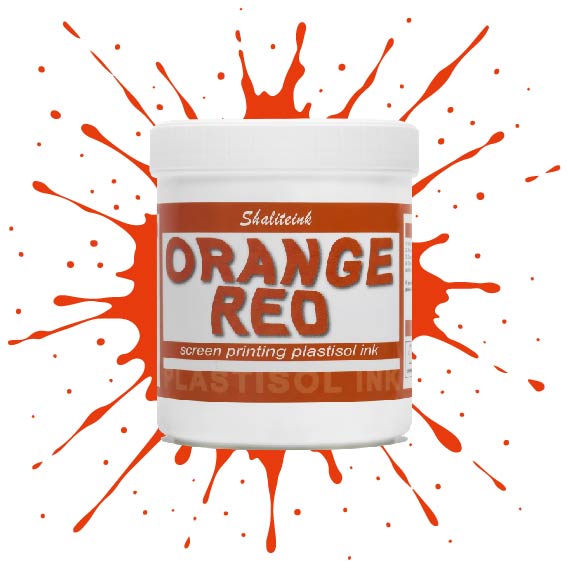
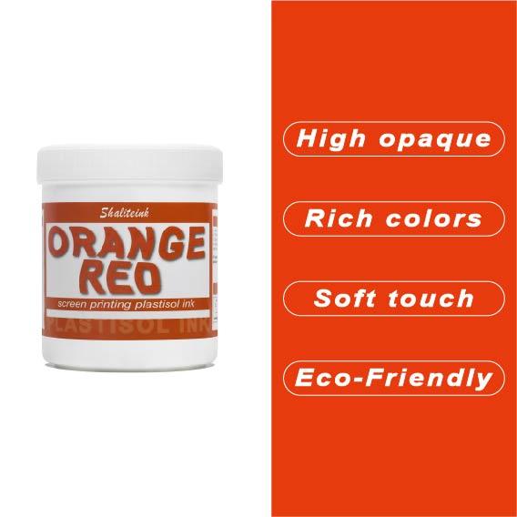
オレンジレッドスクリーン印刷プラスチゾルインク
生地に平板に映えるだけの、退屈で予測可能な赤色に飽き飽きしていませんか? オレンジレッドスクリーン印刷プラスチゾルインク 溶岩のような鮮烈さと、クラシックなイタリアンスポーツカーの絶妙なバランスを体現したカラーです。驚くほど濃厚でクリーミーな質感でありながら、ランチ休憩などで席を離れる必要があっても、スクリーン上で乾くことはありません。白いコットン生地に鮮やかなサマーウェアをプリントする場合でも、黒いパーカーの白い下地にプリントする場合でも、このカラーはまるで振動しているかのような輝きを放ちます。ストリートウェアブランドが切望する、あの力強い「ポップ」な印象を与えつつ、自分でカスタムカラーを調合する手間も省けます。.
このインクは洗濯に強く、しかもお客様の店舗でも安心してご使用いただけるよう設計されています。標準的な160℃(320°F)で硬化し、有害なフタル酸エステル類は一切使用していません。110~156メッシュの糸をスムーズに通過し、乾燥機を通した後も驚くほど柔らかな肌触りで、広範囲をカバーします。「まあまあ」なプリントで満足するのはもうやめて、このインクで個性的なアパレルを際立たせましょう。.
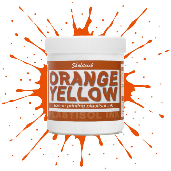
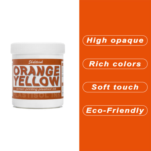
オレンジイエロースクリーン印刷プラスチゾルインク
暗い生地に溶け込んでしまうような「くすんだ」黄色で妥協するのはもうやめましょう。人目を引く鮮やかな発色の秘訣は、妥協を嫌う印刷業者向けに設計された、高不透明度の強力なオレンジイエロースクリーン印刷用プラスチゾルインクです。スポーツウェアでも小売店のTシャツでも、このインクは豊富な顔料含有量のおかげで鮮やかな発色を保ちます。ゴールドとオレンジの中間のような、大胆で太陽の光を浴びたような色合いでありながら、厚塗り感のないしっかりとした存在感を放ちます。.
安全対策は面倒な作業であってはなりません。そこで、この製品はPVCとフタル酸エステルを一切使用せず、お客様の店舗が法令を遵守し、環境にも配慮できるよう開発しました。独自のノンブリード(NB)技術により、扱いにくいポリエステル混紡素材でも染料のにじみを防ぎ、鮮やかな色合いを洗濯後も保ちます。滑らかで切りやすく、上質なソフトな手触りで、お客様にまるで魔法の手を持っているかのような印象を与えます。ぜひ一度お試しいただき、プロがShaliteinkを信頼する理由をご実感ください。.
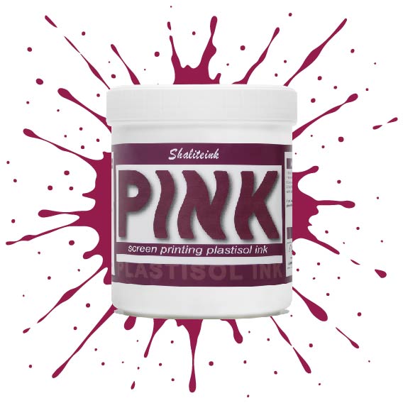
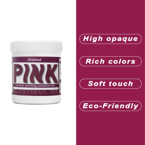
ピンクスクリーン印刷プラスチゾルインク
濃い色の生地に「あざ」のように見えるピンクで妥協するのはもうやめましょう。Shaliteinkのピンクプラスチゾルは、鮮やかで長持ちする色を求める印刷業者にとって最適な高彩度インクです。超高密度顔料配合で設計されたこのインクは、濃い色の衣類染料にも負けず、繊維の上にしっかりと定着し、鮮やかでブティック品質の仕上がりを実現します。バケツから出した直後はクリーミーな質感で、スクリーン上ではほぼ永久に色褪せることなく、休憩中にメッシュ内で乾燥することはありません。スキージを引くたびに、鮮やかで目を引く色合いを再現します。.
長期間の使用を想定して開発された当社のフタル酸エステル不使用のフォーミュラは、320°F(約160℃)で「防弾」フィルムに融合し、デザインがひび割れたり色褪せたりすることなく、50回以上の洗濯サイクルに耐えることを保証します。丈夫なストリートウェアでも、柔らかなコットン混紡素材でも、Shaliteinkは、硬くて「凍ったヨガマット」のような感触なしに、必要なプロ仕様の不透明度を提供します。ただシャツをプリントするのではなく、ついに思い通りのピンク色になったShaliteinkで、お客様にあなたの職人技に夢中になる理由を与えましょう。.
ホワイトスクリーン印刷プラスチゾルインク
生地に溶け込んでしまうような「幽霊のような」白いプリントで妥協するのはもうやめましょう。Shaliteinkのホワイトプラスチゾルインクは、濃色の衣類にしっかりとした不透明度を与えるために開発されました。クリーミーで滑らかな質感でスクリーンに塗布でき、硬いプラスチックというよりはホイップバターのような感触です。そのため、手作業でのプリント作業がスムーズになり、生産性が向上します。たった一度のフラッシュで、鮮やかで明るい白の「ポップ」な仕上がりを実現し、最初の洗濯でインクがひび割れたり色褪せたりする心配もありません。.
週末に趣味でプリントを楽しむ方にも、忙しいショップを経営されている方にも、これはまさにあなたが探し求めていた頼れる相棒です。高発色で、驚くほど簡単に混ぜることができ、数秒で硬化するので、機材の扱いに時間を費やすことなく、実際にプリント作業に集中できます。プロ仕様の性能をバケツに詰め込んだこのインクは、最初のプリントから1000回目のプリントまで、白を鮮やかに保ち、デザインをシャープに仕上げるように設計されています。.
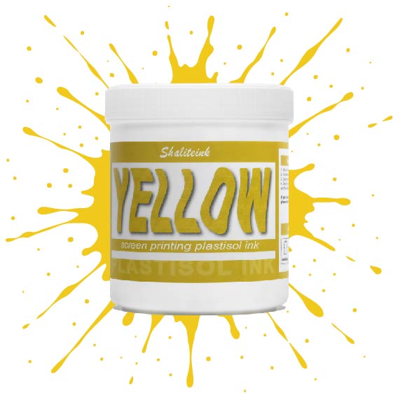
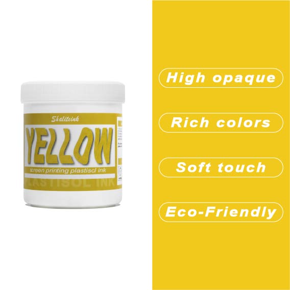
黄色のスクリーン印刷プラスチゾルインク
太陽の光のような鮮やかなプリントを目指しているのに、「沼のような緑」のプリントで妥協するのはもうやめましょう。黄色はインク棚の女王様です。本来半透明で、濃い色の生地にプリントすると濁ったり弱々しく見えたりすることが非常に難しいことで知られています。だからこそ、シャライトインクは顔料を豊富に含んだイエロープラスチゾルを開発しました。白い下地の上に完璧に定着するように特別に設計されており、遠くからでもはっきりと見えるほど鮮やかで、乾燥機にかけた後も明るさが持続します。.
鮮やかでエネルギッシュなレモンイエロー、あるいは温かみのあるバーシティジャケットのようなゴールデンイエロー、どちらの色をお探しでも、このインクはバターのように滑らかで、プリント中にメッシュが乾くこともありません。薄くムラのある仕上がりになるよう配合を調整し、クリーミーな質感を実現。プリントするたびに満足感を得られます。数回の洗濯後もひび割れたり色褪せたりしない、すぐに店頭に並べられるシャツをお求めなら、このイエローこそ、あなたのスクイージーが待ち望んでいた色です。.
 EN
EN  DE
DE  ES
ES  PT
PT  JA
JA
ローラ・ジョンソン –
日々の業務に非常に役立っています。スムーズなアプリ
ダニエル・ウィルソン –
使いやすく、結果も安定しています。非常に価値があります。
ブライアン・クーパー –
スムーズな塗布と信頼性の高いパフォーマンス。簡単
ブライアン・クーパー –
スムーズな塗布と信頼性の高いパフォーマンス。簡単
ブライアン・クーパー –
スムーズな操作性と信頼性の高いパフォーマンス。日々の作業に非常に役立っています。以前のバージョンを上回りました。
カタジナ・レヴァンドフスカ –
Bardzo dobry stosunek jakości do ceny。 Bardzo dobry stosunek jakości do ceny。 Łatwa aplikacja i niezawodne działanie。 Łatwy w użyciu i powtarzalne rezultaty.ヴィソカ・ヤコシチ・イ・シュプカ・ドスタワ。ジアワ バー
フェリックス・ウェーバー –
Hat meine Erwartungen übertroffen。ホッホヴェルティゲ クア
カタジナ・レヴァンドフスカ –
Działa bardzo dobrze na co dzień。ワトウィ・ウィ・ウジシウ・イ
ベアトリス・ロシャ –
機能はありません。機能はありません。 Superou minhas 期待しています。機能はありません。最高の利益。優れた評価と迅速な取り組み。安全な情報を提供します。安全な情報を提供します。優れた才能を発揮する資格